Closed
Description
The CardSubheading text is a bit hard to read.
The contrast ratio is below the recommended 4.5
Looks like it is the $textSecondary color against a white background ($paper).

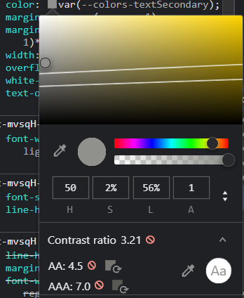
The CardSubheading text is a bit hard to read.
The contrast ratio is below the recommended 4.5
Looks like it is the $textSecondary color against a white background ($paper).