Description
本文是早期译版,未经校审。仅供参考。
Frosted glass effect
毛玻璃效果
Prerequisites
- RGBA/HSLA colors
背景知识
- RGBA/HSLA 颜色
The problem
难题
{原书注释!}
We are using the term “backdrop” here to mean the part of the page that is underneath an element, which shows through its semi-transparent background.
我们在这里用了 “背层”(backdrop)一词,它表示页面被某个上层元素遮住的部分,这部分区域透过该元素的半透明背景显现出来。
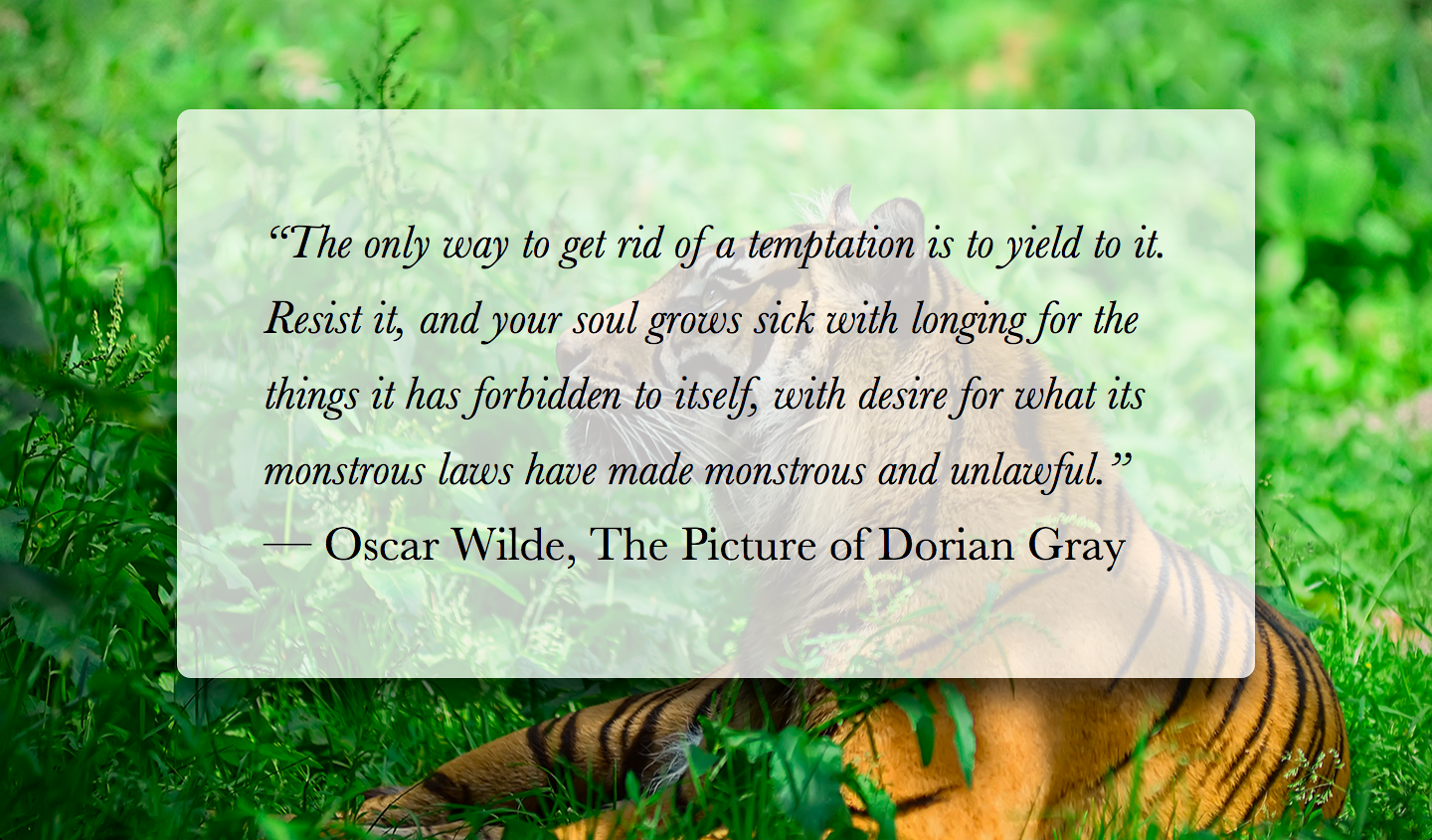
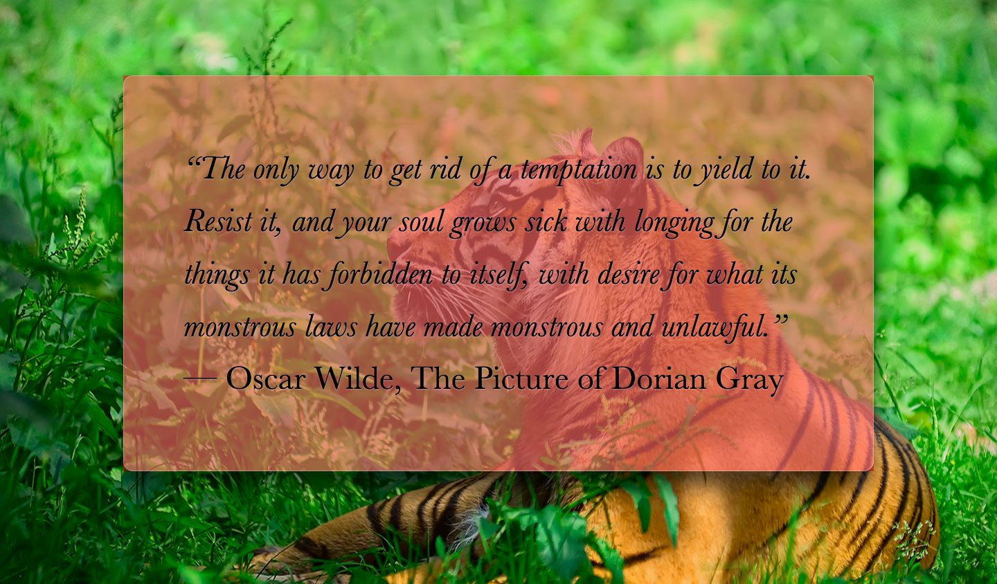
One of the first use cases of semi-transparent colors was using them as backgrounds, over photographic or otherwise busy backdrops, to decrease contrast and make the text possible to read. The result is quite impressive, but can still be hard to read, especially with very low opacity colors and/or busy backdrops. For example, take a look at Figure XX.XX, where the main element has a semi-transparent white background. The markup looks like this:
半透明颜色最初的使用场景之一就是把它们作为背景,当叠放在照片类或其他花哨的背层之上时,可以减少对比度,确保文本的可读性。这种效果确实很有视觉冲击力,但仍然可能导致文字很难阅读,特别是当背景色的不透明度较低或背层图案太过花哨时。举个例子,我们来看看 图 4.14,图中 main 元素的背景是半透明的白色。结构大致是这样的:
<main>
    <blockquote>
        “The only way to get rid of a temptation[...]”
        <footer>--
            <cite>
                Oscar Wilde,
                The Picture of Dorian Gray
            </cite>
        </footer>
    </blockquote>
</main>
And the CSS looks like this (with all irrelevant bits omitted for brevity):
而 CSS 代码可能是这样的(简短起见,这里只列出了关键样式):
body {
    background: url("tiger.jpg") 0 / cover fixed;
}

main {
    background: hsla(0,0%,100%,.3);
}
图 4.14
Our semi-transparent white background makes the text hard to read
半透明白色背景使文字很难阅读。
As you can observe, the text is really hard to read, due to the image behind it being busy and the background color only being 25% opaque. We could of course improve readability by increasing the alpha parameter of the background color, but then the effect will not be as interesting (see Figure XX.XX).
相信你可以察觉出来,文字确实难以看清,因为它后面的图片太过花哨了,而它的背景色只有 25% 的不透明度。当然我们可以通过提升背景色的不透明度来增加文本的可读性,不过这样一来整个效果就没有那么生动了(参见 图 4.15)。
图 4.15
Increasing the alpha value of our background color does fix the readability issue, but also makes our design less interesting
增加背景色的 alpha 值(不透明度)可以改善文本可读性的问题,但同时也让整个设计变得无趣了。
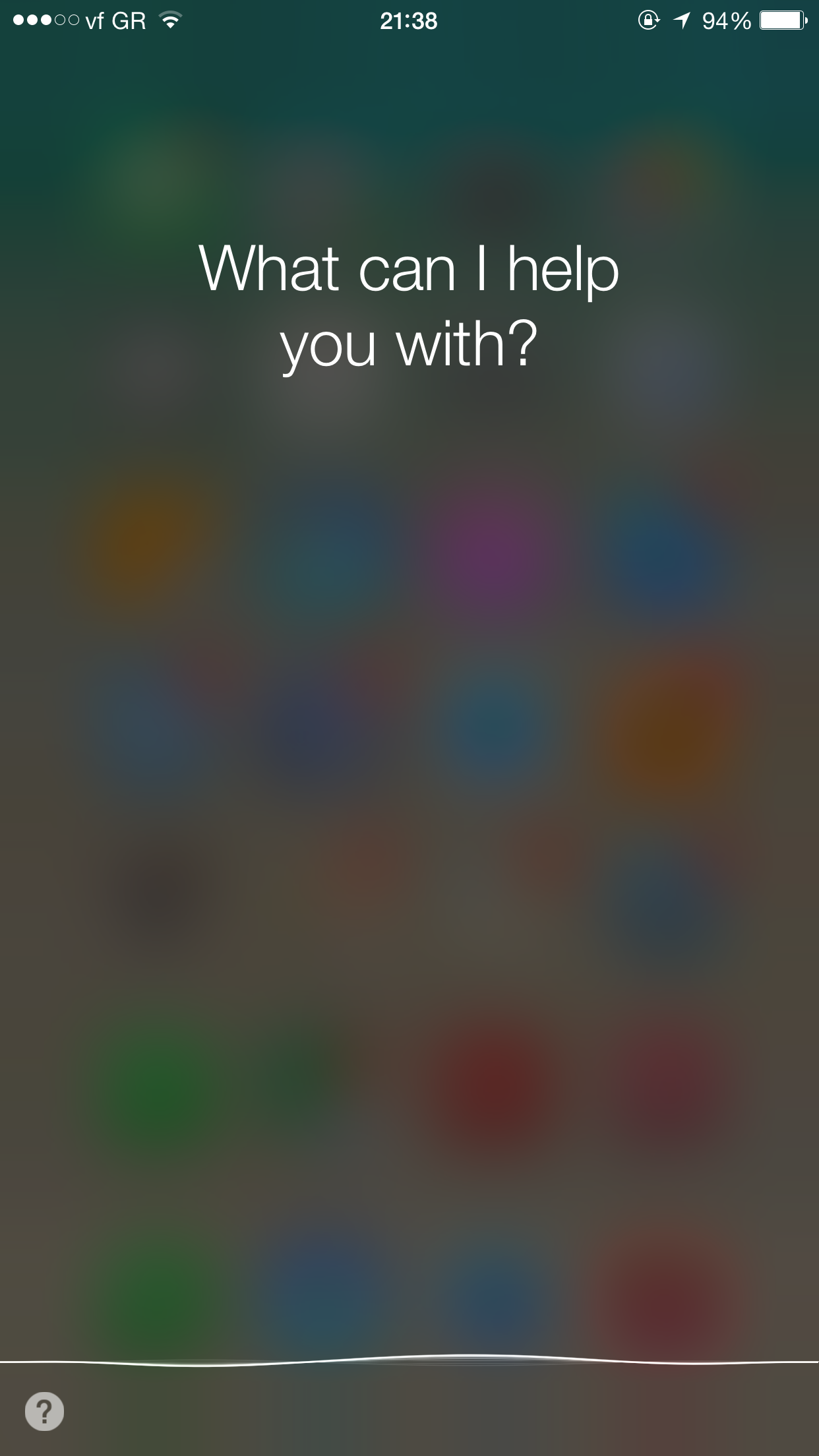
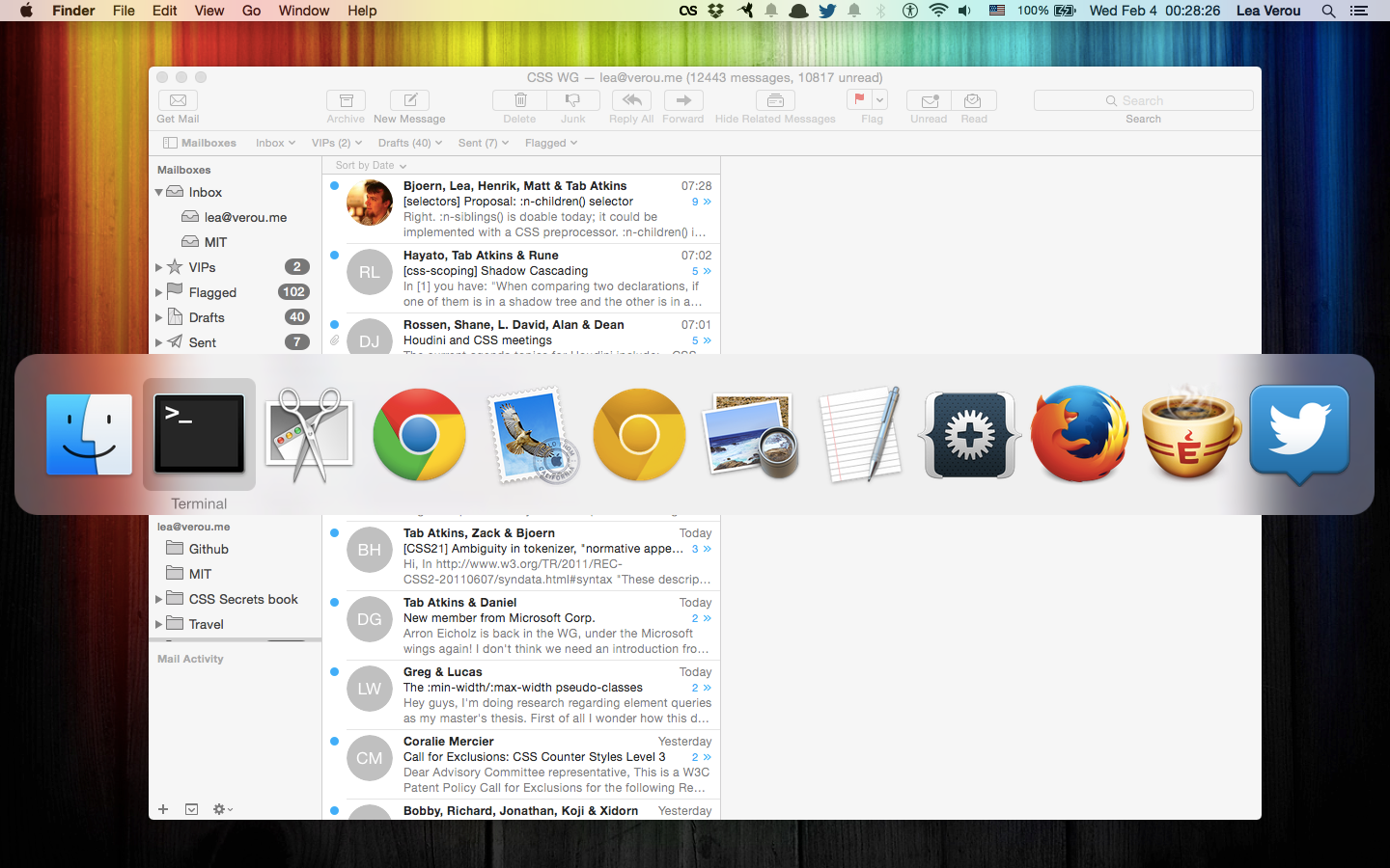
In traditional print design, this issue is often addressed by blurring the part of the photo that is underneath our text container. Blurred backgrounds are not as busy, and thus, text on them is easier to read. Because blurring is computationally expensive, in the past its toll on resources was prohibitive for using this technique in websites and UI design. However, with GPUs improving and hardware acceleration becoming more commonplace for more and more things, these days it’s used quite frequently. In the past few years, we have seen this technique in newer versions of both Microsoft Windows, as well as Apple iOS and Mac OS X (Figure XX.XX).
在传统的平面设计中,这个问题的解决方案通常是把文本层所覆盖的那部分图片区域作模糊处理。模糊的背景看起来就不那么花哨了,因此,在它之上的文本就相对比较易读了。在过去,由于模糊运算的性能消耗极其巨大,以致于这个技巧在网页设计和 UI 设计中鲜有用武之地。不过,随着 GPU 的不断进化以及硬件加速的不断普及,眼下这个技巧已经逐渐流行起来。在过去这几年里,我们已经可以在较新的 Microsoft Windows 系统中看到这个技巧的身影,而苹果的 iOS 和 Mac OS X 操作系统也不例外(图 4.16)。
图 4.16
Translucent UIs with a blurred backdrop have been becoming increasingly common in the past few years, as the toll of blurring on resources has stopped being prohibitively expensive (Apple iOS 8.1 is shown on the left and Apple OS X Yosemite is shown on the right)
在过去这几年间,由于模糊处理的资源消耗已经不再像以前那么高不可攀了,由模糊背层所构成的半透明 UI 已经变得越来越常见了(左图是 Apple iOS 8.1,右图是 Apple OS X Yosemite)。
We also got the ability to blur elements in CSS, via the blur() filter, which is essentially a hardware-accelerated version of the corresponding SVG blur filter primitive that we always had for SVG elements. However, if we directly apply a blur() filter to our example, the entire element is blurred, which makes it even less readable. (Figure XX.XX). Is there any way to just apply it to the element’s backdrop (i.e., the part of the background that is behind our element)?
借助 blur() 滤镜,我们还在 CSS 中获得了对元素进行模糊处理的能力。我们在 SVG 中很早就可以使用模糊滤镜了,而这个 CSS 滤镜本质上就是它的硬件加速对应版本。不过,如果我们直接在这个例子中使用 blur() 滤镜,那整个元素都会被模糊,文本反而变得更加无法阅读了(图 4.17)。有没有某种方法可以只对元素的背层(即被该元素遮住的那部分背景)应用这个滤镜呢?
图 4.17
Applying a
blur()filter to the element itself makes things worse对这个元素应用一个
blur()滤镜反而会把事情搞砸。
The solution
解决方案
{原书注释!}
It’s also possible even with non-fixed backgrounds, just messier.
对非固定的背景来说也是有办法实现的,只不过难搞一些。
Provided that our element has a background-attachment of fixed, this is possible, albeit a bit tricky. Because we cannot apply the blurring to our element itself, we will apply it to a pseudo-element that is positioned behind the element and whose background seamlessly matches the one on <body>.
假设大背景的 background-attachment 值是 fixed,这种情况是有可能的,只不过不太常见。由于我们不能直接对元素本身进行模糊处理,那我们就对一个伪元素进行处理,然后将其定位到元素的下层,而它的背景将会无缝匹配 <body> 的背景。
First, we add the pseudo-element and position it absolutely, with all offsets being 0, so that it covers the entire <main> element:
首先,我们添加一个伪元素,将其绝对定位,并把所有偏移量置为 0,这样就可以将它完整地覆盖到 <main> 元素之上:
main {
    position: relative;
    /* [Rest of styling] */
    /* [其余样式] */
}

main::before {
    content: '';
    position: absolute;
    top: 0; right: 0; bottom: 0; left: 0;
                                  /* for debugging */
    background: rgba(255,0,0,.5); /* 仅用于调试 */
}
{警告!!}
Be careful when using a negative
z-indexto move a child underneath its parent: if said parent is nested within other elements with backgrounds, the child will go below those as well.在使用负的
z-index来把一个子元素移动到它的父元素下层时,请务必小心:如果父元素的上级元素有背景,则这个子元素将出现在它们之后。
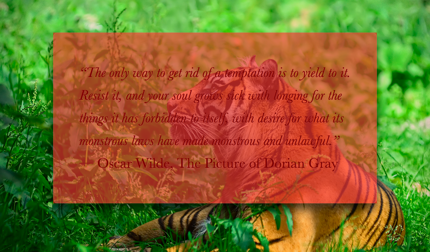
We also applied a semi-transparent red background, so we can see what we’re doing, otherwise debugging becomes difficult when we’re dealing with a transparent (and therefore, invisible) element. As you can see in Figure XX.XX, our pseudo-element is currently above our content, thus obscuring it. We can fix this by adding z-index: -1; (Figure XX.XX).
我们同时还给它设置了一层半透明的 red 背景,这样我们就可以看清楚我们做了什么,不然我们很难调试透明的(即不可见的)元素。你在 图 4.18 中可以看到,我们的伪元素现在就覆盖在内容元素之上。我们可以用 z-index: -1; 来修正这个问题(参见 图 4.20)。
图 4.18
The pseudo-element is currently obscuring the text
伪元素现在正覆盖在文本之上。
图 4.20
Moving the pseudo-element behind its parent, with
z-index: -1;使用
z-index: -1;来把伪元素移动到宿主元素的后面。
{原书注释!}
Why not just use
background: inheritonmain::before? Because then it will inherit frommain, notbody, so the pseudo-element will get a semi-transparent white background as well.为什么不对
main::before使用background: inherit呢?因为伪元素会从main(而不是body)那里继承样式,这样它只能得到一个半透明的白色背景。
Now it’s time to replace that semi-transparent red background, with one that actually matches our backdrop, either by copying over the <body> background, or by splitting it into its own rule. Can we blur now? Let’s try it:
现在该把半透明红色背景换掉了,换成跟背层完全匹配的背景。要实现这一点,我们要么把 <body> 的背景复制过来,要么把伪元素的背景声明合并过去。我们现在可以进行模糊处理吗?来试试看:
body, main::before {
    background: url("tiger.jpg") 0 / cover fixed;
}

main {
    position: relative;
    background: hsla(0,0%,100%,.3);
}

main::before {
    content: '';
    position: absolute;
    top: 0; right: 0; bottom: 0; left: 0;
    filter: blur(20px);
}
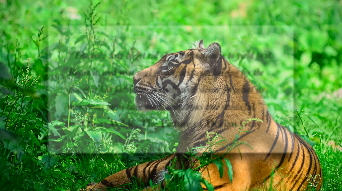
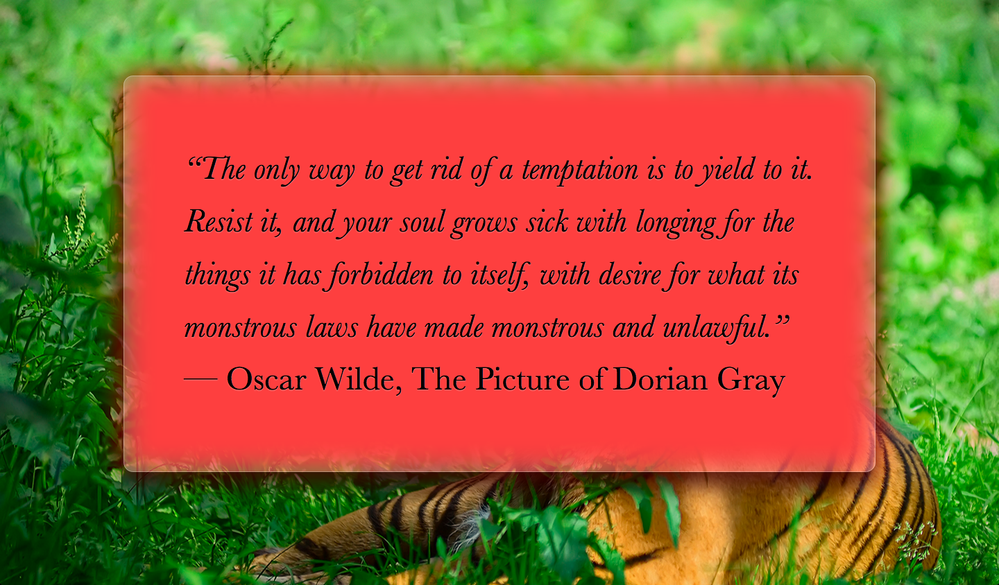
As you can see in Figure XX.XX, we’re pretty much there. The blurring effect looks perfect toward the middle, but is less blurred closer to the edges. This happens because blurring reduces the area that is covered by a solid color by the blur radius. Applying a red background to our pseudo-element helps clarify what’s going on (Figure XX.XX).
你在 图 4.21 中可以看到,这跟我们的期望已经相当接近了。模糊效果在中心区域看起来非常完美,但在接近边缘处会逐渐消退。这是因为模糊效果会削减实色像素所能覆盖的范围,削减的幅度正是模糊半径的长度。对伪元素应用一个 red 背景将有助于我们看清事情的真相(图 4.22)。
图 4.21
Blurring our pseudo-element almost works, but its less blurry on the edges, diminishing the frosted glass illusion
伪元素模糊的方法基本上成功了,但模糊效果在边缘处会逐渐消退,尽重削弱了毛玻璃的视觉效果。
图 4.22
Adding a
redbackground helps make sense of what’s happening添加一个
red背景有助于解释事情的真相。
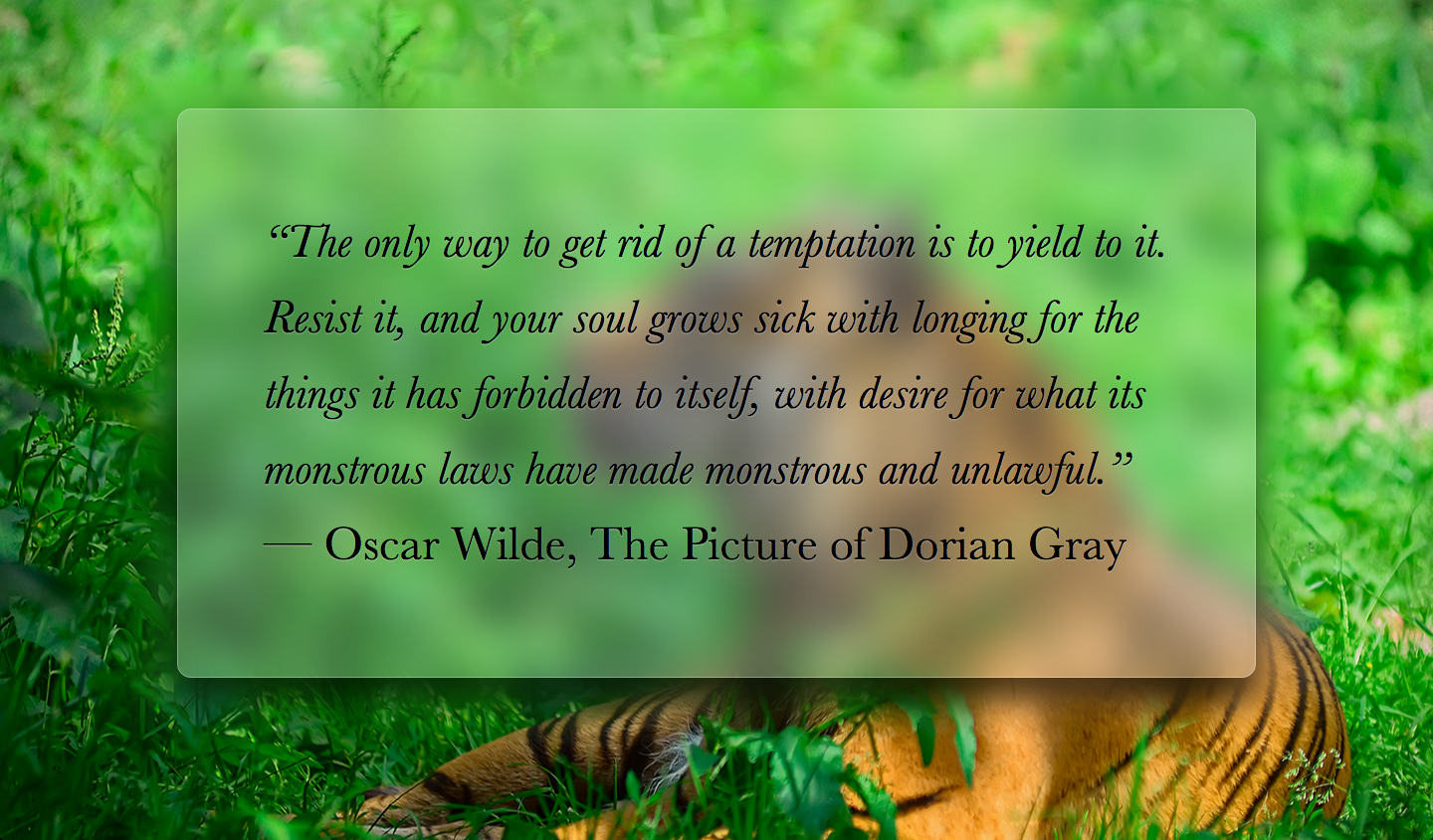
To circumvent this issue, we will make the pseudo-element at least 20px (as much as our blur radius) larger than the dimensions of its container, by applying a margin of -20px or less to be on the safe side, as different browsers might use different blurring algorithms. As Figure XX.XX demonstrates, this fixes the issue with the faded blurring at the edges, but now there is also some blurring outside our container, which makes it look like a smudge instead of frosted glass. Thankfully, this is also easy to fix: we will just apply overflow: hidden; to main, in order to clip that extraneous blurring. The final code looks as follows, and its result can be seen in Figure XX.XX:
为了补偿这种情况,我们需要让伪元素相比其宿主元素的尺寸再向外扩大至少 20px(即它的模糊半径),我们可以通过 -20px 的外边距来达到目的,由于不同浏览器的模糊算法可能存在差异,用一个更大的绝对值(比如 -30px)会更保险一些。如 图 4.19 所示,这个方法可以修复边缘模糊消退的问题,但现在的情况是有一圈模糊效果超出了容器,这让它看起来不像毛玻璃,而更像是玻璃脏了。不过幸运的是,这个问题也很容易修复:我们只要对 main 元素应用 overflow: hidden;,就可以把多余的模糊区域裁切掉了。最终代码如下所示,而最终效果可以在 图 4.23 中看到:
图 4.19
We fixed the faded blurring at the edges, but now there is some blurring outside our element too
我们修正了边缘处的模糊消退情况,但现在又出现了模糊效果超出元素范围的情况。
body, main::before {
    background: url("tiger.jpg") 0 / cover fixed;
}

main {
    position: relative;
    background: hsla(0,0%,100%,.3);
    overflow: hidden;
}

main::before {
    content: '';
    position: absolute;
    top: 0; right: 0; bottom: 0; left: 0;
    filter: blur(20px);
    margin: -30px;
}
图 4.23
Our final result
我们最终得到的效果。
Note how much more readable our page has now become, and how much more elegant it looks. It’s debatable whether the fallback for this effect constitutes graceful degradation. If filters are not supported, we will get the result we saw in the beginning (Figure XX.XX). We can make our fallback a bit more readable by increasing the opacity of the background color.
请注意现在页面文本的可读性相比以前要好多了,而整个设计也优雅多了。现在唯一有争议的问题就是这个效果的回退机制是否算得上平稳退化。如果浏览器不支持滤镜,我们将会得到最开始在 图 4.14 中所看到的结果。我们只能适当增加背景色的不透明度,以便让回退样式下的可读性得到少许提升。
Related specs
相关规范

