-
Notifications
You must be signed in to change notification settings - Fork 2
Walkthrough Part 3
In Walkthrough Part 1 we discovered how Metrics, Events and Snapshots extracted from the AppDynamics Platform become available for offline data mining and archival use.
In Walkthrough Part 2 we explored Snapshots, Exit Calls and Call Graph data in aggregate using visual analytics tools like Excel, Power BI and Tableau.
In this article, we will look at the more advanced reports that allow you to focus on your application performance and application configuration.
A Flame Graph visualizes a collection of stack traces (aka call stacks), shown as an adjacency diagram with an inverted icicle layout. Flame Graphs are commonly used to visualize CPU profiler output, where stack traces are collected using sampling.
Brendan Gregg’s website http://www.brendangregg.com/flamegraphs.html and his talk https://queue.acm.org/detail.cfm?id=2927301 are excellent in helping understand the concepts behind Flame Graphs. Couple other essential reads on using Flame Graphs are https://medium.com/netflix-techblog/java-in-flames-e763b3d32166 and https://medium.com/netflix-techblog/node-js-in-flames-ddd073803aa4.
Flame Graphs and Flame Charts (a type of Flame Graph with time dimension on the X axis) provide an excellent tool to understand the frequent execution paths your application is taking, visualize dependencies between various frameworks and identify performance problems.
AppDynamics DEXTER tool generates Flame Graphs and Flame Chart reports for Application, Tiers, Nodes, Business Transactions The reports are linked to from the Detected Entity, Entity Metrics and Snapshots report. They are SVG files that are best viewed in your favorite internet browser.
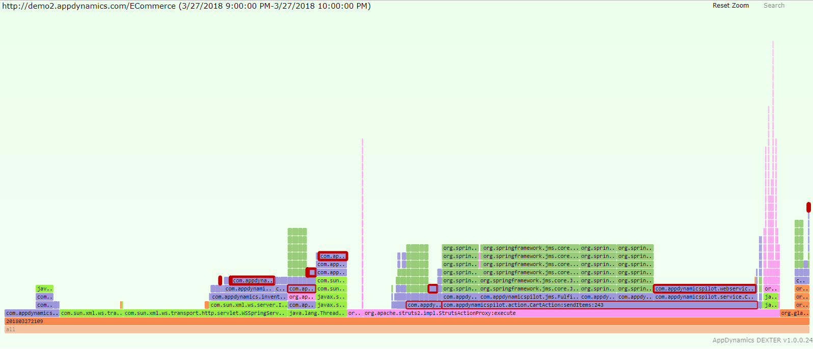
Let’s review Flame Graph for entire ECommerce Application. It shows us distribution of frameworks (color coded – Bright Green=Java, Green=Spring, Lilac=Apache, Purple=AppDynamics, Orange-ish=everything else) and frequency of calls to them (width of the call graph element box). In Flame Graph, there is no concept of time, all call graphs in time region are represented together on one screen. The height of the call stack is not particularly important. But the thickness of the red border around the call graph element is. The thicker the red band, the slower the call:
By clicking on any call graph element, AppDynamics DEXTER Flame Graph focuses to show only children of that individual call graph element. For calls originating from “org.apache.struts2.impl.StritsActionProxy:execute” method, 6.75% of calls ended with call to “raisePO” method, which is likely an HTTP exit, and those took on average 1388ms,:
Zooming into another area of Flame Graph, we can see those Slow and Very Slow Snapshots that we saw happening of the hour showing typical slowness of ~8 seconds when querying Oracle database. There are exactly 140 calls that were that slow:
Here is an example of single Snapshot visualization, a sum of ~20 Segments with ~300 call graph elements. This representation is considerably more compact than typical tree representation for call stacks. That one screen shows the execution spanning multiple threads in multiple processes ran significant portion of activity through Struts proxy, and was really slow due to 2 SQL calls taking average of 8155ms:
Let’s take a look at the same data using Flame Chart, a type of Flame Graph where the X axis shows progression of time. In this example, we have a full hour between 9 and 10 AM, with Flame Charts showing progression through each minute that had Snapshots. The thick red borders around call elements indicate significant time spent in those methods. What stands out is that beginning of the hour has considerably higher rate of slow method calls, and things quieted down afterwards:
Just like with Flame Graphs, you can click into specific minute Flame Chart and see what happened with application then. Here we clicked into minute 09 of the 9 to 10 am time range:
Let’s also look at other applications that use different technology stacks to see how they look in Flame Graph representation.
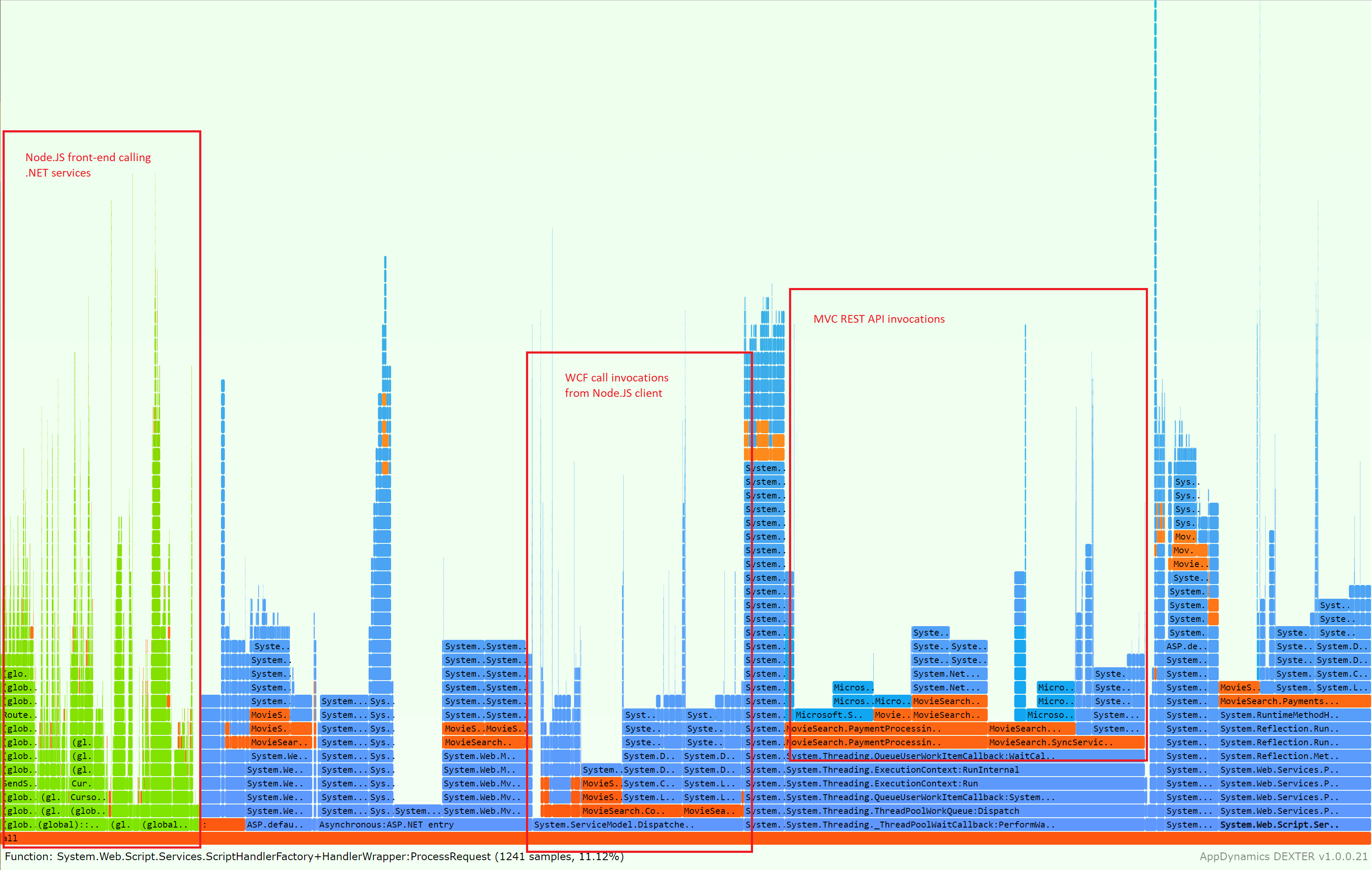
Here is an application with Node.JS frontend calling ASP.NET hosted REST API and WCF Services on the backend, with some queueing in the middle. Green represents Node.JS, Blue represents .NET Framework, and parts in Reddish-Orange are custom application code. We can see that most of application activity is in MVC REST APIs in .NET stack:
Looking at Flame Chart view of the same application, we can see that application is performing largely the same thing minute over minute, but in the middle of the hour there are some slower calls indicated by slightly more thick red borders in the call stacks:
Here is a Java application that is clearly using Aspose Cells vendor package to render Spreadsheets. “com.aspose.cells.**” namespace is used a lot to render formulas in cells, and is highlighted in purple using AppDynamics DEXTER Flame Graph element search function:
In this Flame Graph, we are visualizing a Python application that appears to be doing something with shopping for Shoes in 18% of the samples:
AppDynamics Flow Maps provide visual dependency map of all the calls in the application. It is a familiar and very useful representation for all AppDynamics Customers.
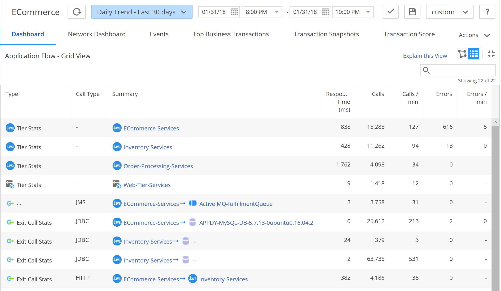
The customers who wish to see a bit more detail, can switch to the Grid View version of Flow Map that looks like that:
AppDynamics DEXTER Entity Metrics and Entity Details reports include the AppDynamics Flow Map rendered in tabular form shown above. It is included both Excel and CSV format in Entity Metrics in 5.Applications.Activity Flow Excel sheet and Entity Details report in 5.Activity Flow Excel sheet:
While it could be a lot of fun looking at the tabular data in Excel, we can do a better visualization using Sankey diagram.
Sankey diagrams are a specific type of flow diagram, in which the width of the arrows is shown proportionally to the flow quantity. For short yet powerful intro, read https://en.wikipedia.org/wiki/Sankey_diagram and see some examples here http://www.sankey-diagrams.com.
Microsoft Power BI Studio, a free data exploration and visualization tool, provides support for Sankey diagrams that can be easily connected to the both Flow Map data and Snapshot Exit Call data.
In this Sankey Activity Flow diagram, our ECommerce Application is represented by the Tiers and Backends (vertical bars of various heights), connected by flows representing call data. The width of connecting lines is proportional to the Average Response Time, the summary ART determines the height of connecting Tiers and Nodes. We can clearly see that the slowest time is taken by Oracle database backend:
In this view, we use the Activity Flow data for Business Transaction filtered to "Checkout" Business Transaction, and again, we can see the bulk of the time is spent in Oracle database:
It is possible to combine the Flow Map data with Exit Calls data for interactive exploration. In this example, a Flow Map of an Application is connected to two Tree Maps of Exit calls, one showing distribution of calls by execution ranges, and another showing specific SQL statement/stored procedure being used. When a flow connector Sankey diagram is clicked on to show just the calls between a certain Tier and Backend, the relevant parts of data set in Tree Maps are highlighted and we can see that most of the SQL calls are only 3 different SQL Stored procedures bulk of calls, and they execute between 1 and 5 seconds. These should be clear focus for optimization:
In this article, you saw how Flame Graphs and Flame Charts can provide powerful single screen, interactive view into thousands of Snapshots generated by AppDynamics APM agents. You also saw how using powerful industry-leading visualization tools allows for effortless discovery of patterns. AppDynamics DEXTER you the tools you need to perform deep analysis of your Appdynamics APM data, turning it into insights.
Return to Getting Started
Return to Walkthrough Part 2
- Home
- Getting Started Walkthrough
- Run
-
Excel Reports
- Detected APM Entities
- Detected SIM Entities
- Detected DB Entities
- Detected WEB Entities
- Detected MOBILE Entities
- Detected BIQ Entities
- Entity Metrics
- Entity Metric Graphs
- Registered APM Metrics
- Entity Flowmaps
- Configuration
- Events and Health Rule Violations
- Entity Details
- Snapshots
- Snapshot Method Calls
- Individual Snapshot
- Users and Permissions
- Dashboards
- Health Check
- PowerBI Reports
- Tableau Reports
- Browser Reports


