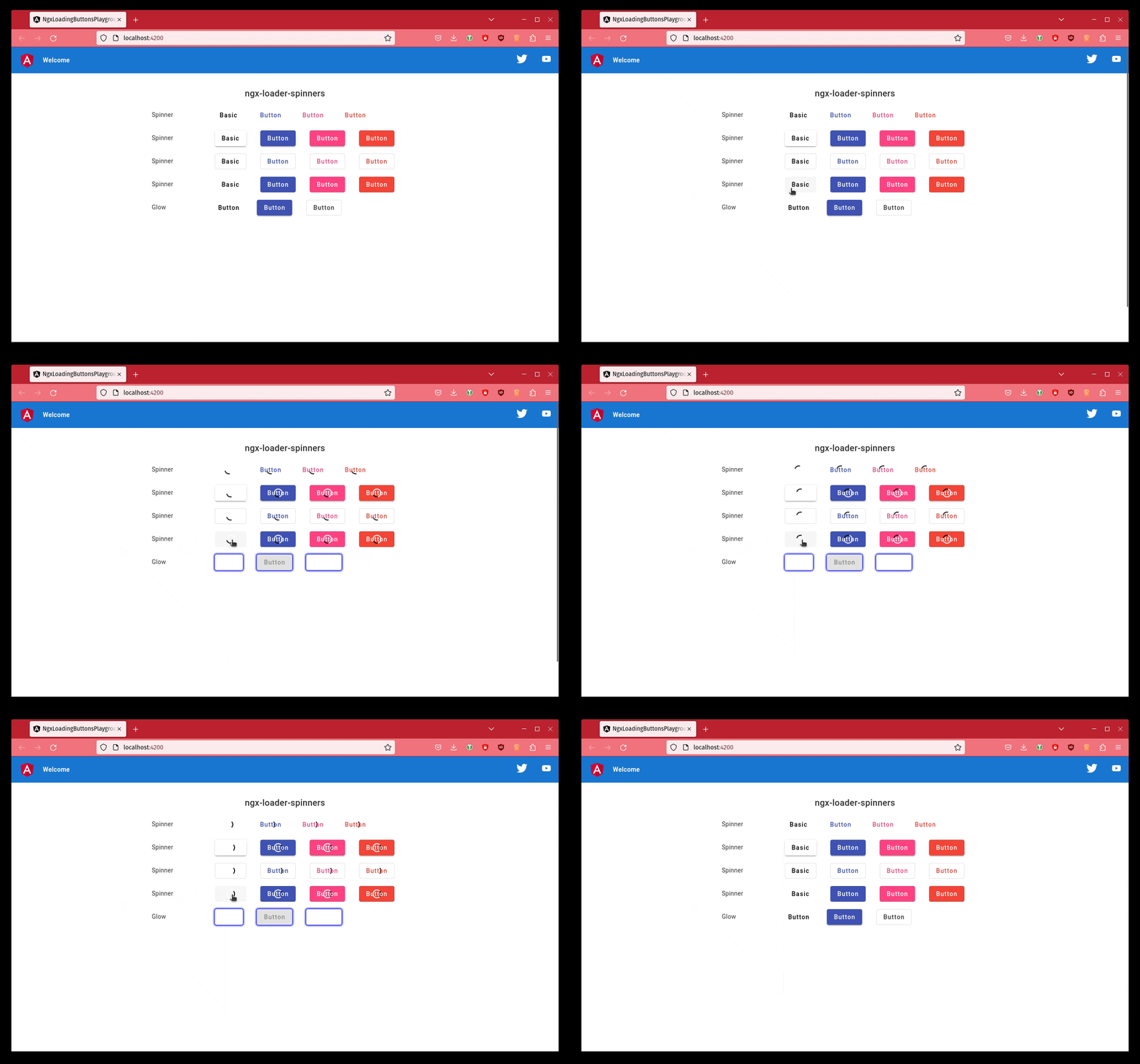
A lightweight Angular library to add a loading spinner to your Angular Material buttons.
ng add ngx-loading-buttons
Import the NgxLoadingButtonsModule into your AppModule. You can configure it as shown below:
import { NgModule } from '@angular/core';
import { BrowserModule } from '@angular/platform-browser';
import { NgxLoadingButtonsModule } from 'ngx-loading-buttons';

import { AppComponent } from './app.component';

@NgModule({
  declarations: [
    AppComponent
  ],
  imports: [
    BrowserModule,
    NgxLoadingButtonsModule,
  ],
  providers: [],
  bootstrap: [AppComponent]
})
export class AppModule { }
And last of all, add it to your <button> element like this.
<button mat-raised-button [mtBasicSpinner]="true">Basic</button>You can also hide the button's text like this.
<button mat-raised-button [mtBasicSpinner]="true" [hideText]="true">Basic</button>A "real-world component" would likely look like this.
import { Component } from '@angular/core';

@Component({
  selector: 'app-root',
  templateUrl: './app.component.html',
  styleUrls: ['./app.component.css']
})
export class AppComponent {
  saving: boolean = false;

  save(): void {
    this.saving = true;
    // Juggle 5 hens while wiggling your toes and other magic... 🤡
  }


}
And our template file.
<button mat-raised-button [mtBasicSpinner]="saving" (click)="save()">Basic</button>Add our styles to yours
@import 'ngx-loading-buttons/styles';Found a bug? Want to request a feature? Confused? Or wanna simply comment on how useful this library is?
Open an issue here.
Thanks goes to these wonderful people (emoji key):
Daniel Kreider 💻 |
Totto 💻 |
Raphaël Balet 💻 |
Arthur Ming 💻 |
Thomas Renger 💻 |
mixer904 💻 |
Fabien Wautriche 🐛 |
tux1337 🐛 |
Milán Németh 🐛 |
Adrien 🐛 |
This project follows the all-contributors specification.
Contributions of any kind welcome!


