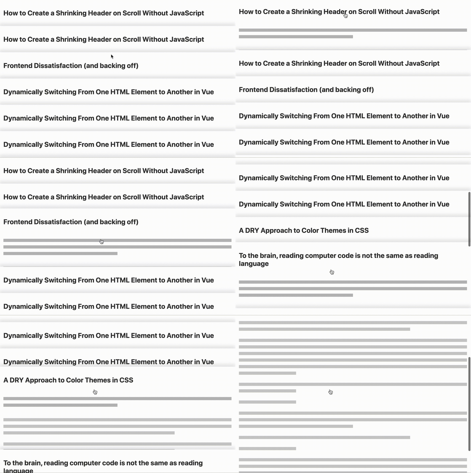
A little experiment with a Svelte component for displaying a list of articles, letting you mouse-over their titles and some preview content, then showing the full article in a 'focus' state.
This project was heavily inspired by enid.fm, which does a beautiful job of giving you this 'stack of records' feeling. I'm wanting to take this layout idea and make it a bit more functional, with each record containing a title, preview, and body section; which the container component knows to display depending on the UI state. At rest, you just see the title content amongst the others, the preview content is displayed on-hover, and the body after clicking on the article. Here's how it looks so far.
I'm just getting started with this project. The jobs I'm looking to do next are:
-
Improve and fine-tune the transition animations, for the time being they're just using a
0.5s ease. -
Allow scrolling above or below the focused article to return to the 'browse' view.
-
Work on allowing blog-post-style HTML content to be displayed by this component. All the content should need to provide are elements with 'data-title', 'data-preview', and 'data-body' attributes, so the container knows which bits to show in the various UI states.
