[Lens] Enabling Random Sampling #151749
[Lens] Enabling Random Sampling #151749
Conversation
 dej611
added
Team:Visualizations
dej611
changed the title
dej611
added
Team:Visualizations
dej611
changed the title
|
Pinging @elastic/kibana-visualizations @elastic/kibana-visualizations-external (Team:Visualizations) |
|
Note the current design does not reflect the new "palette" design on the badge popover as it requires a deep change of the architecture of both the Embeddable code and how Lens derives dimension colors. |
To me they are serving two distinct purposes. |
|
Thanks @MichaelMarcialis for your feedback. I've tried to address it as much as possible and commented inline for each point.
I prefer to push these additional task in a
Also in this case filter visibility would be best to be pursued in a dedicated
Fixed in f1ca9b1
Fixed in f1ca9b1
Fixed in f1ca9b1
Fixed in f1ca9b1
If that is ok I can do a follow up after this PR merged with the provided icon.
Will create a separate issue about this as well.
I think also this needs to be done in a
Fixed in f1ca9b1
Fixed in f1ca9b1
Fixed in f1ca9b1
I agree, but I think if the flag has been raised maybe we could consider it. @drewdaemon the code has been refactored to leverage the user message system as discussed offline. Will follow another couple of fixes for the remaining issues/feedback. |
…to feature/random-sampling
|
Added the on panel hover behaviour to fade-in the wrench icon. Is this what you meant @MichaelMarcialis ?
|
There was a problem hiding this comment.
Thanks so much for making those changes, @dej611. This looks excellent. I'm adding some final small comments for your re-review, but nothing worth holding you up over. Assuming you're able to address these last items, this looks good from my perspective. Approving now.
-
Would it be possible to remove the leading
0before the decimal point in the slider values? Doing so will ensure the tick labels don't collide with each other at small viewport sizes.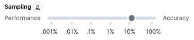
x-pack/plugins/lens/public/datasources/form_based/dimension_panel/dimension_editor.tsx
Outdated
Show resolved
Hide resolved
x-pack/plugins/lens/public/datasources/form_based/dimension_panel/dimension_editor.tsx
Outdated
Show resolved
Hide resolved
x-pack/plugins/lens/public/datasources/form_based/layer_settings.tsx
Outdated
Show resolved
Hide resolved
| > | ||
| <div> | ||
| {messages.map(({ shortMessage, longMessage }, index) => ( | ||
| <aside key={`${shortMessage}-${index}`}> |
There was a problem hiding this comment.
Thanks for adding this aside element. Now rather than applying padding to the child elements within it, would it be better to apply padding to this new aside element? Then you could also use margining (instead of the current padding) to the child elements to correct the excessive spacing between the layer list item elements to be 16px (instead of the current 32px caused by two 16px paddings). Thoughts?
There was a problem hiding this comment.
Fixed in 4dcabe6
If it's ok for you I will add perform more stylistic tuning in a followup where I'll have to add also the color palette for each item in the list.
Co-authored-by: Michael Marcialis <michael.l.marcialis@gmail.com>
Fixed in 8346cfa
|
|
@elasticmachine merge upstream |
💚 Build Succeeded
Metrics [docs]Module Count
Async chunks
Unknown metric groupsESLint disabled line counts
Total ESLint disabled count
History
To update your PR or re-run it, just comment with: |
## Summary Fixes #152523 and a dropdown menu color issue raised in #151749 (review) For the help popover: <img width="477" alt="Screenshot 2023-04-04 at 11 40 04" src="https://user-images.githubusercontent.com/924948/229760378-8b83e454-b81f-4450-a6e2-5cac6860d274.png"> <img width="495" alt="Screenshot 2023-04-04 at 11 49 02" src="https://user-images.githubusercontent.com/924948/229760393-957c00cf-4311-4973-8b2f-99f85b13d126.png"> Unfortunately the bonus point cannot be achieved as the `EuiListGroupItemExtraAction` component only offers an `hover` | `alwaysShow` options: https://elastic.github.io/eui/#/display/list-group As for the layer dropdown menu: <img width="374" alt="Screenshot 2023-04-04 at 12 08 34" src="https://user-images.githubusercontent.com/924948/229760921-5b43c017-8d16-4e1d-9b2d-521040fdd5ed.png"> ### Checklist Delete any items that are not applicable to this PR. - [ ] Any text added follows [EUI's writing guidelines](https://elastic.github.io/eui/#/guidelines/writing), uses sentence case text and includes [i18n support](https://github.com/elastic/kibana/blob/main/packages/kbn-i18n/README.md) - [ ] [Documentation](https://www.elastic.co/guide/en/kibana/master/development-documentation.html) was added for features that require explanation or tutorials - [ ] [Unit or functional tests](https://www.elastic.co/guide/en/kibana/master/development-tests.html) were updated or added to match the most common scenarios - [ ] Any UI touched in this PR is usable by keyboard only (learn more about [keyboard accessibility](https://webaim.org/techniques/keyboard/)) - [ ] Any UI touched in this PR does not create any new axe failures (run axe in browser: [FF](https://addons.mozilla.org/en-US/firefox/addon/axe-devtools/), [Chrome](https://chrome.google.com/webstore/detail/axe-web-accessibility-tes/lhdoppojpmngadmnindnejefpokejbdd?hl=en-US)) - [ ] If a plugin configuration key changed, check if it needs to be allowlisted in the cloud and added to the [docker list](https://github.com/elastic/kibana/blob/main/src/dev/build/tasks/os_packages/docker_generator/resources/base/bin/kibana-docker) - [ ] This renders correctly on smaller devices using a responsive layout. (You can test this [in your browser](https://www.browserstack.com/guide/responsive-testing-on-local-server)) - [ ] This was checked for [cross-browser compatibility](https://www.elastic.co/support/matrix#matrix_browsers) ### Risk Matrix Delete this section if it is not applicable to this PR. Before closing this PR, invite QA, stakeholders, and other developers to identify risks that should be tested prior to the change/feature release. When forming the risk matrix, consider some of the following examples and how they may potentially impact the change: | Risk | Probability | Severity | Mitigation/Notes | |---------------------------|-------------|----------|-------------------------| | Multiple Spaces—unexpected behavior in non-default Kibana Space. | Low | High | Integration tests will verify that all features are still supported in non-default Kibana Space and when user switches between spaces. | | Multiple nodes—Elasticsearch polling might have race conditions when multiple Kibana nodes are polling for the same tasks. | High | Low | Tasks are idempotent, so executing them multiple times will not result in logical error, but will degrade performance. To test for this case we add plenty of unit tests around this logic and document manual testing procedure. | | Code should gracefully handle cases when feature X or plugin Y are disabled. | Medium | High | Unit tests will verify that any feature flag or plugin combination still results in our service operational. | | [See more potential risk examples](https://github.com/elastic/kibana/blob/main/RISK_MATRIX.mdx) | ### For maintainers - [ ] This was checked for breaking API changes and was [labeled appropriately](https://www.elastic.co/guide/en/kibana/master/contributing.html#kibana-release-notes-process) --------- Co-authored-by: Michael Marcialis <michael.l.marcialis@gmail.com> Co-authored-by: Kibana Machine <42973632+kibanamachine@users.noreply.github.com>
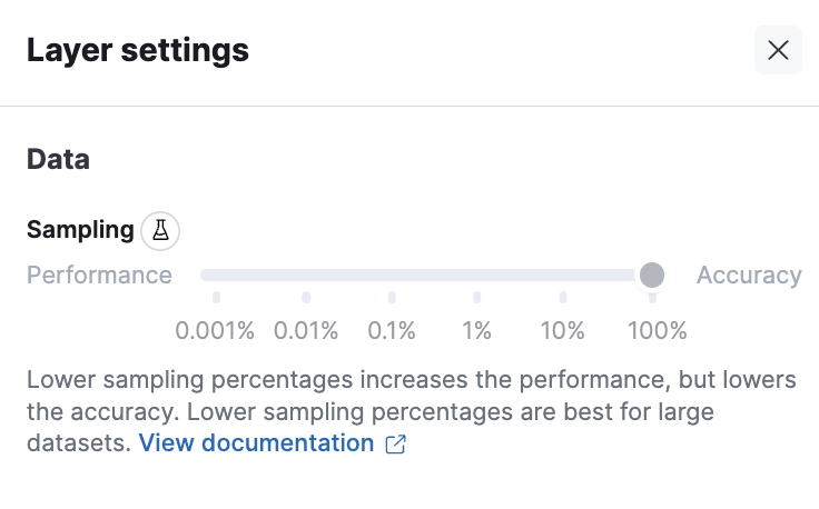
Summary
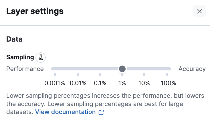
This PR is a design implementation to improve the Random sampling feedback for the user.
Some work has been done to extract locally the
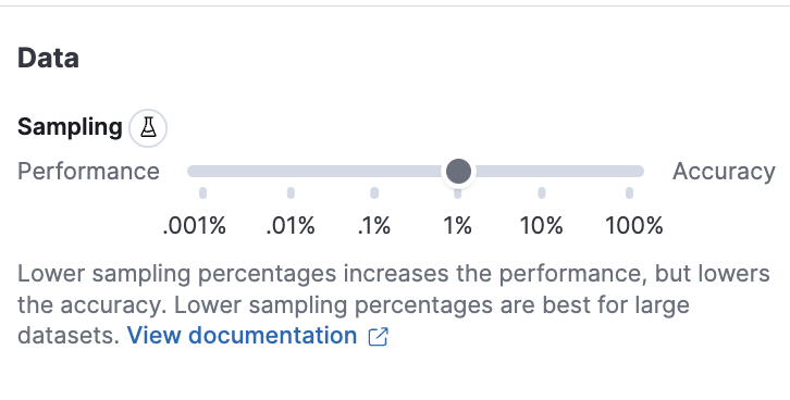
SamplingSlidercomponent, that will be eventually moved into a separate package outside of Lens.In terms of design, to start, the Layer setting now inherits the same

Data/Appearancedesign from the dimension editor:Next, on the dataView picker of the layer panel the random sampling information is shown when enabled:

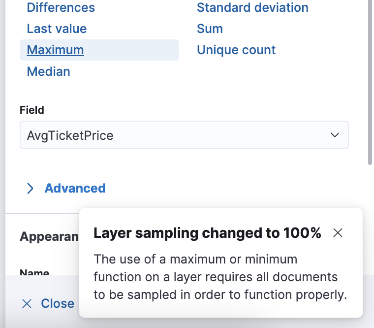
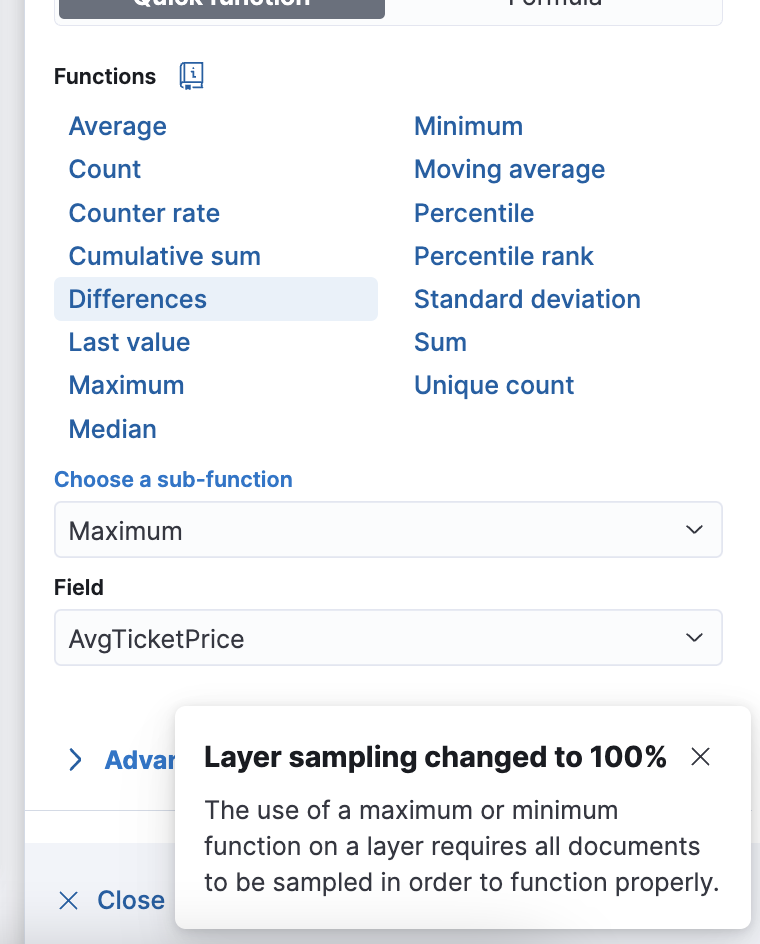
when transitioning to
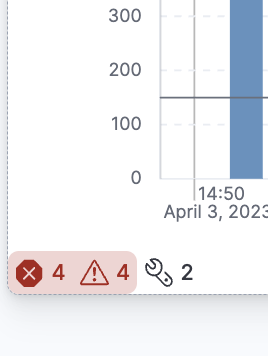
Maximum/Minimumoperation during editing the sampling is disabled and a info toast is shown:The toast will show only when transitioning to such operations. If the user goes from
Maximum/Minimumto other supported operations then the toast flag is reset, therefore going again intoMaximumwill trigger a new toast.Transitioning from a quick function
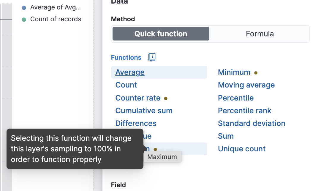
Maximuminto a formulamax(...)will not trigger a toast as the flag is persisted within the same "editing session".If the user configured a random sampling setting but then picked a

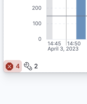
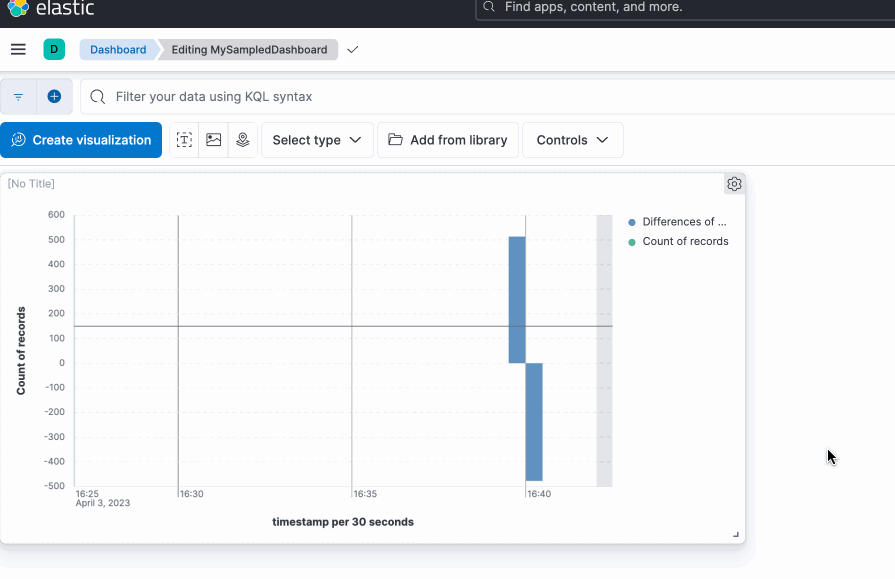
Maximumoperation the Layer setting becomes disabled:and last the embeddable view with the new visualization modifiers view on the bottom-left:


Previous PoC design
This PR works as a PoC for random sampling with the current state of the design. The UI is still a bit rough and not final.when transitioning to
Maximum/Minimumoperation:The toast will show only when transitioning to such operations. If the user goes from
Maximum/Minimumto other supported operations then the toast flag is reset, therefore going again intoMaximumwill trigger a new toast.Transitioning from a quick function
Maximuminto a formulamax(...)will not trigger a toast as the flag is persisted within the same "editing session".If the user configured a random sampling setting but then picked a

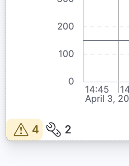
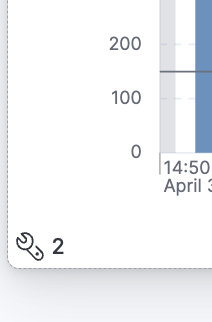
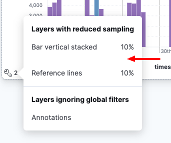
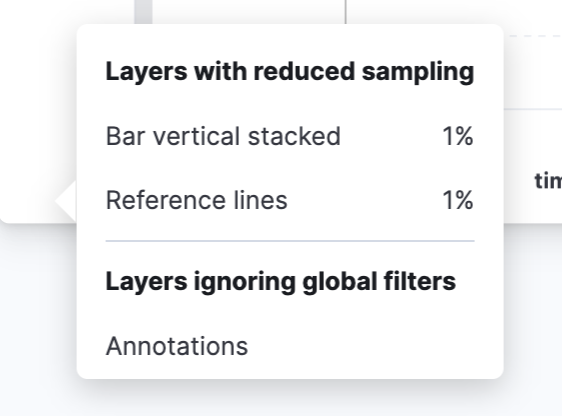
Maximumoperation the Layer setting becomes disabled:At dashboard level the random sampling is notified via an icon on the bottom left:

Hovering the icon will show a detailed tooltip:

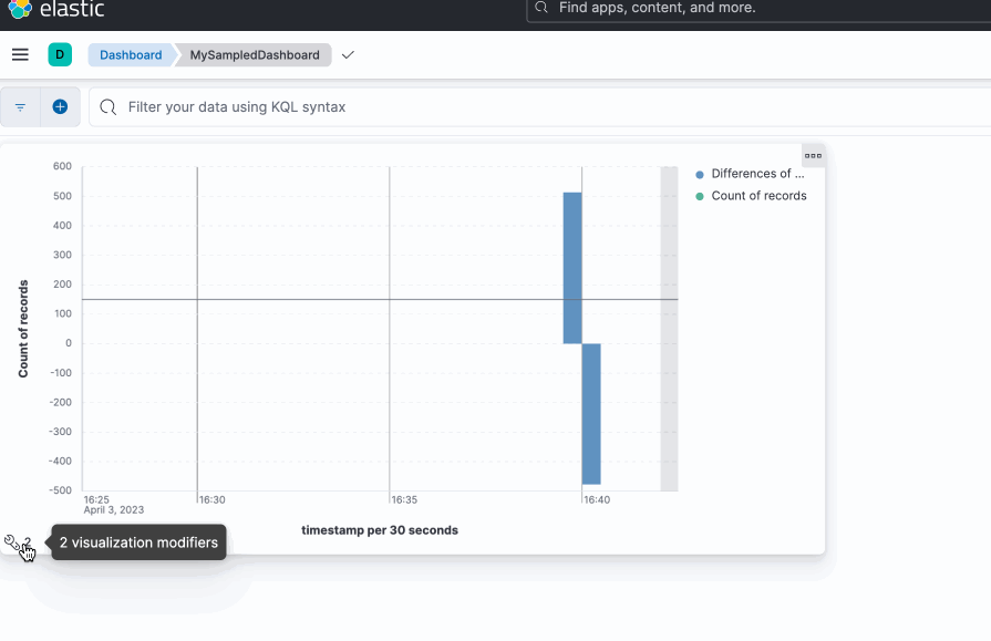
At the dashboard level a new
iicon is displayed when a random sampling feature is enabled in the panel and a popup with more details is shown on hover:Checklist
Delete any items that are not applicable to this PR.
Risk Matrix
Delete this section if it is not applicable to this PR.
Before closing this PR, invite QA, stakeholders, and other developers to identify risks that should be tested prior to the change/feature release.
When forming the risk matrix, consider some of the following examples and how they may potentially impact the change:
For maintainers