-
Notifications
You must be signed in to change notification settings - Fork 1.7k
New issue
Have a question about this project? Sign up for a free GitHub account to open an issue and contact its maintainers and the community.
By clicking “Sign up for GitHub”, you agree to our terms of service and privacy statement. We’ll occasionally send you account related emails.
Already on GitHub? Sign in to your account
CSS-like styling #3284
Comments
|
I am probably spewing a stupid idea here. but Dioxus is implementing CSS for native rendering. maybe it is worth seeing if you could either straight up use that, or bundle your dev power and make a generic lib that would work for both. I do realise this is very optimistic, probably even naive. But just wanted to have shared the thought |
|
Ah my bad - I see they have experimental WGPU support now via their Blitz renderer. Original comment@chris-kruining - as far as I can tell Dioxus isn't actually native, right? It's webview based : https://dioxuslabs.com/learn/0.4/getting_started/desktop#desktop-overview |
|
Ooh my bad if I got that wrong, I seem to remember the dude in the video saying "building a browser is hard" when he talked about css. So I made the presumption that they were implementing there own rendering and not just a webview. |
|
Love this idea! Personally faced a lot of inconvenience when trying to style individual widgets in the past, so this would be amazing! Is there any roadmap for this or is it still in idea phase? This and RTL support are gonna be dream come true |
|
I'm interested in writing a parser for the style language / rule engine / css clone thing. The following is a (hopefully) thought-out attempt to fill holes in the original proposal:
|
|
I was going to start working on this right after finishing writing the proposal but now I'm worn out haha |
|
The way I want to approach this is step-by-step: First implement the new Next up would be to implement the Next up is designing and implementing a hierarchical "class" system and add that as part of And last is the actual CSS language and engine, which can now be fully a separate crate, and opt-in. |
|
That's understandable. I thought doing the CSS parser, being standalone, was better for me as I'm completely unfamiliar with the project internals. Do you think it would be reasonable for me to attempt the refactor? Or should it be left up to someone more experienced? Also, a clarification with the plugin system. Where/How would the plugins be registered? With the top level egui context or in the Widget impl? |
|
An action plan has been added to #3284 |
|
This can be a very large and difficult task that takes a long time. It should be possible to use the egui library without using a |
* Closes #4534

This PR:
- Introduces `Ui::stack()`, which returns the `UiStack` structure
providing information on the current `Ui` hierarchy.
- **BREAKING**: `Ui::new()` now takes a `UiStackInfo` argument, which is
used to populate some of this `Ui`'s `UiStack`'s fields.
- **BREAKING**: `Ui::child_ui()` and `Ui::child_ui_with_id_source()` now
take an `Option<UiStackInfo>` argument, which is used to populate some
of the children `Ui`'s `UiStack`'s fields.
- New `Area::kind()` builder function, to set the `UiStackKind` value of
the `Area`'s `Ui`.
- Adds a (minimalistic) demo to egui demo (in the "Misc Demos" window).
- Adds a more thorough `test_ui_stack` test/playground demo.

TODO:
- [x] benchmarks
- [x] add example to demo

Future work:
- Add `UiStackKind` and related support for more container (e.g.
`CollapsingHeader`, etc.)
- Add a tag/property system that would allow adding arbitrary data to a
stack node. This data could then be queried by nested `Ui`s. Probably
needed for #3284.
- Add support to track columnar layouts.

---------

Co-authored-by: Emil Ernerfeldt <emil.ernerfeldt@gmail.com>
<!-- Please read the "Making a PR" section of [`CONTRIBUTING.md`](https://github.com/emilk/egui/blob/master/CONTRIBUTING.md) before opening a Pull Request! * Keep your PR:s small and focused. * The PR title is what ends up in the changelog, so make it descriptive! * If applicable, add a screenshot or gif. * If it is a non-trivial addition, consider adding a demo for it to `egui_demo_lib`, or a new example. * Do NOT open PR:s from your `master` branch, as that makes it hard for maintainers to test and add commits to your PR. * Remember to run `cargo fmt` and `cargo clippy`. * Open the PR as a draft until you have self-reviewed it and run `./scripts/check.sh`. * When you have addressed a PR comment, mark it as resolved. Please be patient! I will review your PR, but my time is limited! --> * Closes <#4776> * [x] I have followed the instructions in the PR template I've been meaning to look into this for a while but finally bit the bullet this week. Contrary to what I initially thought, the problem of blurry lines is unrelated to feathering because it also happens with feathering disabled. The root cause is that lines tend to land on pixel boundaries, and because of that, frequently used strokes (e.g. 1pt), end up partially covering pixels. This is especially noticeable on 1ppp displays. There were a couple of things to fix, namely: individual lines like separators and indents but also shape strokes (e.g. Frame). Lines were easy, I just made sure we round them to the nearest pixel _center_, instead of the nearest pixel boundary. Strokes were a little more complicated. To illustrate why, here’s an example: if we're rendering a 5x5 rect (black fill, red stroke), we would expect to see something like this: 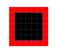 The fill and the stroke to cover entire pixels. Instead, egui was painting the stroke partially inside and partially outside, centered around the shape’s path (blue line): 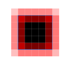 Both methods are valid for different use-cases but the first one is what we’d typically want for UIs to feel crisp and pixel perfect. It's also how CSS borders work (related to #4019 and #3284). Luckily, we can use the normal computed for each `PathPoint` to adjust the location of the stroke to be outside, inside, or in the middle. These also are the 3 types of strokes available in tools like Photoshop. This PR introduces an enum `StrokeKind` which determines if a `PathStroke` should be tessellated outside, inside, or _on_ the path itself. Where "outside" is defined by the directions normals point to. Tessellator will now use `StrokeKind::Outside` for closed shapes like rect, ellipse, etc. And `StrokeKind::Middle` for the rest since there's no meaningful "outside" concept for open paths. This PR doesn't expose `StrokeKind` to user-land, but we can implement that later so that users can render shapes and decide where to place the stroke. ### Strokes test (blue lines represent the size of the rect being rendered) `Stroke::Middle` (current behavior, 1px and 3px are blurry)  `Stroke::Outside` (proposed default behavior for closed paths)  `Stroke::Inside` (for completeness but unused at the moment)  ### Demo App The best way to review this PR is to run the demo on a 1ppp display, especially to test hover effects. Everything should look crisper. Also run it in a higher dpi screen to test that nothing broke 🙏. Before: 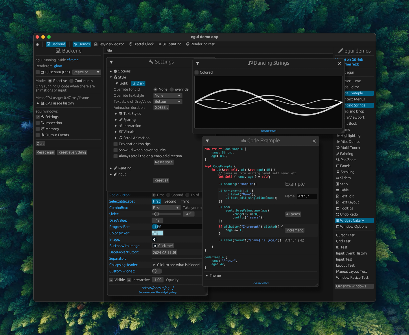 After (notice the sharper lines): 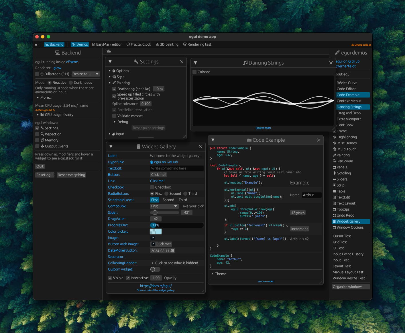
|
Perhaps my crate egui_colors can help in exploring a new styling concept. It is based on the Radix color system and APCA luminosity contrast. |
This comment was marked as off-topic.
This comment was marked as off-topic.
<!-- Please read the "Making a PR" section of [`CONTRIBUTING.md`](https://github.com/emilk/egui/blob/master/CONTRIBUTING.md) before opening a Pull Request! * Keep your PR:s small and focused. * The PR title is what ends up in the changelog, so make it descriptive! * If applicable, add a screenshot or gif. * If it is a non-trivial addition, consider adding a demo for it to `egui_demo_lib`, or a new example. * Do NOT open PR:s from your `master` branch, as that makes it hard for maintainers to test and add commits to your PR. * Remember to run `cargo fmt` and `cargo clippy`. * Open the PR as a draft until you have self-reviewed it and run `./scripts/check.sh`. * When you have addressed a PR comment, mark it as resolved. Please be patient! I will review your PR, but my time is limited! --> * Closes <emilk#4776> * [x] I have followed the instructions in the PR template I've been meaning to look into this for a while but finally bit the bullet this week. Contrary to what I initially thought, the problem of blurry lines is unrelated to feathering because it also happens with feathering disabled. The root cause is that lines tend to land on pixel boundaries, and because of that, frequently used strokes (e.g. 1pt), end up partially covering pixels. This is especially noticeable on 1ppp displays. There were a couple of things to fix, namely: individual lines like separators and indents but also shape strokes (e.g. Frame). Lines were easy, I just made sure we round them to the nearest pixel _center_, instead of the nearest pixel boundary. Strokes were a little more complicated. To illustrate why, here’s an example: if we're rendering a 5x5 rect (black fill, red stroke), we would expect to see something like this:  The fill and the stroke to cover entire pixels. Instead, egui was painting the stroke partially inside and partially outside, centered around the shape’s path (blue line):  Both methods are valid for different use-cases but the first one is what we’d typically want for UIs to feel crisp and pixel perfect. It's also how CSS borders work (related to emilk#4019 and emilk#3284). Luckily, we can use the normal computed for each `PathPoint` to adjust the location of the stroke to be outside, inside, or in the middle. These also are the 3 types of strokes available in tools like Photoshop. This PR introduces an enum `StrokeKind` which determines if a `PathStroke` should be tessellated outside, inside, or _on_ the path itself. Where "outside" is defined by the directions normals point to. Tessellator will now use `StrokeKind::Outside` for closed shapes like rect, ellipse, etc. And `StrokeKind::Middle` for the rest since there's no meaningful "outside" concept for open paths. This PR doesn't expose `StrokeKind` to user-land, but we can implement that later so that users can render shapes and decide where to place the stroke. ### Strokes test (blue lines represent the size of the rect being rendered) `Stroke::Middle` (current behavior, 1px and 3px are blurry)  `Stroke::Outside` (proposed default behavior for closed paths)  `Stroke::Inside` (for completeness but unused at the moment)  ### Demo App The best way to review this PR is to run the demo on a 1ppp display, especially to test hover effects. Everything should look crisper. Also run it in a higher dpi screen to test that nothing broke 🙏. Before:  After (notice the sharper lines): 
|
Previous comment hidden to not derail the topic: the goal is that the advanced rule-engine is OPT-IN in a separate crate, and there is no actual DOM or CSS or any of the like. Everything will still be possible in pure Rust. |
* Closes emilk#4534

This PR:
- Introduces `Ui::stack()`, which returns the `UiStack` structure
providing information on the current `Ui` hierarchy.
- **BREAKING**: `Ui::new()` now takes a `UiStackInfo` argument, which is
used to populate some of this `Ui`'s `UiStack`'s fields.
- **BREAKING**: `Ui::child_ui()` and `Ui::child_ui_with_id_source()` now
take an `Option<UiStackInfo>` argument, which is used to populate some
of the children `Ui`'s `UiStack`'s fields.
- New `Area::kind()` builder function, to set the `UiStackKind` value of
the `Area`'s `Ui`.
- Adds a (minimalistic) demo to egui demo (in the "Misc Demos" window).
- Adds a more thorough `test_ui_stack` test/playground demo.

TODO:
- [x] benchmarks
- [x] add example to demo

Future work:
- Add `UiStackKind` and related support for more container (e.g.
`CollapsingHeader`, etc.)
- Add a tag/property system that would allow adding arbitrary data to a
stack node. This data could then be queried by nested `Ui`s. Probably
needed for emilk#3284.
- Add support to track columnar layouts.

---------

Co-authored-by: Emil Ernerfeldt <emil.ernerfeldt@gmail.com>
<!-- Please read the "Making a PR" section of [`CONTRIBUTING.md`](https://github.com/emilk/egui/blob/master/CONTRIBUTING.md) before opening a Pull Request! * Keep your PR:s small and focused. * The PR title is what ends up in the changelog, so make it descriptive! * If applicable, add a screenshot or gif. * If it is a non-trivial addition, consider adding a demo for it to `egui_demo_lib`, or a new example. * Do NOT open PR:s from your `master` branch, as that makes it hard for maintainers to test and add commits to your PR. * Remember to run `cargo fmt` and `cargo clippy`. * Open the PR as a draft until you have self-reviewed it and run `./scripts/check.sh`. * When you have addressed a PR comment, mark it as resolved. Please be patient! I will review your PR, but my time is limited! --> * Closes <emilk#4776> * [x] I have followed the instructions in the PR template I've been meaning to look into this for a while but finally bit the bullet this week. Contrary to what I initially thought, the problem of blurry lines is unrelated to feathering because it also happens with feathering disabled. The root cause is that lines tend to land on pixel boundaries, and because of that, frequently used strokes (e.g. 1pt), end up partially covering pixels. This is especially noticeable on 1ppp displays. There were a couple of things to fix, namely: individual lines like separators and indents but also shape strokes (e.g. Frame). Lines were easy, I just made sure we round them to the nearest pixel _center_, instead of the nearest pixel boundary. Strokes were a little more complicated. To illustrate why, here’s an example: if we're rendering a 5x5 rect (black fill, red stroke), we would expect to see something like this:  The fill and the stroke to cover entire pixels. Instead, egui was painting the stroke partially inside and partially outside, centered around the shape’s path (blue line):  Both methods are valid for different use-cases but the first one is what we’d typically want for UIs to feel crisp and pixel perfect. It's also how CSS borders work (related to emilk#4019 and emilk#3284). Luckily, we can use the normal computed for each `PathPoint` to adjust the location of the stroke to be outside, inside, or in the middle. These also are the 3 types of strokes available in tools like Photoshop. This PR introduces an enum `StrokeKind` which determines if a `PathStroke` should be tessellated outside, inside, or _on_ the path itself. Where "outside" is defined by the directions normals point to. Tessellator will now use `StrokeKind::Outside` for closed shapes like rect, ellipse, etc. And `StrokeKind::Middle` for the rest since there's no meaningful "outside" concept for open paths. This PR doesn't expose `StrokeKind` to user-land, but we can implement that later so that users can render shapes and decide where to place the stroke. ### Strokes test (blue lines represent the size of the rect being rendered) `Stroke::Middle` (current behavior, 1px and 3px are blurry)  `Stroke::Outside` (proposed default behavior for closed paths)  `Stroke::Inside` (for completeness but unused at the moment)  ### Demo App The best way to review this PR is to run the demo on a 1ppp display, especially to test hover effects. Everything should look crisper. Also run it in a higher dpi screen to test that nothing broke 🙏. Before:  After (notice the sharper lines): 
|
Hey, I've been working on a library to integrate something like what you want in this issue, I'm trying to make a complex UI and for that I think it would be very useful to have css support to support customization, apart from making my life easier when making UI, given the situation with the current issue, I decided to make a library that would allow me to at least prototype the conceptual idea of css in egui, it has the least amount of dependencies as possible, the css parser/engine I did on my own (helping me in ideas from other crates) and I managed to have something very simple, it lacks a lot of work, but I share it in case someone is useful or interested in sharing, obviously the idea is that this gets to be in the core of egui (you need to have knowledge of the current state of the tree of components to make the queries and interpret the css), of the tasks in which I would like to receive help and I am missing are:
The actual features:
The poc looks like: ui.add(Label::new("My egui Application").styled().class(".header"));
if ui
.add(Button::new("Increment").styled().css_id("counter"))
.clicked()
{
self.age += 1;
}
ui.add(
Label::new(format!("age {}", self.age))
.styled()
.class(".text-orange-700"),
);
ui.add(Label::new("No styled"));crate: https://crates.io/crates/egui_css Important I need help, I do not deny it, but it is a considerable progress what I have, there are limitations and with these crates that I made I am realizing it, it would really be very helpful to collaborate with me and eventually work hand in hand to integrate it officially in egui as a feature. 2025-01-11_01-48-54.online-video-cutter.com.mp4Note We are talking about this on the official egui server in case you want to join us https://discord.com/channels/900275882684477440/1327515701568864338 Update: I publish libraries into own repositories |
|
Oh this is quite interesting as a library! Great job! |
|
@SergioRibera Great stuff! FYI, the way we are thinking of this issue is to build into egui some kind of trait-based extension point to allow per-widget/class/id/etc style customisation. When we have that, it will become possible to use any kind of styling engine by as an egui plug-in. It also avoids egui maintainers to have to make a decision on which stylesheet language/dialect/etc. to use. With that being said, it looks like your crate is a perfect candidate to be such a plugin. |
|
@abey79 Oooo that would be great, at the moment my poc is helping me a lot to realize some aspects in egui that currently are not so compatible with a css style customization, I made it public to see if someone else can help me to find solutions or that together we make a list of points to keep in mind in this issue since I understand that the idea is that egui offers an official solution and I love the idea of the traits, is there any site where this is being discussed? or where you can collaborate? |
|
This is the right place to discuss design. (Several of us are in the Rerun team, so we have some informal conversations in Rerun-specific spaces—which is admittedly not ideal). One big part of the design is what should be this trait API. In particular, what contextual information should egui provide to the plug-in, and what styling information should the plug-in give back to egui for rendering. Part of this is the new |
This is also the main annoyance i see in the use of egui. The need to things like Not sure if you heard about https://www.nicbarker.com/clay, but i think it has an interesting way of marrying the good ideas of html/css with an immediate gui. // An example of laying out a UI with a fixed width sidebar and flexible width main content
CLAY(CLAY_ID("OuterContainer"), CLAY_LAYOUT({ .sizing = {CLAY_SIZING_GROW(0), CLAY_SIZING_GROW(0)}, .padding = CLAY_PADDING_ALL(16), .childGap = 16 }), CLAY_RECTANGLE({ .color = {250,250,255,255} })) {
CLAY(CLAY_ID("SideBar"),
CLAY_LAYOUT({ .layoutDirection = CLAY_TOP_TO_BOTTOM, .sizing = { .width = CLAY_SIZING_FIXED(300), .height = CLAY_SIZING_GROW(0) }, .padding = CLAY_PADDING_ALL(16), .childGap = 16 }),
CLAY_RECTANGLE({ .color = COLOR_LIGHT })
) {
CLAY(CLAY_ID("ProfilePictureOuter"), CLAY_LAYOUT({ .sizing = { .width = CLAY_SIZING_GROW(0) }, .padding = CLAY_PADDING_ALL(16), .childGap = 16, .childAlignment = { .y = CLAY_ALIGN_Y_CENTER } }), CLAY_RECTANGLE({ .color = COLOR_RED })) {
CLAY(CLAY_ID("ProfilePicture"), CLAY_LAYOUT({ .sizing = { .width = CLAY_SIZING_FIXED(60), .height = CLAY_SIZING_FIXED(60) }}), CLAY_IMAGE({ .imageData = &profilePicture, .sourceDimensions = {60, 60} })) {}
CLAY_TEXT(CLAY_STRING("Clay - UI Library"), CLAY_TEXT_CONFIG({ .fontSize = 24, .textColor = {255, 255, 255, 255} }));
}
// Standard C code like loops etc work inside components
for (int i = 0; i < 5; i++) {
SidebarItemComponent();
}
CLAY(CLAY_ID("MainContent"), CLAY_LAYOUT({ .sizing = { .width = CLAY_SIZING_GROW(0), .height = CLAY_SIZING_GROW(0) }}), CLAY_RECTANGLE({ .color = COLOR_LIGHT })) {}
}
}I could imagine, an api like this combined with a one/muliple css files that can be loaded globally as with egui-css could be a very nice way to layout/style egui applications. |


Some half-finished ideas around how to improve the styling and theming story for egui.
Background
Styling for egui is currently supplied by
egui::Stylewhich controls spacing, colors, etc for the whole of egui. There is no convenient way of changing the syling of a portion of the UI, except for changing out or modifying theStyletemporarily, and then changing it back.We would like to have a system that can support CSS-like selectors, so that users can easily style their ui based on the Style Modifiers (see below):
It would be very beneficial if such styling could be set in a single text file and live-loaded.
Action plan
Border#4019Framefor most widgets (all but label?)WidgetStyleand use that for all widgets, with first iteration ofStyleModifiersWidgetStyleselection it via a plugin system (ThemePlugin).ThemePluginStyleModifiersProposal
Style modifiers
Here are some things that could influence the style of a widget:
Uiidentifier (”settings_panel”)For instance, a user may want to change the sizes of all buttons within the
"settings_panel".The per-
Uiidentifier would need to be a hierarchial stack, so the query to a theme would be something like:We could also consider having dark/light mode as a modifier, allowing users to specify both variants in one theme file.
WidgetStyle
Let’s start with this:
If each widget as given a
WidgetStyleit could then use it both for sizing (framemargins and font size) and its visual styling. The current theme would select aWidgetStylebased on some given style modifiers, and its interaction state (computed at the start of the frame, thanks to #3936).WidgetStylewould be used by all built-in widgets (button, checkbox, slider, …) but also eachWindowandUi.Example
Speed
We must make sure
eguiisn’t slowed down by this new theming. We should be able to aggressively cache theWidgetStylelookups based on a hash of the input modifiers.Theme plugins
We could start by having a plugin system for the theming, something like:
We could then start with a simple rule engine, but still allow users to implement much more advanced ones (e.g. more and more CSS-like).
Rule-engine
Eventually we want a fully customizable sytem where rules set in one theme file will control the look of the whole UI. Such a rule system has a few open questions to resolve:
Rules
The rules can apply partial settings or modifiers. For instance, a rule can set the font and increase the brightness of the text.
Exactly how to specify the rules (i.e. in what language) is outside the scope of this issue, but here is a few examples of the kind of rules one could maybe want to do:
Color palette
We also need a color palette, indexable by brightness and opacity
https://www.radix-ui.com/colors/docs/palette-composition/understanding-the-scale
In the GUI code users should be able to refer to colors both using aliases (”blue”, “header”, …) and hard-coded colors (
#ff0000).Dark mode vs light mode
We should also consider supporting both light and dark mode within the same theme. That is, one theme file should be able to set both a dark and a light theme. Perhaps “dark” and “light” is just another style modifier?
The text was updated successfully, but these errors were encountered: