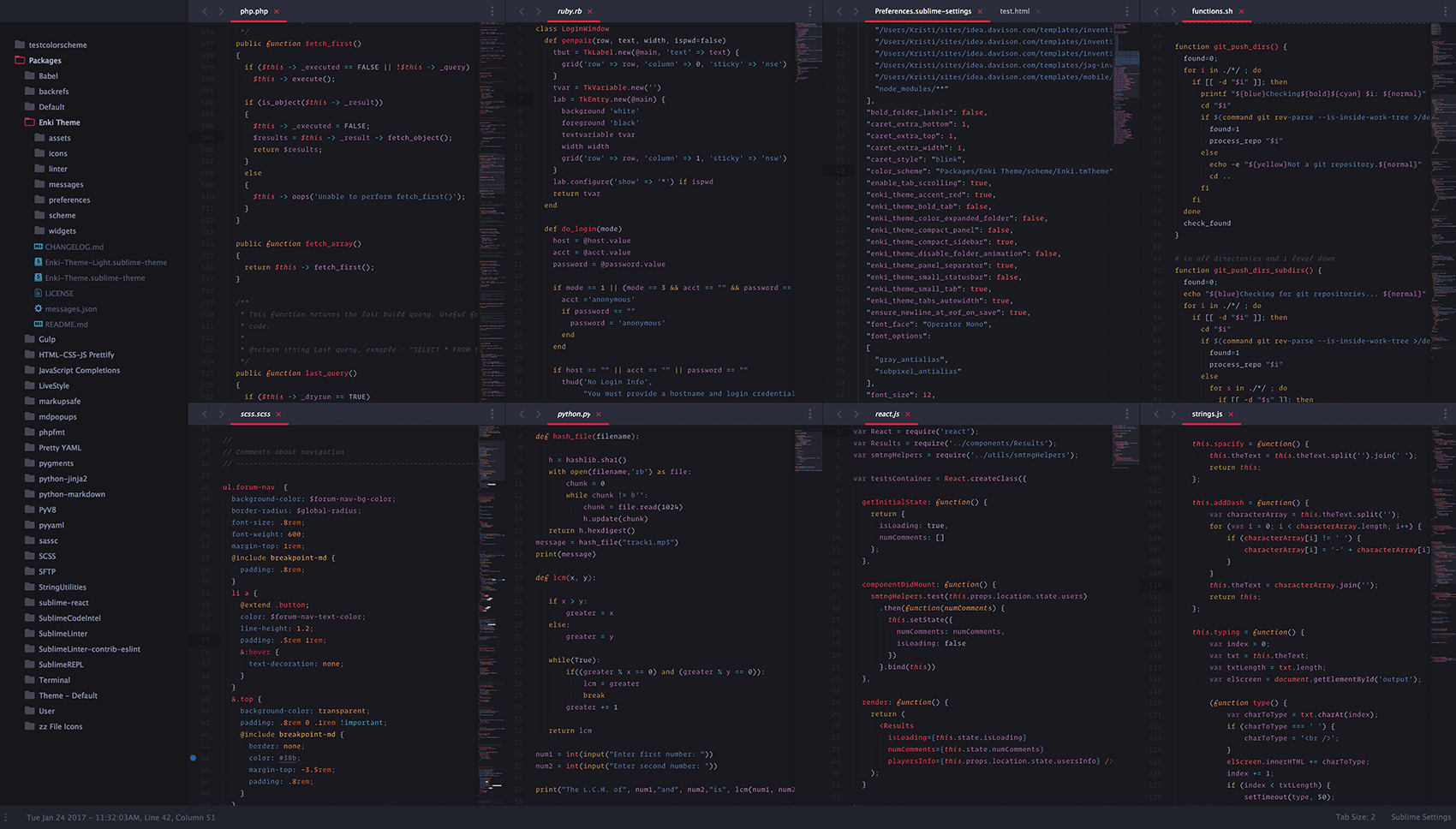
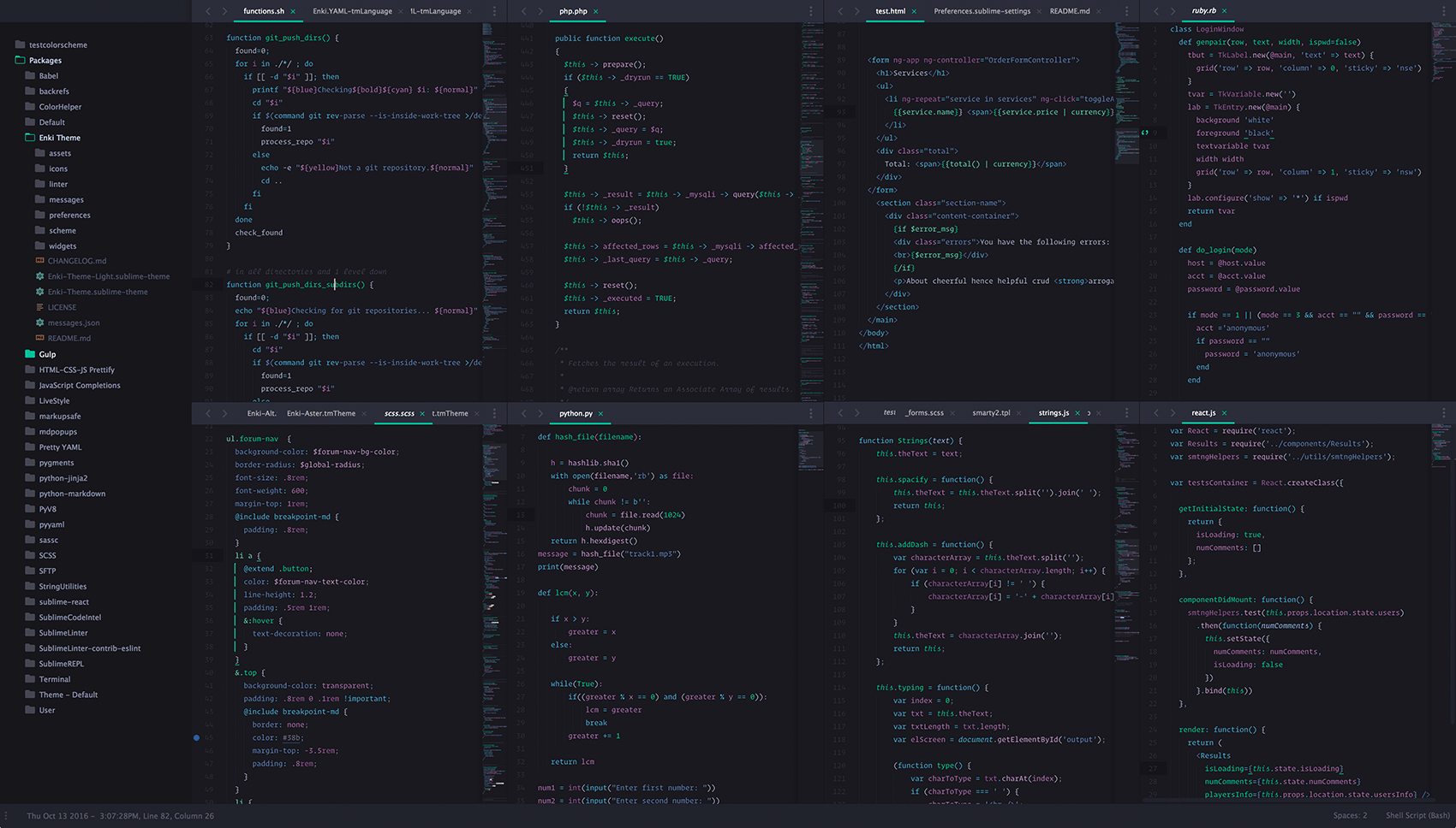
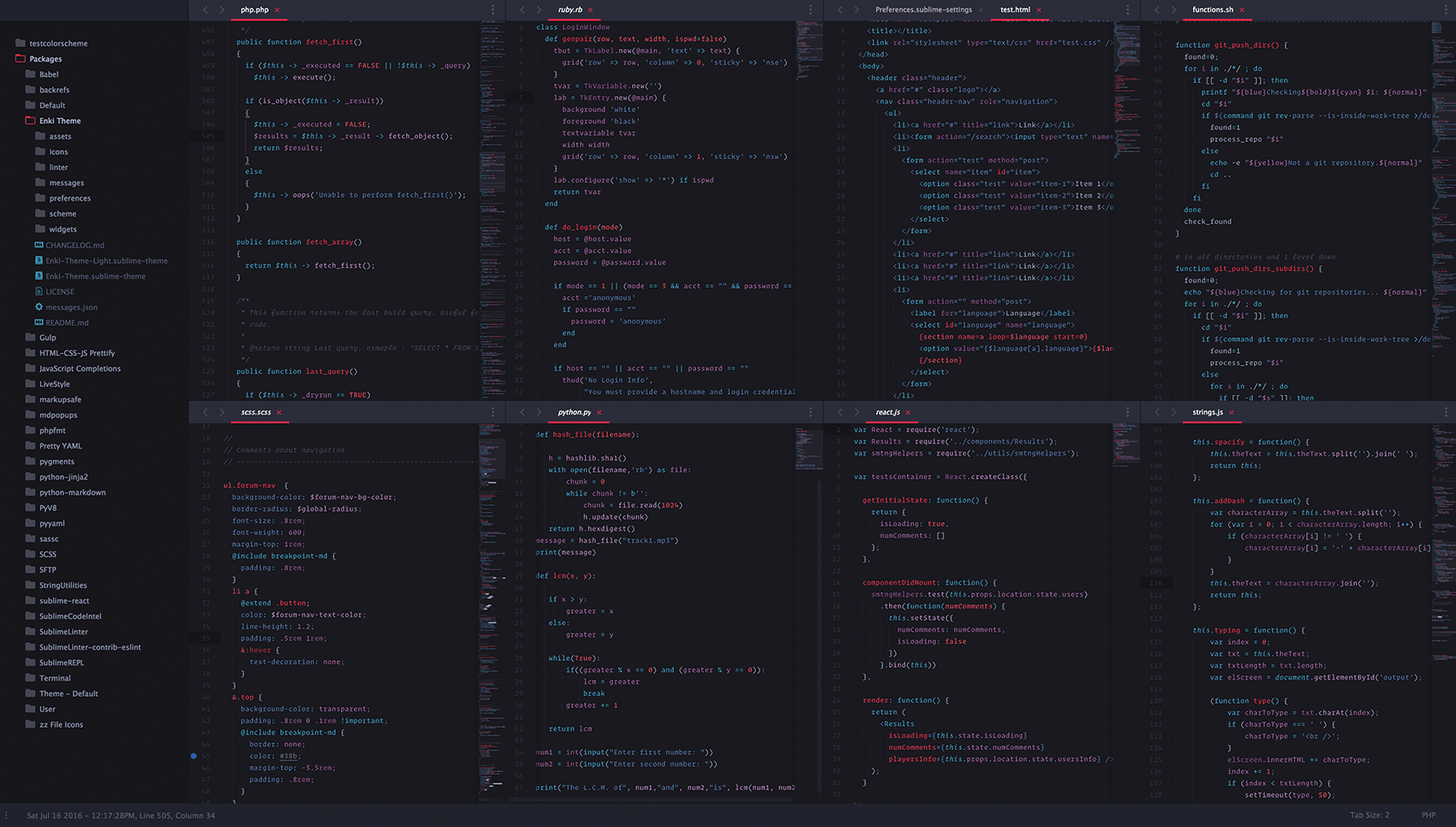
A color scheme and UI theme for Sublime Text with clear, disparate colors to help differentiate between all syntactic aspects of code, including syntax highlighting for the console.
The UI theme itself is a modified version of @equinusocio's amazing work, Material Theme and Material Theme Appbar. Specifically, the overall UI colors have been changed in Material App Bar and Material Theme to better align with this color scheme.
Tokyo Night color scheme (Ported over from my Vscode theme)
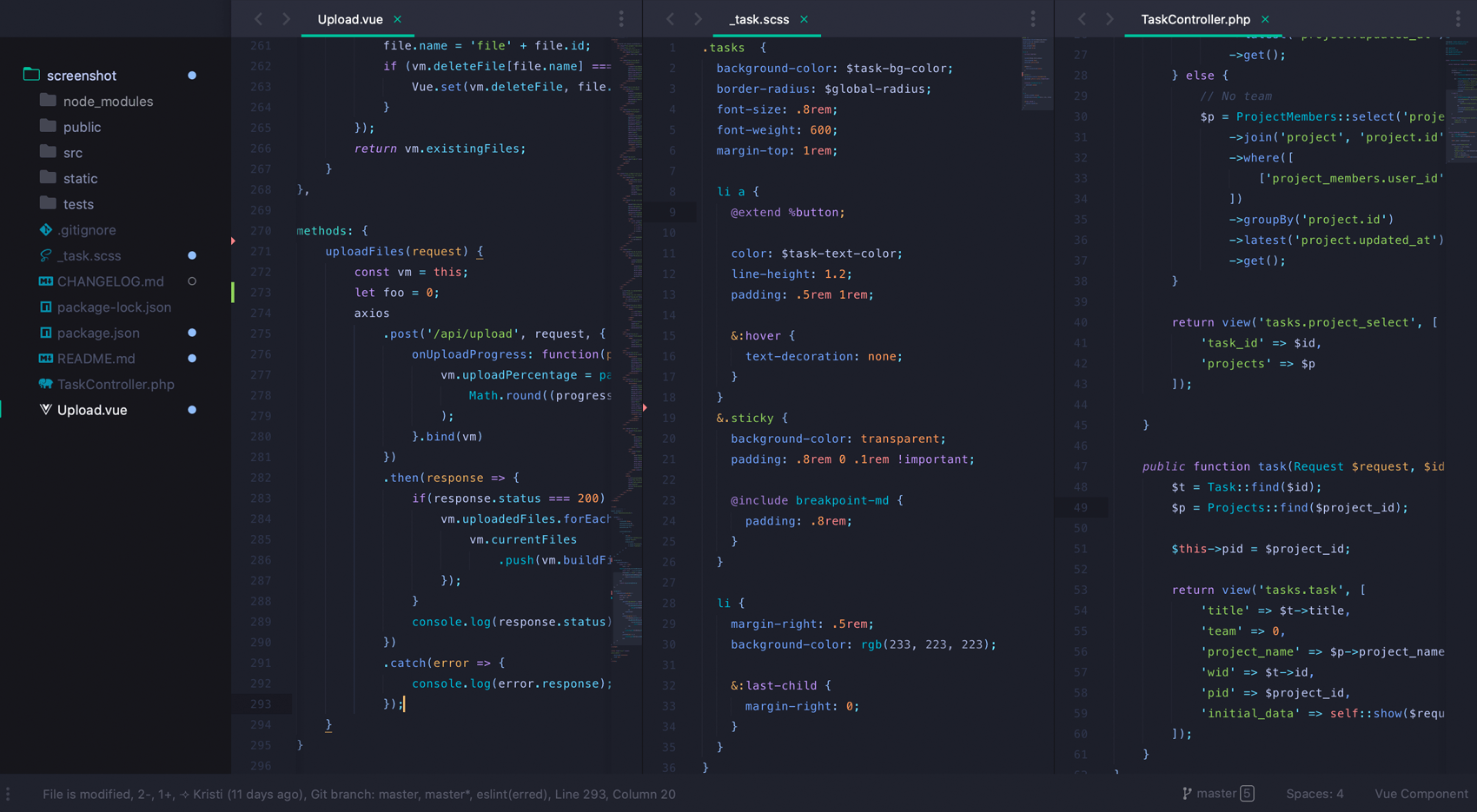
Light color scheme and UI theme:
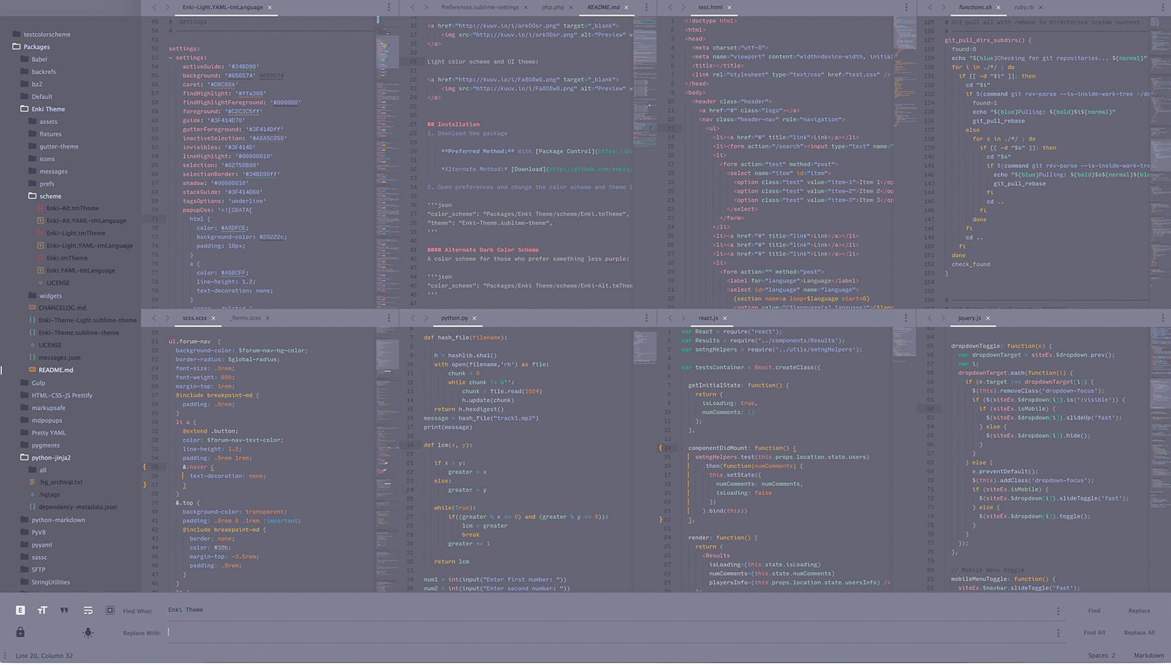
-
Download the package
Preferred Method: With Package Control installed, open the command palette and type
install packageand search forEnki Theme.Alternate Method: Download or clone this repo into
Sublime Text 3/Packagesand rename the folder to 'Enki Theme' -
Open preferences and change the color scheme and theme lines:
"color_scheme": "Packages/Enki Theme/scheme/Enki.tmTheme",
"theme": "Enki-Theme.sublime-theme",A color scheme for those who prefer something less purple:
"color_scheme": "Packages/Enki Theme/scheme/Enki-Alt.tmTheme",A color scheme for those who prefer fewer colors:
"color_scheme": "Packages/Enki Theme/scheme/Enki-Aster.tmTheme",

// red instead of green:
"color_scheme": "Packages/Enki Theme/scheme/Enki-Aster-red.tmTheme",A color scheme and UI theme for those who prefer something lighter:
"color_scheme": "Packages/Enki Theme/scheme/Enki-Light.tmTheme",
"theme": "Enki-Theme-Light.sublime-theme",Because this is essentially Material Theme, it comes packed with many of the same options as the original and one additional option:
"enki_theme_color_expanded_folder": true, // Set expanded folder in sidebar to accent color
                                          // If no accent color is specified, it simply gets brighter

"enki_theme_bold_tab": true, // Bold tab labels
"enki_theme_compact_panel": true, // Compact panel
"enki_theme_compact_sidebar": true, // Compact side bar
"enki_theme_disable_fileicons": true, // Disable file icons
"enki_theme_disable_folder_animation": true, // Disable folder animation
"enki_theme_disable_tree_indicator": true, // Disable active file indicator
"enki_theme_panel_separator": true, // Panel Separator
"enki_theme_small_statusbar": true, // Smaller Status Bar
"enki_theme_small_tab": true, // Smaller tabs
"enki_theme_tabs_autowidth": true, // Automatically adjust width of tabs
"enki_theme_tabs_separator": true, // Add separator in between tabs
"enki_theme_tree_headings": true, // Show sidebar tree headings
Color options:
  "enki_theme_accent_samon": true,
  "enki_theme_accent_bluegray": true,
  "enki_theme_accent_fuschia": true,
  "enki_theme_accent_white": true,
  "enki_theme_accent_green": true,

  "enki_theme_accent_lime": true,
  "enki_theme_accent_purple": true,
  "enki_theme_accent_pink": true,
  "enki_theme_accent_red": true, // Changed to a deeper shade
  "enki_theme_accent_orange": true,
  "enki_theme_accent_indigo": true,
  "enki_theme_accent_teal": true,
  "enki_theme_accent_blue": true,
  "enki_theme_accent_cyan": true,
  "enki_theme_accent_yellow": true,
Options to mimic the screenshot:
  "enki_theme_accent_red": true, // or white for Light theme
  "enki_theme_compact_sidebar": true,
  "enki_theme_panel_separator": true,
  "enki_theme_small_statusbar": true,
  "enki_theme_small_tab": true,
  "enki_theme_tabs_autowidth": true,
  "enki_theme_tree_headings": false,

  "overlay_scroll_bars": "enabled",
  "line_padding_bottom": 2,
  "line_padding_top": 2,
  "bold_folder_labels": false, // or remove this line if you set it to true for Material Theme
  "always_show_minimap_viewport": true,
  "indent_guide_options": ["draw_normal", "draw_active"],
"font_options": ["gray_antialias", "subpixel_antialias"], // for retina Mac & WindowsUI Plugins shown in screenshot:
Get schemes here.
- Ruby developers: Try removing Ruby Slim package if syntax appears muddled.
- SCSS/SASS developers: This theme is best used with the SCSS - TextMate SCSS Official Bundle because the Sass package has fewer syntax definitions to work with. Unfortunately, it's no longer maintained. Feel free to download my fork where I've made a few necessary updates.
- Javascript developers: This theme is best used with the newly updated (see build 3114 notes) default Javascript syntax definitions or the ones from the Babel package.
- Color Scheme palettes: Color Palette 1, Color Palette 2
- Font: Operator Mono
- If a syntax definition doesn't appear to be supported, please submit an issue.
- Use the supplied YAML file for use with PackageDev if you'd like to contribute to the color scheme.
Despite this being a modified version of the Material Theme, please submit UI issues here as a bug may have been introduced when modifying Material Theme.
This will be updated with all major bug fixes released by equinusocio for Material Theme and Material Theme Appbar but understand that since this is not the original UI theme, these updates will not occur immediately.
