-
Notifications
You must be signed in to change notification settings - Fork 62
Styling

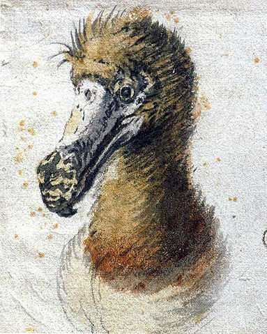
Painting of a dodo head by Cornelis Saftleven, 1638. Source: Wikimedia Commons.
One can style message bar for the given view by using its dodo.style property. The styles are set before the bar is shown.
view.dodo.style.bar.backgroundColor = UIColor.blackHere is how one can style all success and error bars:
DodoPresets.success.style.bar.backgroundColor = UIColor.black
DodoPresets.error.style.bar.backgroundColor = UIColor.purpleNote: The corresponding property of the view style must be empty in order for preset styles to be applied.
Finally, one can change default styles for all types of message bars:
DodoBarDefaultStyles.cornerRadius = 0
DodoButtonDefaultStyles.size = CGSize(width: 40, height: 40)
DodoLabelDefaultStyles.font = UIFont.preferredFont(forTextStyle: UIFontTextStyle.footnote)Note: The corresponding property of the view and preset styles must be empty in order for default styles to be applied.
Bar styles describe the appearance and behaviour of the whole message bar. One can use style.bar property for styling the message bar. For example:
view.dodo.style.bar.locationTop = true
List of available bar styles:
-
animationHide: Specify a function for animating the bar when it is hidden. You can also use of the predefined animation functions, for example:
DodoAnimations.fade.hide. See animation wiki page for more details. - animationHideDuration: Duration of hide animation. When nil it uses default duration for selected animation function.
-
animationShow: Specify a function for animating the bar when it is shown. You can also use of the predefined animation functions, for example:
DodoAnimations.fade.show. See animation wiki page for more details. - animationShowDuration: Duration of show animation. When nil it uses default duration for selected animation function.
- backgroundColor: Background color of the bar.
- borderColor: Color of bar's border.
- borderWidth: Border width of the bar.
- cornerRadius: Corner radius of the bar view.
- debugMode: When true it highlights the view background for spotting layout issues.
- hideAfterDelaySeconds: Hides the bar automatically after the specified number of seconds. The bar is kept on screen indefinitely if the value is zero. Default value: 0.
- hideOnTap: When true the bar is hidden when user taps on it. Default value: false.
- locationTop: Position of the bar. When true the bar is shown on top of the screen. Default value: true.
- marginToSuperview: Margin between the bar edge and its superview.
- onTap: Supply a function that will be called when user taps the bar.
Button styles describe the appearance and behaviour of one of two bar buttons. One can use style.leftButton and style.rightButton property for styling the buttons. For example:
view.dodo.style.leftButton.tintColor = DodoColor.fromHexString("#00000090")
view.dodo.style.rightButton.tintColor = DodoColor.fromHexString("#00000090")
List of available button styles:
- accessibilityLabel: This text is spoken by the device when it is in accessibility mode. It is recommended to always set the accessibility label for your button. The text can be a short localized description of the button function, for example: "Close the message", "Reload" etc.
- hideOnTap: When true it hides the bar when the button is tapped.
- horizontalMarginToBar: Horizontal margin between the bar edge and the button.
-
icon: When set it shows one of the default Dodo icons. Use
imageproperty to supply a custom image. The color of the image can be changed withtintColorproperty. -
image: Custom image for the button. One can also use the
iconproperty to show one of the default Dodo icons. The color of the image can be changed withtintColorproperty. - onTap: Supply a function that will be called when user taps the button.
- size: Size of the button.
- tintColor: Replaces the color of the image or icon. The original colors are used when nil.
Label styles describe the appearance of the bar's text message. One can use style.label property for styling the label, for example:
view.dodo.style.label.font = UIFont.preferredFont(forTextStyle: UIFontTextStyle.headline)
List of available label styles:
- color: Color of the label text.
- font: Font of the label text.
- horizontalMargin: Margin between the bar/button edge and the label.
- numberOfLines: The maximum number of lines in the label.
- shadowColor: Color of text shadow.
- shadowOffset: Text shadow offset.