Description
Epic tasks
- Move
Workspacesinto top right nav, moveDocsandHelpunder profile - Soft-highlight all top nav elements to show context
- Split team context button with 2 active hover areas
- Move tabs for projects and teams down below the heading #10976
- Remove the sidebar menu and use the tabs for the admin dashboard #7879
Problem to solve
The dashboard navigation has grown over the last few months with the addition of new features like Teams & Projects as well as new features in the admin dashboard like Telemetry settings, etc.
This introduced new components like tabs and dropdowns that help scale the user interface options but also improve overall UX of the dashboard, etc. However, on the way the the additional navigation elements affected usability and more specifically user control[1] and consistency[2] across the product, see screenshots below as well as relevant issues: #7668, #7879, and #7716.
| Projects (Personal Account) | Projects (Team) |
|---|---|
 |
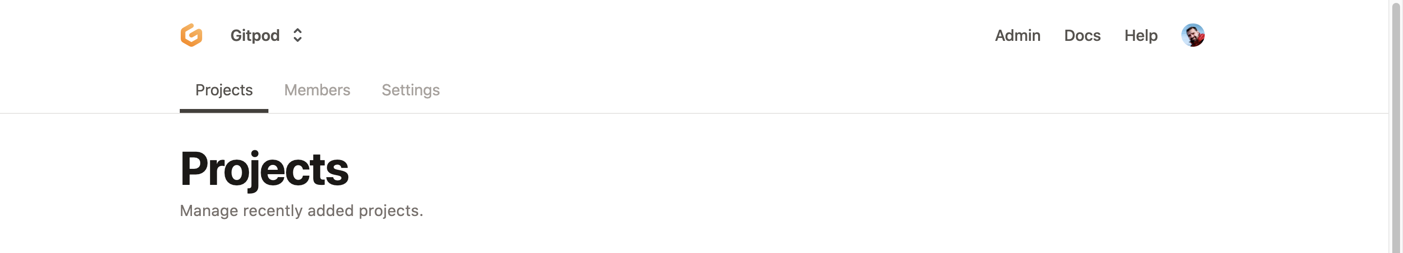 |
| Settings (Project) | Settings (Admin) | Users (Admin) |
|---|---|---|
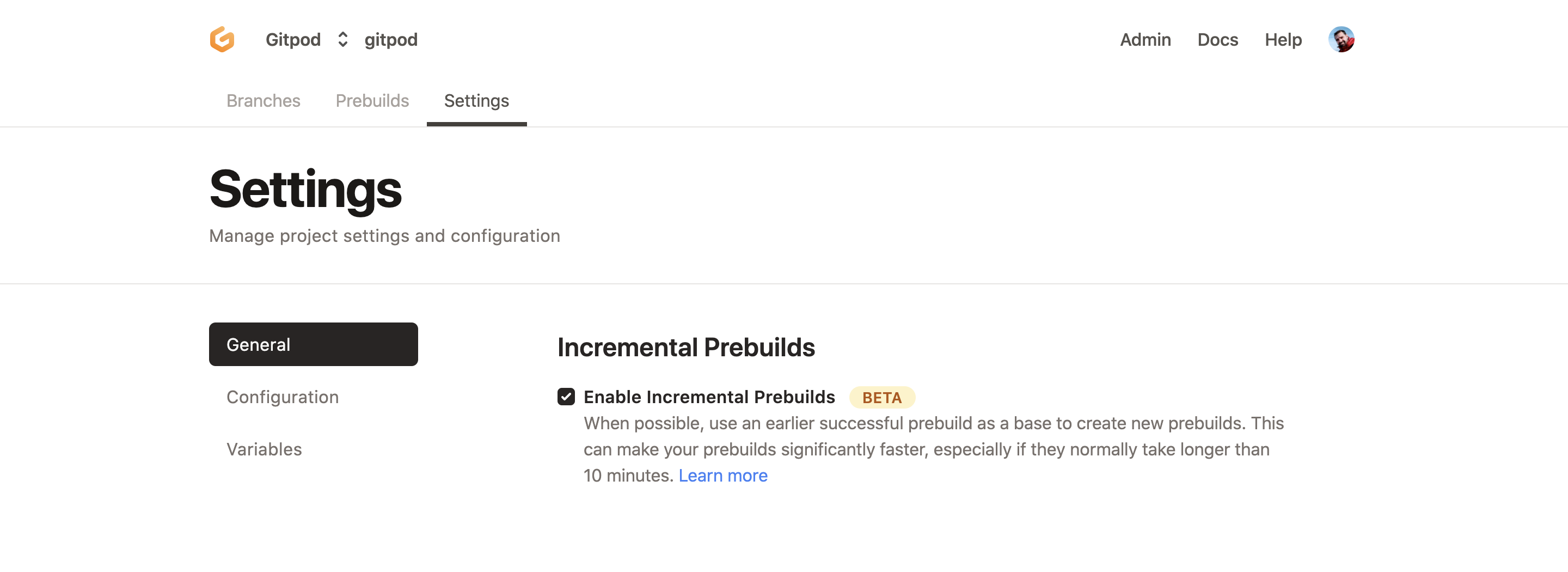 |
 |
 |
| Workspaces (Personal Account) | Branches (Project) | Prebuild (Project) |
|---|---|---|
 |
 |
 |
Proposal
Opening this as a placeholder issue based on the relevant discussion[1][2] (internal). Cc @jldec
In the spirit of MVC (minimum viable change) here's the proposed changes within the scope of this issue.
Changelist:
- Move workspaces as a global navigation menu item
- Introduce a dropdown split button with two active areas.
- Use the team scope dropdown left area to link to the default page of the scope, that is Projects.
- Use the team scope dropdown right area to trigger the dropdown.
- Use a darker active color to visually separate information hierarchy of the page contents below.
- Move the tabs (Projects, Settings, etc) below the header section.
- Re-structure admin menu to use tabs.
- Move Help and Docs user menu inside the user dropdown as described in Epic: Low-friction dashboard form to collect feedback #7925 (comment).
Changes to consider:
- Keep the active top-level menu item per page. ✔️
- Use a narrower container width (optional).
- Use more radius for the top-level navigation menu items. ✔️
- Remove the separator border between the top-level navigation and the header title. (would help to show top-nav everywhere)
- Consider moving the feedback menu inside the user dropdown.
Designs
| Workspaces |
|---|
 |
| Broad width | Narrow width |
|---|---|
 |
 |
| Team Hover (Left) | Team Hover (Right) | Team Active |
|---|---|---|
 |
 |
 |
| Project | Prebuild | Admin |
|---|---|---|
 |
 |
 |
See design specs.
Metadata
Metadata
Assignees
Labels
Type
Projects
Status