-
-
Notifications
You must be signed in to change notification settings - Fork 5.7k
New issue
Have a question about this project? Sign up for a free GitHub account to open an issue and contact its maintainers and the community.
By clicking “Sign up for GitHub”, you agree to our terms of service and privacy statement. We’ll occasionally send you account related emails.
Already on GitHub? Sign in to your account
Styling Issues (CSS) #25628
Comments
|
Fix UI misalignment on user setting page #25629 |
silverwind
pushed a commit
that referenced
this issue
Jul 3, 2023
Fix #25628 Diff with ignoring space: https://github.com/go-gitea/gitea/pull/25629/files?diff=unified&w=1 The "modal" shouldn't appear between "ui attached segment", otherwise these segments lose margin-top. After the fix: <details>     </details>
GiteaBot
pushed a commit
to GiteaBot/gitea
that referenced
this issue
Jul 3, 2023
Fix go-gitea#25628 Diff with ignoring space: https://github.com/go-gitea/gitea/pull/25629/files?diff=unified&w=1 The "modal" shouldn't appear between "ui attached segment", otherwise these segments lose margin-top. After the fix: <details>     </details>
silverwind
pushed a commit
that referenced
this issue
Jul 3, 2023
Backport #25629 by @wxiaoguang Fix #25628 Diff with ignoring space: https://github.com/go-gitea/gitea/pull/25629/files?diff=unified&w=1 The "modal" shouldn't appear between "ui attached segment", otherwise these segments lose margin-top. After the fix: <details>     </details> Co-authored-by: wxiaoguang <wxiaoguang@gmail.com>
Sign up for free
to subscribe to this conversation on GitHub.
Already have an account?
Sign in.
Description
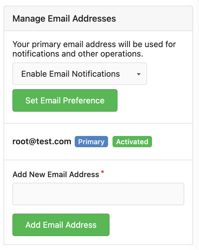
Firstly, I discovered that there is no spacing between the components under this route:
{INSTANCE_URL}/user/settings/securitySecondly, under this route:
{INSTANCE_URL}/user/settings/account, the alignment of theEnable Email Notificationsdropdown and theSet Email Preferencebutton is uneven.Screenshots
Gitea Version
1.21.0+dev-195-gaab7cb675
Can you reproduce the bug on the Gitea demo site?
Yes
Operating System
linux 5.19.0-1026-gcp
Browser Version
Microsoft Edge v114.0.1823.51 (Official build) (64-bit)
The text was updated successfully, but these errors were encountered: