Skip to content
New issue

Have a question about this project? Sign up for a free GitHub account to open an issue and contact its maintainers and the community.

By clicking “Sign up for GitHub”, you agree to our terms of service and privacy statement. We’ll occasionally send you account related emails.

Already on GitHub? Sign in to your account

Fixing issue filter #25335

Closed

Conversation

puni9869
Copy link
Member

@puni9869 puni9869 commented Jun 18, 2023

In current version of Gitea we have problems with mobile viewport.
Current Mobile screen:
image

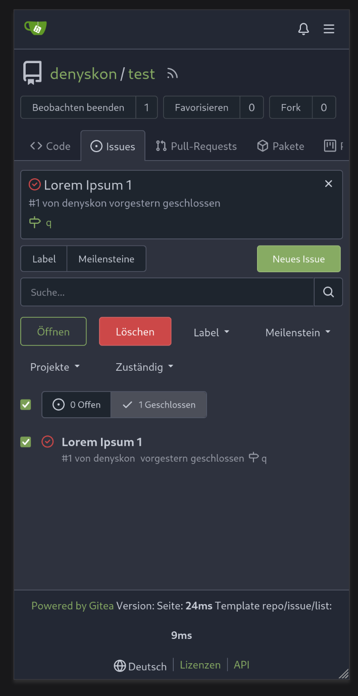
After Modification Mobile Screen [Main Modification]:

image

Dropdowns:

image

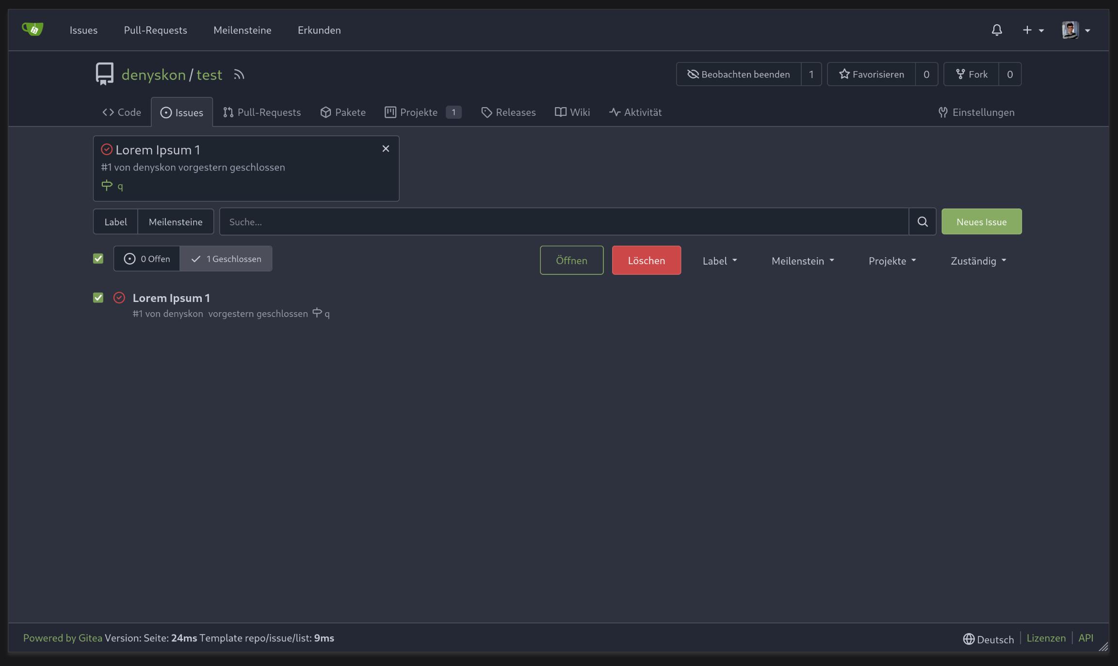
Ultra Large Devices:

image

Large Devices:

image

Devices less than 1024 and grater than mobile screen:

image

Fixes #24846

@GiteaBot GiteaBot added the lgtm/need 2 This PR needs two approvals by maintainers to be considered for merging. label Jun 18, 2023
@pull-request-size pull-request-size bot added the size/M Denotes a PR that changes 30-99 lines, ignoring generated files. label Jun 18, 2023
@puni9869
Copy link
Member Author

puni9869 commented Jun 18, 2023

This is a very complex style issue to fix. But I have tried my best to cover all the screen sizes, specially mobile view and viewport < 1024px . Obviosly there are some tricks and hacks I have used.

I know there may be some changes which not looks great in terms of coding style. I am open for all the feedbacks and suggestions to make the screen great.

Please take the pull of this branch and run at the local while reviewing. Code may looks great but keeping ui screen on side by side will give extra points to consider why this style used.

@puni9869 puni9869 changed the title #24846 Fixing issue filter Fixing issue filter Jun 18, 2023
@silverwind
Copy link
Member

I think we could also just make those wrap instead. Horizontal scrollbars are suboptimal UX on mobile, and I would also like to eventually get rid of the one on the repo tab bar.

@puni9869
Copy link
Member Author

This is a very complex style issue to fix. But I have tried my best to cover all the screen sizes, specially mobile view and viewport < 1024px . Obviosly there are some tricks and hacks I have used.

I know there may be some changes which not looks great in terms of coding style. I am open for all the feedbacks and suggestions to make the screen great.

Please take the pull of this branch and run at the local while reviewing. Code may looks great but keeping ui screen on side by side will give extra points to consider why this style used.

Sure thing,
so you are referring to a vertical collapsed nav bar for repo tabs

@silverwind
Copy link
Member

Yes, for this I want to make a JS overflow solution into a "..." button similar to GitHub, but it's not for this PR:

image

For this, we can have a horizontal flexbox with gt-fw to let them wrap.

image

@puni9869
Copy link
Member Author

puni9869 commented Jun 18, 2023

Yes, for this I want to make a JS overflow solution into a "..." button similar to GitHub, but it's not for this PR:

image For this, we can have a horizontal flexbox with `gt-fw` to let them wrap. image

Got it,
image

we can target in next followup pr.

These designs are complex. Need to modularize it in future run.

@puni9869
Copy link
Member Author

@wxiaoguang
Requesting for your feedback.

@wxiaoguang
Copy link
Contributor

Thank you for inviting me for reviewing, and thank you for your contribution 🙏 . I am pretty busy on this one (25330) and its related problems, I haven't got enough time for other PRs at the moment.

Overall I think I am neutral to these changes, while I am not sure whether different languages would also affect the layout. I might take a look later but I can't promise because I am going be in travel in the following weeks.

@puni9869
Copy link
Member Author

Thank you for inviting me for reviewing, and thank you for your contribution 🙏 . I am pretty busy on this one (25330) and its related problems, I haven't got enough time for other PRs at the moment.

Overall I think I am neutral to these changes, while I am not sure whether different languages would also affect the layout. I might take a look later but I can't promise because I am going be in travel in the following weeks.

No worries, whenever required I am available for making changes and discussion to taking this in right direct.
Thanks for acknowledging my pr.

Copy link
Contributor

@wxiaoguang wxiaoguang left a comment

Choose a reason for hiding this comment

The reason will be displayed to describe this comment to others. Learn more.

Some nits and questions

templates/repo/issue/list.tmpl Outdated Show resolved Hide resolved
web_src/css/repo/issue-list.css Outdated Show resolved Hide resolved
@wxiaoguang
Copy link
Contributor

Two nits (not sure whether they are related): the checkbox, the unnecessary scrollbar.

image

@puni9869
Copy link
Member Author

Two nits (not sure whether they are related): the checkbox, the unnecessary scrollbar.

image

Fixes
image

image

But when clicking the checkbox new options are populating.
This also needs a fix. will work on it.
image

@denyskon
Copy link
Member

This PR seems to break the changes introduced in #25315 by removing used CSS classes....

@puni9869
Copy link
Member Author

puni9869 commented Jun 18, 2023

This PR seems to break the changes introduced in #25315 by removing used CSS classes....

I can not say right now on the break changes. But I have gone through that PR. I am making changing cautiously so that they will not effect others.

@puni9869
Copy link
Member Author

puni9869 commented Jun 18, 2023

Desktop:
image

Mobile:-
image

1024px:
image

image

@pull-request-size pull-request-size bot added size/L Denotes a PR that changes 100-499 lines, ignoring generated files. and removed size/M Denotes a PR that changes 30-99 lines, ignoring generated files. labels Jun 18, 2023
@denyskon
Copy link
Member

I think I have a slightly cleaner fix for it, will push it later

@puni9869
Copy link
Member Author

puni9869 commented Jun 19, 2023

Shall I close this PR. Since alternate PR #25368 looks nicer.
@silverwind

@silverwind
Copy link
Member

Yeah, let's go with #25368. @puni9869 sorry about it. Maybe next time you find some easier issues to work on :)

@silverwind silverwind closed this Jun 19, 2023
silverwind pushed a commit that referenced this pull request Jun 19, 2023
@go-gitea go-gitea locked as resolved and limited conversation to collaborators Sep 17, 2023
Sign up for free to subscribe to this conversation on GitHub. Already have an account? Sign in.
Labels
lgtm/need 2 This PR needs two approvals by maintainers to be considered for merging. size/L Denotes a PR that changes 100-499 lines, ignoring generated files.
Projects
None yet
Development

Successfully merging this pull request may close these issues.

Issue filter list looks not good on phone
5 participants