-
Notifications
You must be signed in to change notification settings - Fork 295
New issue
Have a question about this project? Sign up for a free GitHub account to open an issue and contact its maintainers and the community.
By clicking “Sign up for GitHub”, you agree to our terms of service and privacy statement. We’ll occasionally send you account related emails.
Already on GitHub? Sign in to your account
Tooltip background is different between Figma and test site #5444
Comments
|
This isn't a Dashboard-sharing specific issue: the Tooltip in question is imported from Material UI and used both in Dashboard sharing UI and outside it. That said: the proposed improvements to the tooltip style in the Dashboard Sharing Figma designs are pleasant and more readable. I've added ACs but removed this from the Dashboard Sharing epic. |
@nfmohit, please, avoid using the PR as IB approach, this is strongly discouraged because time spent on actual execution for your PoC hasn't been allocated for this ticket yet. Try to describe steps that are needed without coding, if something is not clear or needs discovery, then just mention it in IB.
We also need to display an arrow that will point to the target element. There is an example in the documentation that has the arrow, we need to do the same. Could you please add it to IB? |
|
@eugene-manuilov Thank you very much for the kind and detailed IBR!
Noted, I'll keep that in mind and not add it in future unless absolutely necessary. Thanks!
Added, thank you! |
|
Thanks, @nfmohit. IB ✔️ |
QA Update ✅
|


Feature Description
Bug bash issue: https://app.asana.com/0/1202258919887896/1202422111202705 please see Asana for background
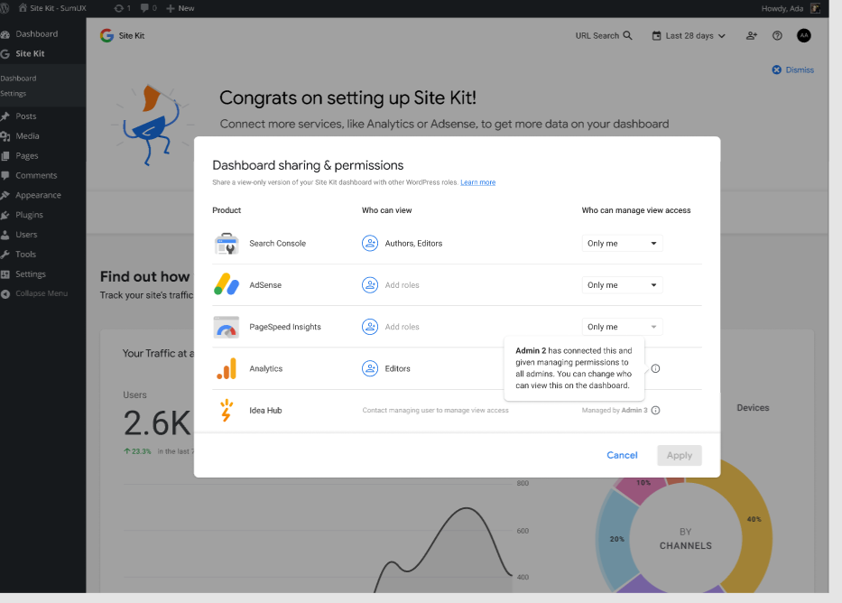
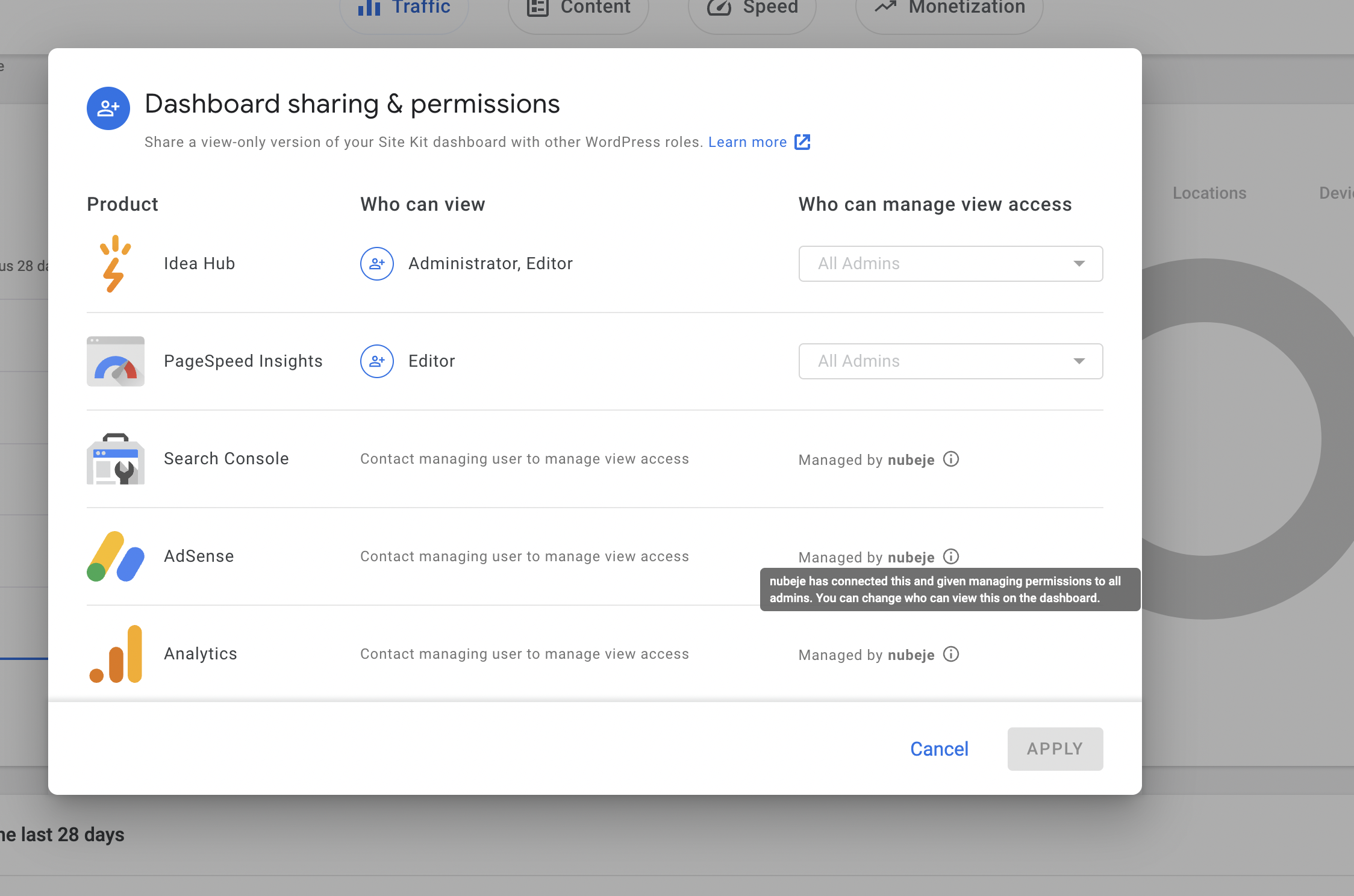
On the figma designs the tool tip (when you have 2 or more admins) is white background with blank text. Where as on the test site it is grey background with black text. This is quite hard to read. Also the font size is bigger on the figma designs, and easier to read.
Figma:

Chrome:

Do not alter or remove anything below. The following sections will be managed by moderators only.
Acceptance criteria
Tooltipcomponent should be created to replace our existing usage of the Material UI<Tooltip>component.import { Tooltip } from '@material-ui/core';should be replaced with our own Tooltip component.Implementation Brief
PoC PR
A proof-of-concept PR has been added with most of the implementation mentioned below here. This can be used as a starting point, ensuring these next steps:
A summary of the implementation is still mentioned below:
Tooltip.jsfile in theassets/js/componentsfolder to something likeJoyrideTooltip.jsorFeatureTourTooltip.js, since it is only used in a few places and mostly within feature tours. Also, update its component definition, stories, and usages across the codebase.Tooltip.js, which will contain the generic tooltip component that we will create in this issue. In this file:Tooltipcomponent from@material-ui/corewith our own CSS selectors and styling.Tooltipwhich should explicitly accept the propchildren. The remaining props can be assigned toprops(e.g....props).Tooltipcomponent with an alias (e.g.MuiTooltip) from@material-ui/core.MuiTooltipfrom the component. It should have:classesprop with an object containing a keys:popperwith the value ofgooglesitekit-tooltip-popper.tooltipwith the value ofgooglesitekit-tooltip.true).propspassed to this component as well (e.g.{ ...props }).childrenprop should be passed as the child for this component.assets/sass/components/global/_googlesitekit-tooltip.scss, add the necessary styles according to Figma to the.googlesitekit-tooltip.MuiTooltip-tooltipand the.googlesitekit-tooltip .MuiTooltip-arrowselectors.@material-ui/coreTooltipcomponent with the newTooltipcomponent.classesprop as it is already added in our new component.Test Coverage
QA Brief
Changelog entry
The text was updated successfully, but these errors were encountered: