Skip to content
New issue

Have a question about this project? Sign up for a free GitHub account to open an issue and contact its maintainers and the community.

By clicking “Sign up for GitHub”, you agree to our terms of service and privacy statement. We’ll occasionally send you account related emails.

Already on GitHub? Sign in to your account

Add Publishing Checklist #12

Closed
rmccue opened this issue Jun 12, 2019 · 18 comments · Fixed by #13
Closed

Add Publishing Checklist #12

rmccue opened this issue Jun 12, 2019 · 18 comments · Fixed by #13
Assignees

Comments

@rmccue
Copy link
Member

rmccue commented Jun 12, 2019

We want to add our new Publishing Checklist functionality, and ensure it's integrated with the rest of the workflow features. We may need to do this in two stages, with the deeper integration in a later release.

@rmccue rmccue self-assigned this Jun 12, 2019
@rmccue rmccue added this to the 2.0 Beta milestone Jun 12, 2019
@rmccue
Copy link
Member Author

rmccue commented Jun 25, 2019

Product

Fundamentally, what we need is a framework for developers to check that a post is ready to publish, and block publication if it isn't. These checks range from things like spell checking, to testing which blocks exist in the content, to meta fields, and potentially to legal/etc approval as well.

There are three primary end-users of this framework: writers in smaller teams who can write and self-publish posts, writers in larger teams who have to submit posts for approval, and editors in larger teams who approve posts for publication.

  • As a writer in small and large teams, I need to know which tasks are required in order to make a post ready for publication so that I know when a post is ready for publication or submission for approval.
  • As a writer in small teams or an editor in larger teams, I want to see whether a post is complete before publication so that the post meets minimum standards for approval.
  • As a writer in small teams or an editor in larger teams, I want potential problems to be highlighted for manual review so that I can review faster.

UX

Visually, here's what we have, based on the base code provided from an existing project by Thorsten:

Screen Shot 2019-06-25 at 10 26 06

This pretty much matches the older Publishing Checklist metabox, but is now part of Gutenberg's native pre-publish sidebar.

The basic interaction is: click Publish, and the sidebar slides out. This displays the checklist "progress" and individual checks beneath it.

This sidebar as a whole is created by Gutenberg, and we can't change a huge amount outside of our "Publication Checklist" section; I'm working on having it block the Publish button if there are any failures. (The "info" status can be used if blocking publish isn't desired.) We also presumably want to remove the "Always show pre-publish checks" ability, as we want to force checking the status.

Currently, it's also possible for checks to link to specific blocks, and clicking on the check brings the block into focus so that problems can be rectified. This interaction might need to be dropped for technical reasons.

Implementation

The base code handles all these checks in React and is purely visual; I'm working on rewriting this to instead work on the backend so that it is able to enforce checks rather than simply indicate status.

Once checks are run, they return a status (complete, incomplete, or info) which is used to indicate progress, block publication, and render messages to the user. I'll look into whether we can make this compatible with the older Publishing Checklist plugin as well.

The visual aspect of this will use a default React component that just renders out the message from the backend, but I'll aim to make this pluggable so that advanced uses can swap out the frontend as well.


@elodiebouneau Does this match your expectations? Am I missing anything here?

@humanmade/design Right now, the design is purely based on the old style Publishing Checklist. Do we want to rethink the interactions and/or visual design for the Gutenberg context?

@paulgibbs
Copy link

The base code handles all these checks in React and is purely visual; I'm working on rewriting this to instead work on the backend so that it is able to enforce checks rather than simply indicate status.

It would be nice to be able to be able to somehow trigger (as many of the) validation routines in PHP (as possible) in order to to avoid duplicating the validation logic server-side.

@rmccue
Copy link
Member Author

rmccue commented Jun 25, 2019

It would be nice to be able to be able to somehow trigger (as many of the) validation routines in PHP (as possible) in order to to avoid duplicating the validation logic server-side.

Yep; this will be PHP-first, but you'll be able to write additional (visual-only) checks or enhance existing ones (e.g. for deeper integration with Gutenberg's UI) on the frontend.

@rmccue
Copy link
Member Author

rmccue commented Jun 25, 2019

Worth noting: looks like Gutenberg may change from a sidebar to a modal here: WordPress/gutenberg#15847

@elodiebouneau
Copy link

@rmccue Thank you so much putting this together!!

Feature is as expected. A few questions to make sure I understand it all:

  1. Is this for post only or page as well
  2. Does it show somehow on Post page where all the posts are listed?
  3. How does it fit with the current workflow feature?
  4. Other DXPs have something like an approval process for new document uploads before they appear in the media library. do you see this fitting in a secondary step here if we wanted to do this?

@grarighe probably wants to be aware of this and do a Design review :-)

@rmccue
Copy link
Member Author

rmccue commented Jul 2, 2019

Is this for post only or page as well

Right now, anything that uses the block editor; we can make this configurable.

Does it show somehow on Post page where all the posts are listed?

Not currently, but can do.

How does it fit with the current workflow feature?

Currently there's no integration there; per @roborourke it sounds like there's not a huge amount there that integrates, but in the next versions I think we can look into deeper integration throughout.

Other DXPs have something like an approval process for new document uploads before they appear in the media library. do you see this fitting in a secondary step here if we wanted to do this?

We can do that in the future yeah. :)

@grarighe grarighe self-assigned this Jul 2, 2019
@grarighe
Copy link

grarighe commented Jul 5, 2019

Hi all, you can play with a little prototype of this feature here: https://invis.io/QBSTFAAFUP4#/372029898_Publishing-Checklist-01


Some explanation:

  • I renamed items with tasks and phrased everything consistently as an action. Verbs at the begin of each sentence. Just Social headline lenght didn't really tell me what I'm supposed to do with it.

  • I found the icons misleading (E.g. a cross could also mean 'done' in different cultures). I think that if we enhance the look of an item that is done (making it crossed out + the tick, for example), the others can just look like a simple list. This would remove the cognitive load of having to understand what the icons mean.

    Screenshot 2019-07-05 at 13 28 52
  • I wanted to remove tasks that don't block Publishing from the list. I think this makes the interface clearer and more consistent, given that the progress bar at the top only counts blocking items. But... there might be a better micro-copy for it (currently Not-blocking tasks:)

  • I removed the text at the top Ready to publish? etc., I don't think it's very useful especially given the context and our type of users.

  • The colour of the links 'Public', 'Immediately', 'Add tags' etc should be altis-blue like the rest of the links in our theme

  • I removed the checkbox Always show pre-publish checks like discussed, as we want to enforce pre-publish checks, but because we still want users to be able to force publishing, I've added some friction in the form of a small modal that appears if users click on Publish without having completed all the tasks.

    Screenshot 2019-07-05 at 13 46 29

    Happy to discuss micro-copy and actual look of this modal.

  • I've made a state for the complete checklist:

Screenshot 2019-07-05 at 13 40 41

Screenshot 2019-07-05 at 13 41 00

Let me know your thoughts, I'm working on the Posts admin page next. 👍

@rmccue
Copy link
Member Author

rmccue commented Jul 5, 2019

This looks brilliant, thanks @grarighe.

Comments on a few bits:

I found the icons misleading (E.g. a cross could also mean 'done' in different cultures).

Brilliant, I hadn't even considered that.

But... there might be a better micro-copy for it (currently Not-blocking tasks:)

"Non-blocking tasks" would be more correct, but maybe "Optional tasks" would be best?

phrased everything consistently as an action

These are mostly just demo items (not included out-of-the-box), but great point; we can make it clear in the documentation how developers should phrase their items 👍

I've added some friction in the form of a small modal that appears if users click on Publish without having completed all the tasks.

Looks fantastic! Some projects may want to make it completely mandatory, so we can offer the ability to completely block publication for developers who want it (but set the default to allow overriding).

Also, will look into the technical feasibility of this; hopefully we can override this button 🤞


I'll work on updating to match these designs.

@rmccue
Copy link
Member Author

rmccue commented Jul 9, 2019

Update: here's where I'm at:

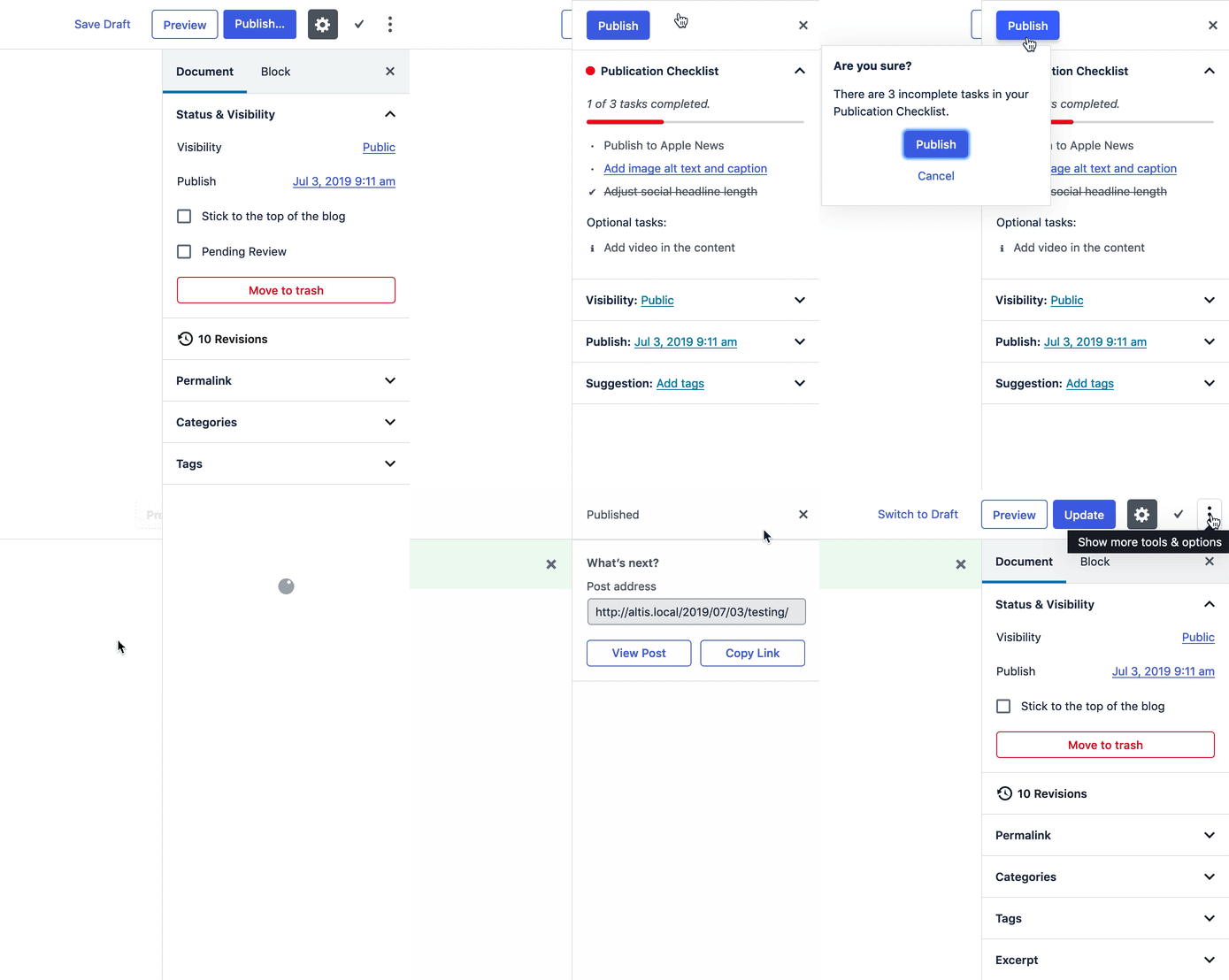
Screen Recording 2019-07-09 at 12 08 30

Some complications:

  • It's not possible to anchor Gutenberg's Popover (the mini modal) to the left properly, as it automatically adjusts the anchor point to avoid the edge. At the core of it, it's only designed to have the anchor arrow at the centre of the popover. We could implement our own popover component or use another React library, but it will likely be inconsistent with the rest of Gutenberg if so.
  • The publish button in the popover basically has to say "Publish", unless I reimplement the entirety of the publish button component. It's not a simple component, so I'd really like to avoid this, as it's likely to be brittle for future changes.
  • I've had to reimplement the header of the prepublish sidebar (the bit with the button and the close button), which is quite complex. In the process, we no longer have the animated publish button, so it's somewhat inconsistent with Gutenberg's design there; there's simply not enough extension points in Gutenberg to avoid this. I could reimplement the entire prepublish sidebar to fix this, but again, this is likely to be quite brittle.
  • Completed optional tasks will show in the main list, not under "optional".

I haven't swapped out the icons yet, as it will require loading in a new icon set we're not using, unless we use Dashicons' equivalents. I also haven't updated the link colours, as they're part of the theme, not related to this issue.

I believe we want to swap out the red for an orange instead; can you let me know what colour this should be? I'm not sure where the palette for this would be :)

@grarighe Any thoughts on the above? Also, any updates on designs for the list view? :)

@grarighe
Copy link

grarighe commented Jul 9, 2019

It's not possible to anchor Gutenberg's Popover...

It's bad news that it's going to cover the actual checklist. The only thing I can think of, is making it a standard modal that appears at the centre of the screen but it would require a quite consistent change of focus and movement of the mouse (but again, friction could be a good thing). And, that's also true if people have to close the modal to re-look at the checklist.

Do you have strong feelings about this one, eg against a modal at the centre of the screen? I think I'm leaning toward that. (Example)

The publish button in the popover basically has to say "Publish"...

I thought that the problem was that the button couldn't work smartly and recognise if the user wants to Publish or Schedule. That's why in Slack I suggested that, if the microcopy starts with "Are you sure?...", perhaps the button label could be "Yes, Ignore Checklist". Because in the end that's what we're doing here. And clicking on 'Publish' three times is not ideal. But if the actual problem is that that buttons HAS TO say 'Publish' for technical reasons, well... I don't know how to solve it 😂

we no longer have the animated publish button...

I think I see the animation on the header but not on the popover, is that what you mean? It does feel inconsistent but again, I'm sure it's OK for a v1.

Completed optional tasks will show in the main list, not under "optional".

Hm, it's just gonna be inconsistent...

Let's assume there is a total of 15 tasks, optional (11) and mandatory (4):

  • If the counter doesn't include optional tasks in the total, the microcopy will say "1 of 4 tasks completed" but there could be x completed tasks in the list, let's say 10! Confusing.
  • If we add optional tasks to the total (eg: "1 of 15 tasks completed"), users won't easily see the number of tasks that are actually blockers, especially on the Posts list screen. They won't get a sense of how soon they can be able to publish. The progress bar becomes less useful and will be orange most of the time.

This is why I'm still showing completed optional tasks but under the 'Optional tasks' title and I'm not counting them. I don't think it's that important to count those, but maybe I'm missing something?

I haven't swapped out the icons yet, as it will require loading in a new icon set we're not using, unless we use Dashicons' equivalents.

Swapping the icons in this case would be for pure aesthetic reasons, as the Dashicons would be fine in terms of conveying their meaning. I guess this can be prioritised accordingly. Ideally in a future (eg Altis dashboard or such) I would use more and more Feather icons so if we can move away from the ugly WordPress ones that'd be great.

can you let me know what colour this should be?

Try #F97A14 – first time we need some orange so we didn't have one before.

Thank you!

@rmccue
Copy link
Member Author

rmccue commented Jul 10, 2019

Do you have strong feelings about this one, eg against a modal at the centre of the screen? I think I'm leaning toward that.

We can definitely do that; here's what it looks like:

Screen Shot 2019-07-10 at 12 31 31

Given button text is shorter (see below), I changed the buttons to side-by-side per Gutenberg guidelines.

We should also reword the title; Gutenberg's design guidelines specifically discourage "Are you sure?"

I thought that the problem was that the button couldn't work smartly and recognise if the user wants to Publish or Schedule. That's why in Slack I suggested that, if the microcopy starts with "Are you sure?...", perhaps the button label could be "Yes, Ignore Checklist". Because in the end that's what we're doing here. And clicking on 'Publish' three times is not ideal. But if the actual problem is that that buttons HAS TO say 'Publish' for technical reasons, well... I don't know how to solve it 😂

It's actually the opposite: the button is designed to change the text automatically, but that means we can't add additional text to it. To override the text, I'll have to reimplement the button entirely; I can do that if we really want to, but it may be brittle for future changes.

Given Gutenberg is looking at changing up this entire prepublish workflow, we may as well do it. I'll work on switching that out.

I'm thinking we could potentially change the visual hierarchy of the buttons as well: we want people to hit "Cancel" and fix up the items as the primary action. Maybe also change the microcopy from "Cancel" to "Back to Editor" or similar as well.

Also, we can replace the text on the other Publish button (the one in the sidebar's header) if we want.

I think I see the animation on the header but not on the popover, is that what you mean? It does feel inconsistent but again, I'm sure it's OK for a v1.

In our workflow, you'll see the sidebar is replaced with a spinner after clicking the final Publish button. This is then replaced by "Published" and the "post-publish sidebar".

In Gutenberg, this happens, but above the spinner is the Publish button in the "busy" state. Here's what this looks like:

Screen Recording 2019-07-10 at 12 38 00

We can't replicate the Publish button in the busy state, so we only have the spinner.

This is why I'm still showing completed optional tasks but under the 'Optional tasks' title and I'm not counting them. I don't think it's that important to count those, but maybe I'm missing something?

Internally, I'm not differentiating between mandatory and optional tasks; there are just tasks in one of three states (as described above). Given that, there's no way to distinguish between mandatory-and-complete and optional-and-complete.

I could redesign the internal API for this if desired, but I'm following the existing API patterns which don't distinguish here. Do you think it's worth changing this? (Something we could always iterate on later too.)


One other state we haven't accounted for: I have the option for site administrators to enforce checks and remove the "Ignore checklist" option. This isn't the default, but we want to provide that as a platform option for sites that really want to make sure all conditions are met.

For this, we can remove the Publish button from the modal and display informational text there; we could also disable the Publish button in the sidebar or something similar.

Screen Shot 2019-07-10 at 12 45 35

Sorry for not mentioning this case earlier, I had forgotten about it!

@grarighe
Copy link

  • OK, beautiful! Totally right about the "are you sure?" title, I thought (too quickly) to phrase it as a question, but it needs to be a descriptive question. Now you have Ignore incomplete tasks? and I think that's great.

  • Thanks for working on the Publish/Schedule button 👍

  • I'm thinking we could potentially change the visual hierarchy of the buttons as well: we want people to hit "Cancel" and fix up the items as the primary action. Maybe also change the microcopy from "Cancel" to "Back to Editor" or similar as well.

    Personally I would keep Publish/Schedule as the primary button in the modal, to align with the initial users' intentions. Given they already cliecked on a blue button that says Publish (twice), I guess they would expect again that behaviour (think of Drunk User Testing )😄 . We could also see how it goes and add more friction later.

  • Thanks for explaining what happens with the animation. I guess it's fine...

  • I could redesign the internal API for this if desired, but I'm following the existing API patterns which don't distinguish here. Do you think it's worth changing this? (Something we could always iterate on later too.)

    You have to tell me what would currently happen with the counter... because I struggle to see that. 🤔

  • Re: the modal without Publish button, I think it's an OK solution but maybe I would just disable the previous Publish/Schedule button in that case? (Which would be Publish and not Publish...). Something to consider.

@rmccue
Copy link
Member Author

rmccue commented Jul 10, 2019

You have to tell me what would currently happen with the counter... because I struggle to see that. 🤔

So, with the same example you had (15 tasks, 11 optional and 4 mandatory):

  • With no items complete, the indicator will say "0 of 4 tasks complete"
  • After completing one mandatory task, the indicator will say "1 of 4 tasks complete"
  • After completing one mandatory and one optional task, the indicator will say "2 of 5 tasks complete" (note total increases too), and the optional task will be displayed with other completed tasks in the main list
  • After completing all mandatory tasks, the indicator will say "4 of 4 tasks complete" with the section below collapsed
  • After completing all mandatory tasks and one optional task, the indicator will say "5 of 5 tasks complete" with the section below collapsed
  • After completing all mandatory and optional tasks, the indicator will say "15 of 15 tasks complete" with the section below collapsed

Re: the modal without Publish button, I think it's an OK solution but maybe I would just disable the previous Publish/Schedule button in that case? (Which would be Publish and not Publish...). Something to consider.

Yep, I like that as a solution too. We may want additional microcopy as well; maybe after the indicator text we say "These tasks must be completed before you can publish."?

@rmccue
Copy link
Member Author

rmccue commented Jul 11, 2019

The button is now disabled if tasks are not complete and the site is set to require them. I also added explanatory text:

Screen Shot 2019-07-11 at 12 15 08

(I tried using a tooltip on the button, but as it turns out, the Tooltip component in Gutenberg is a bit broken.)

Also implemented the list table column:

Screen Shot 2019-07-11 at 12 17 22

I think the only items remaining here are integration into the Workflow module, and sorting out the optional tasks point.

@rmccue
Copy link
Member Author

rmccue commented Jul 11, 2019

I think the only items remaining here are integration into the Workflow module, and sorting out the optional tasks point.

I lied; two other things to do: switch out symbols for actual icons, and implement the hide/show tasks for completed.

@grarighe
Copy link

Looking good! Keep in mind that if you implement this on something that is not a post (a page), the message needs to change (Currently it says "This post cannot be published until...")

RE: Progress bar – I think that changing the total of tasks is not ideal, it's like always moving the target? ...which is why I hadn't considered it. I hope we can improve it later on! 😬

@rmccue
Copy link
Member Author

rmccue commented Jul 11, 2019

Currently, this only works on posts; CPT support is something for v2 I think.

@rmccue
Copy link
Member Author

rmccue commented Jul 12, 2019

If there's any follow-up issues here, let's file them separately.

Sign up for free to join this conversation on GitHub. Already have an account? Sign in to comment
Labels
None yet
Projects
None yet
Development

Successfully merging a pull request may close this issue.

4 participants