feat: string array cell renderer #655
Conversation
Codecov Report
@@            Coverage Diff             @@
##             main     #655      +/-   ##
==========================================
+ Coverage   85.20%   85.22%   +0.02%
==========================================
  Files         777      778       +1
  Lines       16017    16030      +13
  Branches     2066     2068       +2
==========================================
+ Hits        13647    13662      +15
+ Misses       2335     2333       -2
  Partials       35       35
Continue to review full report at Codecov.
|

This comment has been minimized.
This comment has been minimized.
This comment has been minimized.
This comment has been minimized.
There was a problem hiding this comment.
Please investigate how we can share this pattern with #615 (either by using that component inside this renderer, or pulling a base component out of the two of them)
...ts/src/table/cells/data-renderers/string-array/string-array-table-cell-renderer.component.ts
Outdated
Show resolved
Hide resolved
...ts/src/table/cells/data-renderers/string-array/string-array-table-cell-renderer.component.ts
Show resolved
Hide resolved
| template: ` | ||
| <div class="string-array-cell"> | ||
| <span class="first-item">{{ this.firstItem }}</span> | ||
| <span class="summary-text" [htTooltip]="this.summaryTooltip">{{ this.summaryText }}</span> |
There was a problem hiding this comment.
So I think the tooltip should be across the whole cell, and show all values. This actually just came up when @anandtiwary implemented basically exactly this component... can we share an underlying component? let me go find it
There was a problem hiding this comment.
Linked in the summary comment
There was a problem hiding this comment.
@aaron-steinfeld the link you used is for this PR. :)
There was a problem hiding this comment.
Sorry. My browser was not redirecting when I clicked on the link. So I assumed its this page. I'll check that PR.
There was a problem hiding this comment.
@aaron-steinfeld Checked that PR. I'm not sure if we should use that here. #655 adds them as summary values which has a certain format. If there are no icons present, it shows a dot. To circumvent that usecase we'll have to modify the summary value component's behaviour. Also override fonts etc. I don't think we should do that just to reuse it. Our usecase here is plain string array display.
We cannot take this out into a component and have it used there either because that component is built for summary values usecase. The API is more complex with optional icons, labels etc.
One thing we can do is to write a wrapper which covers both cases that'd use summary value / plain text based on requirement. But then we'd be writing a component with a pretty confusing/complicated API to share one template and couple lines of code.
There was a problem hiding this comment.
OK - definitely not worth maintaining that level of difference in one component. I just wish we'd stop using similar but slightly unique components everywhere...
There was a problem hiding this comment.
We should really consolidate the two styles. I think per michael it is the same component. This would lead to inconsistency, right?
There was a problem hiding this comment.
What if we pull this one out into a standalone, simple component that we use in the renderer? We can then leave it as tech debt to make the summaries component use that too.
There was a problem hiding this comment.
I'll file a tech debt for this.
This comment has been minimized.
This comment has been minimized.
This comment has been minimized.
This comment has been minimized.
Description
Cell renderer for string arrays.
Expected behaviour:
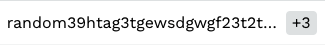
Should show the first item in the cell, along with a
+xrepresenting the number of remaining values. Tooltip should show a list of these values on hovering on+x.Overflow
Testing
Manually verified. Added UTs.
Checklist: