Practice projects.
I didn't bother too much making them for tiny screens. I wanted to build something that covered the project instructions and satisfied me, then keep moving on.
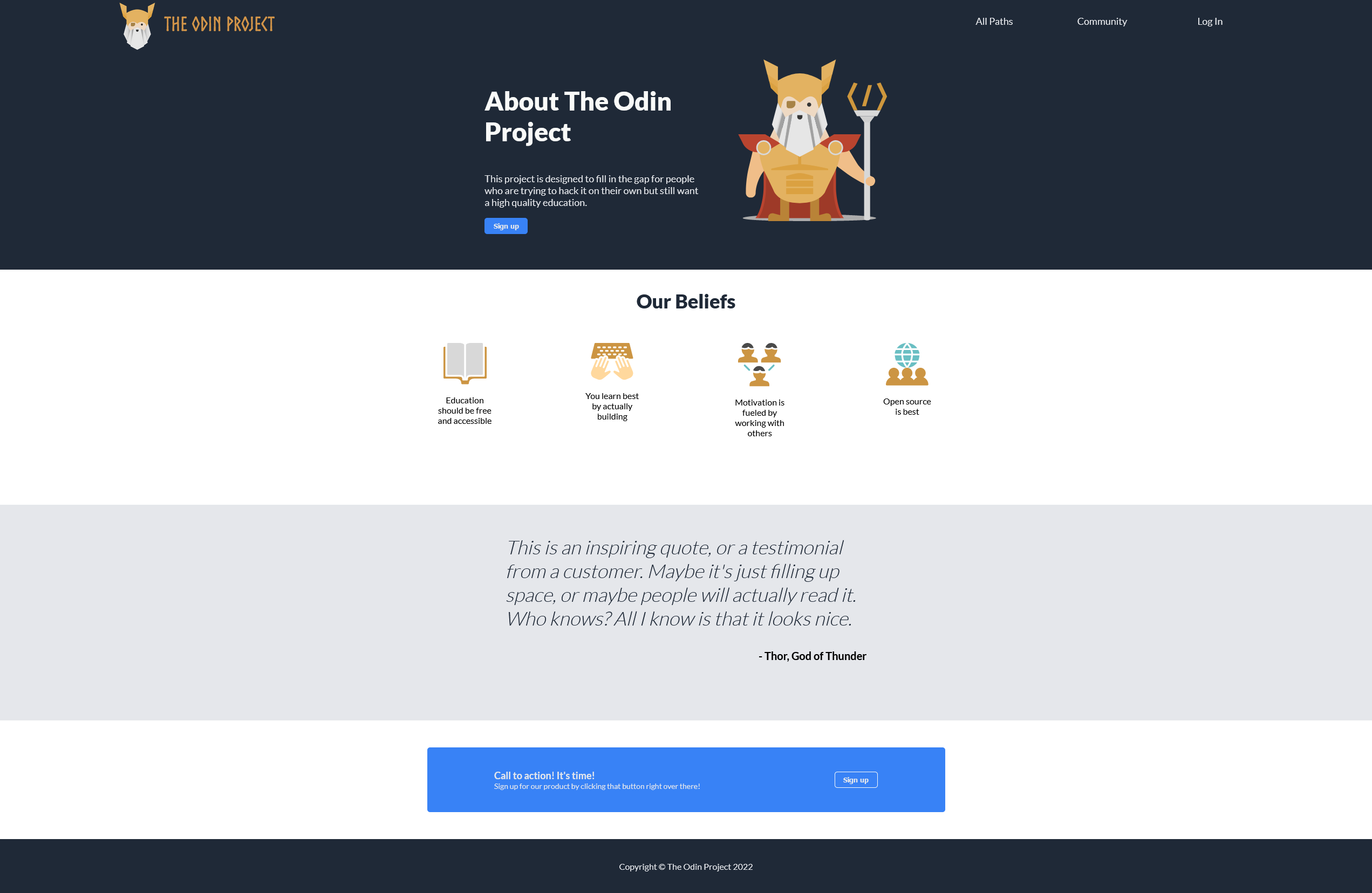
Basic HTML with a bit of CSS for fun.
I used information and images from the About page.
I mostly followed the style instructions, but added subtle changes (I like Lato).
Rounds are defined by the player. Draws count as completed rounds.
New branch ("rps-ui"). I didn't want to delete it. I didn't want to overdo this project, I am satisfied with the result.
Rounds fixed to 5.
I wanted to give CSS Grid a try.
Painting click to click.
Calculators look so simple in the front and so complex in the back...
Considerations:
- No multi-sign (something like "--+-1").
- I probably started with a bad approach.
- Dealing with subtraction as negative numbers, adding a '+' operator in the back, in place of '-'. This means that "3-1" goes as "3+(-1)".
- If there is any bug... sorry. ¯\_(ツ)_/¯


