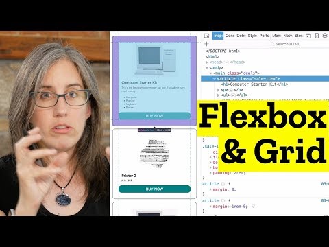
Exercise & rules
- See the "MakeThis.gif" and make that.
- Only change the CSS file. No changing of the HTML document (or the DOM).
- Use CSS grid for the overall layout and Flexbox for the card/
<article>"design". See if you can do it without media queries - remember (or look up): repeat, auto-fill, minmax? - Only use "rem" as the unit for margin, padding etc.
main {
    display: grid;
    grid-template-columns: repeat(auto-fill, minmax(300px, 1fr)); /* Keep adding new columns - even if theres is no content for them. content does not always take up full width */
    /*grid-template-columns: repeat(auto-fit, minmax(300px, 1fr));*/ /* Don't add more columns than theres is content for. && +content "always" take full width */
    grid-gap: 1rem;
}*Don't go directly to the solution - try to see if you can write it on your own first! Compare your work with Jenn Simmons' solution in the video. If you are totally lost you can use the video as a tutorial. It's important that you write and understand this yourself. *
Jen Simmons' video on this very example at https://www.youtube.com/watch?v=dQHtT47eH0M
SEE "css/style-solution.css"