implement filtering by marker type #83797
Conversation
Linux build failed because apt get failed, trying to trigger again
|
@tfenster Good approach. But how does it look when the filter input size reduces? |
|
Ping @misolori for UX. Any feedback? |
Very good point, that didn't look good in my initial version :) I've now increased the min-width and padding with the following result
|

|
Thanks @tfenster for taking a look at this, really appreciate the work you put into this! We ran this through our weekly ux sync today to see what the team thought of the ux and here is some feedback:
And when filtered:
I think because this does require some significant ux work we might want to first decide as a team the direction that we want to pursue before we accept a PR for this. |


|
@misolori Thanks for your feedback. To your points:
Of course, all just my 2 cents and you are making the decisions but I wanted to state that I have a hard time following the reasoning here. If you still feel like the dropdown thing is better, would you know of any place in VS Code where this approach is used so that I could take a look and understand how that could be done so I might be able to replicate that? I didn't find anything working like that |


The point here is that adding these additional toggles in the input field (which is now 4 toggles) adds additional weight that doesn't look very appealing.
I was wrong about this, we do show this text when your matches have no results and also show it in larger views (as you've shown)
Yes, our find widget is definitely cluttered and I'm personally not a fan how we display these actions. I think that's why we have a strong reaction to adding these toggles is that it adds more noise where we want to try to minimize it.
I respectfully disagree. I think that we always strive for a balance of efficiency and aesthetics. I'm not saying my proposal is perfect, but this does require more discussions about what the right pattern should be.
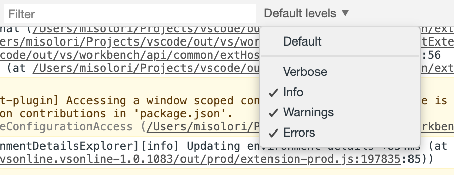
I think the team needs to discuss this more and do a few explorations, Chrome Dev Tools does something similar for log levels that uses a dropdown (but it's not part of the input field):
Firefox uses text toggles:
So I think it does require some explorations on our end to find the right pattern to go with. Once we do find the right pattern we want to go with I'll be sure to post an update in the main issue. I know you put a lot of work into this and really appreciate it, just hope you can understand the reasons why we need to explore this a bit more. |

|
@misolori Again, thanks for taking the time and providing this very detailed feedback. I would say we have to agree to disagree :) And I can for sure understand your reasoning now with more explanation although it still feels a bit weird to basically hear "you do the same as we but I reject it because I don't like it" from you. Anyway, I personally like the dev tools approach a lot, where the dropdown is not part of the input box. To me that seems like a more established and intuitive pattern (at the cost of one more click, but that seems unavoidable if you don't want multiple elements). Would it help to have a quick implementation along those lines? I think I should be able to provide that rather easily with the pieces I already have in place |
|
@tfenster Thanks for taking this up and coming up with a proposal. As you have already seen we have a very strict process for doing new UI. This has to go through our UX discussion and has to get approved by the team. Generally for such kind of features, we try to avoid them getting done through external PRs as the feedback loop will be slow. I see this PR is logically completed but needs some UX tweaks. So, I would take this PR as is and will incorporate the UX feedback. Hope it is fine for you? |
|
@sandy081 what are the implications of "So, I would take this PR as is and will incorporate the UX feedback"? Will you make the necessary changes here to get to a UX that works for your team? |
That works best for most 😄 . Getting the feedback from the community is also part of it. So I would keep posting the updates. |
That sounds perfect. It would have been a bit sad for me to just close this PR and what until something pops up but if you do the work and I can feedback, that of course works very well for me 😊 |
|
I would still say that you have done the majority of the work and gets the appreciation 🎉 . I would be just polishing the feature as we do always 😉 . So my UX proposal for this feature is as follows
Grouped all filters into single dropdown. This will make all filter parts (filter text, filters, results badge) as a single unit. |
|
@tfenster Conflicts have to be resolved before merging. Shall I go ahead and resolve them? |
Thanks a lot, I very much appreciate that. I personally think the filter element should be outside of the entry field like in the Chrome Dev Tools as Miguel showed. To me when it is insider the entry field, it reminds me too much of the type-ahead dropdowns e.g. when selecting countries in an order form and that works differently. |
|
Good point. Moving it outside will make it disconnected with the results badge. This leads to move results badge also outside which makes the UI not so appealing. How different this filter action from |
|
Ok, that definitely is valid as well. I just think having the filter element inside of the entry field suggests to me that it filters the entry while in truth it filters the results. Maybe keeping the gear symbol could work? That doesn't have such a strong connection for me |
|
I would not prefer the gear icon as it does not convey more filters. Filter icon is more closer to that. I understand your point but are you getting this feeling because above picture does not have problems panel? In the bigger perspective the filter input, actions and results might apt well? |
|
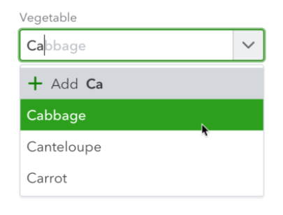
It just reminds me too much of something like this, probably because it is triangle shaped as well
But that might just be my perspective |
|
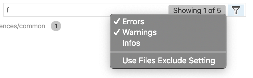
😮 The filters dropdown is different from above one as it is a list of filters with ✔️ that gets applied. Let's play around and see how it is. I have pushed the changes to master. Also asked the community to do the same. Hope we get more feedback. |
This PR fixes #47354
I have added three new checkboxes to the filter element in the problems view, one for each marker type (error, warning, info). This makes it more convenient to filter and allows scenarios where you want to e.g. only show errors with text "warning" which wasn't possible before:
I tried to follow the coding guidelines and hope I complied, but as this is my first VS Code PR, I might be wrong. In that case, any tips on what I missed are greatly appreciated