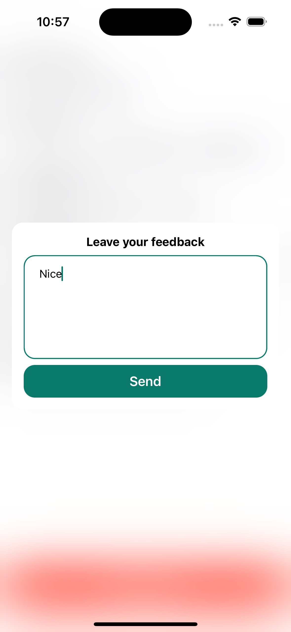
UIKit library for creating fully configurable alert screens
The example application is the best way to see AlertMaster in action. Simply open the AlertMasterExample.xcodeproj and run the AlertMasterExample scheme.
The library requires a dependency AppViewUtilits.
To integrate using Apple's Swift Package Manager, add the following as a dependency to your Package.swift:
dependencies: [
    .package(url: "https://github.com/moslienko/AlertMaster.git", from: "1.1.0")
]
Alternatively navigate to your Xcode project, select Swift Packages and click the + icon to search for AlertMaster.
If you prefer not to use any of the aforementioned dependency managers, you can integrate AlertMaster into your project manually. Simply drag the Sources Folder into your Xcode project.
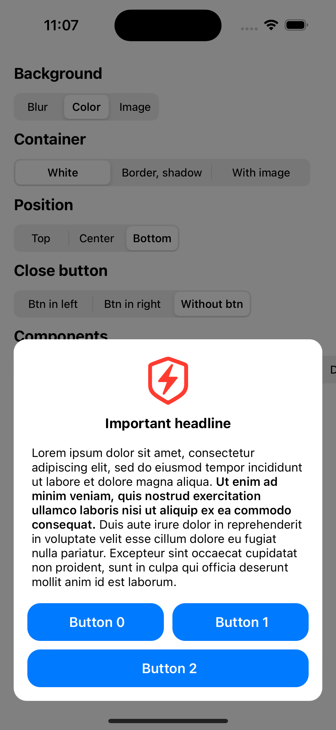
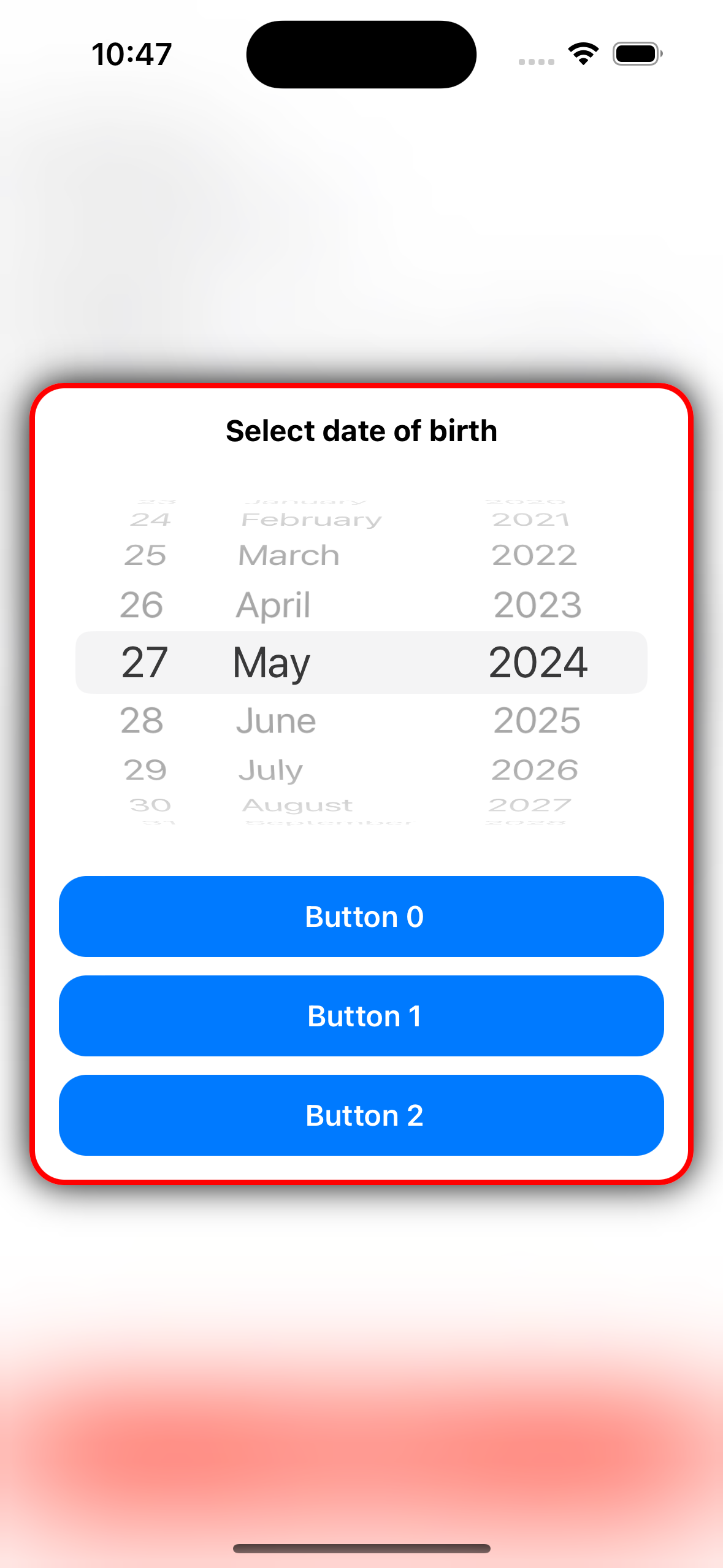
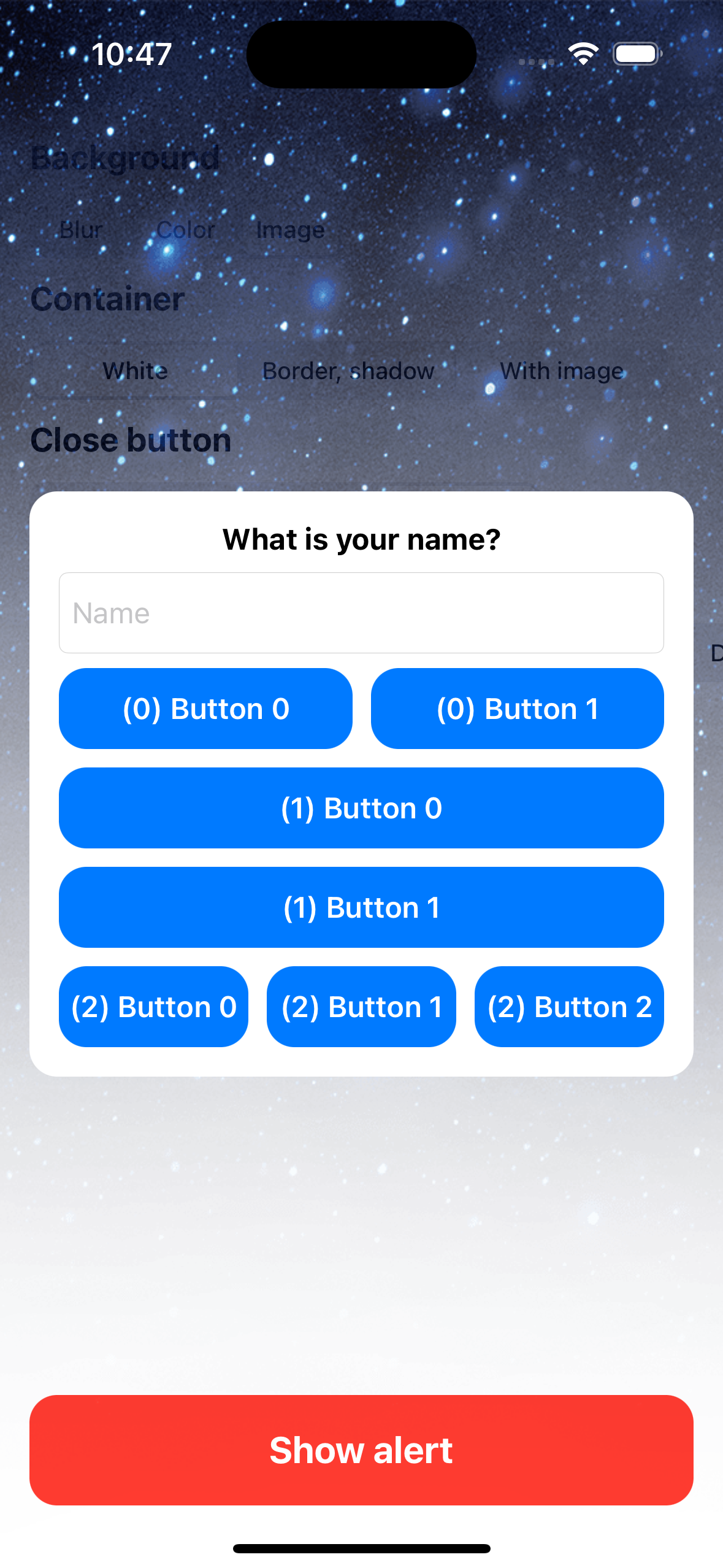
Components are UI elements that are added to the content of the alert. You can add the following elements or create them from your custom view using .custom
enum AlertComponents {
  case text(value: String, style: DecorateWrapper<UILabel>)
  case textView(value: NSAttributedString, style: DecorateWrapper<UITextView>)
  case image(_ imageView: UIImageView, height: CGFloat)
  case textField(
    value: String, style: DecorateWrapper<UITextField>,
    height: CGFloat, callback: ((String?) -> Void)?)
  case editedTextView(
    value: String, style: DecorateWrapper<UITextView>,
    height: CGFloat, callback: ((String?) -> Void)?)
  case timePicker(
    date: Date, style: DecorateWrapper<UIDatePicker>,
    height: CGFloat, callback: ((Date?) -> Void)?)
  case custom(view: UIView, height: CGFloat)
}All action buttons are added to the footer, which is displayed at the bottom after all components. Several layouts options are available.
enum ButtonLayout {
  /// Arrangement at which all buttons in the alert will have the same layout.
  case auto(buttons: [AppButton], position: ButtonPosition)
  /// An arrangement in which each individual group can have its own layout.
  case manual(buttonsGroup: [AlertButtonsGroup])
  /// Without buttons.
  case none
}
Please note that by default the buttons do not close the alert, so you need to specify this action yourself, for example as follows:
let closeButton = AppButton()
closeButton.addAction {
  alert.dismiss()
}
alert.buttonsLayout = .auto(buttons: [closeButton], position: .horizontal)To set styles and other parameters to ui elements it is recommended to use DecorateWrapper from AppViewUtilits. Example:
let headerStyle: DecorateWrapper<UILabel> = .wrap(style: {
  $0.numberOfLines = 0
  $0.textColor = .black
  $0.font = .systemFont(ofSize: 22, weight: .bold)
  $0.textAlignment = .center
})let alert = AlertMasterService(
components: [],
buttonsLayout: .none
)
alert.didDismissButtonTapped = {
print("Dismiss btn tapped")
}
let applyButton = AppButton()
let cancelButton = AppButton()
applyButton.addAction {
alert.dismiss()
}
cancelButton.addAction {
alert.dismiss()
}
alert.buttonsLayout = .auto(buttons: [cancelButton, applyButton], position: .horizontal)
let text = "Fill a profile now to get access to all the incredible features of the app"
let regularAttributes: [NSAttributedString.Key: Any] = [
.font: UIFont.systemFont(ofSize: 14), .foregroundColor: UIColor.black,
]
let boldAttributes: [NSAttributedString.Key: Any] = [
.font: UIFont.boldSystemFont(ofSize: 14), .foregroundColor: UIColor.black,
]
let attributedString = NSMutableAttributedString(string: text, attributes: regularAttributes)
let boldRange = (text as NSString).range(of: "all the incredible features")
attributedString.setAttributes(boldAttributes, range: boldRange)
let imageView = UIImageView(image: UIImage(systemName: "person.circle"))
imageView.tintColor = tintColor
imageView.contentMode = .scaleAspectFit
let components: [AlertComponents] = [
.image(imageView, height: 64),
.text(value: "Fill profile", style: headerStyle),
.textView(value: attributedString, style: textViewStyle),
.text(value: "What is your name?", style: subHeaderStyle),
.textField(
value: "", style: textFieldStyle, height: 44,
callback: { text in
applyButton.isEnabled = !(text ?? "").isEmpty
}),
.text(value: "Tell us briefly about yourself", style: subHeaderStyle),
.editedTextView(value: "", style: textViewEditedStyle, height: 80, callback: { _ in }),
]
alert.components = components
alert.show(in: self, with: viewModel.alertConfig)Show setting styles
let tintColor = UIColor(hex: "7F00FF")

let headerStyle: DecorateWrapper<UILabel> = .wrap(style: {
  $0.numberOfLines = 0
  $0.textColor = .black
  $0.font = .systemFont(ofSize: 22, weight: .bold)
  $0.textAlignment = .center
})
let subHeaderStyle: DecorateWrapper<UILabel> = .wrap(style: {
  $0.numberOfLines = 0
  $0.textColor = .black
  $0.font = .systemFont(ofSize: 16, weight: .bold)
  $0.textAlignment = .left
})
let textViewStyle: DecorateWrapper<UITextView> = .wrap(style: {
  $0.textAlignment = .center
})
let textViewEditedStyle: DecorateWrapper<UITextView> = .wrap(style: {
  $0.textAlignment = .left
  $0.font = .systemFont(ofSize: 15, weight: .regular)
  $0.layer.cornerRadius = 15
  $0.layer.borderColor = tintColor.cgColor
  $0.layer.borderWidth = 1.5
  $0.tintColor = tintColor
  $0.textContainerInset = UIEdgeInsets(top: 16.0, left: 16.0, bottom: 16.0, right: 16.0)
})

let textFieldStyle: DecorateWrapper<UITextField> = .wrap(style: {
  $0.textAlignment = .left
  $0.font = .systemFont(ofSize: 16, weight: .regular)
  $0.borderStyle = .roundedRect
  $0.tintColor = tintColor
  $0.layer.cornerRadius = 15
  $0.layer.borderColor = tintColor.cgColor
  $0.layer.borderWidth = 1.5
  $0.placeholder = "Name"
})

applyButton.setTitle("Apply", for: [])
applyButton.setTitleColor(.white, for: [])
applyButton.layer.cornerRadius = 15
applyButton.regularStyle = .wrap(style: {
  $0.backgroundColor = tintColor
})
applyButton.highlightedStyle = .wrap(style: {
  $0.backgroundColor = tintColor.withAlphaComponent(0.7)
})
applyButton.disabledStyle = .wrap(style: {
  $0.backgroundColor = tintColor.withAlphaComponent(0.3)
})
applyButton.titleLabel?.font = .boldSystemFont(ofSize: 18)
applyButton.heightAnchor.constraint(equalToConstant: 44).isActive = true
applyButton.isEnabled = false

cancelButton.setTitle("Cancel", for: [])
cancelButton.setTitleColor(tintColor, for: [])
cancelButton.layer.cornerRadius = 15
cancelButton.backgroundColor = .clear
cancelButton.layer.borderWidth = 1.5
cancelButton.regularStyle = .wrap(style: {
  $0.layer.borderColor = tintColor.cgColor
})
cancelButton.highlightedStyle = .wrap(style: {
  $0.layer.borderColor = tintColor.withAlphaComponent(0.7).cgColor
})
cancelButton.disabledStyle = .wrap(style: {
  $0.layer.borderColor = tintColor.withAlphaComponent(0.3).cgColor
})
cancelButton.titleLabel?.font = .boldSystemFont(ofSize: 18)
cancelButton.heightAnchor.constraint(equalToConstant: 44).isActive = true
Result:

All detailed customization of alert properties is done using the class AlertConfig.
struct AlertConfig {
  /// Config for parent window style.
  public var backgroundConfig: AlertBackgroundConfig
  /// Config for alert dismiss buttom style.
  public var closeButtonConfig: AlertCloseButtonConfig
  /// Config for alerts container style.
  public var containerConfig: AlertContainerConfig
  /// Config for alert action buttons.
  public var buttonsConfig: AlertButtonsConfig
  /// Config for swiping on the alert container.
  public var swipeConfig: AlertSwipeConfig
  /// Animation class that allows you to customize the appearance and closing animations of the alert.
  public var presentableService: AlertScreenPresentable
}
AlertBackgroundConfig
struct AlertBackgroundConfig {
 /// A Boolean value indicating whether tapping on the background should dismiss the alert.
 public var isAllowTapForDismiss: Bool
 /// A Boolean value indicating whether to apply a blur effect to the background.
 public var isNeedBlur: Bool
 /// The style of the blur effect to be applied to the background.
 public var blurStyle: UIBlurEffect.Style
 /// The background color of the alert.
 public var backgroundColor: UIColor
 /// An optional background image to be displayed behind the alert.
 public var backgroundImage: UIImage?
}
AlertCloseButtonConfig
struct AlertCloseButtonConfig {
 /// A Boolean value indicating whether the close button should be shown in the alert.
 public var isShowCloseButton: Bool
 /// The icon image for the close button.
 public var icon: UIImage
 /// The tint color for the close button.
 public var tintColor: UIColor
 /// The size of the close button.
 public var size: CGSize
 /// The position of the close button within the alert.
 public var position: Position
}
AlertContainerConfig
struct AlertContainerConfig {
/// The maximum height of the alert container as a percentage of the screen height.
public var maxAlertHeightIntPercentage: Float
/// The alert position on the screen.
public var containerPosition: AlertPosition
/// The insets for the container.
public var containerInsets: AlertContainerConfig.SideInset
/// The insets for the components within the container.
public var componentsInsets: UIEdgeInsets
/// The spacing between components within the container.
public var componentsSpacing: CGFloat
/// The corner radius of the container.
public var cornerRadius: CGFloat
/// The width of the container's border.
public var borderWidth: CGFloat
/// The background color of the container border.
public var borderColor: CGColor
/// The background color of the container.
public var backgroundColor: UIColor
/// The background image of the container.
public var backgroundImage: UIImage?
/// The parameters for the shadow of the container.
public var shadowParams: ShadowParams?
}
AlertButtonsConfig
struct AlertButtonsConfig {
 /// The horizontal spacing between buttons in the grid layout.
 public var horizontalGridSpacing: CGFloat
 /// The vertical spacing between buttons in the grid layout.
 public var verticalGridSpacing: CGFloat
 /// The maximum number of buttons to display in a single row of the grid layout.
 public var countButtonsInOneRow: Int
}
AlertSwipeConfig
public struct AlertSwipeConfig {
 ///  A Boolean value indicating whether the alert can be closed by swiping on it.
 public var isAllowSwipeForDismiss: Bool
 /// Minimum distance at which you can swipe the alert to the other side (for the bounce effect).
 public var insetForBounceInOtherDir: CGFloat
 /// Minimum distance at which the alert will be closed.
 public var minInsetForDismiss: CGFloat
}To create your own implementation of the alert screen appearance and closing animation, you need to create a class following the AlertScreenPresentable protocol.
class RotatePresentable: AlertScreenPresentable {
 func showView(backgroundView: UIView, alertView: UIView) {
   UIView.animate(withDuration: 0.35) {}
 }

 func hideView(backgroundView: UIView, alertView: UIView, finished: (() -> Void)?) {
   UIView.animate(withDuration: 0.35, animations: {}) { _ in
     finished?()
   }
 }
}
Then set it in the config:
var alertConfig = AlertConfig()
alertConfig.presentableService = RotatePresentable()AlertMaster
Copyright (c) 2024 Pavel Moslienko 8676976+moslienko@users.noreply.github.com
Permission is hereby granted, free of charge, to any person obtaining a copy
of this software and associated documentation files (the "Software"), to deal
in the Software without restriction, including without limitation the rights
to use, copy, modify, merge, publish, distribute, sublicense, and/or sell
copies of the Software, and to permit persons to whom the Software is
furnished to do so, subject to the following conditions:
The above copyright notice and this permission notice shall be included in
all copies or substantial portions of the Software.
THE SOFTWARE IS PROVIDED "AS IS", WITHOUT WARRANTY OF ANY KIND, EXPRESS OR
IMPLIED, INCLUDING BUT NOT LIMITED TO THE WARRANTIES OF MERCHANTABILITY,
FITNESS FOR A PARTICULAR PURPOSE AND NONINFRINGEMENT. IN NO EVENT SHALL THE
AUTHORS OR COPYRIGHT HOLDERS BE LIABLE FOR ANY CLAIM, DAMAGES OR OTHER
LIABILITY, WHETHER IN AN ACTION OF CONTRACT, TORT OR OTHERWISE, ARISING FROM,
OUT OF OR IN CONNECTION WITH THE SOFTWARE OR THE USE OR OTHER DEALINGS IN
THE SOFTWARE.