
Library for quick and easy creation of UITableViewCell's in a platform-standard style
The library requires a dependency AppViewUtilits.
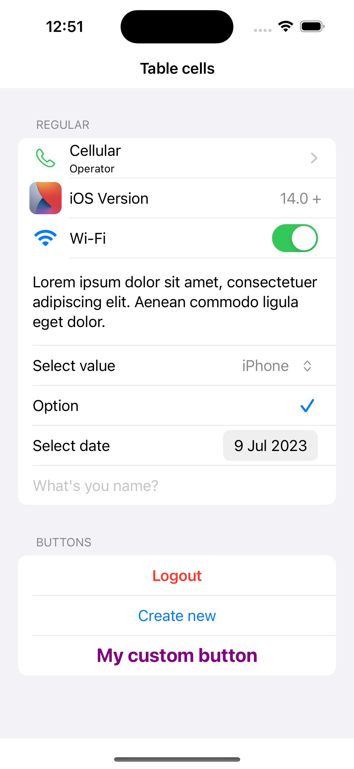
Supported cell types:
- ℹ️ Link cell
- ℹ️ Button cell
- ℹ️ Switch cell
- ℹ️ Text content cell
- ℹ️ Select values cell
- ℹ️ Checkmark cell
- ℹ️ Date picker cell
- ℹ️ Input field cell
The example application is the best way to see TableCellConfigurator in action. Simply open the TableCellConfigurator.xcodeproj and run the Example scheme.
To integrate using Apple's Swift Package Manager, add the following as a dependency to your Package.swift:
dependencies: [
    .package(url: "https://github.com/moslienko/TableCellConfigurator.git", from: "1.0.0")
]
Alternatively navigate to your Xcode project, select Swift Packages and click the + icon to search for TableCellConfigurator.
If you prefer not to use any of the aforementioned dependency managers, you can integrate TableCellConfigurator into your project manually. Simply drag the Sources Folder into your Xcode project.
import AppViewUtilits
import TableCellConfigurator
Connect cells:
self.tableView.registerCellClass(RegularCell.self)
self.tableView.registerCellClass(InputCell.self)
Models:
private var models: [[AppViewCellIdentifiable]] = []UITableViewDataSource:
func tableView(_ tableView: UITableView, cellForRowAt indexPath: IndexPath) - > UITableViewCell {
   guard let model = models[safe: indexPath.section]?[safe: indexPath.row] else {
		return UITableViewCell()
    }
    if let model = model as ? RegularCellModel {
        let cell = tableView.dequeueReusableCell(with: RegularCell.self,
            for: indexPath)
        cell.cellModel = model
        return cell
    } else if let model = model as ? InputCellModel {
        let cell = tableView.dequeueReusableCell(with: InputCell.self,
            for: indexPath)
        cell.cellModel = model
        return cell
    }

    return UITableViewCell()
}
Actions on tap:
 func tableView(_ tableView: UITableView, didSelectRowAt indexPath: IndexPath) {
    if let cellModel = models[safe: indexPath.section]?[safe: indexPath.row] as ? RegularCellModel,
        cellModel.type.isAllowLink {
            cellModel.action ? ()
            tableView.deselectRow(at: indexPath, animated: true)
        }
}static func createDefault(title: String, subtitle: String?, icon: UIImage?, style: UITableViewCell.CellStyle, accessoryType: UITableViewCell.AccessoryType, action: Callback?) -> RegularCellModelExample:
 let model = RegularCellModel.createDefault(
    title: "Cellular",
    subtitle: "Operator",
    icon: UIImage(systemName: "phone"),
    style: .default,
    accessoryType: .disclosureIndicator) {

}static func createActionButton(title: String, style: CellActionButtonStyle, isInteractiveEnabled: Bool, action: Callback?) -> RegularCellModelThere are the following styles for the button - two with preset styles and one with customisation:
enum CellActionButtonStyle {
    case accent
    case danger
    case custom(color: UIColor, textAlignment: UIListContentConfiguration.TextProperties.TextAlignment, font: UIFont)
}
Example:
let model = RegularCellModel.createActionButton(
    title: "Create new",
    style: .accent,
isInteractiveEnabled: true) {}static func createSwitch(title: String, icon: UIImage? = nil, isOn: Bool, onChange: DataCallback<Bool>?) -> RegularCellModelExample:
var isActiveWifi = true
 ...
let model = RegularCellModel.createSwitch(
    title: "Wi-Fi",
    icon: UIImage(systemName: "wifi"),
    isOn: isActiveWifi) { val in
        self.isActiveWifi = val
}Cell with multi-line text.
Example:
let model = RegularCellModel(
    title: "Lorem ipsum dolor sit amet, consectetuer adipiscing elit. Aenean commodo ligula eget dolor.",
    type: .textContent
)Clicking on a cell opens a menu with a list of values.
func createSelectValues(title: String, selectingValue: String?, icon: UIImage?, contextMenu: UIMenu) -> RegularCellModelExample:
let values = ["iPhone", "iPad", "Apple Watch", "Apple Vision Pro", "Mac"]
var selectingValue: String?
 ...
let model = RegularCellModel.createSelectValues(
    title: "Select value",
    selectingValue: selectingValue,
    icon: nil,
    contextMenu: createMenuForSelectingValues()
)
...
func createMenuForSelectingValues() - > UIMenu {
    UIMenu(title: "", children: self.values.map({ item in
        UIAction(title: item, handler: { [weak self] _ in
            self?.selectingValue = item
            self?.reloadData()
        })
    }))
}Example:
var isActiveOption = true
...
let model = RegularCellModel(
    title: "Option",
    type: .checkmark,
    style: .default,
    isOn: isActiveOption) {
    self.isActiveOption.toggle()
}static func createDatePicker(title: String, date: Date?, onChange: DataCallback<Date>?) -> RegularCellModelExample:
var selectedDate: Date?
...
let model = RegularCellModel.createDatePicker(
    title: "Select date",
    date: selectedDate,
    onChange: { value in
        self.selectedDate = value
        self.reloadData()
    }
)Some internal parameters can be changed by accessing RegularCellOptions
public struct RegularCellOptions {
    public var tintColor: UIColor
    public var layoutMargins: UIEdgeInsets
    public var iconSize: CGSize
    public var imageToTextPadding: CGFloat
}
Example:
model.options.tintColor = .redvar nameValue: String?
...
let model = InputCellModel(
text: nameValue,
placeholder: "What's you name?",
isInteractiveEnabled: true,
maxLimit: 64,
valueChanged: { value in
self.nameValue = value
}, valueFinishChanged: { value in
}
)Some internal parameters can be changed by accessing InputCellOptions
public struct InputCellOptions {
    public var tintColor: UIColor
    public var activeColor: UIColor
    public var disabledColor: UIColor
    public var layoutMargins: UIEdgeInsets
}
Example:
model.options.tintColor = .redmodel.isInteractiveEnabled = falseTableCellConfigurator
Copyright (c) 2023 Pavel Moslienko 8676976+moslienko@users.noreply.github.com
Permission is hereby granted, free of charge, to any person obtaining a copy
of this software and associated documentation files (the "Software"), to deal
in the Software without restriction, including without limitation the rights
to use, copy, modify, merge, publish, distribute, sublicense, and/or sell
copies of the Software, and to permit persons to whom the Software is
furnished to do so, subject to the following conditions:
The above copyright notice and this permission notice shall be included in
all copies or substantial portions of the Software.
THE SOFTWARE IS PROVIDED "AS IS", WITHOUT WARRANTY OF ANY KIND, EXPRESS OR
IMPLIED, INCLUDING BUT NOT LIMITED TO THE WARRANTIES OF MERCHANTABILITY,
FITNESS FOR A PARTICULAR PURPOSE AND NONINFRINGEMENT. IN NO EVENT SHALL THE
AUTHORS OR COPYRIGHT HOLDERS BE LIABLE FOR ANY CLAIM, DAMAGES OR OTHER
LIABILITY, WHETHER IN AN ACTION OF CONTRACT, TORT OR OTHERWISE, ARISING FROM,
OUT OF OR IN CONNECTION WITH THE SOFTWARE OR THE USE OR OTHER DEALINGS IN
THE SOFTWARE.