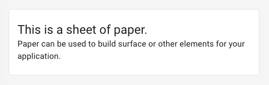
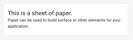
[Paper] Support outlined Card / Paper #15728
Comments
 oliviertassinari
added
component: Paper
oliviertassinari
added
component: Paper
|
@mjadczak Thank you for opening the issue. I wasn't aware the Material Specification was supporting it. I'm tempted to encourage this API: <Paper variant="outlined">It would invalidate the elevation prop. |
That's going to be the tricky part. AFAIK, you can only do this with a background image (or color). The content is constrained to the content box. Instead the border would have to be an overlay that mirrors the Paper's size. |
|
@mbrookes What API do you prefer? |
|
@oliviertassinari The API you proposed looks fine, it's the implementation of it that may prove challenging. |
|
@mbrookes I would propose the following: diff --git a/packages/material-ui/src/Paper/Paper.js b/packages/material-ui/src/Paper/Paper.js
index 981db55f4..1db7e2040 100644
--- a/packages/material-ui/src/Paper/Paper.js
+++ b/packages/material-ui/src/Paper/Paper.js
@@ -23,6 +23,9 @@ export const styles = theme => {
rounded: {
borderRadius: theme.shape.borderRadius,
},
+ outlined: {
+ border: `1px solid ${theme.palette.grey[300]}`,
+ },
...elevations,
};
};
@@ -34,6 +37,7 @@ const Paper = React.forwardRef(function Paper(props, ref) {
component: Component = 'div',
square = false,
elevation = 1,
+ variant = 'elevation',
...other
} = props;
@@ -44,9 +48,10 @@ const Paper = React.forwardRef(function Paper(props, ref) {
const className = clsx(
classes.root,
- classes[`elevation${elevation}`],
{
[classes.rounded]: !square,
+ [classes.outlined]: variant === 'outlined',
+ [classes[`elevation${elevation}`]]: variant === 'elevation',
},
classNameProp,
);
@@ -82,6 +87,7 @@ Paper.propTypes = {
* If `true`, rounded corners are disabled.
*/
square: PropTypes.bool,
+ variant: PropTypes.oneOf(['outlined', 'elevation']),
};
export default withStyles(styles, { name: 'MuiPaper' })(Paper);@mjadczak What do you think? |
oliviertassinari
added
the
good first issue
|
This seems reasonable to me, and would be ok for my needs, but what it doesn't address (I don't think), and what @mbrookes was talking about is this (from Material docs): |
|
@mjadczak It would work with: box-shadow: inset 0px 0px 0px 1px red;I'm not sure what would be the right API to support the border as well as the inset box shadow 🤔. Ideas? |
|
Ah, I didn't think of inset shadows. In fact, with this it means that you could enable this behaviour just by changing the theme (i.e. change the shadow for 0 elevation), right? Is there any downside to this approach? If not, why do you think that both the border and inset shadow approach to this effect should be supported? |
|
@mjadczak Correct. I'm not aware of any downside. I'm having a hard time picturing a good API here. |
|
What's wrong with the original API proposed, i.e. <Paper variant="outlined">? Alternatively, this could be something set in the theme and apply to all |
|
@mjadczak How would you expose an implementation that uses box-shadow and another one that uses border? I find the two approaches interesting. Should we expose both? Which one should we expose by default? |
|
It seems it should be outlined by default when |
|
@mbrookes Oh wow, that's great to know. How do we handle it 🤔? |
|
Something like this would do it: --- a/packages/material-ui/src/Paper/Paper.js
+++ b/packages/material-ui/src/Paper/Paper.js
@@ -3,6 +3,7 @@ import PropTypes from 'prop-types';
import clsx from 'clsx';
import warning from 'warning';
import withStyles from '../styles/withStyles';
+import { fade } from '../styles/colorManipulator';
export const styles = theme => {
const elevations = {};
@@ -24,6 +25,9 @@ export const styles = theme => {
borderRadius: theme.shape.borderRadius,
},
...elevations,
+ outlined: {
+ boxShadow: `inset 0px 0px 0px 1px ${fade(theme.palette.grey[300], 0.5)}`,
+ },
};
};
@@ -47,6 +51,7 @@ const Paper = React.forwardRef(function Paper(props, ref) {
classes[`elevation${elevation}`],
{
[classes.rounded]: !square,
+ [classes.outlined]: elevation === 0,
},
classNameProp,
);But it's a breaking change. A variant prop that only applies when |
|
Maybe we could use the following API. The first value of the enum behind the default one. variant?: 'elevation' | 'outlined';
outlined?: 'border' | 'boxShadow';And in practice:
|
|
I kind of feel like the boxShadow implementation should be the default, if it plays properly with having a media card header. I don't really see the advantage of having both implementations available—do you think there is one? I think it may just cause confusion. |
|
The advantage I see with the border approach is how popular it is, hence simpler to override. You have a border-color attribute and the option to compound the border with a box shadow at the same time. From my perspective, the image problem is not the most common use case. What should we optimize for? |
|
Why do you say that the border approach is more popular? Just in terms of other material libraries using it? Even if this is the case, I kind of think that if you're going to the trouble of customising the outlined variant of your 0dp-elevated cards, you can handle doing that yourself through the |
|
@mjadczak I'm saying it's more popular because most of the UI components people are building/using follow this approach (we are more in the business of saving people time than implementing material design down to the last pixel). It's the least surprising option we have. |
|
What about using the diff --git a/packages/material-ui/src/Paper/Paper.js b/packages/material-ui/src/Paper/Paper.js
index 981db55f4..1db7e2040 100644
--- a/packages/material-ui/src/Paper/Paper.js
+++ b/packages/material-ui/src/Paper/Paper.js
@@ -23,6 +23,9 @@ export const styles = theme => {
rounded: {
borderRadius: theme.shape.borderRadius,
},
+ outlined: {
+ outline: `1px solid ${theme.palette.grey[300]}`,
+ },
...elevations,
};
}; |
oliviertassinari
added
component: card
oliviertassinari
added
new feature
oliviertassinari
added
the
component: Paper
oliviertassinari
removed
the
priority: important
|
@LorenzHenk As far as I know, there is no radius support for the outline CSS property. I spend more time looking at the problem, I think that we should go with the following approach: diff --git a/packages/material-ui/src/Paper/Paper.d.ts b/packages/material-ui/src/Paper/Paper.d.ts
index 02de56d36..3d1a5fd31 100644
--- a/packages/material-ui/src/Paper/Paper.d.ts
+++ b/packages/material-ui/src/Paper/Paper.d.ts
@@ -6,11 +6,13 @@ export interface PaperProps
component?: React.ElementType<React.HTMLAttributes<HTMLElement>>;
elevation?: number;
square?: boolean;
+ variant?: 'elevation' | 'outlined';
}
export type PaperClassKey =
| 'root'
| 'rounded'
+ | 'outlined'
| 'elevation0'
| 'elevation1'
| 'elevation2'
diff --git a/packages/material-ui/src/Paper/Paper.js b/packages/material-ui/src/Paper/Paper.js
index 9b1a9ee36..0c042ba19 100644
--- a/packages/material-ui/src/Paper/Paper.js
+++ b/packages/material-ui/src/Paper/Paper.js
@@ -22,6 +22,9 @@ export const styles = theme => {
rounded: {
borderRadius: theme.shape.borderRadius,
},
+ outlined: {
+ border: `1px solid ${theme.palette.divider}`,
+ },
...elevations,
};
};
@@ -33,6 +36,7 @@ const Paper = React.forwardRef(function Paper(props, ref) {
component: Component = 'div',
square = false,
elevation = 1,
+ variant = 'elevation',
...other
} = props;
@@ -46,9 +50,10 @@ const Paper = React.forwardRef(function Paper(props, ref) {
<Component
className={clsx(
classes.root,
- classes[`elevation${elevation}`],
{
[classes.rounded]: !square,
+ [classes[`elevation${elevation}`]]: variant === 'elevation',
+ [classes.outlined]: variant === 'outlined',
},
className,
)}
@@ -86,6 +91,10 @@ Paper.propTypes = {
* If `true`, rounded corners are disabled.
*/
square: PropTypes.bool,
+ /**
+ * The variant to use.
+ */
+ variant: PropTypes.oneOf(['elevation', 'outlined']),
};
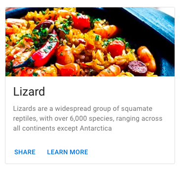
export default withStyles(styles, { name: 'MuiPaper' })(Paper);While the box-shadow approach can look better, it's not always the case. Using border is safer, especially with light images. It's the approach used by Google Keep, Google Search rich snippets, and Vuetify.
|

 oliviertassinari
added
the
good first issue
oliviertassinari
changed the title
oliviertassinari
added
the
good first issue
oliviertassinari
changed the title
|
Working on this. |
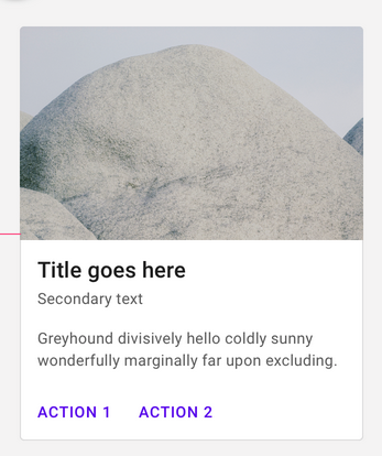
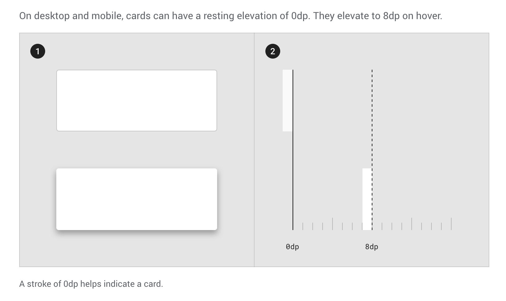
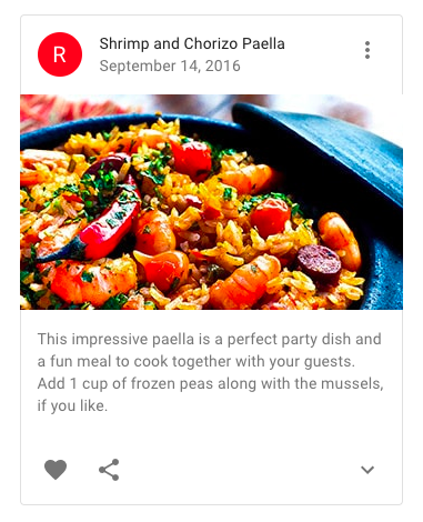
The Material spec states that cards on the desktop have 0dp elevation, and should be outlined instead of being delimited using their shadow. I think this variant should be supported.
This has been mentioned in an unrelated issue, but seems to not have been brought back up.
Expected Behavior 🤔
There should be a way to get an outlined
CardorPaperwith 0dp elevation.This could either take the form of
<Card variant="outlined">(issues - should this automatically set elevation to 0? Should it work with elevation not 0?) or by automatically adopting the style when<Card elevation={0}>is used (issues - does this mean you cannot have a no-outline no-shadowCard?)I'm not sure whether determining in some global fashion whether we are on "desktop" or not is feasible and whether it should change the default elevation of the card - my instinct is that it should not.
Current Behavior 😯
Currently a
CardorPaperwith no elevation is flat with no outline or shadow and there is no outlined variant.Examples 🌈
Material spec states under the "Resting elevation and environment" heading that
and the second image in that section illustrates this.
The styles implemented in material-components-web could be an inspiration for this, but it basically boils down to applying a border correctly and making sure this does not impact spacing (e.g. in the Material docs example, the outline seamlessly merges into the media block at the top of the card).
Context 🔦
I am writing a desktop-only web app using a dense Material design and when there are lots of components on the screen, a flat outlined style is easier to look at and use.
The text was updated successfully, but these errors were encountered: