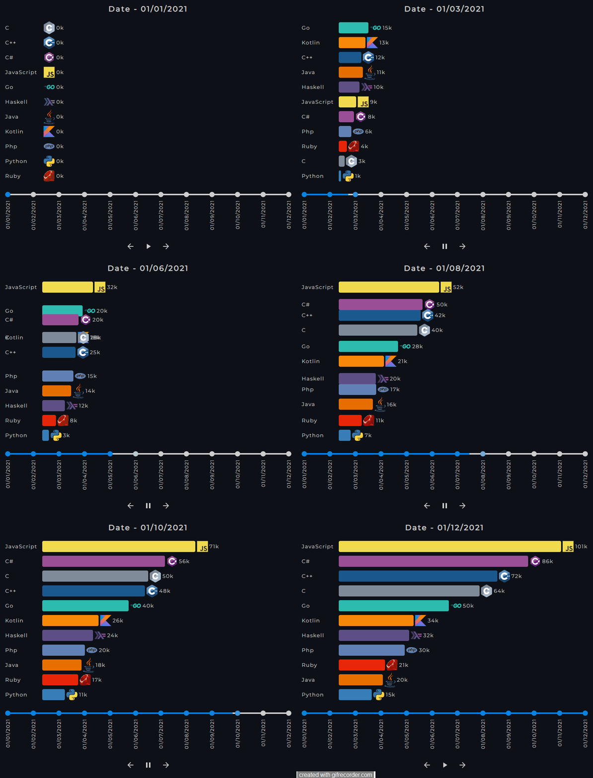
Highly customizable, animated, responsive, and dependency-free Evolution Graph implementation. The package is built with Vanilla JavaScript and is used to create flexible data visualizations and present evolution relationships between entities.
Custom graph demo | Repository
Custom graph demo | Repository
Thanks to Abraham Hernandez for the programming-languages-logos, used in the above demos.
$ npm install evolution-graphor
$ yarn add evolution-graphimport React from "react";
import EvolutionGraph from "evolution-graph";
import "evolution-graph/src/css/styles.css";
const data = [
{
label: "Python",
className: "python",
color: "#387EB8",
image: "./assets/images/python.svg",
values: [0, 3, 4, 7, 8, 9, 9, 10, 11, 12, 13, 15],
},
{
label: "Ruby",
className: "ruby",
color: "#E82609",
image: "./assets/images/ruby.svg",
values: [0, 2, 4, 5, 6, 8, 10, 13, 14, 17, 20, 21],
},
{
label: "JavaScript",
className: "javascript",
color: "#F0DB4F",
image: "./assets/images/javascript.svg",
values: [0, 2, 3, 6, 7, 10, 14, 20, 20, 24, 28, 32],
},
];
const labels = [
"01/01/2021",
"01/02/2021",
"01/03/2021",
"01/04/2021",
"01/05/2021",
"01/06/2021",
"01/07/2021",
"01/08/2021",
"01/09/2021",
"01/10/2021",
"01/11/2021",
"01/12/2021",
];
const App = () => {
let graph = null;
// graph.goToNextStep()
// graph.goToPreviousStep()
// graph.pause()
// graph.play()
// graph.setCurrentStep(3)
return (
<div className="app">
<EvolutionGraph
data={data}
labels={labels}
autoPlay={false}
barDataGap={4}
barLabelWidth={100}
barThickness={20}
barTransitionTopInterval={750}
className="custom-evolution-graph"
gap={10}
order="desc"
stepInterval={1500}
showActionButtons
timelineTrackColor="#cecece"
timelineTrackFillColor="#0984e3"
timelineMarkerColor="#cecece"
timelineMarkerSize={14}
timelineTrackThickness={4}
getController={(controllerInstance) => {
graph = controllerInstance;
}}
onChange={(currentStep) => {
console.log(currentStep);
}}
renderBarValue={(value) => `${value}k`}
renderGraphTitle={(title) => `Date - ${title}`}
/>
</div>
);
};
export default App;Download the latest package version and unpack it in your project.
<!DOCTYPE html>
<html lang="en">
  <head>
    <meta charset="UTF-8" />
    <meta http-equiv="X-UA-Compatible" content="IE=edge" />
    <meta name="viewport" content="width=device-width, initial-scale=1.0" />
    <link rel="stylesheet" href="./vendor/evolution-graph/src/css/styles.css" />
    <title>Evolution Graph</title>
  </head>
  <body>
    <div id="evolution-graph-example"></div>
    <script type="module">
      import EvolutionGraph from "./vendor/evolution-graph/Controller.js";

      const data = [
        {
          label: "Python",
          className: "python",
          color: "#387EB8",
          image: "./assets/images/python.svg",
          values: [0, 3, 4, 7, 8, 9, 9, 10, 11, 12, 13, 15],
        },
        {
          label: "Ruby",
          className: "ruby",
          color: "#E82609",
          image: "./assets/images/ruby.svg",
          values: [0, 2, 4, 5, 6, 8, 10, 13, 14, 17, 20, 21],
        },
        {
          label: "JavaScript",
          className: "javascript",
          color: "#F0DB4F",
          image: "./assets/images/javascript.svg",
          values: [0, 2, 3, 6, 7, 10, 14, 20, 20, 24, 28, 32],
        },
      ];

      const labels = [
        "01/01/2021",
        "01/02/2021",
        "01/03/2021",
        "01/04/2021",
        "01/05/2021",
        "01/06/2021",
        "01/07/2021",
        "01/08/2021",
        "01/09/2021",
        "01/10/2021",
        "01/11/2021",
        "01/12/2021",
      ];

      const graph = new EvolutionGraph({
        data,
        labels,
        autoPlay: false,
        barDataGap: 4,
        barLabelWidth: 100,
        barThickness: 20,
        barTransitionTopInterval: 750,
        className: "custom-evolution-graph",
        gap: 10,
        order: "desc",
        showActionButtons: true,
        stepInterval: 1500,
        timelineTrackColor: "#cecece",
        timelineTrackFillColor: "#0984e3",
        timelineMarkerColor: "#cecece",
        timelineMarkerSize: 14,
        timelineTrackThickness: 4,
        onChange: (currentStep) => {
          console.log(currentStep);
        },
        renderBarValue: (value) => `${value}k`,
        renderGraphTitle: (title) => `Date - ${title}`,
      });

      // graph.goToNextStep()
      // graph.goToPreviousStep()
      // graph.pause()
      // graph.play()
      // graph.setCurrentStep(3)

      graph.render("#evolution-graph-example");
    </script>
  </body>
</html>type: Array
Array of objects, each representing one bar on the graph. Must have the same length as labels.
type: Array
Array of strings, each representing one label on the graph timeline. Must have the same length as data.
type: Boolean
default: false
Play the graph on component mount.
type: Number
default: 4
Gap between bar and bar data, in pixels.
type: Number
default: 100
Width of the bar labels, in pixels.
type: Number
default: 20
Bar thickness, in pixels.
type: Number
default: stepInterval / 2
Bar transition top time, in milliseconds.
type: String
default: ""
Custom CSS class applied to the graph container.
type: Number
default: "desc"
Gap between graph bars, in pixels.
type: String
default: "desc"
Graph bars order. Can be either "desc" or "asc".
type: Boolean
default: true
Action buttons visibility.
type: Number
default: 1500
Step transition time, in milliseconds.
type: String
default: "#cecece"
Background color of the timeline track.
type: String
default: "#0984e3"
Background color of the timeline track fill.
type: String
default: "#cecece"
Background color of the timeline markers.
type: Number
default: 14
Width and height of the timeline markers, in pixels.
type: Number
default: 4
Height of the timeline track, in pixels.
default: (controller:Controller) => controller
Returns the graph controller instance. React prop only.
default: (currentStep:Number) => currentStep
Returns the current step when the graph changes.
default: (value:Number) => value
Returns the current bar value for handling.
default: (title:String) => title
Returns the current graph title for handling.
Go to the next step.
Go to the previous step.
Pause the graph if it is playing.
Play step by step.
argument: selector
argument type: String
Create and append the graph as a child of the element selected by the selector passed as an argument.
argument: step
argument type: Number
Set the current step using the index passed as argument.
- renderBarLabel callback prop
- playIcon prop
- pauseIcon prop
- previousIcon prop
- nextIcon prop
- manage labels exibition on window resize
- Global types declaration
- Tests
- showBarLabel prop
- showBarValue prop
- showBarImage prop
- onClickTimelineLabel prop
- onClickBar prop

