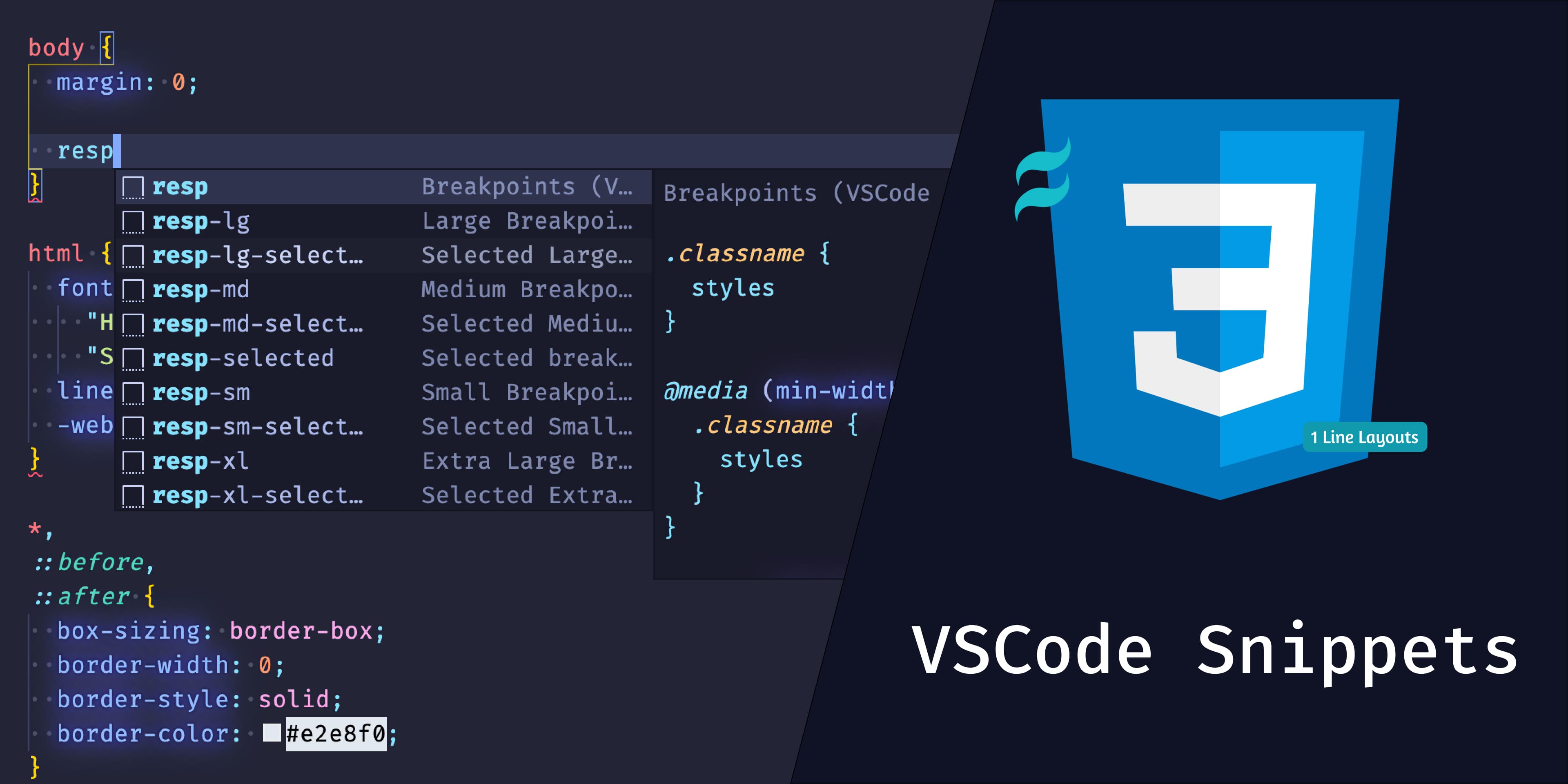
Collection of CSS Snippets to make your life easier by auto-completing common css rules, Tailwind utility classes as css rules - Tailwind and 1 line layouts
It's not debatable, most of us got used to utility classes from Tailwind, BootStrap etc,. But when you come back to write plain CSS, wouldn't be great to have those utility classes converted as snippets instead of typing the CSS rules?
Apart from CSS Utility snippets, collection of snippets from popular CSS examples found all over the web can be found.
To see the list of all the CSS Snippets, go here →
Want to have your own favourite CSS Snippets in this extension, see Contributing →
Install via the Visual Studio Code Marketplace →
You can enable tab completion (recommended) by opening
Code > Preferences > Settings (on a Mac) and applying
"editor.tabCompletion": "onlySnippets" to your personal settings
| Snippet | Purpose |
|---|---|
css-reset |
An opinionated set of base styles Cloned from Tailwind Preflight - Original File |
| Snippet | Purpose |
|---|---|
hover |
:hover |
focus |
:focus |
active |
:active |
disabled |
:disabled |
visited |
:visited |
first |
:first-child |
last |
:last-child |
even |
:nth-child(2n) |
odd |
:nth-child(odd) |
nth-child |
:nth-child(rule) |
| Snippet | Purpose |
|---|---|
resp |
Get all tailwind breakpoints - 640px - 768px - 1024px - 1280px |
resp-sm |
Get tailwind breakpoint - sm - 640px |
resp-md |
Get tailwind breakpoint - md - 768px |
resp-lg |
Get tailwind breakpoint - lg - 1024px |
resp-xl |
Get tailwind breakpoint - xl - 1280px |
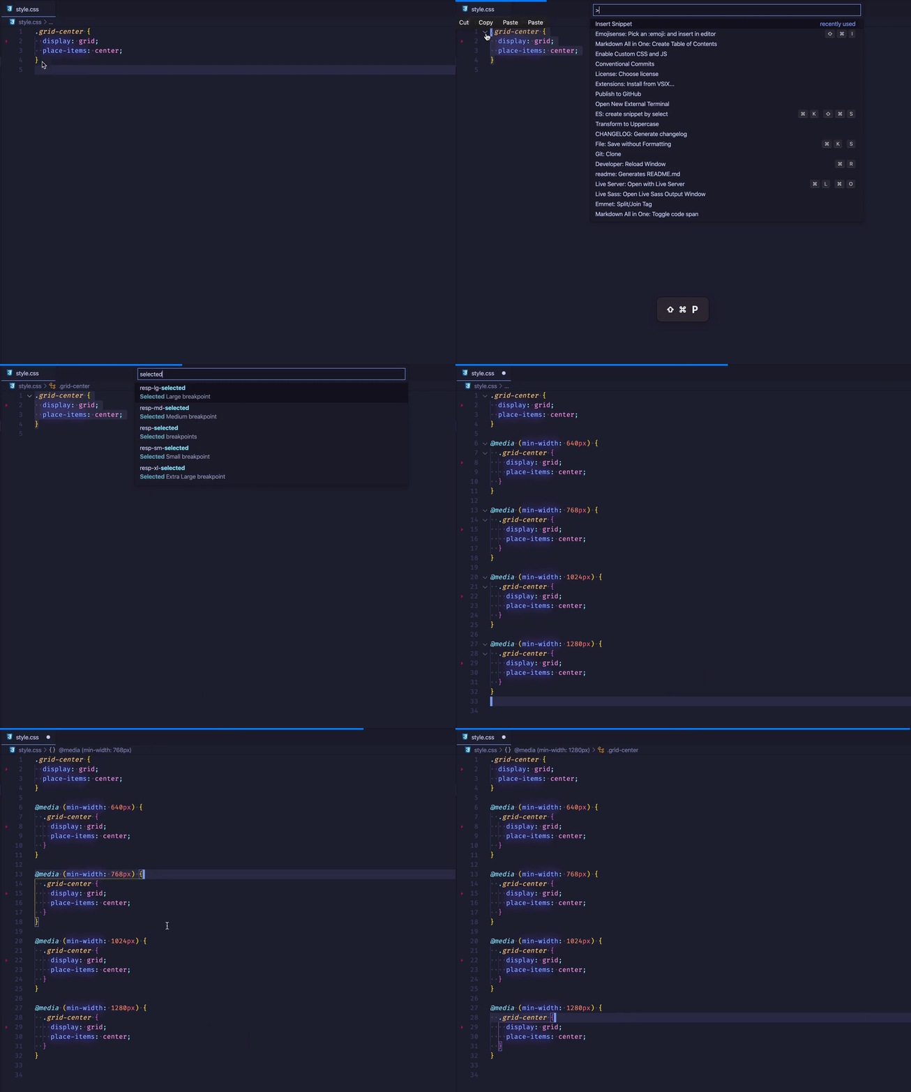
resp-selected |
Get all tailwind breakpoints for selected class/classes - 640px - 768px - 1024px - 1280px See how → |
resp-sm-selected |
Get tailwind breakpoint for selected class/classes - sm - 640px See how → |
resp-md-selected |
Get tailwind breakpoint for selected class/classes - md - 768px See how → |
resp-lg-selected |
Get tailwind breakpoint for selected class/classes - lg - 1024px See how → |
resp-xl-selected |
Get tailwind breakpoint for selected class/classes - xl - 1280px See how → |
List of all FlexBox Snippets →
List of all Spacing Snippets →
Learn 1linelayouts in detail from Web Dev →
| Snippet | Purpose |
|---|---|
super-centered |
place-items: center; |
deconstructed-pancake |
flex: 0 1 baseWidth}; |
sidebar-says |
grid-template-columns: minmax(min, max) ...}; |
pancake-stack |
grid-template-rows: auto 1fr auto; |
classic-holy-grail-layout |
grid-template: auto 1fr auto / auto 1fr auto; |
12-span-grid |
grid-template-columns: repeat(12, 1fr); |
ram |
grid-template-columns: repeat(auto-fit, minmax(base, 1fr)); |
line-up |
justify-content: space-between; |
clamping-my-style |
clamp(min, actual, max); |
respect-for-aspect |
aspect-ratio: width / height}; |
This is an Open Source Project with MIT License.
You can also contribute to this extension by adding your own list of CSS Snippets which you think will help others increase their productivity.
See Contributing Docs → for detailed guidance.
Snippet Ideation:
Snippet Generation:
Docs Inspiration:
Contributing Inspiration:
Huge thanks 🙏: to above wonderful persons for creating awesome projects which helped me build this project.


