-
-
Notifications
You must be signed in to change notification settings - Fork 3.1k
New issue
Have a question about this project? Sign up for a free GitHub account to open an issue and contact its maintainers and the community.
By clicking “Sign up for GitHub”, you agree to our terms of service and privacy statement. We’ll occasionally send you account related emails.
Already on GitHub? Sign in to your account
UI Design: Thoughts and mockups #490
Comments
|
@ziburski this is awesome - I'll be having a close look soon. You should consider joining us for the bi-weekly cms planning meeting tomorrow, it's a community thing. More info here: https://github.com/netlify/netlify-cms/wiki |
|
@ziburski Just jumping in here quickly to note how fantastic this exploration is! Thanks as well for sharing your Sketch file. I want to spend some time to evaluate this further and further the concepts presented. 🙌🏼 Will follow up as soon as I can. |
|
@ziburski I really love how this looks and works, and appreciate the thoroughness of thought. I have one accessibility concern for the fields like booleans, where the fields names are very far away from their controls. It does make for a nicely balanced layout, but for a low-vision user who zooms in very close, it's difficult to associate labels with controls when both can't be seen on the screen at the same time. |
|
Great, I’m happy you like it and look forward to hearing further thoughts! @verythorough That’s a good point! They are very far apart right now, even for users with good vision. A hover row highlight would help a little in that case. Would be interesting to experiment with a few different layouts here. |
|
@ziburski I love the simplicity of this, great work! I feel it's a much better solution to the current side-by-side editing approach - I feel that's too chaotic and overwhelming for the average user. I could easily imagine showing one of my clients this interface and have them just "get it", without needing extensive training. |
|
From @ziburski in Gitter:
The latest is that @neutyp has begun digging into some of the UX intricacies of moving the CMS UI forward. The design in this issue has been a strong catalyst, but it was stated that the final UI may look different. We definitely want to work through this improvement in the open. @ziburski to what extent are you able to contribute? e.g. collaborating on further design mockups, writing code, etc. Really loving what you've brought so far. Let us know! |
|
Sounds good! I can help with iterating on the mockups and any remaining design problems. A more open design process would be great I think, happy to collaborate. I’m not too comfortable writing production code here, but I can definitely do quick prototypes or tweaks if needed. It would be great to hear from @neutyp what the thinking towards a realistic UI revamp is, and which features are being worked on right now. |
|
@ziburski we're actually working on a brand new media library right now in #350 and haven't done any design or UX work (just using components as-is from React Toolbox). Would you be up for mocking a media library and how it would integrate with the vision you laid out above? @neutyp also, can you provide a quick overview of the UX considerations discussed in last week's meeting for posterity/collaboration? |
|
@erquhart Yeah, I’ll give it a shot in the next few days. |
|
@ziburski, I wanted to see if you'd made an progress. I'm poking around at some of the media stuff to support our editors. If you had some designs I could possibly lend a hand implementing them. |
|
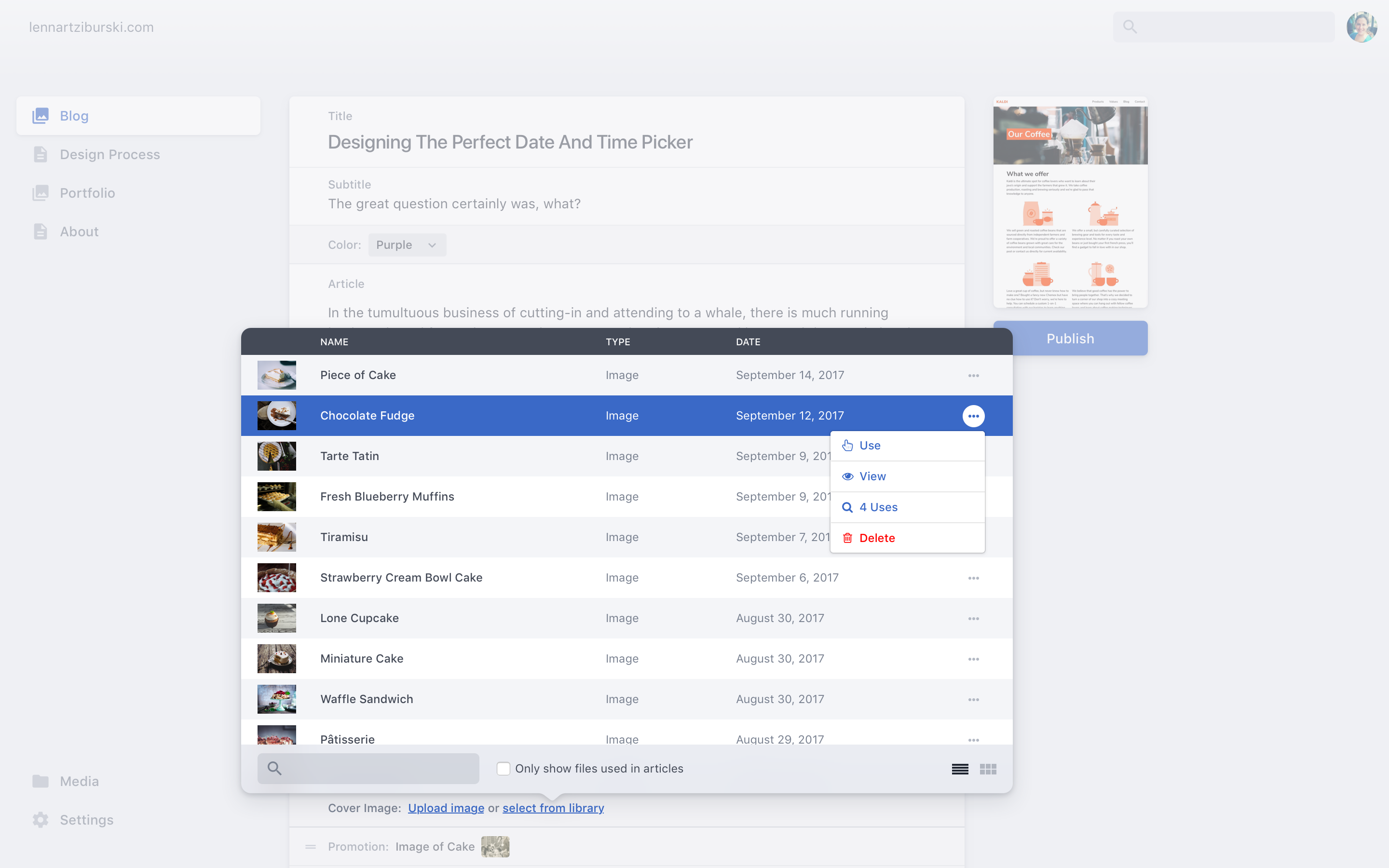
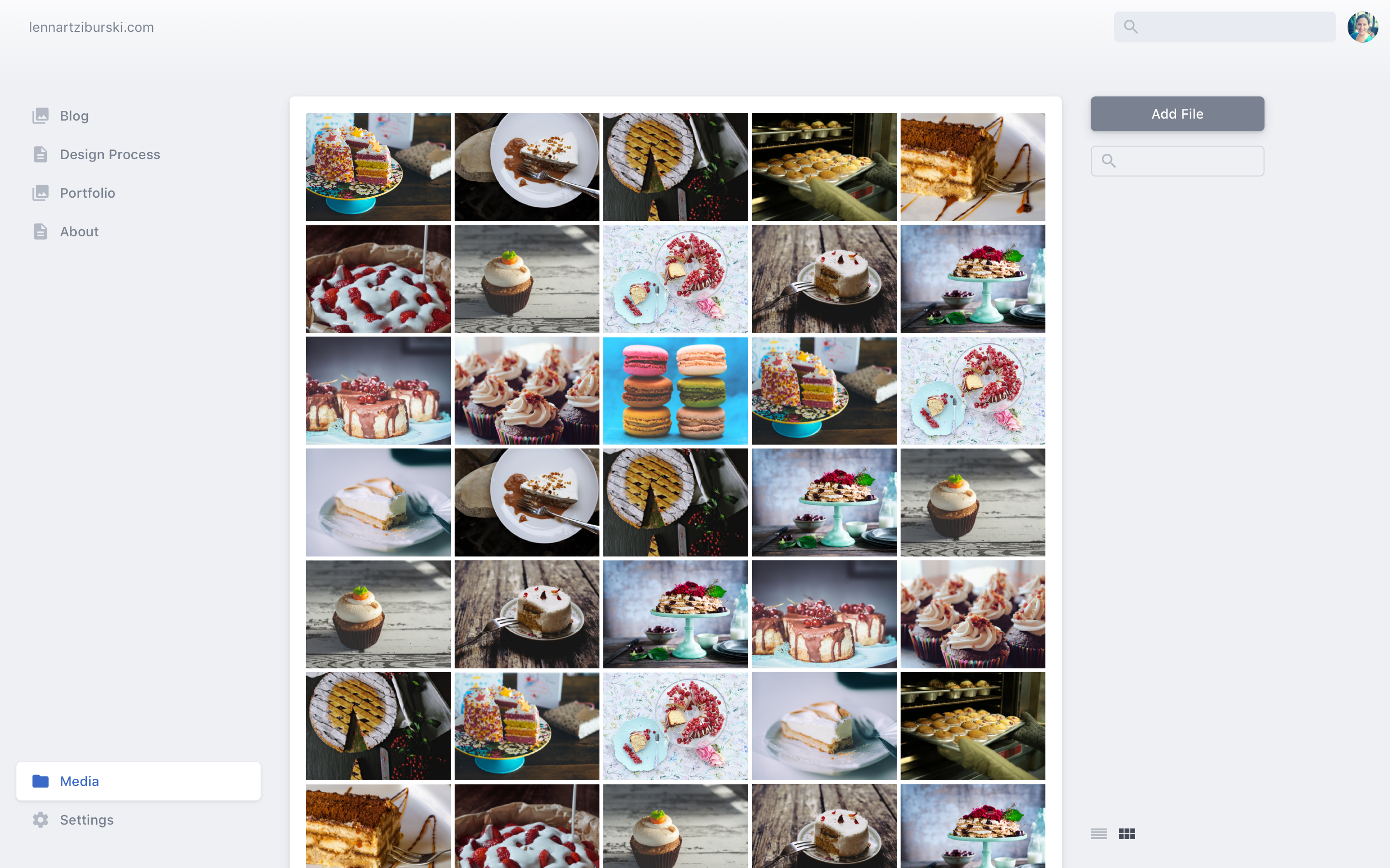
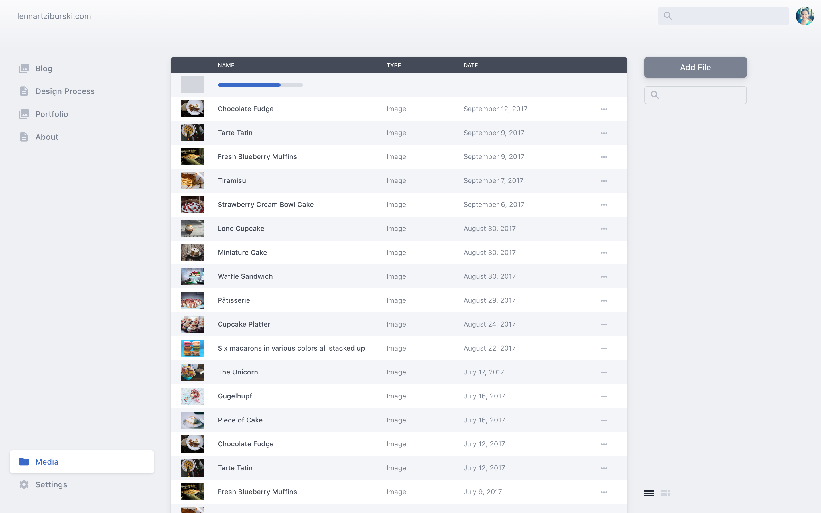
@dopry Thanks for the push! Building on what was discussed in #350, here is what I’m thinking. The main use case for a media library is so that you can reuse your content without having to upload it again. Everything else, like uploading files directly to the library, viewing file details or deleting files, is secondary. For larger projects, we’ll at some point need file organisation features, but we can ignore that for now. My mockups are below with some brief notes. As before, I have included some features that act as more of a long-term vision, but the basic design works without them. I would love to use it as a starting point for feedback and discussion.
Here is the .sketch file. It’s a little messy and I removed the images to save file size, but I hope it does the job: netlifycms-medialibrary-ui.sketch.zip Again, I would be grateful to hear your thoughts. And I’m happy to assist with iteration and implementation, especially if any design problems come up along the way. Cheers! :) |
|
Kudos to such a detailed work on the mockups and thinking through what's needed when. I do also agree on the issue of showing two search input fields at the same time: the main search input should not be displayed as long as the focus is on Media Library, I think.
Yes, fully agreed! |
|
@ziburski These look awesome. Thank you for all the effort you've put into this. No oversights in the UX really jump out to me. WRT the search form it would be nice to have one search to rule them in non-modal contexts... ie) re-use the global search form and apply it locally, so users always go to the same location for search in non-modal contexts. Have you thought at all about the inline image use cases? Our editors like to have a fair amount of layout control within their blog posts and pages, so we tend to use more inline images instead of fields. Also 3rd party image/media hosting services, cloudinary etc. Have you thought about hoe they get integrated in the media library or if they should? |
|
@ziburski that looks fantastic! I love the thought and detail you've put into these mockups. |
|
@ziburski Great work. |
@indysigner @dopry Interesting ideas. I wonder what the expectation and use case for the universal search is. If it’s more of a quick "go to" bar, it should always search everything and probably just show the results in a simple dropdown. If it’s an extensive way to look through your content and media database, we need a more elaborate UI for selecting what you want to search anyway. Maybe both can be combined. So I think we have to decide on what the universal search is for to see how that impacts the media library.
I didn’t really work on that, but this UI should also work for inline images. There is a mockup for the Markdown editor in the first post, which could easily have a button to bring up the library popover. After inserting an image, it could look similar to the large image field in the mockup.
No, I didn’t consider that. Honestly, I’m not very familiar with the modern publishing workflows involving those services. Are they just different sources to put your images, or is there more involved? For sources, you could probably add a filter dropdown but show all by default? |
|
I would strongly hesitate on any kind of global search. Very hard to discern what a user would expect to search for with a global search and hard to deliver on their promises. Better to have search located at the top of certain lists where it would be obvious what that search would query against |
|
@ziburski, @neutyp, re: global search. I would hesitate on truly global search as well. I tend to design where the search box is positioned consistently in the same page, but primarily serves to filter the current view context. Whether it's at the top of the 'page' or at the top of the 'table' the positioning should be consistent through out the UX. @ziburski, re: inline image editing. I see the controls, but I don't see what an actual inline image looks like in the editor. It would be nice to see how it's visually implement in the wysiwyg view. I know it's not media library specific but I think it is an important factor in the overall media experience. @ziburski, re: 3rd party media hosting. This is honestly a huge can of worms. I've dealt with it originally in drupal, and now in my SPA projects. Different services offer different functionality and interfaces. A service like cloudinary provides a whole suite of features and client side tools you can use, as does filestack. When you try to build a UX to unify them you normally have to build for the least common denominator feature suite and lose the use of the components they provide. My gut says they each deserve their editor 'widget', but I think offering a unified search may be a real possibility. I think a good starting point might be bouncing back to #432 talk more about what services people are interested in and take a close look at what they offer. |
|
Contextual search is definitely the way to go, especially in the near-term. Regarding third party asset storage, that is something we'll need to support post-1.0, but we'll be abstracting away the differences between them and offering a consistent experience in the UI across providers. Worst case, perhaps some providers don't have certain features in the CMS if the API doesn't support it. Fantastic work @ziburski! |
That actually makes a lot of sense. I had kind of taken global search as a given, but contextual search seems a lot more useful. So I guess just remove the search from the header and keep it like this?
I would just do it like this for normal (full-size) images. You get the same controls from the image field on hover.
Sounds good. I think a media library is something that you can overload with features very easily, since there are so many different workflows and use cases. For Netlify CMS, keeping the basics very simple and not tailored to specific services seems like a good idea. If anyone wants to work further on this, let me know and I’m happy to talk things through. |
|
We're ready to start implementing! I believe we'll be handling the implementation in a separate issue that's more focused, and I'll link that here soon. For now, here's the public prototype link (which accepts comments and annotations) from @neutyp, based on @ziburski's designs: https://marvelapp.com/6ggbi1e/screen/33390720 |
|
Hey @ziburski, we're starting to think about the redesign of the editorial workflow, which is basically a kanban board with three columns for the Draft, In Progress, and Ready for Review statuses of unpublished entries. Would you be interested in providing some input on how that might look? cc/ @neutyp |
|
Hi @erquhart. I didn’t include the editorial workflow in my mockups because I don’t feel I can contribute much there. I’m not very familiar with how editorial teams work and would need to do a lot of research to figure out what it’s all about. You and the team seems to have a very clear idea already of what you want to do there. That said, a kanban board sounds like a great fit for the current card-based design direction. It will be interesting to see if we can design cards for the different content types that work across layouts and use cases. And I wonder if the editorial workflow really needs to be a dedicated section. Maybe it would be easier to approach it as another way to view my content? We could have list, grid and kanban. That changes the story around the feature quite a bit though. |
|
@ziburski I remember considering the same, eg. list, grid, kanban view. The problem, as I recall, is that not all posts/cards have editorial workflow statuses attached to them; or vice versa something to that affect? eg. users would see different sets of things in each view. |
|
@ziburski so I know it's been quite a while since you looked at your concepts above, but I've been eyeing them increasingly as of late, specifically your vision for the control panel itself. We're going to start having community created control widgets, and your design "gets out of the way" so those widgets aren't subject to much design constraint. One detail that I'd like some input on if you can: how would you envision nested fields? Sometimes fields are nested multiple levels deep, and our current interface produces layers of boxes that crowd the panel, curious how we could improve on that with your design. |
|
Hey @erquhart! Glad to hear my designs still provide some inspiration. :)
Yep, I remember having a hard time with nested fields as well. Not sure if there is a great solution. Generally, my thinking was that the most common / important use case is probably nesting just one level down. So I worked that into the mockups, with the image box fields. For deeper nesting, maybe a modal popup is the way to go. Otherwise, it gets really messy when you show 5 levels on screen, and it’s often more confusing than helpful. So separating the levels in the hierarchy and drilling down one-by-one might work better. Also, maybe Netlify CMS doesn’t need to support endless nesting. Are there use cases where having five, four, or even three levels are really the best way to structure your content? |
|
Hey @erquhart and @ziburski :) Shawn, I'm assuming when you say 'control panel' you mean the editor experience? Or at least an interface that uses the same concepts of nesting? Back in the days of the 1.0 launch, I had originally hoped to push for an iteration of Lennart's great 'mono level' visualization of widgets in the editor. Specifically the idea that widgets don't need to be nested by reducing their pixel width. My hope was a version that borrowed a lot from what the program Ableton Live has proven can be successful. Here's a walkthrough of what I mean. It's worth the 5 minutes: http://share.neutyp.com/2N2P3p0P420Q |
|
@ziburski ah, didn't even notice the image box field had children, thanks for pointing that out. @neutyp great recording, thanks for that! It's a pretty compelling approach for infinitely nesting the UI, seems like a great general direction to take this! My only concern would be showing a complex hierarchy of collapsed fields all at once and only clarifying relationship with focus styles, but I think improvements are possible there. |
|
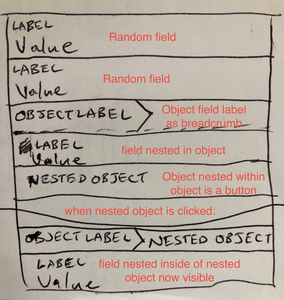
@neutyp @ziburski I started considering how to repackage the core strength of Ableton's nesting while providing clear hierarchy information at all times, and I want to run a potential solution by you. What if we did the always-full-width thing that Ableton does, but instead of collapsing each parent into a full width bar, we collapsed it into a breadcrumb? We could provide the breadcrumbs in a bar for each top level parent, and they could wrap within the bar when necessary. This way we maintain infinite full width children but hierarchy is always obvious. Thoughts? |
|
At first blush this sounds compelling, but I'll admit I'm having trouble fully visualizing it. Shawn if you have a chance to do even a 'bad' mockup it would awesome to see and I'd be happy to help flesh it out further should any details need consideration |
|
It will be very bad, I promise. I'll give it a swing when I get some time. |
|
Literally even a paper sketch. I can take it past there 😊
…
On Jun 11, 2018 at 12:57 PM, <Shawn Erquhart ***@***.***)> wrote:
It will be very bad, I promise. I'll give it a swing when I get some time.
—
You are receiving this because you were mentioned.
Reply to this email directly, view it on GitHub (#490 (comment)), or mute the thread (https://github.com/notifications/unsubscribe-auth/ABQHGrSlvRKMOMNk9s5b0o8v-Bs9y9TPks5t7svBgaJpZM4OcCpj).
|
|
I really like the breadcrumb approach, and I wonder if it might be complemented by some extra contextual navigation... I notice that there's a fair amount of space available in the left column of the editor, and I'd be interested to see how a document outline (ala Google Docs) might work here. For a quick example of what I mean, consider the Chrome extension Headings Map. Here's a screencast demonstrating navigating around a collapsable, hierarchical navigation: https://memelab.wistia.com/medias/lla1iihclt Add a bit of colour coding, and you get the best of all worlds: brevity and clarity, and without losing any width! If you wanted that space in the left column to be re-usable, another useful pattern could be Anyhoo, love your work, people.. many thanks 👍 |
|
Hi everyone, has there been any design progress since this thread? I don't see anything in GitHub Issues, but just checking if the main design has been updated elsewhere. I'd love to help improve the CMS UI. It's not bad as-is, but I think there are some definite confusion points for non-tech users, namely the nesting of list items. |
|
@angeloashmore that'd be fantastic, we're very open to design contributions. Can you open an issue outlining a specific problem you'd like to tackle? We'll probably close this issue up soon, too broad and longstanding. |
|
I also would like to see contributions to this. I can also help if someone wants to approach this together. Also the proposal in this thread is already awesome. It could have some contrast improvements for accessibility reasons but overall, this is great work. I'd say the functional design is very good so far with the current design of Netlify CMS. But what I think what has most potential for improvement is the visual design of the form fields. Especially when you start using flexible fields, nesting and groups that can be collapsed, it's very difficult to use at the moment for new users, based on my experience. |
|
This issue has been automatically marked as stale because it has not had recent activity. It will be closed if no further activity occurs. Thank you for your contributions. |
|
Any updates on this, everyone thinks the current design is super ugly |
|
@Phara0h See this ticket #2557 and all referenced discussions. There are working examples of the new design on some separate branch. Check all the tickets with UX tags: (ps. I'm not involved. I'm just as curious and eager as you to see a new admin interface) |
|
Closing this issue in favour of #2557 |


I understand that there is a larger goal of improving the UI in future versions. I wanted to contribute by sharing my ideas and design concepts. Not everything is a direct translation of existing features, but it can be seen as an aspirational concept for a 1.0 release.
Part of the reason for my contribution here is that I am frustrated by existing CMS. They all have similar information architectures with "Content", "Pages", "Collections" or "Entries". Editors usually offer a kitchen sink of fields that users don’t need. CMS don’t reflect how users think about their content, they instead rely on technical abstractions. Netlify CMS wants to make things easier, and it’s already nearly there. But I think we can still streamline the user experience, and let developers customize the UI to match their users expectations.
Visually, I think it’s good to keep it very light and simple for now. If only to show that it’s different from traditional, complicated systems.
Architecture and Editor
Sidebar Index
The sidebar shows collections and pages on the same level. You can still group pages together, but I think for new users we should lay out all pages right here by default. Note how there is no mention of collections, pages or entries — and it still works. There should also be a basic level of hierarchy represented here, but that’s another issue to figure out.
Editor
The editor should be very much focused on the users content, avoiding any unnecessary chrome or technical lingo. Text fields are white and feature a dedicated label for clarity, while other fields like boolean and select are easier to scan in a single line.
Title Field
I am also introducing a new title field here, which basically just has bigger text to improve the visual hierarchy. How exactly this could be implemented should be a different issue.
Markdown Editing
Markdown toggle and add-image button is in the top right when the field is active. In the default visual mode, the inline editing bar shows the most important options.
Publish
The publish button is fixed on the right below the preview. It should also change state to show the page status.
Publishing Progress
Showing the publishing progress like that seems like a stopgap — ideally, it wouldn’t take more than a second for your changes to deploy. But for now, we at least need to indicate that something is happening after you hit publish.
Preview
By default, the preview is super small. That kind of context will often be enough, but you can also click to enlarge it.
Large Preview
Click on the preview to enlarge it, click again to shrink it. Straightforward, and a more direct interaction than a simple button. I think these previews need to look exactly like the website though, so I’m not sure if the current implementation with custom CSS previews is a good enough solution.
Blank State
Text and markdown fields that are not yet filled in start out collapsed to focus on the label. Especially useful if you have a lot of optional textfields.
All Fields
Here is how all currently available fields would work in this design. There is still some work to be done on polish and different states, but I think the concept is fine. Especially repeatable fields (which should exist), groups and repeatable groups profit a lot from clarity and space savings here. Not sure how to handle nested groups yet, but maybe that’s an edge case anyway. Also, there are two kinds of image fields here for different use cases (large and small preview).
Collections
Cards
Displaying your content in these cards is tricky, since all content is different. That’s why customization is key here. Developers could be able to decide which fields content is displayed on the card, and where.
Grid View
The same goes for the grid view. List view vs grid view again depends greatly on the content, so it would make a lot of sense to just have the layout (list/grid) as a setting in the collection config. Grid ist mainly good for images, so I feel like list should be the default.
Quick Add
Hover over a collection in the sidebar to quickly create a new entry.
Final Thoughts
Again, this is my opinionated stance on how I would like a modern CMS to work. There are a few further-out ideas here, but it should still be possible to salvage them for some UI directions.
I am providing the source .Sketch file for these designs for you to work with:
Netlify CMS.zip
(The .Sketch also includes some additional ideas and a first stab at translating this to mobile).
I know I’m brushing on a lot of different topics, but I still hope it will be a good start for a deeper discussion on the UI and UX of the CMS. I’m new to contributing to open source, and not much of a developer, so I’m eager to see how this goes and what I have missed. Cheers!
The text was updated successfully, but these errors were encountered: