Add Studio/Insights links to Staff Instructor Toolbar#24020
Add Studio/Insights links to Staff Instructor Toolbar#24020stvstnfrd merged 2 commits intoopenedx:masterfrom
Conversation
 stvstnfrd
left a comment
stvstnfrd
left a comment
There was a problem hiding this comment.
Kind of a hack, but maybe not the Worst Thing Ever ™️
I may be totally missing some context (literally, the templating kind) on what data is available, but this seemed like the easiest way to fetch the current vertical ID (used for the Studio link/redirect on unit-level pages). Vertical-level context appears to be collected/passed further down the call stack, in a separate block.render call.
This is explained in further detail as code comments
There was a problem hiding this comment.
Note for later: the // prefix..
There was a problem hiding this comment.
Note: No algorithm, no helper method, so we weren't off by creating the URL the same way in the MFE :)
There was a problem hiding this comment.
We found some similar limitations in studio for building LMS URLs... there wasn't really a good way to 'reverse' those routes, so to speak. Ended up looking much like this.
We found, also, that studio didn't have a fully reliable LMS base URL, in that if there were multi-tenancy or enterprise domains, it wasn't necessarily right. More details here: https://openedx.atlassian.net/browse/TNL-7198
lms/templates/edit_unit_link.html
Outdated
lms/templates/preview_menu.html
Outdated
There was a problem hiding this comment.
TODO: Remove after local testing.
There was a problem hiding this comment.
These tests seem fairly module-level specific, so probably not worth porting over as-is.
How much, if any, do we care to add testing here for the legacy view/component?
Spoiler: I've not added any at this point :)
lms/templates/preview_menu.html
Outdated
There was a problem hiding this comment.
Anchor tag hrefs work fine without an explicit protocol (eg: google.com or //google.com), but Javascript complains if you try to set window.location.href without an explicit protocol.
In devstack, stage, and prod, there is no protocol on CMS_BASE, but there is on ANALYTICS_DASHBOARD_URL.
4aba540 to
0126aa6
Compare
|
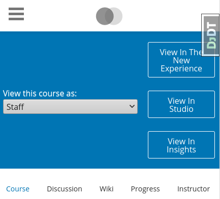
Note: This doesn't look great on a smaller screen width; the buttons stack oddly...
|
So perhaps there are three categories?
|
|
@stvstnfrd - For the button sizing we might need to make the width of the buttons wider than whatever percentage they have and make the masquerade area less of the width. Additionally on smaller screens the masquerade dropdown could be 100% and the buttons could be 100% so that they're stacked? |
|
@marcotuts Yeah, how is described is what it is in practice now, since we don't show toolbar at all on non-course pages. re |
|
For 3 - this is tricky because viewing a given unit page we might do different things. If viewing a page with a video we might wnat ot link to that video engagement view, if viewing a problem page then the problem performance page in Insights, but it becomes a mess when pages have both videos and problems, and other edge cases. I think for now ok to skip that level of context- sensitivity. Already this is a huge lift in the visibility of insights so we shall see how usage shifts and decide whether we should do anything else later. thanks! |
lms/templates/preview_menu.html
Outdated
There was a problem hiding this comment.
@davidjoy Do you have any tricks on how to get these buttons to collapse better on smaller widths?
I'm happy to look for other examples in platform, just seeing if you have anything on hand ;)
There was a problem hiding this comment.
If you add display: flex to this div, it'll cause the buttons to at least stay side-by-side. At very small widths (less than 460w on my screen) the insights button is partially off screen, but at least it doesn't take up more vertical space. Hm, I also don't have the MFE link enabled, but even if it was, I think they'd all stay on a line.
Beyond that, I think you have two options that I can think of:
- You could vertically align the stuff in the toolbar - probably a non-starter because it'd take up so much space.
- You could change them to an icon-based buttons instead of text, or a smaller font size, at narrower resolutions so that they take up less room. Or maybe a dropdown. You'd probably have to do this via media queries in CSS. Not that bad, but you'd have to play around a bit to get it right.
I think the latter is probably your best bet for making it "right" at small resolutions. Whether staff/instructors are really going to go look at studio/insights on a mobile phone, though... not clear to me it's worth it, though it galls me to leave it not-quite-fitting. :)
lms/templates/preview_menu.html
Outdated
There was a problem hiding this comment.
Could add a right margin instead of this , probably.
There was a problem hiding this comment.
I'm not 100% on the details here, but where is the equivalent of this check in the new code? Seems like in the old code we don't show the link unless the course_edit_method is "Studio", but I don't see a similar condition in the new stuff.
There was a problem hiding this comment.
Hrmmm, good point...
We're also not performing this check in the MFE; we always link to Studio.
@davidjoy With this implemented as-is, I don't think we can perform this check; we don't have access to the block, so I think we'd need another approach.
@marcotuts (cc: @ormsbee) Do you have background on this feature, its use/exposure/etc?
Depending on that, we should determine:
- If we care about this check, do we need to port this check to the MFE too? (now or backlog)
- If we don't, do we care enough to preserve backward compatibility here? (now or backlog)
- Or just ignore it and always link to the block in Studio?
 davidjoy
left a comment
davidjoy
left a comment
There was a problem hiding this comment.
Calling this a "Comment" review because it sounds like there are a few small changes to make and I had a few minor questions. In principle it's an Approve, though
stvstnfrd
left a comment
There was a problem hiding this comment.
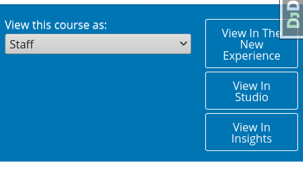
Sooo, I tried quite a few things, but here's the TL;DR:
This scales down decently at smaller widths now.
It still stacks buttons as needed, but this is cleaned up and looks nicer. See:
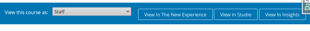
It's "normal" on a single line down to about ~1,000px.
Drops down to a second line from ~600px to ~1,000px
And then puts each button on its own line below ~600px, and still looks decent down to ~400px, with room to spare.

I also confirmed that the "View as a specific user" still works at the smaller widths (it uses a bit more real estate). It's tight, but it's a lot of content 🤷
Note: px values here are rounded for ease of reference; no explicit media queries are used here; that's just roughly where the breaks occur.
There was a problem hiding this comment.
Now it doesn't look as bad when they stack.
There was a problem hiding this comment.
This handles the stacking display, as well as removing the need for the .
There was a problem hiding this comment.
Hrmmm, good point...
We're also not performing this check in the MFE; we always link to Studio.
@davidjoy With this implemented as-is, I don't think we can perform this check; we don't have access to the block, so I think we'd need another approach.
@marcotuts (cc: @ormsbee) Do you have background on this feature, its use/exposure/etc?
Depending on that, we should determine:
- If we care about this check, do we need to port this check to the MFE too? (now or backlog)
- If we don't, do we care enough to preserve backward compatibility here? (now or backlog)
- Or just ignore it and always link to the block in Studio?
lms/templates/preview_menu.html
Outdated
There was a problem hiding this comment.
Could I suggest changing the align-items here to start instead of center? I think having the dropdown aligned to the top when the window width is shrunken down will look a bit cleaner.
There was a problem hiding this comment.
Otherwise, I screwed around with this for a while just now and came up with much the same layout.
There was a problem hiding this comment.
Hrmm, it might look a little better when shrunken down, but I think it may look worse when wide, since it's all on a single line and no longer centered vertically on the one side.
center, shrunk
start, shrunk
start, wide
center, wide

There was a problem hiding this comment.
Oh, darn. Yup, looks like junk with start. Ah well.
davidjoy
left a comment
There was a problem hiding this comment.
Had a suggestion to change align-items to start, but otherwise think we're good to go.
in a feature backport from the new Courseware/Learning MFE.
in favor of display in the Staff Instructor Toolbar.
1461ff8 to
4490e4c
Compare
|
Your PR has finished running tests. There were no failures. |
|
EdX Release Notice: This PR has been deployed to the staging environment in preparation for a release to production. |
|
EdX Release Notice: This PR may have caused e2e tests to fail on Stage. If you're a member of the edX org, please visit #e2e-troubleshooting on Slack to help diagnose the cause of these failures. Otherwise, it is the reviewer's responsibility. E2E tests have failed. https://gocd.tools.edx.org/go/tab/pipeline/history/deploy_to_stage |
|
EdX Release Notice: This PR has been deployed to the production environment. |
…utton

openedx#24020 introduced a workaround for viewing the current vertical in Studio
However, replacing `window.location.href` on `click` did not support opening
it in a new tab.
…utton

openedx#24020 introduced a workaround for viewing the current vertical in Studio
However, replacing `window.location.href` on `click` did not support opening
it in a new tab.
…utton

openedx#24020 introduced a workaround for viewing the current vertical in Studio
However, replacing `window.location.href` on `click` did not support opening
it in a new tab.

(cherry picked from commit 01ada0b)
…utton

openedx#24020 introduced a workaround for viewing the current vertical in Studio
However, replacing `window.location.href` on `click` did not support opening
it in a new tab.

(cherry picked from commit 01ada0b)
…utton

openedx#24020 introduced a workaround for viewing the current vertical in Studio
However, replacing `window.location.href` on `click` did not support opening
it in a new tab.

(cherry picked from commit 01ada0b)
…utton

openedx#24020 introduced a workaround for viewing the current vertical in Studio
However, replacing `window.location.href` on `click` did not support opening
it in a new tab.

(cherry picked from commit 01ada0b)
…utton

openedx#24020 introduced a workaround for viewing the current vertical in Studio
However, replacing `window.location.href` on `click` did not support opening
it in a new tab.

(cherry picked from commit 01ada0b)
Backport the new behavior from the Learning MFE.
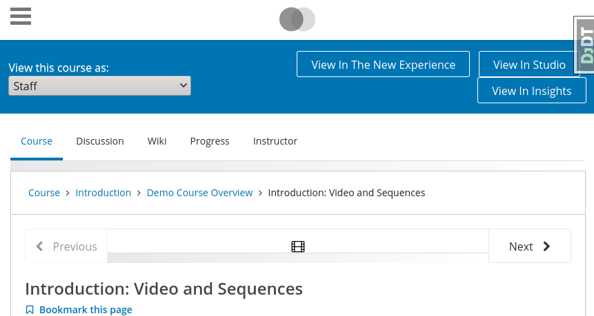
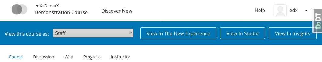
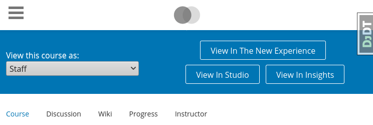
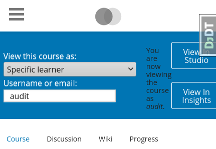
Since this toolbar can appear outside of the unit-aware (and even courseware) pages, the link behavior is as follows:
Both Buttons
If the relevant Django settings aren't configured (not the case for us, but eg: some installs don't run Insights),
CMS_BASE,ANALYTICS_DASHBOARD_URL, then no button is shown.Insights Button
Studio Button
FWIW: We currently do not display the toolbar at all on course-unware pages.