-
Notifications
You must be signed in to change notification settings - Fork 280
New issue
Have a question about this project? Sign up for a free GitHub account to open an issue and contact its maintainers and the community.
By clicking “Sign up for GitHub”, you agree to our terms of service and privacy statement. We’ll occasionally send you account related emails.
Already on GitHub? Sign in to your account
Plover could use more art #263
Comments
|
How about a stylized single steno key? |
|
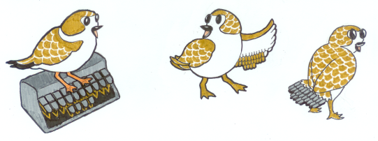
I'd also like to leave a callback to the old Plover logo drafts from the blog post which are: Then there's Dolores who you can see in all her one-pose glory: |
|
Maybe Dolores with squinted eyes and lightning in the background. |
|
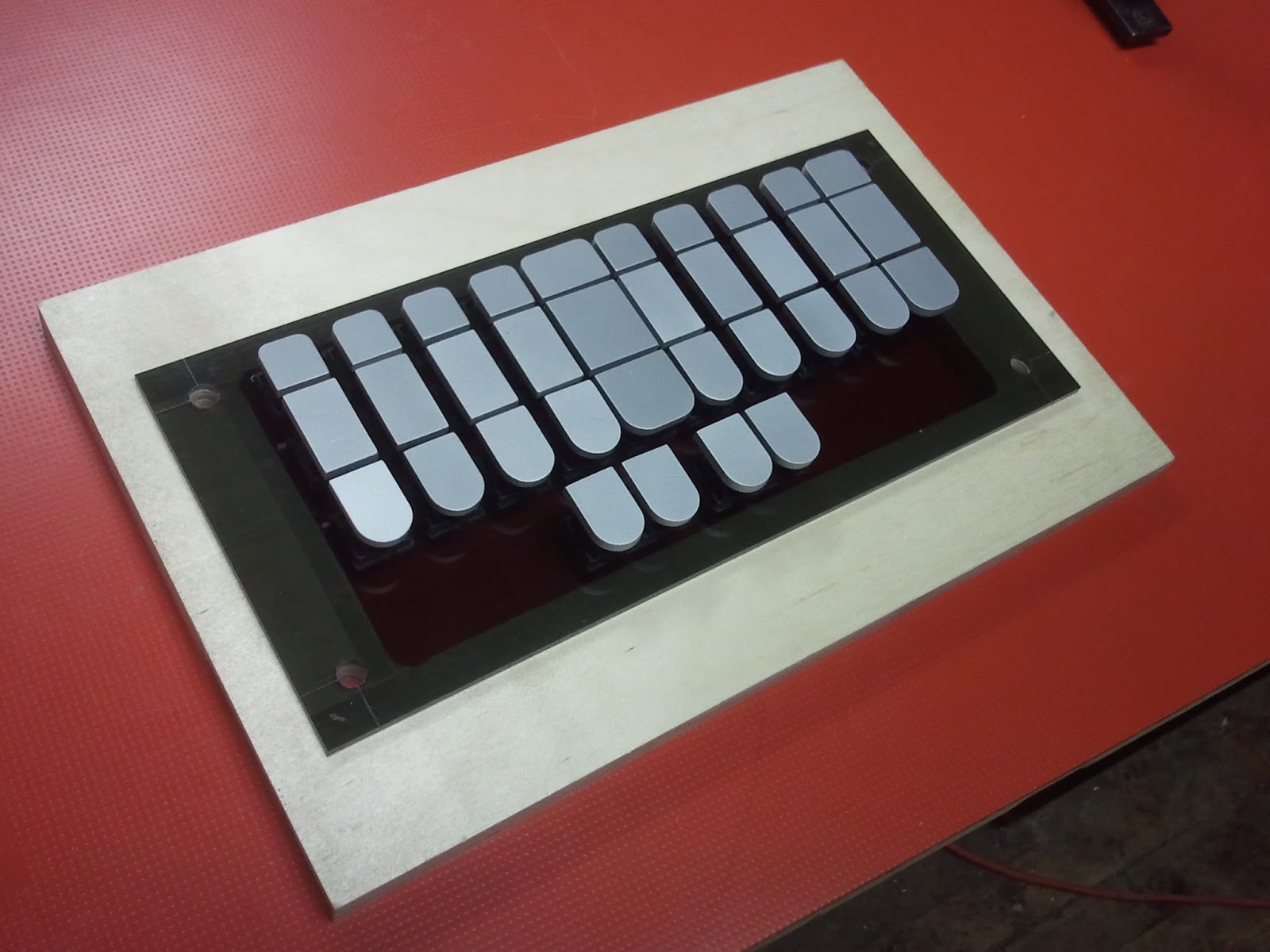
I like the idea of a single steno key. Jeff was toying with adding a simple beak and eyes to turn steno keys into mascots. (you could add a tail and make a stenosaurus...) |
|
OK Teddy asked my to design a mascot for plover. The idea is to have Dolores the mascot bird interact with steno keys as if they are objects. I'm going to make a handful of these. |
|
Just going off the images you sent me originally. No problems designing around something smaller though. |
|
I have to say I like the elegance and simplicity of the current On Mon, Sep 28, 2015 at 12:53 AM, Ted Morin notifications@github.com
Mirabai Knight, CCP, RDR |
|
Yup, but I don't think I could make it look good at anything above 16x16. |
|
(So the Plover bird icon is called Dolores? You learn something new everyday!) It's cute how Dolores feathers make out the steno keyboard, with the highlighted feathers spelling out the stroke for the word 'Plover'. How about making the status indicator spell out the strokes for the words "on" and "off"? |
|
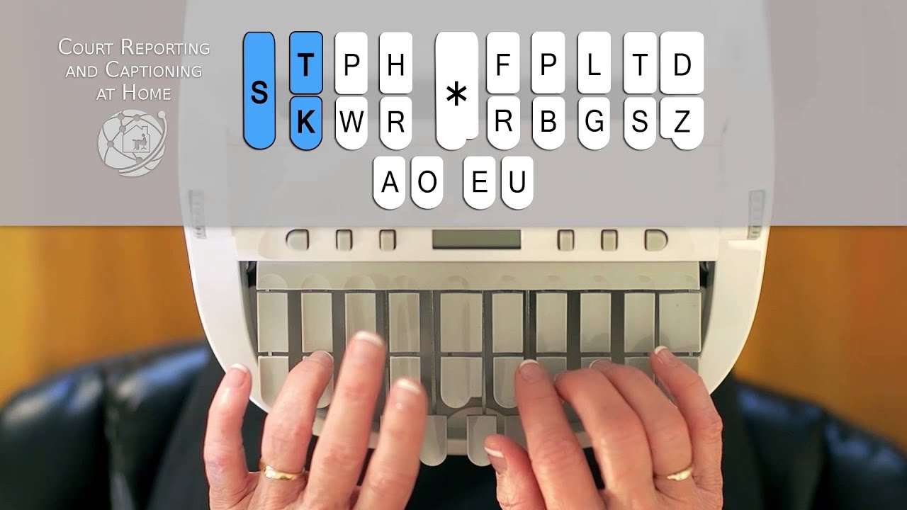
Yep! Longest one-stroke name I could think of: TKHRORS. (': I like that idea, though I'm not sure how big the indicator would have to On Tue, Sep 29, 2015 at 9:45 AM, Drew Neil notifications@github.com wrote:
Mirabai Knight, CCP, RDR |
|
What do y'all think of the Plover Rainmeter skin design? http://plover.stenoknight.com/2015/06/beautiful-plover-skin-for-rainmeter.html On Tue, Sep 29, 2015 at 3:22 PM, Ted Morin notifications@github.com wrote:
Mirabai Knight, CCP, RDR |
|
I'm a fan of minimalist artwork. Here's some sketches of a super simple Plover tray icon. It would be awesome to see some variations on this theme. A link to the SVG file is here, open in inkscape and zoom out: https://www.dropbox.com/s/d4jlj7t44w9egfo/plovericons.svg?dl=0 Here's how it might look on OSX, enabled: |
|
I really like the elegance of your keyboard design, but I feel like the X On Tue, Sep 29, 2015 at 6:31 PM, gcr notifications@github.com wrote:
Mirabai Knight, CCP, RDR |
|
Sorry, I meant to say the keyboard with solid black keys indicating "Plover On Tue, Sep 29, 2015 at 6:33 PM, Mirabai Knight mkk@stenoknight.com wrote:
Mirabai Knight, CCP, RDR |
|
Maybe a stenokeyboard with a connected or broken wire to indicate connected/disconnected (would also make the icon square with the added height) |
|
I quite like the way that Screenflow shows its status in the menu bar. The one on the right means that screenflow is recording: Maybe Plover could do something similar. When Plover is disabled, the icon could be the outline of a single key. When Plover is active, the icon could change to contain an asterisk. |
|
@gcr that looks good! |
|
Man you are great at this gcr. Can you make a version like that but with a On Wed, Sep 30, 2015, 8:53 AM gcr notifications@github.com wrote:
|
|
Oh dear. What is the standard height of a key? Like a height/width ratio of 3/2 or something including the rounded tip? I'll sketch something when I get home tonight. |
|
Not sure, but go check the Stenosaurus blog and maybe copy Lifton's designs. On Wed, Sep 30, 2015, 10:05 AM gcr notifications@github.com wrote:
|
|
This is really nice! I like the new interface. Is there a purpose of having the "Machine" group be separate? For example, we could just have the output label say "Enabled (Treal)", "Enabled (NKRO Keyboard)", "Disabled (Treal)", or "Machine Disconnected (Treal)". The only reason why I mention it is because the colored light gives weight to the "Machine" group, so the "Machine" group feels more important than the "Output" group. Probably not a big deal. Just curious. |
|
@gcr the hardest part of merging them for me was indicating output status versus machine status. The output header emphasizes what enable and disable mean. |
|
Just noticed that the connection light is top-aligned with the text vs vertically centered. We could equalize the weight by throwing the same red/green/gray light in the output row, too, to signal output status the same as we do machine, or increase the output status weight by moving the light there and dropping it from the machine. I could also see not showing the light unless it's red. No need to call-out the normal, everything-is-fine state! :) All those are minor improvements though. Let's get this merged and in people's hands. |
|
It is vertically aligned in the pull request that is open.
|
|
Disconnected is clearer with the button style, but otherwise, the radio buttons feel much more natural to me. My location memory will lead me to just click by left side or right, vs needing to read to decide of I should click to switch modes or not. So, 1 vote for radio buttons!Jeremy W. Sherman
|
|
Okay, agreed, I like the radio buttons because of the positional view, thanks for the suggestion @Achim63. I'll update my PR and hopefully we can go back to focusing on more art assets. Where's the gradient on that logo haha :P |
|
Thanks for pointing me to this thread - I missed it up to now. And yes, my vote also definitely goes to the radio buttons. I don't even think we'd need to grey them out if the machine is not connected, since those are not really directly related. |
|
Disabling the button group on disconnect is good. Staying enabled would suggest we change machines to keyboard when you disconnect your writer. Which also isn't guaranteed connected - I've used machines without any keyboard briefly before. (A mouse plus on-screen virtual keyboard works in a pinch.)Jeremy W. Sherman
|
|
I don't get that - the machine area already says that it's disconnected. If it were connected to a qwerty keyboard it would say so, i.e. show "NKRO keyboard connected". |
|
I have found it misleading that you can change whether Plover is outputting
|
|
There's a big red "LED" just below, and you'd think all is fine? Mkay ... |
|
Yes, especially previously because there was a bigger green "P" just above, and I'd think all is fine. As a new user playing around with settings, I'd sometimes end up there, a little confused about how it works. At least now the status indicator is subtle enough that it won't draw your attention, and in the disabled state it is exceedingly clear that Plover won't do anything until you 1) go to the configuration dialogue and change back to another machine or 2) connect your selected machine. In any case, I think I'll stop tweaking this UI now, pending feedback after a release. One can only spend so many days rejigging a layout >.< |
|
Yep, let's wait and see if new users get along with it. If there ever will be some sort of a "playback" feature it could be changed then. |
👍🏼 This is wonderful. I am looking forward to seeing this in my Dock!Jeremy W. Sherman
|
|
Yes, the version with the slightly rounded corners is the most attractive, IMHO. A little bit of shadow as the Apple icons have would be nice (light coming straight from the top would seem correct, as can be seen on the System Preferences icon and also on Illustrator). |
|
Has this issue been resolved now that the icon has been updated? If not, what remains to be done? |
|
I think this is more of a discussion thread, I welcome any new On Mon, Apr 25, 2016 at 9:55 PM Jeremy W. Sherman notifications@github.com
|
|
Benoit Pierre has been working like crazy, migrating Plover to Python 3. He's also completely rewritten the UI in QT instead of WX. At the same time, we are reimagining the interface and I've been playing with the icon set. Feel free to pop in and look at #571 to get an idea of the UI and art changes. |
|
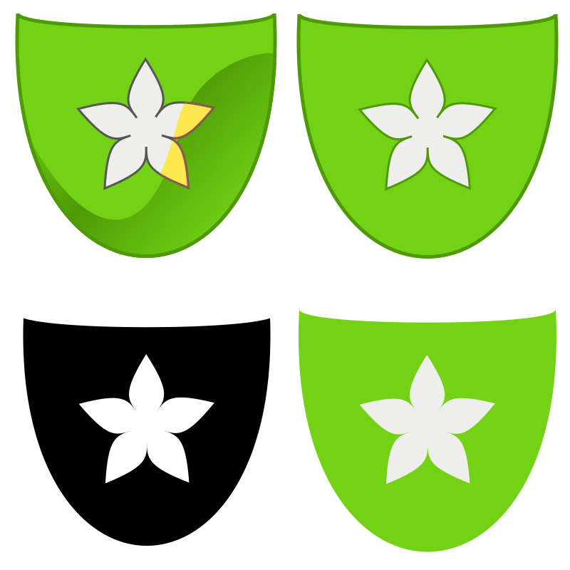
An asterisk is a star character, and some flowers look like stars, so I thought I'd try to see if I could make the asterisk look more like a star. I've tried to follow those Tango guidelines that @gcr mentioned above, but I made four variants. Other colours might work too though, but I think brown would look old-fashioned, and the colour of the asterisk itself should be different enough from that of the keycap. Here's the source code (in Python) which generates four SVG files in different styles: import math
# Constants for the different icon styles
STYLE_PLAIN=0 # Plain, has borders but no shading (should fit on Mac)
STYLE_FANCY=1 # With borders and a gradient (should fit on Linux)
STYLE_HI_CONTRAST=2 # Black keycap with white borders and a white asterisk
STYLE_MINI=3 # Minimal style with no borders
VARIANT_RED=0
VARIANT_GREEN=1
VARIANT_BLUE=2
VARIANT_YELLOW=3
VARIANT_BROWN=4
VARIANT_PURPLE=5
VARIANT_ORANGE=6
def moveDiagonally(shape, amount):
'''Takes some SVG in, and outputs it with a constant
added to all numbers. Used to offset shadows.'''
r=''
for line in shape.splitlines():
processedText=''
processedNumber=''
for ch in line:
if(ch in '0123456789-'):
processedNumber+=ch
elif(processedNumber):
processedText+=str(int(processedNumber)+amount)+ch
processedNumber=''
else:
processedText+=ch
if(processedNumber):
processedText+=str(int(processedNumber)+amount)
r+=processedText+'\n'
return(r)
def fetchColour(shade, variant):
if(variant==VARIANT_RED):
# Using the light orange colour on the shadow on the star
return('#'+('ef2929 cc0000 a40000 fcaf3e'.split()[shade]))
if(variant==VARIANT_GREEN):
return('#'+('8ae234 73d216 4e9a06 fce94f'.split()[shade]))
if(variant==VARIANT_BLUE):
return('#'+('729fcf 3465a4 204a87 729fcf'.split()[shade]))
if(variant==VARIANT_YELLOW):
# The shadow on the star is taken from brown
return('#'+('fce94f edd400 c4a000 e9b96e'.split()[shade]))
if(variant==VARIANT_BROWN):
return('#'+('e9b96e c17d11 8f5902 e9b96e'.split()[shade]))
if(variant==VARIANT_PURPLE):
# I used c57fa8 on the star shadow to make it seem lighter
return('#'+('ad7fa8 75507b 5c3566 c57fa8'.split()[shade]))
if(variant==VARIANT_ORANGE):
return('#'+('fcaf3e f57900 ce5c00 fce94f'.split()[shade]))
raise IndexError ('No such variant')
def makeHeader(style=STYLE_PLAIN, variant=VARIANT_RED):
svgStart='''<svg xmlns="http://www.w3.org/2000/svg"
width="100%" height="100%" viewBox="0 0 400 400">
'''
grad=('''<linearGradient id="grad"
gradientTransform="rotate(40 0.5 0.5)">
<stop offset="0" stop-color="'''+
fetchColour(1,variant)+
'''"/>
<stop offset="0.5" stop-color="'''+
fetchColour(2,variant)+
'''"/>
<stop offset="1" stop-color="'''+
fetchColour(1,variant)+
'''"/>
</linearGradient>''')
shadow='''<clipPath id="shadow">
<path d="M 25 180
C
30 220
180 480
250 190
C
280 90
400 80
390 100
L 390 390
L 10 390
L 25 180"/>
</clipPath>
'''
asteriskShadow=moveDiagonally(shadow,-5)
asteriskShadow=asteriskShadow.replace('shadow','asteriskShadow')
capCoords='''M 20 36
C
-4 490
404 490
380 36
380 61
20 61
20 36'''
keyCap=('<path d="'+capCoords+
'" stroke="'+
fetchColour(2, variant)+
'" fill="'+
fetchColour(1, variant)+
'" stroke-width="5"/>\n')
keyCap2=('<path d="'+capCoords+
'" stroke="'+
fetchColour(2, variant)+
'" fill="url(#grad)" stroke-width="5"'+
' clip-path="url(#shadow)"/>\n')
keyCapBlack=('<path d="'+capCoords+
'" stroke="#ffffff" fill="#000000" stroke-width="15"/>\n')
keyCapNoOutline=('<path d="'+capCoords+
'" stroke="none" fill="'+
fetchColour(1, variant)+
'"/>\n')
r=svgStart
if(style==STYLE_FANCY):r+=grad+shadow+asteriskShadow
if(style==STYLE_HI_CONTRAST): r+=keyCapBlack
elif(style==STYLE_MINI):
r+=keyCapNoOutline
else: r+=keyCap
if(style==STYLE_FANCY): r+=keyCap2
return(r)
def rStr(num):
return(str(round(num,5)))
def makeStarAngle(p0,p1,p2,first, centre):
'''Make a single point of a star.
p1 is the actual point, p0 and p2 are the points it connects to.
'''
# Constants: edit them to make it more like a star
# or more like a flower
smallDistance=2
largeDistance=2.5
toward0=(p0[0]-centre[0], p0[1]-centre[1])
away0=(centre[0]+toward0[0]*smallDistance,
centre[1]+toward0[1]*smallDistance)
further0=(centre[0]+toward0[0]*largeDistance,
centre[1]+toward0[1]*largeDistance)
toward2=(p2[0]-centre[0], p2[1]-centre[1])
away2=(centre[0]+toward2[0]*smallDistance,
centre[1]+toward2[1]*smallDistance)
further2=(centre[0]+toward2[0]*largeDistance,
centre[1]+toward2[1]*largeDistance)
r=''
if(first): r='M '+rStr(p0[0])+' '+rStr(p0[1])+'\n'
r+='C '+rStr(away0[0])+' '+rStr(away0[1])+'\n'
r+=rStr(further0[0])+' '+rStr(further0[1])+'\n'
r+=rStr(p1[0])+' '+rStr(p1[1])+'\n'
r+='C '+rStr(further2[0])+' '+rStr(further2[1])+'\n'
r+=rStr(away2[0])+' '+rStr(away2[1])+'\n'
r+=rStr(p2[0])+' '+rStr(p2[1])+'\n'
return(r)
def makeStar(circleCentre):
r='<path d="'
ptFirst=0
ptLater=1
pointType=ptFirst
isFirst=True
starSize=5 # Number of points
starScaleBig=100 # Size of the outside
starScaleSmall=23 #Size of the inside
# The ratio between the inside and outside size
# decides how pointy the star becomes
halfStarSize=starSize/2.0
precision=5 # How many digits to allow when rounding
for i in range(starSize):
i2=i-math.pi*2/starSize
j=(i2*math.pi/halfStarSize)
k=(i2*math.pi/halfStarSize)-(math.pi/starSize)
l=(i2*math.pi/halfStarSize)+(math.pi/starSize)
centreX=(round(math.cos(j),precision)*starScaleBig)+circleCentre[0]
centreY=(round(math.sin(j),precision)*starScaleBig)+circleCentre[1]
leftX=(round(math.cos(k),precision)*starScaleSmall)+circleCentre[0]
leftY=(round(math.sin(k),precision)*starScaleSmall)+circleCentre[1]
rightX=(round(math.cos(l),precision)*starScaleSmall)+circleCentre[0]
rightY=(round(math.sin(l),precision)*starScaleSmall)+circleCentre[1]
p0=(leftX,leftY)
p1=(centreX,centreY)
p2=(rightX,rightY)
r+=makeStarAngle(p0, p1, p2, isFirst, circleCentre)
isFirst=False
return(r)
def flowerAsterisk(style=STYLE_PLAIN, variant=VARIANT_RED):
'''Generate the flower (without the keycap, header and footer)
'''
svgPathEnd1=('" stroke="'+fetchColour(2,variant)+
'" fill="#eeeeec" stroke-width="3"\n'+
'stroke-linecap="round"/>')
svgPathEnd2=('" stroke="'+
fetchColour(2,variant)+'" fill="'+
fetchColour(3,variant)+'" stroke-width="3"\n'+
'stroke-linecap="round" clip-path="url(#asteriskShadow)"/>')
if(style==STYLE_FANCY):
svgPathEnd1='''" stroke="#555753" fill="#eeeeec" stroke-width="3"
stroke-linecap="round"/>'''
elif(style==STYLE_HI_CONTRAST):
svgPathEnd1='''" fill="#ffffff" stroke="none"/>'''
points=makeStar((200,200)) # Put it in the centre of the image
if(style==STYLE_MINI):
svgPathEnd1='''" stroke="none" fill="#eeeeec"/>'''
r=points+svgPathEnd1
if(style==STYLE_FANCY): r+=points+svgPathEnd2
return(r)
def makeIcon(style=STYLE_PLAIN, variant=VARIANT_GREEN):
'''Return SVG code for the icon
The style is there to adjust the icon to fit on different operating systems,
and there's also a high-contrast option. The list can be found near the start
of this file.'''
svgEnd='</svg>'
return(makeHeader(style, variant)+flowerAsterisk(style, variant)+svgEnd)
for style in [('fancy', STYLE_FANCY),
('plain', STYLE_PLAIN),
('minimal', STYLE_MINI),
('hi-contrast', STYLE_HI_CONTRAST)]:
with open('asterisk-'+style[0]+'.svg','w')as outFile:
r=makeIcon(style[1])
outFile.write(r) |
|
Nice ...!
I can't say I'm fond of the shade of green we've been using of late ...
being able to choose something a little different is good!
…--gdw
On Mon, Mar 5, 2018 at 2:34 PM, SeaLiteral ***@***.***> wrote:
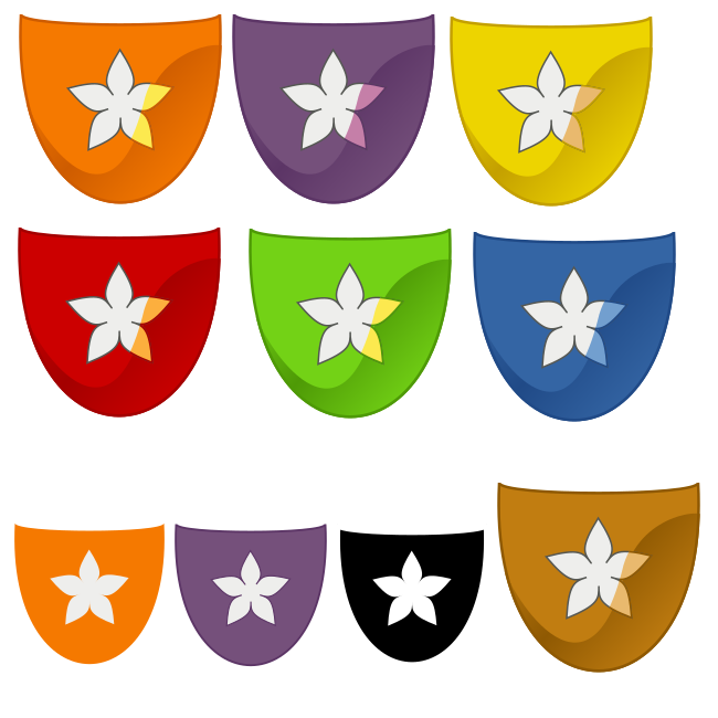
I edited the above code to include multiple colour variants. Each variant
can be shown in three styles: plain, fancy and minimalistic. Plain has
coloured outlines around the keycap and around the asterisk, but no
shading, fancy has those outlines as well and there's a gradient shadow in
the bottom-right, and on the asterisk the shadow is slightly displaced and
possibly coloured. Minimalistic has no outlines or shading. And there's
also high-contrast which ignores the differences. The asterisks are white
on coloured keycaps, which have big curves outwards in the bottom and
smaller curves inwards at the top.
[image: orange, purple, yellow, red green, blue and brown fancy icons,
plus some smaller icons: plain purple, mini orange and black high contrast]
<https://user-images.githubusercontent.com/34283904/37003062-0b96696e-20cc-11e8-8924-892c3cb1bc7f.png>
—
You are receiving this because you are subscribed to this thread.
Reply to this email directly, view it on GitHub
<#263 (comment)>,
or mute the thread
<https://github.com/notifications/unsubscribe-auth/AQ3G71iPQg1lW_vlfxbT6sDp21-DmRwdks5tbb13gaJpZM4GEI40>
.
|





Right now the red "P" doesn't mean anything and is used arbitrarily as an indicator for Plover being on and off. A couple things that I don't like about the P:
I think that the Plover art could:
I'll be talking a little bit with my friend Jeff to see if he can fit this into his free time, but any contributions and suggestions are totally welcome.
The text was updated successfully, but these errors were encountered: