Skip to content

Conversation

@evwilkin
Copy link
Member

@evwilkin evwilkin commented Sep 13, 2022

Closes #2992

This PR adds a component gallery listed as "View all components" at the top of the components sidenav section, which contains a gallery view (illustrations only) and a list view (illustrations + summary text) both of which link directly to component pages on click. These new components are built in a way that by changing just the section and subsection props you are able to dynamically generate a new gallery for any nav grouping.

Notes:

  • Added ability for consumer to choose whether to show or hide subsections within a sidenav section (ex: components => menus expandable section would be listed as "menus" in the gallery & link to first page within that expandable section).
  • Added ability for consumer to include subsection items in the gallery (ex: components => menus components - Dropdown, Menu, Select, etc - will be included in the gallery. They're grouped separately in the sidenav tertiary nav for organization, but can still be listed individually in the gallery view).
  • Search only filters by component name. Searching through component summary text would be possible, but as this text is only shown in list view and is hidden in gallery view it could lead to confusion around results in gallery view based on text descriptions that don't exist on the page.

Design and implementation has changed significantly throughout build, final designs here: #2992 (comment)

TODO:
  • sidenav.js: replace hard code placement of "View all components" with weighting in .md file
  • remove componentsData being passed to docs framework, keep within v4
    • Complete for sake of this issue, can still consider moving summary text & illustration location into .md frontmatter and removing need for componentsData file altogether.
  • create .md file in v4 which imports componentGallery from docs-framework
  • remove component illustrations being accessible from webpack.base.config, move logic back to v4 to be passed as prop to componentGallery
  • fix list view preview images are different widths
  • Review Beta Label implementation - custom CSS currently to match placement to designs, and Beta label takes up space even when not present to avoid image being resized due to presence of label.
  • Split out "sectionGallery" into smaller more composable components in the case that consumer wants to use part but not all of the gallery options.
  • Allow user to customize text through props

@patternfly-build
Copy link
Collaborator

patternfly-build commented Sep 13, 2022

@evwilkin
Copy link
Member Author

@maryshak1996 I've put up a rough draft of this page to confirm some of the details before cleaning up for a final review, you can see it here:

Questions:

  1. All of our website pages have a max-width of 832px - the mockup shows 3 card columns + the sidebar but with this width limitation it looks to fit 2 columns + the sidebar.
  2. Is it correct that the sidebar should run the entire height of the page? Note that if you're near the bottom of the page and select something like the Truncate component, you then have to scroll all the way back to the top of the page to view the component info.
  3. I added a toggle at the top showing what this would look like implemented as a drawer rather than a sidebar. The pro is that it doesn't replace one of the columns of cards as it slides in front of them, but the con is the same issue where the data in the drawer is only visible when the user is at the top of the page.
  • We could fix this issue by simply making the sidebar sticky once it hits the top of the page, so it would follow the user down the screen. If we wanted to use the drawer I would need to look into how to accomplish something similar.

@mcarrano FYI

@maryshak1996
Copy link

Hey @evwilkin , so exciting to see this coming together! To your questions:

  1. 2 columns + sidebar seems fine to me!
  2. I think that the sidebar should run the height of the user's display. In my mind, the toolbar and sidebar should be stick to the top and right of the display, and just the contents of the card catalog body should be scrollable. This way the contents of the sidebar are always visible and the search bar is always accessible. If having the toolbar be sticky to the top is out of the scope, I think that that is okay, but I definitely think it's important that the sidebar be sticky with it's contents always viewable.
  3. I don't have much of a preference of 'sidebar' vs ' drawer', but I do like that the sidebar doesn't cover up any content -- feels a bit more scannable that way.

@evwilkin evwilkin changed the base branch from main to v5 April 10, 2023 17:48
@evwilkin evwilkin dismissed mcoker’s stale review April 12, 2023 01:00

Addressed all feedback

@evwilkin
Copy link
Member Author

evwilkin commented Apr 13, 2023

@mcarrano @nicolethoen @wise-king-sullyman this PR is ready for review. See PR description, including the link to most recent design iteration, as that should give high-level summary of all the conversation that's happened (above) in this issue.

Copy link
Member

@mcarrano mcarrano left a comment

Choose a reason for hiding this comment

The reason will be displayed to describe this comment to others. Learn more.

At first glance this looks great @evwilkin ! @mmenestr @maryshak1996 @lboehling @edonehoo perhaps also take a look.

@mmenestr
Copy link
Collaborator

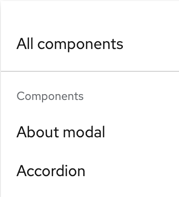
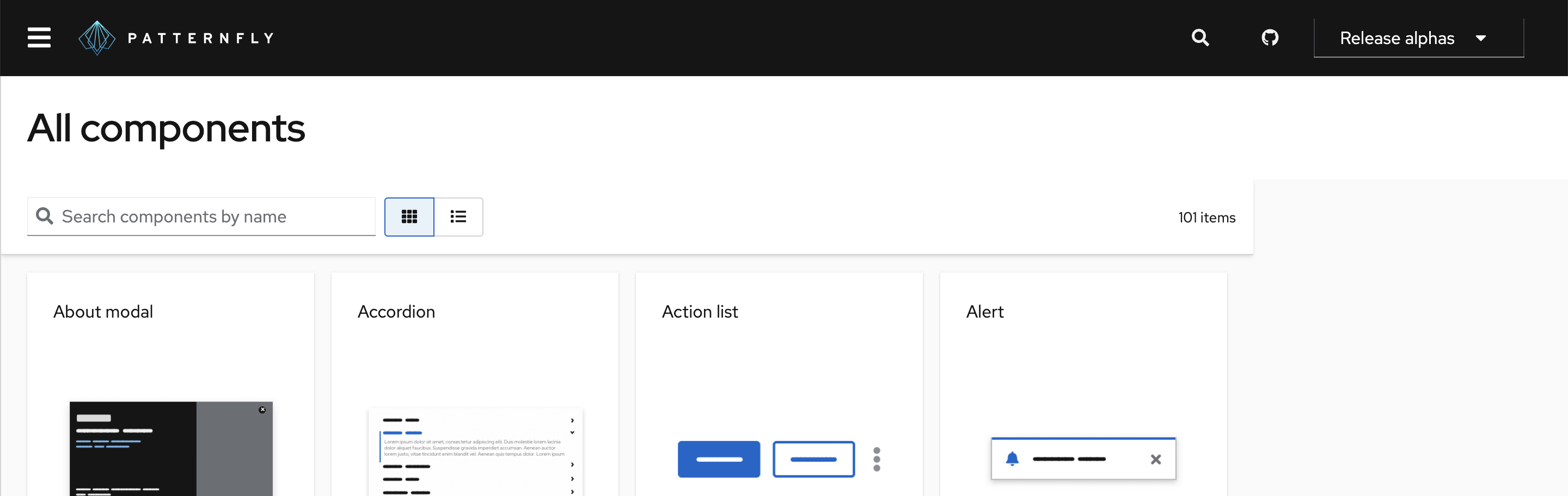
@evwilkin looks great!! My only comment is, are we going to call that nav item "View all components"? It feels weird to me to have an "action" as a nav item. Maybe we could simplify it to "All components" (?) Curious what others think!

nicolethoen
nicolethoen previously approved these changes Apr 13, 2023
Copy link
Collaborator

@nicolethoen nicolethoen left a comment

Choose a reason for hiding this comment

The reason will be displayed to describe this comment to others. Learn more.

This LGTM. The number of style overrides applied to the Toolbar specifically feel like a little bit of a red flag - I wonder if we could use Toolbar props to a similar effect. But that can be a follow up eventually. For now this is good.

@evwilkin
Copy link
Member Author

@mmenestr I'm good with "All components", @edonehoo what do you think? This (as it stands) is different from the landing pages we reviewed for different sections, so I think the "All components" link name indicates that (vs. something like "Overview")

@maryshak1996
Copy link

maryshak1996 commented Apr 14, 2023

This looks great! I think that @mmenestr 's comment around removing the action text makes sense. I have two other notes ...

  1. It'd be good to have a way sort of separate the 'All components' item and the rest of the components (since this menu item is the only one that isn't, itself, a component). Could we add a horizontal divider for something like this? (See screenshot below)

Screenshot 2023-04-14 at 10 00 46 AM

2. Not sure if this is the correct PR to comment on this, but I just noticed something funky behavior that happens with the 'All components' page header when the left nav is collapsed (See screenshot below). Basically, the header section just doesn't grow to fill the space to the right.

Screenshot 2023-04-14 at 10 05 22 AM

@edonehoo
Copy link
Collaborator

This looks fantastic. I'm also team "All components"! I think it makes sense for it to be named differently and, to me, "Overview" suggests that there will be top level details regarding components, rather than a catalog of everything.

@lboehling
Copy link

lboehling commented Apr 14, 2023

This looks great! +1 to the comments made above. I also suggest that we stay consistent with the label color we're using for "beta features" and other component tagging across the site. I recommend updating the label to a blue fill per the design recommendation in #1239

@nicolethoen
Copy link
Collaborator

  1. It'd be good to have a way sort of separate the 'All components' item and the rest of the components (since this menu item is the only one that isn't, itself, a component). Could we add a horizontal divider for something like this? (See screenshot below)

I might have this be a follow up PR if we want it.

Copy link
Member

@mcarrano mcarrano left a comment

Choose a reason for hiding this comment

The reason will be displayed to describe this comment to others. Learn more.

Looks great!

@nicolethoen nicolethoen merged commit 6126676 into patternfly:v5 Apr 27, 2023
Sign up for free to join this conversation on GitHub. Already have an account? Sign in to comment

Labels

None yet

Projects

None yet

Development

Successfully merging this pull request may close these issues.

Component catalog page