Single select #1277
Single select #1277
Conversation
|
PatternFly-React preview: https://1277-pr-patternfly-react-patternfly.surge.sh |
Pull Request Test Coverage Report for Build 4594
💛 - Coveralls |
packages/patternfly-4/react-core/src/components/Select/Select.d.ts
Outdated
Show resolved
Hide resolved
packages/patternfly-4/react-core/src/components/Select/Select.d.ts
Outdated
Show resolved
Hide resolved
packages/patternfly-4/react-core/src/components/Select/Select.d.ts
Outdated
Show resolved
Hide resolved
packages/patternfly-4/react-core/src/components/Select/Select.d.ts
Outdated
Show resolved
Hide resolved
packages/patternfly-4/react-core/src/components/Select/Select.d.ts
Outdated
Show resolved
Hide resolved
packages/patternfly-4/react-core/src/components/Select/Select.js
Outdated
Show resolved
Hide resolved
packages/patternfly-4/react-core/src/components/Select/Select.js
Outdated
Show resolved
Hide resolved
packages/patternfly-4/react-core/src/components/Select/SelectOption.d.ts
Show resolved
Hide resolved
packages/patternfly-4/react-core/src/components/Select/SelectToggle.js
Outdated
Show resolved
Hide resolved
|
@kmcfaul The behavior of this looks good with one exception. Is there any way to fix the width of the control (or make that an option)? I wouldn't necessarily want this to resize whenever I select a new value, especially if it's used in a layout with other elements following it. |
|
@mcarrano @tlabaj @jschuler |
 tlabaj
requested review from
christiemolloy and
srambach
and removed request for
srambach
tlabaj
requested review from
christiemolloy and
srambach
and removed request for
srambach
|
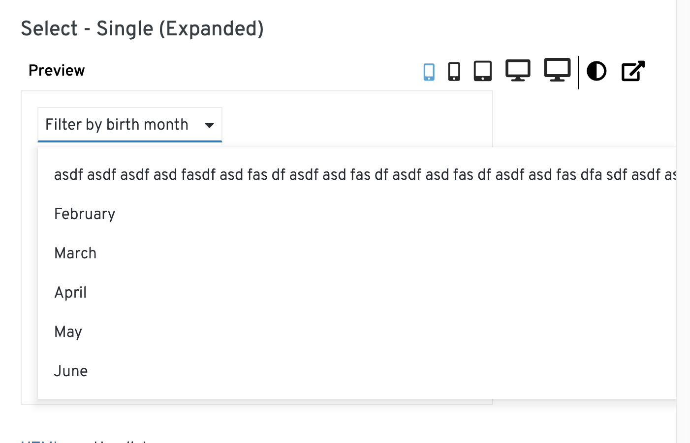
I would probably expect the default width of the select to match the widest item in the select menu. I guess that's a little weird when the initial value (ie, "please choose one") isn't in the menu. In that case, I would probably still expect the menu width to match the width of "please choose one", and not change when you select something else in the menu. I could also see allowing the menu to be as wide as the parent container, so it's basically 100% width, and that's constrained by the container it's in. And additionally, in this state, you could use a So maybe 2 modes. 1) The width matches the width of the widest thing in it, so that it doesn't change when you select things, and 2) it's 100% width and fills the width of it's parent element, and you could use this with a |
|
This sounds good @mcoker . I think it's important to be able to constrain the width independent of the content. For example, we might use the select to select a server name where the names could be anything and possibly long. Or worse the available values might change based on something else in the page. In this case I would not want the width of the Select to shrink or grow dependent on the values that are loaded. On a related note, can I assume that long values will truncate (i.e. if they do not fit)? |
Currently the text in the toggle will truncate, but the text in the dropdown options will not. The menu will just grow to match the width of the text inside of it.
Looking at Carbon and Bootstrap, Carbon always displays the dropdown menu as wide as the toggle (the entire dropdown is 100% width by default, so it consumes all of the available space it's in), then wraps the text if it exceeds the dropdown menu width.
Bootstrap behaves the same way we do.
|
|
In that case @mcoker I like it the way we have it. So long object names can be displayed at full length in the menu without wrapping. |
I'm having trouble finding a good way to implement case 1 so far, but case 2 is very straightforward. I'm curious if having the width default to 100% would be the best solution overall?
@mcoker The current build doesn't seem to truncate, if you define a long placeholder text the toggle div expands vertically. Am I missing a css class? |
|
We would likely need to add
Yep, looks like you're missing |
 christiemolloy
left a comment
christiemolloy
left a comment
christiemolloy
left a comment
There was a problem hiding this comment.
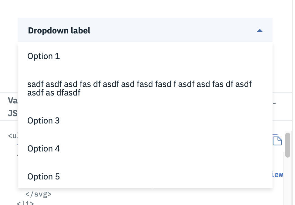
I agree with what @mcoker said above. Also the button that says "Clear" next to the select is confusing. IMO it would be better to have the select component handle the clearing of a selected option. Because in this example it looks as though the button is required to clear the selected option. In Boostrap their Select has a first option called: "Choose..." which returns the select back to default. And in Material-UI their Select has a first option that says "None". The button you chose is used as one of the primary buttons on the page and in this case its more of a clear button. @mcoker @mcarrano what do you think?
|
Agree re: the clear button. I think the default "none" option or whatever the text is in the toggle is also represented as an option in the menu to de-select would work. I also wonder if we could use the |
 kmcfaul
force-pushed
the
single-select
branch
from
kmcfaul
force-pushed
the
single-select
branch
from
e1703b4 to
74f0ef3
Compare
|
Your Travis build is fine, just merge master to get the latest .travis.yml changes to ignore the coveralls error. |
add tests, ts declarations. build select wrapper for future variant types
also locally test TS
defaults to 100%
…hen not focused in options

If toggle has focus and menu is open, keyboard input should behave as normal except for space and
enter
… keyboard focus, add missing to
rename aria labelled by, use constants, add missing props, update TS
kmcfaul
force-pushed
the
single-select
branch
from
dfc7a9d to
0cc32ed
Compare
|
@kmcfaul Looking good. I still don't understand why you are providing an interface for the SelectToggle. It is an internal component. |
|
Oh yeah, when I was first implementing the component I planned to follow Dropdown in that the user defines the toggle, but I found it wasn't really necessary and changed it to an internal component. I can remove that interface. |
christiemolloy
left a comment
christiemolloy
left a comment
There was a problem hiding this comment.
Great job on this one!!!
13 participants
What: Added select wrapper and single select variant along with tests and TS declarations. TS was tested locally.
Tried to structure Select for future use with other variants. Select control/state is outside of the component for now, matching Dropdown, but we may want to move that into Select itself and instead issue a callback when the selected items are updated.
Keyboard navigation is similar to Dropdown.
Refers to issue: #1214