chore(Wizard): make wizard inPage #4140
Conversation
|
PF4 preview: https://patternfly-react-pr-4140.surge.sh |
 dlabrecq
left a comment
dlabrecq
left a comment
dlabrecq
left a comment
There was a problem hiding this comment.
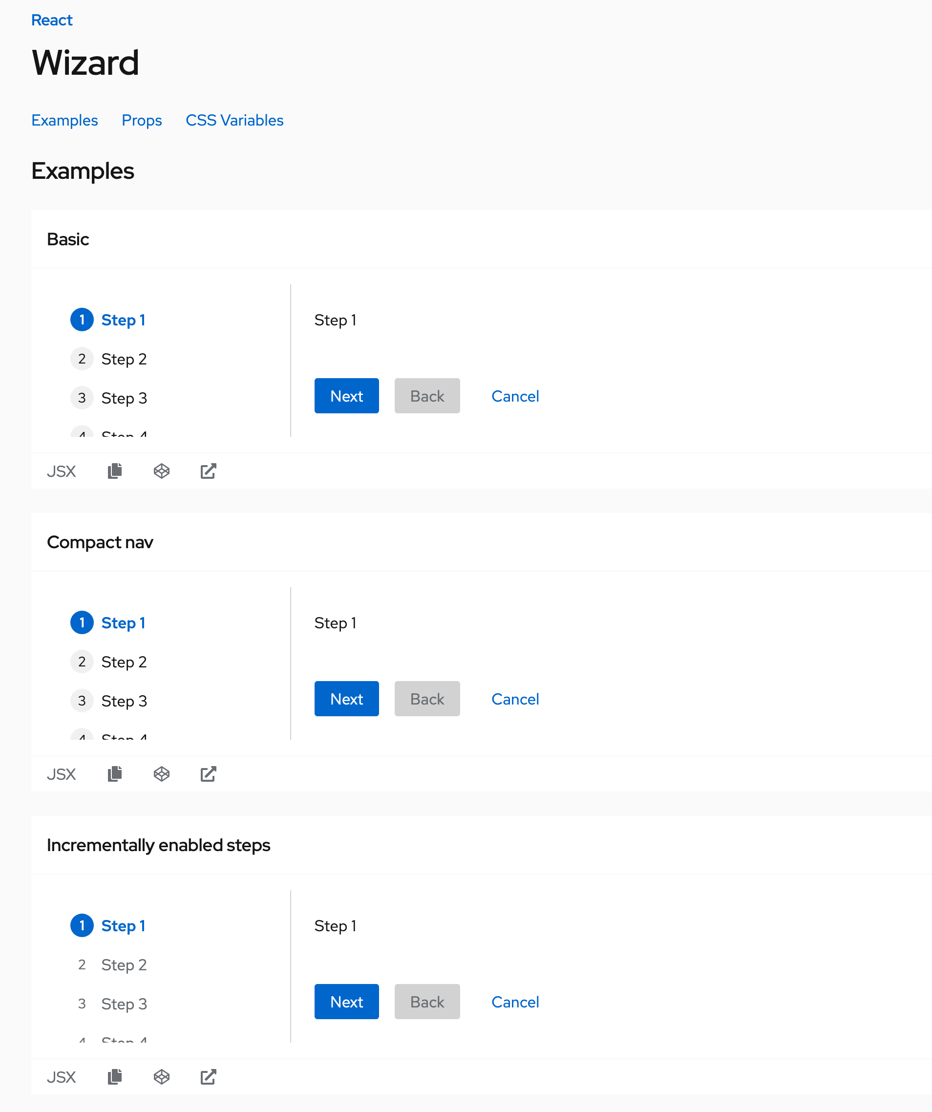
You can see the adverse effect of the wizard changes in our examples
| isOpen?: boolean; | ||
| /** True to show the wizard without the modal */ | ||
| isInPage?: boolean; |
There was a problem hiding this comment.
I don't understand why isOpen was removed? Are all wizards now being placed within a modal?
|
@dlabrecq To see the Wizard component in a Modal, there is now an example in the Modal component examples. I could conceivably add it to the wizard examples as well. The issue I addressed wanted to decouple the Wizard with the Modal component so that it wasn't a second modal implementation. |
|
@tlabaj |
 redallen
left a comment
redallen
left a comment
redallen
left a comment
There was a problem hiding this comment.
I'm liking where this is going~! You can create a wizard.css file with a rule like
.ws-react-c-wizard {
  min-height: 400px;
}
and just import it in Wizard.md to fix the height of the examples in the preview :)
| this.descriptionId = `pf-wizard-description-${newId}`; | ||
| } | ||
|
|
||
| this.state = { |
There was a problem hiding this comment.
If all you're doing is setting state, you don't need a constructor and can just set the class member state.
|
As for the API, I'm fine with whatever we choose since there aren't that many products using a Wizard:
My 2 cents are that we should create a wrapper |
|
This looks great @nicolethoen! A couple of things. In the example where we show the wizard in a modal
You can see examples of the size variation and wizard header in the core docs under demos -> wizard - http://patternfly-v4.surge.sh/documentation/core/demos/wizard |
These are the sorts of things that would actually be solved much easier with a WizardModal wrapper. Because the Wizard needs to know it's in a modal to have these features work correctly. It cannot remain parent agnostic. I will begin implementing a WizardModal component as Zac recommended. |
 tlabaj
added
the
Breaking change 💥
tlabaj
added
the
Breaking change 💥
 nicolethoen
force-pushed
the
wizard_modal_changes
branch
from
nicolethoen
force-pushed
the
wizard_modal_changes
branch
from
92ade72 to
72d3427
Compare
So, I think I was able to get it to work. If the consumer provides a Title, the WizardHeader will appear. So a Wizard with a Title placed in a Modal with the isBasic flag works like an old Wizard :) |
The wizard component was from the start fundamentally wrong, it's not specific usecase only to modals. It should be a component that can be placed wherever you want and be free with it. Why not placing the wizard component in dropdown? It might sound strange, but the useage of it can be actually pretty nice. As for the demo, the wizard page demo could have an example in modal since that's one usecase, but I wouldn't limit the wizard component to modals only. I think this is great direction with the wizard compoent, thank you @nicolethoen for taking care of it! |
| {children} | ||
| </ModalBoxBody> | ||
| {modalBoxFooter} | ||
| {!isBasic && showClose && <ModalBoxCloseButton onClose={onClose} />} |
There was a problem hiding this comment.
Can we remove this isBasic prop and unify all these elements into one component?
const ModalBody = () => {
  onst modalBoxHeader = header ? (
    <div className={css(titleStyles.title)}>{header}</div>
  ) : (
    <ModalBoxHeader hideTitle={hideTitle}> {title} </ModalBoxHeader>
  );

  const modalBoxFooter = footer ? (
    <ModalBoxFooter>{footer}</ModalBoxFooter>
  ) : (
    actions.length > 0 && <ModalBoxFooter>{actions}</ModalBoxFooter>
  );
  return <Fragment>
    {showClose && <ModalBoxCloseButton onClose={onClose} />}
    {modalBoxHeader}
    {description && <ModalBoxDescription id={id}>{description}</ModalBoxDescription>}
    <ModalBoxBody {...props} {...(!description && { id })}>
          {children}
        </ModalBoxBody>
    {modalBoxFooter}
</Fragment>
}
This way we won't have a ton of ifs in this component and it can just have children as with any other component.
If we don't want to break backwards compatibility that much we could add prop called bodyWrapper to Modal where you'd by default use ModalBody component, if you'd don't want to use you could pass in null or w/e. The bodyWrapper prop could be either null, string, number, function or node.
|
I've had discussion with a few folks about this PR, I really want it to be part of PF, because it can be great example of how to write and export componets as building blocks. However this can eventually be hard to migrate to as we usually have a lot of other things to do instead just fixing breaking changes from component libray. This PR fixes the linked issue in elegant way, but it will introduce a breaking change and would require from app developers to fix this. There can be another approach to this, it will bloat the PR, but I think it'll help us in the long run:
@nicolethoen the work you've done here is awesome, it actually led me to these ideas and proposals, without this change we'd probably won't know what would be the ideal outcome of original issue. But I feel like this is the right path. I'd be more than happy to implement it as well, because this might be interesting addition. That being said if you'd need any more information or didn't understood anything, don't hesitate to ask. I'll monitor this PR and try help you as much as I could so we can have this change un in the wilderness soon. |
nicolethoen
force-pushed
the
wizard_modal_changes
branch
from
72d3427 to
2bd7bfe
Compare
| /** Simple text content of the Modal Header, also used for aria-label on the body */ | ||
| title: string; | ||
| /** Flag to hide the title */ | ||
| hideTitle?: boolean; |
There was a problem hiding this comment.
This looks great! Can you please add all the breaking changes to the bottom of your PR? in this form:
## Breaking changes
- Your list of changes.
- You can use MD
| } | ||
| ``` | ||
|
|
||
| ```js title=No-title |
There was a problem hiding this comment.
the no header and no title examples seem identical?
There was a problem hiding this comment.
Lol, yep. That's evident of me experiencing tunnel vision.
| } | ||
| ``` | ||
|
|
||
| ```js title=With-wizard |
There was a problem hiding this comment.
The Escape button does not seem to be working to close the wizard.
nicolethoen
force-pushed
the
wizard_modal_changes
branch
from
7dae4e1 to
3df306c
Compare
Codecov Report
@@            Coverage Diff             @@
##               v4    #4140      +/-   ##
==========================================
- Coverage   58.73%   57.94%   -0.80%
==========================================
  Files         396      390       -6
  Lines        6007     5963      -44
  Branches     2350     2334      -16
==========================================
- Hits         3528     3455      -73
- Misses       2022     2060      +38
+ Partials      457      448       -9
Continue to review full report at Codecov.
|

| <div className={css(titleStyles.title)}>{header}</div> | ||
| ) : ( | ||
| <ModalBoxHeader hideTitle={hideTitle}> {title} </ModalBoxHeader> | ||
| title && <div className={css(styles.modalBoxTitle)}>{title}</div> |
There was a problem hiding this comment.
I think it might be good to keep the ModalBoxHeader and just update it. This way, existing consumers won't be too broken
 nicolethoen
force-pushed
the
wizard_modal_changes
branch
from
nicolethoen
force-pushed
the
wizard_modal_changes
branch
from
44dbf15 to
4fa074a
Compare
redallen
left a comment
redallen
left a comment
There was a problem hiding this comment.
This API is a crowd pleaser!
| target.appendChild(this.container); | ||
| } | ||
| this.toggleSiblingsFromScreenReaders(true); | ||
| const target = (typeof document !== 'undefined' && document.body) || null; |
There was a problem hiding this comment.
Creative way to write a ternary.
There was a problem hiding this comment.
lol I guess I too quickly borrowed the logic from a different part of the code :P
| /** Variant of the modal */ | ||
| variant?: 'small' | 'large' | 'default'; | ||
| /** Flag indicating if modal content should have no padding*/ | ||
| noPadding?: boolean; |
There was a problem hiding this comment.
I wonder if this prop name is too generic and might overlap or be confusing with other props we could introduce into the modal, like one that removes all padding from the modal, or just the padding from the <ModalBoxBody> element. I have seen potential use cases for the former.
Technically this prop removes the <ModalBoxBody> element all together.
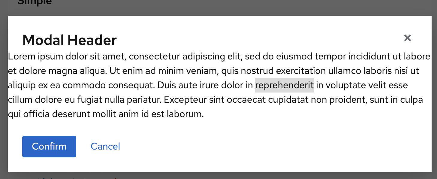
Here is what it looks like now with regular modal content and noPadding
There was a problem hiding this comment.
hm... would it makes sense to have it be called noModalBoxBody? Would that make sense to a consumer? Could something like removeBody make more sense?
There was a problem hiding this comment.
Yeah, noModalBoxBody definitely isn't as easy of a name, though it's a more accurate description of what it does. Or maybe noModalBoxBodyWrapper since you can still pass content and it puts it where the body would go. noModalBoxBody and removeBody could be confused with the modal having no body content. At any rate, I think as long as we document it, any of those names seem OK to me. I'm interested in others' thoughts.
|
Should we remove the |
 mcoker
left a comment
mcoker
left a comment
mcoker
left a comment
There was a problem hiding this comment.
Looks good to me! Thanks for all of your hard work on this @nicolethoen!
 karelhala
left a comment
karelhala
left a comment
karelhala
left a comment
There was a problem hiding this comment.
Looking good! I am wondering if we could also somehow export helper functions this.goToStepById, this.goToStepByName, this.onNext and this.onBack. No need to be part of this PR at all! But it would make the further usage of smaller building blocks much easier.
redallen
left a comment
redallen
left a comment
There was a problem hiding this comment.
I love seeing more lines removed than added :)
Thanks for the refactor @nicolethoen !
|
Your changes have been released in:
Thanks for your contribution! 🎉 |
9 participants
Summary of changes:
To Modal component
To Wizard component
Above changes address Core updates:
patternfly/patternfly#2969
patternfly/patternfly#2964
What: Closes #3668
Breaking changes