replace Toolbar with PageHeaderTools in page header #4223
Conversation
|
PF4 preview: https://patternfly-react-pr-4223.surge.sh |
 redallen
left a comment
redallen
left a comment
redallen
left a comment
There was a problem hiding this comment.
Looks good, just need some notes
| section: components | ||
| cssPrefix: 'pf-c-page' | ||
| typescript: true | ||
| propComponents: ['Page', 'PageHeader', 'PageSidebar', 'PageSection'] |
There was a problem hiding this comment.
Should the new Components be listed here so their props are included in the docs?
| className={css( | ||
| styles.pageHeaderToolsGroup, | ||
| className, | ||
| hiddenOnLg && styles.modifiers.mobile, |
There was a problem hiding this comment.
If we're going to structure this so that we offer header toolbar groups and items that require the user specify visibleOnLg for items that are only visible on desktop, hiddenOnSm for items that are hidden on mobile, etc, then I wonder if we should drop the current modifiers and use a hidden/visible mixin that would give us a set of styles that allow a user to specify pf-m-hidden[-on-{breakpoint}] and pf-m-visible[-on-{breakpoint}] on any header-tools-group or header-tools-item. In this PR, users can only specify hiddenOnLg , visibleOnLg, and hiddenOnSm.
Then users will have full control over hiding/showing things at any breakpoint. The downside to the current approach (whether we include the mixin or not) is that the responsibility is on the user to hide/show header toolbar items appropriately. The alternative to that would be to have something like 3 props on the header tools component, mobileDropdown, desktopActions, and userMenu or something like that, and we put the contents of those props in the appropriate classes and control the mobile, desktop, and user menu breakpoints where that content is hidden/shown.
The former seems like the better approach, but could lead to inconsistency in implementation. @mcarrano wdyt? If we're OK allowing users to hide/show any header toolbar items/groups at any breakpoint, but we show the proper way to do it in the demos and could have a masthead/header design guideline that goes into more detail, I'd like to drop the existing classes and add the full hidden/visible breakpoint classes to header toolbar groups and items.
We could keep the existing classes and add the hidden/visible classes on top, but that seems like it might be confusing to have both, and the prop names that enable the current classes seem like they would overlap.
There was a problem hiding this comment.
Yes, I was going back and forth with the prop names, initially I named them something similar to your mentioned alternative before landing on this (as it also seemed familiar with what we have in other components).
I guess if we wanted to we could streamline this even more and provide a way for users to define specific things and we can lay it out for them:
<PageHeaderTools
   mobileDropdown={<Dropdown />}
   desktopActions={
      { component: <NotificationBadge />, isSelected: false }
      { component: <Button><CogIcon /></Button>, isSelected: true }
   }
   userDropdown={
      <Dropdown />
   }
   avatar={<Avatar />}
>
   Other components here that should come before?
</PageHeaderTools>
Maybe this for ease-of-use, but still allow users to use the component without those convenience props and define the content themselves using visibility mixins?
There was a problem hiding this comment.
Looking at the way it's done in master now, it looks like we import the accessibility utility classes and it's up to users to apply hidden/visible classes on their own. It seems logical then to bake this hidden/visible behavior into the page header tools, and give users the ability to hide/show header elements at any breakpoint.
| * will render | ||
| * <button class="pf-m-plain pf-m-selected">Hello</button> | ||
| */ | ||
| export const PageHeaderToolsItem: React.FunctionComponent<PageHeaderToolsItemProps> = ({ |
There was a problem hiding this comment.
I'm curious how this component works. I think it would be more consistent if we had a .pf-c-page__header-tools-item class that you could apply hidden/visible to. I'm assuming that would still allow us to apply .pf-m-selected to a <Button> used in .pf-c-page__header-tools-item if it has the isSelected prop?
There was a problem hiding this comment.
So the problem is, in HTML you can just add the pf-m-selected class to a button anywhere. If you wanted to do this in react you'd have to manually add this class name yourself i.e.
<PageHeaderTools>
  <PageHeaderToolsGroup>
      <Button className="pf-m-selected">
          <CogIcon />
      </Button>
  </PageHeaderToolsGroup>
</PageHeaderTools>
because the selected modifier is not a prop we have available for Buttons, the class is defined in the context of page.
Wrapping the <Button> component in <PageHeaderToolsItem> basically allows me to pass the pf-m-selected class or any other potential modifier down to the child component.
 mcoker
left a comment
mcoker
left a comment
mcoker
left a comment
There was a problem hiding this comment.
This looks great, @jschuler! I left a few comments and created a follow up core issue to fix an alignment issue I'm seeing with one of the buttons in the header patternfly/patternfly#3086. Though how we fix that depends on what we decide with the comments I left, so I'll hold off on addressing #3086 for the time being.
|
@jschuler I realize that the goal of this PR is not to fully implement the intended design updates for the masthead, but here is a Marvel deck that shows where we want to get to for reference: https://marvelapp.com/5cjajdg/screen/63256946 Getting the demo as close as possible to this would be great. Note the the Notification icon never hides. |
|
@mcarrano thanks for that, I'll update the demo to reflect this layout as much as possible. @mcarrano @mcoker and @mceledonia and I met this morning and decided that core will make some changes. Core will remove the Once these changes are in the core v4 branch, we'll bring it into react and then I'll update this PR. So it'll be on hold until then! |
|
@jschuler patternfly/patternfly#3091 was merged.
|
|
Depends on #4243 |
| /** Content rendered in page header tools item. If you need the selected class, use the render prop instead */ | ||
| children?: React.ReactNode; | ||
| /** If you need the selected class, use this render prop instead of children */ | ||
| render?: (props: InjectedPageHeaderToolsItemProps) => React.ReactNode; |
There was a problem hiding this comment.
opened issue in core so this hopefully won't be necessary to get the selected class
patternfly/patternfly#3108
There was a problem hiding this comment.
We haven't really used an API like this before, but I like it and I think it satisfies the documentation part.
There was a problem hiding this comment.
Yes, I remembered there was some controversy about using cloneElement so render prop puts the resposibility of adding the class back to the user. anyways, this render prop will be short-lived once the mentioned core PR is available :)
redallen
left a comment
redallen
left a comment
There was a problem hiding this comment.
I think after RC1 we can come back and clean up the render API. One it passes CI this LGTM.
| /** Content rendered in page header tools item. If you need the selected class, use the render prop instead */ | ||
| children?: React.ReactNode; | ||
| /** If you need the selected class, use this render prop instead of children */ | ||
| render?: (props: InjectedPageHeaderToolsItemProps) => React.ReactNode; |
There was a problem hiding this comment.
We haven't really used an API like this before, but I like it and I think it satisfies the documentation part.
 tlabaj
added
the
Breaking change 💥
tlabaj
added
the
Breaking change 💥
| <div | ||
| className={css( | ||
| styles.pageHeaderToolsGroup, | ||
| breakpointMods && formatBreakpointMods(breakpointMods, styles), |
There was a problem hiding this comment.
I opened an issue agains the page header. formatBreakpointMods function does not work for the 2xl breakpoint.
|
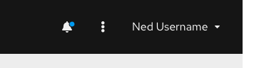
This LGTM, my only comments are that the notification bell should be in a header-tools-item element, and that the cog shouldn't be selected. We can add the selected state as an example with either a drawer or notification drawer demo where a header tools button toggles a drawer. |
 mcarrano
left a comment
mcarrano
left a comment
mcarrano
left a comment
There was a problem hiding this comment.
This is looking good @jschuler . I just had a couple of requests to try and get this closer to the intended design.
- At the medium breakpoint the avatar should hide and the user dropdown just displays the user name as shown here:
- At the small breakpoint, the user menu should collapse entirely into the kebob as shown here:

The way it is now, the user menu is not accessible when only the avatar is present.
Also, I would remove the selected state from the gear icon. Ideally each of those icons would have a hover which is same as the selected state you are showing. Let me know if you have questions. I would be glad to walk through this with you.
Codecov Report
@@            Coverage Diff             @@
##               v4    #4223      +/-   ##
==========================================
- Coverage   57.85%   55.36%   -2.50%
==========================================
  Files         391      428      +37
  Lines        5979     7077    +1098
  Branches     2354     2612     +258
==========================================
+ Hits         3459     3918     +459
- Misses       2064     2666     +602
- Partials      456      493      +37
Continue to review full report at Codecov.
|

|
@jschuler looks like we lost the header tools in the card view demo - https://patternfly-react-pr-4223.surge.sh/documentation/react/demos/cardview/basic. Otherwise LGTM! |
|
@mcoker thanks, I can add those in a followup PR |
 tlabaj
left a comment
tlabaj
left a comment
tlabaj
left a comment
There was a problem hiding this comment.
Thanks for the updates. Looks good.
|
@jschuler Fix conflicts and we can merge! |
9 participants
What: Closes #4106
This PR updates the page demos to use the new
PageHeaderTools/PageHeaderToolsGroup/PageHeaderToolsItemcomponentshttps://patternfly-react-pr-4223.surge.sh/documentation/react/demos/pagelayout
Breaking changes
PageHeader:
avatarprop was removed. Add the avatar to thePageHeaderToolscomponent instead (which is passed intoPageHeadervia theheaderToolsprop.PageHeader:
toolbarprop was removed. Use theheaderToolsprop instead. Also, if you previously used theToolbar,ToolbarGroup, orToolbarItemcomponents for the header, replace them with thePageHeaderTools,PageHeaderToolsGroup, andPageHeaderToolsItemcomponents.