A collection of basic composable components for creating calendars.
Add the following line to your pubspec.yaml
calendar_components: ^0.1.0This package comes with some very simple components for you to build your own calendar.
These components expect you to handle the design and state by yourself. Having designed a few customised calendars myself, I've found it hard to follow a specific design and modifying it to fit my needs. Because of this, the components in this package only provide an item builder with certain useful parameters for you to construct your own widgets.
The header of a calendar. Typically shown at the top of the calendar.
CalendarComponentHeader(
  itemBuilder: (day) => Text(day.name),
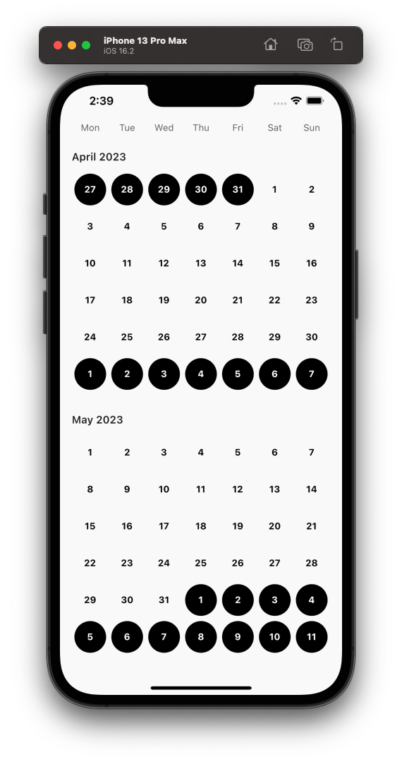
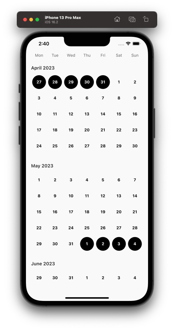
)The basic calendar grid. If the start and end dates are not specified, the calendar grid is fully filled with 6 rows of 7 days with underflowed/overflowed dates. An example of underflow/overflow:
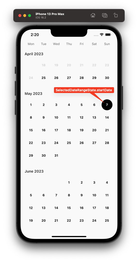
To deal with overflow, you can specify your own date range for either/both start and end dates. For example, if the end date is 30th April 2023, the grid would only build items up till the last day of the week containing 30th April 2023.
Referring to the example above:
Notice that the overflowed week at the bottom has been removed but the underflowed days remain at the top since removing the whole week would mean removing the 1st and 2nd days of the month, which is part of the current month and shouldn't be removed.
final currentMonth = DateTime.now();

CalendarComponentDayGrid(
  currentMonth: currentMonth,
  startDate: currentMonth.copyWith(day: 1),
  endDate: currentMonth.lastDayOfCurrentMonth(),
  itemBuilder: (context, date, index) {
    return Text('${date.day}');
  },
)

// or

CalendarComponentDayGrid.noOverflow(
  currentMonth: currentMonth,
  startDate: currentMonth.copyWith(day: 1),
  endDate: currentMonth.lastDayOfCurrentMonth(),
  itemBuilder: (context, date, index) {
    return Text('${date.day}');
  },
);A selectable day grid of a calendar which allows for the selection of one or more date(s). This is a StatelessWidget. You should handle storing your selected date(s) by yourself.
An isSelected boolean is provided in the item builder to render your widget for selected and unselected states.
final currentMonth = DateTime.now();

CalendarComponentSelectableDayGrid.single(
  selectedDate: ...,
  currentMonth: currentMonth,
  itemBuilder: (context, date, isSelected, index) {
    return GestureDetector(
      onTap: () => setState(() {
        // Do something
      }),
      child: Text('${date.day}'),
    );
  },
)

// or

CalendarComponentSelectableDayGrid.multiple(
  selectedDates: [...],
  currentMonth: currentMonth,
  startDate: currentMonth.copyWith(day: 1),
  endDate: currentMonth.lastDayOfCurrentMonth(),
  itemBuilder: (context, date, isSelected, index) {
    return GestureDetector(
      onTap: () => setState(() {
        // Do something
      }),
      child: Text('${date.day}'),
    );
  },
);A selectable ranged day grid of a calendar which allows for the selection of a range of dates. This is a StatelessWidget. You should handle storing your selected date range by yourself. An example is provided in the example/ folder.
The item builder for this widget contains a SelectedDateRangeState passed in its builder.
A SelectedDateRangeState describes what state a selected date is in inside the CalendarComponentRangedSelectableDayGrid calendar grid
If this value is null, it means the item being built is not a selected item nor is it within a selected date range.
If only one date is chosen, this corresponds to an unconnected start date. Note that there cannot be an unconnected end date since it is unbounded at this point.
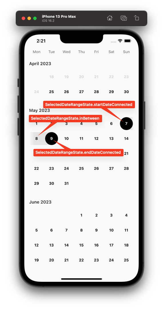
For a valid/bounded date range, it is possible to determine whether an item in the selected date range is a start date, end date or in between. Notice that the enum is called startConnected and endConnected. This is because the date range is now valid and you may want to render a joined selected item widget.
Additionally, there is also a startDateIsEndDate enum value to describe that the start and end dates are the same. This is exposed in case you want to render this as a valid date range.
Also included is an index that is passed in the item builder. This is typically useful for showing fade effects/gradients at the extreme ends of the calendar grid.
CalendarComponentSelectableRangedDayGrid(
  selectedStartDate: ...,
  selectedEndDate: ...,
  currentMonth: DateTime.now(),
  itemBuilder: (context, date, selectedState, index) {
    return GestureDetector(
      onTap: () => setState(() {
        // Do something
      }),
      child: Text('${date.day}'),
    );
  },
)


