-
Notifications
You must be signed in to change notification settings - Fork 4.7k
New issue
Have a question about this project? Sign up for a free GitHub account to open an issue and contact its maintainers and the community.
By clicking “Sign up for GitHub”, you agree to our terms of service and privacy statement. We’ll occasionally send you account related emails.
Already on GitHub? Sign in to your account
Slider Component #39
Comments
|
Hi Cagatay, It would be really great to display the scale over the slider. Like this : 1 2 3 4 5 As it we can see where to click and what is the value pointed Thanks You do really a good job |
|
Thank you, is there an example slider somewhere that has a scale? |
|
Thank you, there is also; |
|
Yep, that looks pretty sweet. |
|
Let's track at #118 |
|
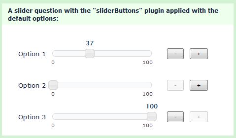
I prefer to have a label (= fixed tooltip) above the handle with the current selected value in it (cfr option 1 of slider scale) because if you use the slider within a small component (eg. search facets of 300px wide), the scale cannot be displayed, unless you only can select 3 values in range or so. It would be great if both solutions (fixed scale + label above handle) would be implemented and users can select which solution they want to use via attributes on the component |


No description provided.
The text was updated successfully, but these errors were encountered: