
Note: Remember, there's so much information out there. Don't be afraid to explore and learn the various tools out there for visualization.
"If you're not Googling, you're not trying" - Anonymous :-)
Humans are very visual creatures. We understand things better when we see things visualized. However, the step to presenting analyses, results or insights can be a bottleneck: you might not even know where to start or you might have already a right format in mind. Luckily for you, there is Matplotlib!
Matplotlib is a python library that help us to plot data. The easiest and basic plots are line, scatter and histogram plots.
- Line plot is better when x axis is time.
- Scatter plot is better when there is correlation between two variables
- Histogram is better when we need to see distribution of numerical data.
- Customization: Colors,labels,thickness of line, title, opacity, grid, figsize, ticks of axis and linestyle
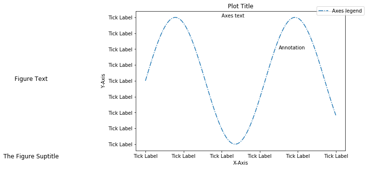
The anatomy of Matplotlib can be simply broken down into: figure, axes, tick labels, (X,Y)-axis labels, title, and legend.
-
Figure: The Figure is the overall window or page that everything is drawn on.
-
Axes: Ontop of a figure are axes. The Axes is the area on which the data is plotted with functions such as plot(). It contains your ticks, labels, etc.
-
Tick Labels: These are the values, which are the locations along the x and y axis where the tick marks appear.
-
Axis Labels: These are your X and Y axis column name that represents the type of values you're displaying.
-
Title: This is just the title of your graph
-
Legend: This represents your graph's key, which represents the different categories of your visualization. It requires handles as parameters
Matplotlib is a is a plotting library for the Python programming language. It allows to make quality charts in few lines of code. Most of the other python plotting library are build on top of Matplotlib.
It makes that a basic understanding of matplotlib is probably needed to make any chart with python. I highly advise you to have a look to the matplotlib homepage and have a look to this general concept page.
This page aims to give a few tip concerning the general usage of Matplotlib. It gives examples showing how to custom your title, the colors of your chart, how to annotate it etc.
Resource: https://www.datacamp.com/community/tutorials/matplotlib-tutorial-python#anatomy

For now to keep it simple, let's prepare our dataset by creating two arrays. One for year values and the other for population values.
# This magic function allows you to display your graphs without the need of plt.show()
%matplotlib inline

# Import the matplotlib library
import matplotlib.pyplot as plt

# Prepare your dataset
year = [1950, 1960, 1970, 1980, 1990, 2000, 2010, 2020]
population = [3, 4, 5, 6, 7.5, 9, 11, 15]
baby_population = [0.5, 1, 2, 3, 6, 8, 12, 13]Apply the plot() function and pass in two parameters: your x-values and y-values
# A. Create two plots
population_handle, = plt.plot(year, population, color='red', label='World Population')
baby_handle, = plt.plot(year, baby_population, color='blue', label='Baby Population')

# =============================================================================================
# Modify Aesthics of Your Graph
# =============================================================================================

# Create a title for your graph
plt.title('World Population Projection')

# Label your X-Axis
plt.xlabel('Year')

# Label your Y-Axis
plt.ylabel('Population (In Billions)')

# Modify your Y-Axis Ticks
plt.yticks([0,3,6,9,12,15,18],['0','3B','6B','9B','12B','15B','18B'])

# Display a grid layout on the graph
plt.grid()

# Define and display your Legend
plt.legend(handles=[population_handle,baby_handle],loc='upper right')
<matplotlib.legend.Legend at 0x231bfee0be0>


Not only are Pandas used for data manipulation, but Pandas also has a built in function that allows you to perform simple and powerful graphs from Matplotlib itself! We'll dive into three common graphs: Scatter Plot, Histograms, and
# Import the necessary libraries
import pandas as pd
import matplotlib.pyplot as plt

# Prepare your dataset
year = [1950, 1960, 1970, 1980, 1990, 2000, 2010, 2020]
population = [3, 4, 5, 6, 7.5, 9, 11, 15]
baby_population = [0.5, 1, 2, 3, 6, 8, 12, 13]

# Convert your list into a DataFrame
world_df = pd.DataFrame({"Year":year, "World Population":population, "Baby Population":baby_population})
# Examine the first five observations in your DataFrame
world_df.head().dataframe tbody tr th {
vertical-align: top;
}
.dataframe thead th {
text-align: right;
}
| Year | World Population | Baby Population | |
|---|---|---|---|
| 0 | 1950 | 3.0 | 0.5 |
| 1 | 1960 | 4.0 | 1.0 |
| 2 | 1970 | 5.0 | 2.0 |
| 3 | 1980 | 6.0 | 3.0 |
| 4 | 1990 | 7.5 | 6.0 |
# Use your DataFrame to create a line plot
world_df.plot(x="Year", y="World Population", kind = 'line', color = 'blue',label = 'World Population',alpha = 0.5, grid = True)

plt.xlabel('Years')
plt.ylabel('World Population')
plt.title('World Population Line Plot')
plt.show()
world_df.plot(kind='scatter', x='World Population', y='Year',alpha = 0.5,color = 'red')
plt.xlabel('World Population')
plt.ylabel('Year')
plt.title('World Population Scatter Plot')
plt.show()
world_df["Baby Population"].plot(kind = 'hist',bins = 20,figsize = (10,4), color='green')
plt.xlabel('Baby Population')
plt.ylabel('Frequency')
plt.title('Baby Population Histogram')
plt.show()