-
Notifications
You must be signed in to change notification settings - Fork 14k
rustdoc: redesign [+]/[−] controls #113074
New issue
Have a question about this project? Sign up for a free GitHub account to open an issue and contact its maintainers and the community.
By clicking “Sign up for GitHub”, you agree to our terms of service and privacy statement. We’ll occasionally send you account related emails.
Already on GitHub? Sign in to your account
Conversation
|
r? @jsha (rustbot has picked a reviewer for you, use r? to override) |
|
Some changes occurred in HTML/CSS/JS. cc @GuillaumeGomez, @Folyd, @jsha Some changes occurred in GUI tests. |
This comment has been minimized.
This comment has been minimized.
c18871a to
2436438
Compare
|
I think it's a great idea! A few comments now: I find that the "toggle all" button attracts too much attention: It has the same "level" of importance as the other buttons (help and settings). Also, its style differs from the other toggles. For the other buttons, the I think the appearance of the |
That seems like it's just Should I make the "toggle all" button see-through on dark theme, like this?
#107658 claimed that the toggle design made it too hard to tell them apart from each other, so the color change was aimed at making the + and − easier to distinguish. Do you have any alternative suggestions? |
Yep with background color of button being the same color as the "general" background, looks great (or just transparent, as you prefer).
I don't agree that this is an issue, quite the opposite when I see the result. My attention is bugged by this difference. Looking at the sign tells me if it's for expanding or collapsing, I don't think adding something to differentiate +/- buttons is a good idea. But as usual, we can see what the rest of the team thinks about it. I personally think it makes it more distracting than actually useful. |
|
Some changes occurred in HTML/CSS themes. |
|
Updated the PR by making plus and minus have the same border: Before: https://github.com/rust-lang/rust/assets/1593513/1ed1e302-2490-4d20-859a-5e52d5a280c0 After: https://github.com/rust-lang/rust/assets/1593513/883d3bd9-58f9-47bc-a8e7-d226c25c5d0f |
This comment has been minimized.
This comment has been minimized.
This comment has been minimized.
This comment has been minimized.
|
Looks good to me, thanks! |
|
@rfcbot fcp merge |
|
Team member @notriddle has proposed to merge this. The next step is review by the rest of the tagged team members: Concerns:
Once a majority of reviewers approve (and at most 2 approvals are outstanding), this will enter its final comment period. If you spot a major issue that hasn't been raised at any point in this process, please speak up! See this document for info about what commands tagged team members can give me. |
|
Don't forget to fix the CI failure. ;) |
8d94986 to
522d6c0
Compare
|
One tiny issue I see is that this makes the "Trait std::iter::Iterator" and "1.0.0 · source" text blocks even more misaligned, I wonder if it's possible to have them on the same baseline and keep the button looking good. |
|
@rfcbot concern bigger-plus-sign |
|
👍 |
|
I guess ❤️ means it fixed it. @rfcbot resolve bigger-plus-sign |
|
☔ The latest upstream changes (presumably #113732) made this pull request unmergeable. Please resolve the merge conflicts. |
2ab84f6 to
bf2ee19
Compare
|
@Nemo157 I've tweaked the alignment of the out-of-band pane.
|
|
If I align it with the · bullet point, it looks like this: If I align it with the 1.0.0 version number, it looks like this: If I align it with the source link, it looks like this: For comparison's sake, here's what it looks like now: Personally, I think they all look terrible, and that this whole section should be redesigned to not use a bunch of different font sizes in a line like that. |
|
Agreed. Thanks for sharing the results. What do you think @camelid ? |
This is a continuation of rust-lang#107658 and rust-lang#59851, making the toggles
consistent with other buttons, instead of looking like syntax.

The tactics to improve the look of these controls:

* When the toggle is expanded, the minus sign remains as dark as
  before, but the border is lighter. The plus sign has a border
  that's the same color as the label (black, on the default theme).
  This makes expansion buttons more prominent, easier to tell
  apart from collapse buttons.
* The plus sign is slightly taller than wide, also to make
  it easier to tell apart from the minus sign.
  * The use of crispEdges has to get a bit strategic to make this
    come out right. I've tested it on Firefox, Safari, and
    Chromium, but it's a bit hard to be sure it works right on
    all setups.
  * Does anybody know some trick to do crispEdges on only the
    X axis, while still allowing antialiasing on the Y?
* The "toggle all" button is modeled after the Help and Settings
  buttons, with a matching border, width, and +/− label.
16a861c to
b3c08a3
Compare
This comment has been minimized.
This comment has been minimized.
b1d9af3 to
5731a0a
Compare
This comment has been minimized.
This comment has been minimized.
5731a0a to
97cdf9c
Compare
97cdf9c to
36f75e4
Compare
|
I forgot to resolve concern in this comment. @rfcbot resolve bigger-plus-sign |
|
Wrong concern... @rfcbot resolve why-not-triangle |
|
Ah only original author can resolve the concern. Let's wait for @jsha then. |
|
I'd still really like to figure out a way to make this work with triangles. It seems like we have common feeling on the team and elsewhere that triangles are the standard web way to make this type of interaction, and would be ideal. It sounds like the only thing blocking them is that the control in the top-right can't be a triangle (I agree), and if it's text, the layout moves around when the text changes. I think there are ways to solve those problems; for instance by making a text control that has a fixed size, and choosing words that are similar in size so that feels natural. Or even rethinking the top-right control entirely. I feel bad holding up progress on something that has been more or less ready to go for a while now; I have been wanting to present a workable demo of the above ideas, and apologies for not dedicating the time so far to do so. The reason I'm resistant to the incremental improvement now followed by a possible bigger improvement later is that the nature of docs.rs means we will have for a while some docs with the old |
|
Obsoleted by #129545 |
…GuillaumeGomez rustdoc: redesign toolbar and disclosure widgets Fixes rust-lang#77899 Fixes rust-lang#90310 ## Preview | before | after | ------ | ----- |  |  |  | 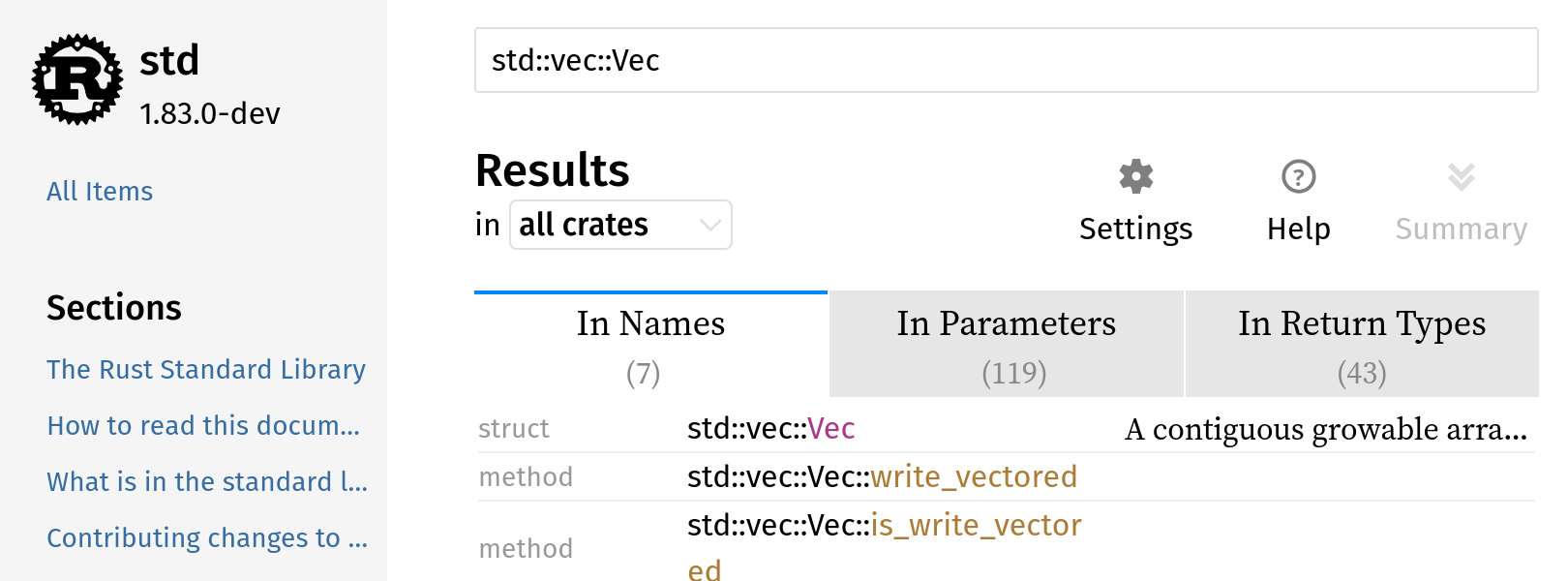 | 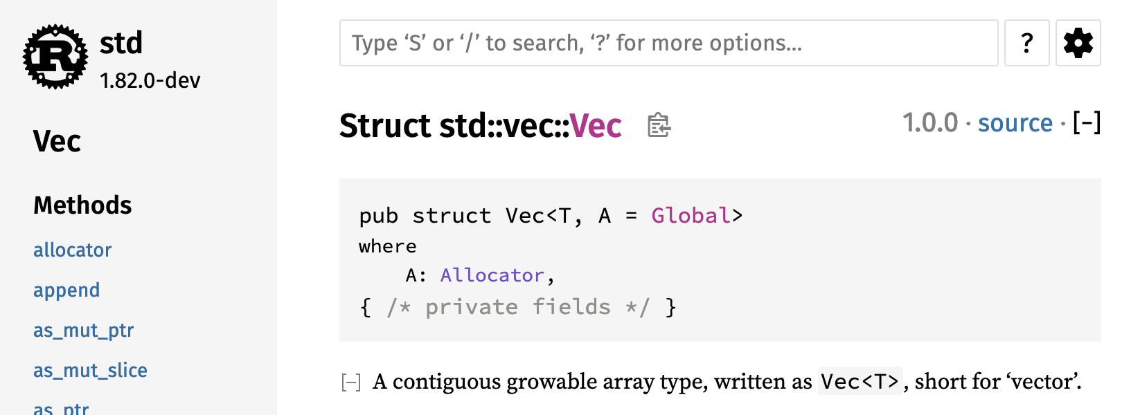 | 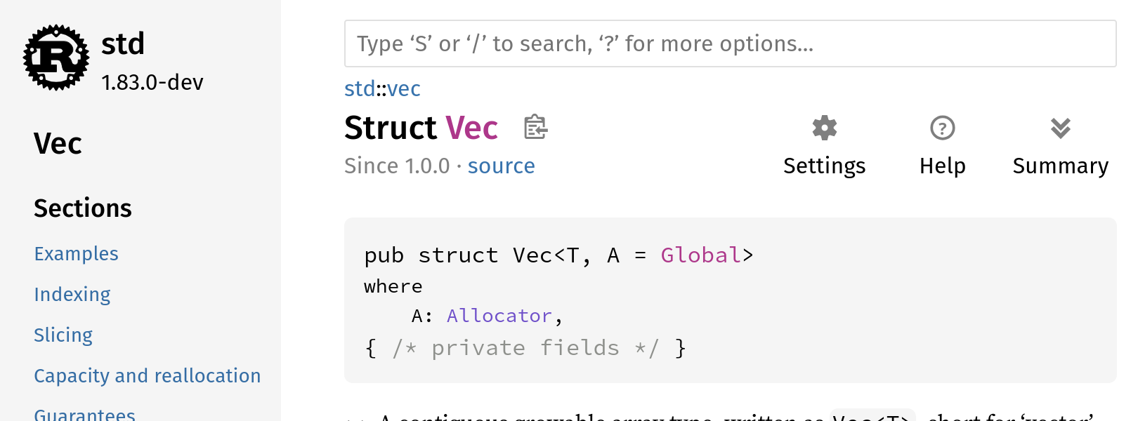 | 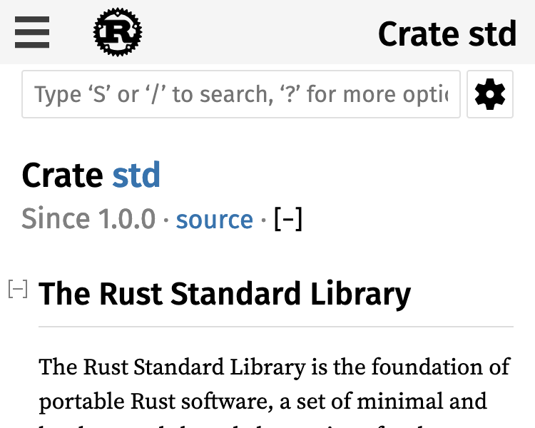 | 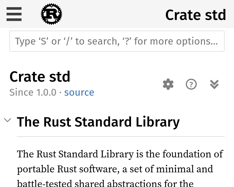 | 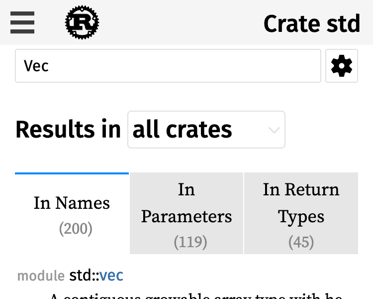 | 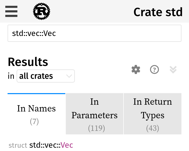 | N/A |  | 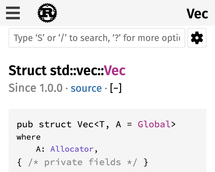 | 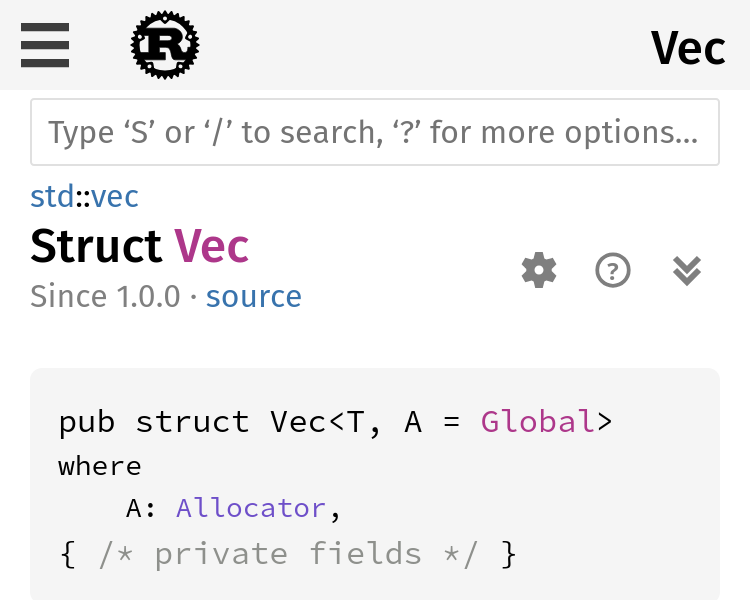 |  |  https://notriddle.com/rustdoc-html-demo-12/toolbar-v2/std/index.html ## Description This adds labels to the icons and moves them away from the search box. These changes are made together, because they work together, but are based on several complaints: * The [+/-] thing are a Reddit-ism. They don't look like buttons, but look like syntax <https://rust-lang.zulipchat.com/#narrow/stream/266220-t-rustdoc/topic/More.20visual.20difference.20for.20the.20.2B.2F-.20.20Icons>, <rust-lang#59851> (some of these are laundry lists with more suggestions, but they all mention [+/-] looking wrong) * The settings, help, and summary buttons are also too hard to recognize <https://lwn.net/Articles/987070/>, <rust-lang#90310>, <rust-lang#14475 (comment)>, <https://internals.rust-lang.org/t/improve-rustdoc-design/12758> ("Not all functionality is self-explanatory, for example the [+] button in the top right corner, the theme picker or the settings button.") The toggle-all and toggle-individual buttons both need done at once, since we want them to look like they go together. This changes them from both being [+/-] to both being arrows. CC <rust-lang#113074 (comment)> and `@jsha` regarding the use of triangles for disclosure, which is what everyone wanted, but was pending a good toggle-all button. This PR adds a toggle-all button that should work. Settings and Help are also migrated, so that the whole group can benefit from being described using actual words. The breadcrumbs also get redesigned, so that they use less space, by shrinking the parent module path parts. This is done at the same time as the toolbar redesign because it's, effectively, moving space from the toolbar to the breadcrumbs. This is aimed at avoiding any line wrapping at desktop sizes. ## Prior art This style of toolbar, with explicit labels on the buttons, used to be more popular. It's not very common in web browsers nowadays, and for truly universal icons like ⬅️ I can understand why, but words are great when icons fail. 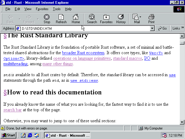
…GuillaumeGomez rustdoc: redesign toolbar and disclosure widgets Fixes rust-lang#77899 Fixes rust-lang#90310 ## Preview | before | after | ------ | ----- |  |  |  |  |  |  |  |  |  |  | N/A |  |  |  |  |  https://notriddle.com/rustdoc-html-demo-12/toolbar-v2/std/index.html ## Description This adds labels to the icons and moves them away from the search box. These changes are made together, because they work together, but are based on several complaints: * The [+/-] thing are a Reddit-ism. They don't look like buttons, but look like syntax <https://rust-lang.zulipchat.com/#narrow/stream/266220-t-rustdoc/topic/More.20visual.20difference.20for.20the.20.2B.2F-.20.20Icons>, <rust-lang#59851> (some of these are laundry lists with more suggestions, but they all mention [+/-] looking wrong) * The settings, help, and summary buttons are also too hard to recognize <https://lwn.net/Articles/987070/>, <rust-lang#90310>, <rust-lang#14475 (comment)>, <https://internals.rust-lang.org/t/improve-rustdoc-design/12758> ("Not all functionality is self-explanatory, for example the [+] button in the top right corner, the theme picker or the settings button.") The toggle-all and toggle-individual buttons both need done at once, since we want them to look like they go together. This changes them from both being [+/-] to both being arrows. CC <rust-lang#113074 (comment)> and `@jsha` regarding the use of triangles for disclosure, which is what everyone wanted, but was pending a good toggle-all button. This PR adds a toggle-all button that should work. Settings and Help are also migrated, so that the whole group can benefit from being described using actual words. The breadcrumbs also get redesigned, so that they use less space, by shrinking the parent module path parts. This is done at the same time as the toolbar redesign because it's, effectively, moving space from the toolbar to the breadcrumbs. This is aimed at avoiding any line wrapping at desktop sizes. ## Prior art This style of toolbar, with explicit labels on the buttons, used to be more popular. It's not very common in web browsers nowadays, and for truly universal icons like ⬅️ I can understand why, but words are great when icons fail. 
…GuillaumeGomez rustdoc: redesign toolbar and disclosure widgets Fixes rust-lang#77899 Fixes rust-lang#90310 ## Preview | before | after | ------ | ----- |  |  |  |  |  |  |  |  |  |  | N/A |  |  |  |  |  https://notriddle.com/rustdoc-html-demo-12/toolbar-v2/std/index.html ## Description This adds labels to the icons and moves them away from the search box. These changes are made together, because they work together, but are based on several complaints: * The [+/-] thing are a Reddit-ism. They don't look like buttons, but look like syntax <https://rust-lang.zulipchat.com/#narrow/stream/266220-t-rustdoc/topic/More.20visual.20difference.20for.20the.20.2B.2F-.20.20Icons>, <rust-lang#59851> (some of these are laundry lists with more suggestions, but they all mention [+/-] looking wrong) * The settings, help, and summary buttons are also too hard to recognize <https://lwn.net/Articles/987070/>, <rust-lang#90310>, <rust-lang#14475 (comment)>, <https://internals.rust-lang.org/t/improve-rustdoc-design/12758> ("Not all functionality is self-explanatory, for example the [+] button in the top right corner, the theme picker or the settings button.") The toggle-all and toggle-individual buttons both need done at once, since we want them to look like they go together. This changes them from both being [+/-] to both being arrows. CC <rust-lang#113074 (comment)> and ``@jsha`` regarding the use of triangles for disclosure, which is what everyone wanted, but was pending a good toggle-all button. This PR adds a toggle-all button that should work. Settings and Help are also migrated, so that the whole group can benefit from being described using actual words. The breadcrumbs also get redesigned, so that they use less space, by shrinking the parent module path parts. This is done at the same time as the toolbar redesign because it's, effectively, moving space from the toolbar to the breadcrumbs. This is aimed at avoiding any line wrapping at desktop sizes. ## Prior art This style of toolbar, with explicit labels on the buttons, used to be more popular. It's not very common in web browsers nowadays, and for truly universal icons like ⬅️ I can understand why, but words are great when icons fail. 
…GuillaumeGomez rustdoc: redesign toolbar and disclosure widgets Fixes rust-lang#77899 Fixes rust-lang#90310 ## Preview | before | after | ------ | ----- |  |  |  |  |  |  |  |  |  |  | N/A |  |  |  |  |  https://notriddle.com/rustdoc-html-demo-12/toolbar-v2/std/index.html ## Description This adds labels to the icons and moves them away from the search box. These changes are made together, because they work together, but are based on several complaints: * The [+/-] thing are a Reddit-ism. They don't look like buttons, but look like syntax <https://rust-lang.zulipchat.com/#narrow/stream/266220-t-rustdoc/topic/More.20visual.20difference.20for.20the.20.2B.2F-.20.20Icons>, <rust-lang#59851> (some of these are laundry lists with more suggestions, but they all mention [+/-] looking wrong) * The settings, help, and summary buttons are also too hard to recognize <https://lwn.net/Articles/987070/>, <rust-lang#90310>, <rust-lang#14475 (comment)>, <https://internals.rust-lang.org/t/improve-rustdoc-design/12758> ("Not all functionality is self-explanatory, for example the [+] button in the top right corner, the theme picker or the settings button.") The toggle-all and toggle-individual buttons both need done at once, since we want them to look like they go together. This changes them from both being [+/-] to both being arrows. CC <rust-lang#113074 (comment)> and `@jsha` regarding the use of triangles for disclosure, which is what everyone wanted, but was pending a good toggle-all button. This PR adds a toggle-all button that should work. Settings and Help are also migrated, so that the whole group can benefit from being described using actual words. The breadcrumbs also get redesigned, so that they use less space, by shrinking the parent module path parts. This is done at the same time as the toolbar redesign because it's, effectively, moving space from the toolbar to the breadcrumbs. This is aimed at avoiding any line wrapping at desktop sizes. ## Prior art This style of toolbar, with explicit labels on the buttons, used to be more popular. It's not very common in web browsers nowadays, and for truly universal icons like ⬅️ I can understand why, but words are great when icons fail. 
…GuillaumeGomez rustdoc: redesign toolbar and disclosure widgets Fixes rust-lang#77899 Fixes rust-lang#90310 ## Preview | before | after | ------ | ----- |  |  |  |  |  |  |  |  |  |  | N/A |  |  |  |  |  https://notriddle.com/rustdoc-html-demo-12/toolbar-v2/std/index.html ## Description This adds labels to the icons and moves them away from the search box. These changes are made together, because they work together, but are based on several complaints: * The [+/-] thing are a Reddit-ism. They don't look like buttons, but look like syntax <https://rust-lang.zulipchat.com/#narrow/stream/266220-t-rustdoc/topic/More.20visual.20difference.20for.20the.20.2B.2F-.20.20Icons>, <rust-lang#59851> (some of these are laundry lists with more suggestions, but they all mention [+/-] looking wrong) * The settings, help, and summary buttons are also too hard to recognize <https://lwn.net/Articles/987070/>, <rust-lang#90310>, <rust-lang#14475 (comment)>, <https://internals.rust-lang.org/t/improve-rustdoc-design/12758> ("Not all functionality is self-explanatory, for example the [+] button in the top right corner, the theme picker or the settings button.") The toggle-all and toggle-individual buttons both need done at once, since we want them to look like they go together. This changes them from both being [+/-] to both being arrows. CC <rust-lang#113074 (comment)> and ``@jsha`` regarding the use of triangles for disclosure, which is what everyone wanted, but was pending a good toggle-all button. This PR adds a toggle-all button that should work. Settings and Help are also migrated, so that the whole group can benefit from being described using actual words. The breadcrumbs also get redesigned, so that they use less space, by shrinking the parent module path parts. This is done at the same time as the toolbar redesign because it's, effectively, moving space from the toolbar to the breadcrumbs. This is aimed at avoiding any line wrapping at desktop sizes. ## Prior art This style of toolbar, with explicit labels on the buttons, used to be more popular. It's not very common in web browsers nowadays, and for truly universal icons like ⬅️ I can understand why, but words are great when icons fail. 
Rollup merge of rust-lang#129545 - notriddle:notriddle/toolbar-v2, r=GuillaumeGomez rustdoc: redesign toolbar and disclosure widgets Fixes rust-lang#77899 Fixes rust-lang#90310 ## Preview | before | after | ------ | ----- |  |  |  |  |  |  |  |  |  |  | N/A |  |  |  |  |  https://notriddle.com/rustdoc-html-demo-12/toolbar-v2/std/index.html ## Description This adds labels to the icons and moves them away from the search box. These changes are made together, because they work together, but are based on several complaints: * The [+/-] thing are a Reddit-ism. They don't look like buttons, but look like syntax <https://rust-lang.zulipchat.com/#narrow/stream/266220-t-rustdoc/topic/More.20visual.20difference.20for.20the.20.2B.2F-.20.20Icons>, <rust-lang#59851> (some of these are laundry lists with more suggestions, but they all mention [+/-] looking wrong) * The settings, help, and summary buttons are also too hard to recognize <https://lwn.net/Articles/987070/>, <rust-lang#90310>, <rust-lang#14475 (comment)>, <https://internals.rust-lang.org/t/improve-rustdoc-design/12758> ("Not all functionality is self-explanatory, for example the [+] button in the top right corner, the theme picker or the settings button.") The toggle-all and toggle-individual buttons both need done at once, since we want them to look like they go together. This changes them from both being [+/-] to both being arrows. CC <rust-lang#113074 (comment)> and ``@jsha`` regarding the use of triangles for disclosure, which is what everyone wanted, but was pending a good toggle-all button. This PR adds a toggle-all button that should work. Settings and Help are also migrated, so that the whole group can benefit from being described using actual words. The breadcrumbs also get redesigned, so that they use less space, by shrinking the parent module path parts. This is done at the same time as the toolbar redesign because it's, effectively, moving space from the toolbar to the breadcrumbs. This is aimed at avoiding any line wrapping at desktop sizes. ## Prior art This style of toolbar, with explicit labels on the buttons, used to be more popular. It's not very common in web browsers nowadays, and for truly universal icons like ⬅️ I can understand why, but words are great when icons fail. 
…Gomez rustdoc: redesign toolbar and disclosure widgets Fixes #77899 Fixes #90310 ## Preview | before | after | ------ | ----- |  |  |  |  |  |  |  |  |  |  | N/A |  |  |  |  |  https://notriddle.com/rustdoc-html-demo-12/toolbar-v2/std/index.html ## Description This adds labels to the icons and moves them away from the search box. These changes are made together, because they work together, but are based on several complaints: * The [+/-] thing are a Reddit-ism. They don't look like buttons, but look like syntax <https://rust-lang.zulipchat.com/#narrow/stream/266220-t-rustdoc/topic/More.20visual.20difference.20for.20the.20.2B.2F-.20.20Icons>, <rust-lang/rust#59851> (some of these are laundry lists with more suggestions, but they all mention [+/-] looking wrong) * The settings, help, and summary buttons are also too hard to recognize <https://lwn.net/Articles/987070/>, <rust-lang/rust#90310>, <rust-lang/rust#14475 (comment)>, <https://internals.rust-lang.org/t/improve-rustdoc-design/12758> ("Not all functionality is self-explanatory, for example the [+] button in the top right corner, the theme picker or the settings button.") The toggle-all and toggle-individual buttons both need done at once, since we want them to look like they go together. This changes them from both being [+/-] to both being arrows. CC <rust-lang/rust#113074 (comment)> and ``@jsha`` regarding the use of triangles for disclosure, which is what everyone wanted, but was pending a good toggle-all button. This PR adds a toggle-all button that should work. Settings and Help are also migrated, so that the whole group can benefit from being described using actual words. The breadcrumbs also get redesigned, so that they use less space, by shrinking the parent module path parts. This is done at the same time as the toolbar redesign because it's, effectively, moving space from the toolbar to the breadcrumbs. This is aimed at avoiding any line wrapping at desktop sizes. ## Prior art This style of toolbar, with explicit labels on the buttons, used to be more popular. It's not very common in web browsers nowadays, and for truly universal icons like ⬅️ I can understand why, but words are great when icons fail. 


Fixes #60255
Preview
Web preview: http://notriddle.com/rustdoc-html-demo-6/plus-minus-december-2023/std/iter/trait.Iterator.html
Image preview (GitHub's downscaling makes it hard to see some of what I'm talking about, so you might want to open the image in a new tab):

Image preview of "toggle all" button:

Description
This is a continuation of #107658 and #59851, making the toggles consistent with other buttons, instead of looking like syntax.
The tactics to improve the look of these controls: