Add Progress Bar Component #1773
Conversation
|
I learning and working on adding test cases, as per given instructions in the contribution guide. I will update with a patch, adding it in sometime soon. :) |
|
@aswinshenoy Screenshots are looking great! I'll try to get you feedback on your props/API proposal soon. |
|
@interactivellama meanwhile, I will add the component into Regards, |
 aswinshenoy
force-pushed
the
progress-bar
branch
from
aswinshenoy
force-pushed
the
progress-bar
branch
from
3e94f26 to
54b35dd
Compare
|
yes, multiple commits are fine. |
 tanhengyeow
left a comment
tanhengyeow
left a comment
tanhengyeow
left a comment
There was a problem hiding this comment.
Just some friendly pointers from me after taking a quick look at this PR :)
Can take them into consideration but I think @interactivellama would advice better 😄
|
Props proposal is approved. Please ping when you are ready for a review. |
|
Props approved. Please proceed with tests, since this isn't interactive DOM and image snapshots should be enough. @aswinshenoy The prop type for |
|
Also, you have lint errors |
|
I have added snapshot test, and written |
|
@aswinshenoy Because I was unclear about how the Jest snapshot tests were to be created, I went ahead and pushed an update to your branch. 9dcb6d5#diff-ef6040eafe786a4a9723ca820a5e2566R43 The |
|
@interactivellama I have pushed adding ids in the examples, and the tests have passed it seems :) Sorry, I was a bit late and inactive for some days. |
aswinshenoy
force-pushed
the
progress-bar
branch
2 times, most recently
from
f1fd7de to
12917f9
Compare
|
@aswinshenoy I will be the last person to complain about being late and inactive (at least before and after the official GSoC time 😄 ). |
|
As an aside, @aswinshenoy it's great that you have added some of the building block components that will be consumed by Setup Assistant. |
move width to progress-bar__value
…to pr/aswinshenoy/1773

# Conflicts:
#	components/story-based-tests.js
 interactivellama
left a comment
interactivellama
left a comment
interactivellama
left a comment
There was a problem hiding this comment.
I found a few bugs. Mostly the width issue.
components/progress-bar/index.jsx
Outdated
| this.props.className | ||
| )} | ||
| style={{ | ||
| width: `${this.props.value}%`, |
There was a problem hiding this comment.
There isn't a gray background on the progress bar as in https://www.lightningdesignsystem.com/components/progress-bar/. This is because the "container" width is being set instead of slds-progress-bar__value.
There was a problem hiding this comment.
Sorry, I must have been a little careless there. :( Looks perfect with your patch 👍
components/progress-bar/index.jsx
Outdated
| > | ||
| <span>{this.props.label}</span> | ||
| <span aria-hidden="true"> | ||
| <strong>{this.props.value}% Complete</strong> |
There was a problem hiding this comment.
All text should be able to be changed with props in order to support internationalization.
There was a problem hiding this comment.
True, I forgot about the internationalization part. Seems like you already fixed it with labels prop. Thank you :)
…eact into pr/aswinshenoy/1773

# Conflicts:
#	components/progress-bar/__examples__/default.jsx
#	components/progress-bar/__examples__/descriptive.jsx
|
Looks good! Thank you @aswinshenoy |
|
@interactivellama It is wonderful to see it done :) I will looking forward for more 👍 Thank you so much for writing out the test, and doing all those changes. 💯 I had been a little sloppy on this, perhaps, sorry. |
|
I just talked to a program manager today on an internal team, and they are looking to consume this and ScopedNotification, so I wanted to go ahead and get this these merged. |
|
@interactivellama that's cool, thank you. The #1785 PR that adds ScopedNotifications also has also passed the tests and seems it is mergeable now after your fixes. |
4 participants
Fixes #1365
Added Progress Bar Component support.
@interactivellama @futuremint, kindly review it, I will make any changes required.
Additional description
The progress bar component as found in SLDS has been ported to react, with almost all its functionality, and reusing the same classes.
Props Taken
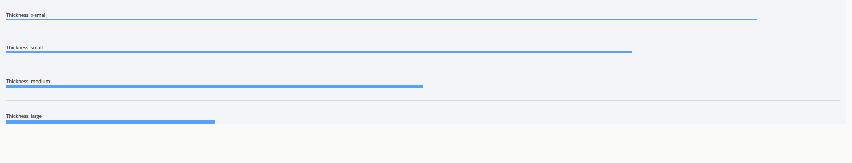
id- HTML id for the component containerclassName- CSS classes to be added to tag with.slds-progress-bar.label- Label for the progress bar, if provided will render as a descriptive progress barcolor- Color to be filled in the progress barthickness- Thickness of the progress barvalue- Percentage of progress completion, ranging [0, 100].Limitations
Screenshots
Default -


With Label -
Color set to success -
Different Thickness -
Rounded -
CONTRIBUTOR checklist (do not remove)
Please complete for every pull request
npm run lint:fixhas been run and linting passes.components/component-docs.jsonCI tests pass (npm test).REVIEWER checklist (do not remove)
components/component-docs.jsontests.Required only if there are markup / UX changes
last-slds-markup-reviewinpackage.jsonand push.last-accessibility-review, topackage.jsonand push.npm run local-updatewithin locally cloned site repo to confirm the site will function correctly at the next release.