Add Visual Picker Component #1786
Conversation
|
A five-minute look at the examples looks like this is the right direction and looking great! I may need a few more days to re-review my own props proposal and look this pull request more in-depth. |
|
There are some text size issues with the coverable variant.
From https://www.lightningdesignsystem.com/components/visual-picker/ |
There was a problem hiding this comment.
Functionally, this is working well.
Since this is essentially a pretty radio and checkbox group. I'd like to mirror the API of Radio Button Group https://github.com/salesforce/design-system-react/blob/master/components/radio-button-group/__docs__/storybook-stories.jsx#L34 and Button Group (Checkbox variant)
I'm thinking something like:
<VisualPicker content="coverable" variant="radio" // this is actually "base" on the SLDS site
  <Radio label="Connected App" onRenderVisualPickerNotSelected={<Icon iconName="lightning" />} /> // clone radio child and pass in variant="visual-picker-coverable"
</VisualPicker>
This would allow custom icons and other things like custom SVG. What do you think?
|
So, is it going to be like https://github.com/salesforce/design-system-react/blob/master/components/button-group/index.jsx, where we will clone <Radio> / <Checkbox> and render? |
|
Yes, I think these would clone and add a My main thought on this is make sure consumers know it's a Radio or Checkbox, so that they know it has limitations. |
 aswinshenoy
force-pushed
the
visual-picker
branch
from
aswinshenoy
force-pushed
the
visual-picker
branch
from
6583ee5 to
38593ea
Compare
components/checkbox/index.jsx
Outdated
| {!this.props.vertical ? ( | ||
| <span className="slds-visual-picker__body"> | ||
| <span className="slds-text-heading_small"> | ||
| {this.props.label} |
There was a problem hiding this comment.
The prop label has been deprecated for checkbox. This will need to be this.props.labels.label
|
In regards to the
Then, for
|
aswinshenoy
force-pushed
the
visual-picker
branch
2 times, most recently
from
2e67e8d to
3519db5
Compare
aswinshenoy
force-pushed
the
visual-picker
branch
from
3519db5 to
c54ecf4
Compare
components/checkbox/index.jsx
Outdated
| /** | ||
| * Allows icon to shown with checkbox (only for non-coverable visual picker variant) | ||
| */ | ||
| onRenderVisualPicker: PropTypes.node, |
There was a problem hiding this comment.
@aswinshenoy these onRender{Item} props need to be functions, and then in the examples the content should be returned from those functions:
https://github.com/salesforce/design-system-react/blob/master/docs/codebase-overview.md#prefix-render-props-with-onrender
components/checkbox/index.jsx
Outdated
| /** | ||
| * Allows icon to shown with checkbox (only for non-coverable visual picker variant) | ||
| */ | ||
| onRenderVisualPicker: PropTypes.node, |
There was a problem hiding this comment.
onRender callbacks should be function instead of type node
Although, I guess that isn't very clear here and assumes that:
https://github.com/salesforce/design-system-react/blob/master/docs/codebase-overview.md#prefix-render-props-with-onrender
…react into visual-picker

# Conflicts:
#	components/checkbox/index.jsx
#	components/component-docs.json
#	components/radio/index.jsx
#	components/visual-picker/__docs__/storybook-stories.jsx
#	components/visual-picker/__examples__/coverable.jsx
#	components/visual-picker/__examples__/non-coverable.jsx
#	components/visual-picker/__examples__/vertical-coverable.jsx
#	components/visual-picker/__examples__/vertical.jsx
#	components/visual-picker/__tests__/visual-picker.browser-test.jsx
#	components/visual-picker/index.jsx
#	components/visual-picker/link.jsx
…react into visual-picker
components/radio/index.jsx
Outdated
| /** | ||
| * Allows icon to shown if radio is not selected (only for non-coverable visual picker variant) | ||
| */ | ||
| onRenderVisualPicker: PropTypes.node, |
There was a problem hiding this comment.
This should be of type function along with the other render props in radio
components/visual-picker/index.jsx
Outdated
| /* Licensed under BSD 3-Clause - see LICENSE.txt or git.io/sfdc-license */ | ||
|
|
||
| // Implements the [Visual Picker design pattern](https://lightningdesignsystem.com/components/visual-picker/) in React. | ||
| // Based on SLDS v2.4.5 |
There was a problem hiding this comment.
This version is wrong. The whole line can be removed though.
| id="visual-picker-vertical-coverable-radio-1" | ||
| onRenderVisualPickerSelected={ | ||
| <Icon | ||
| assistiveText={this.props.assistiveText} |
There was a problem hiding this comment.
The icons in this vertical coverable example should have text in it. Currently it's undefined, so the screen reader doesn't read anything. The name of the icon would be fine since this example doesn't exist in SLDS.
connected_apps or check
The goes for the checkbox examples in this story.
If you run npm run test:accessibility (I would recommend commenting out all of the components in story-based-tests.jsx except VisualPicker in order to speed things up.), you will see:
aXe Testing
    aXe storyshots
      SLDSVisualPicker
        ✓ Coverable (2646ms)
        ✓ Non-Coverable (2902ms)
        ✓ Links (518ms)
        ✓ Vertical (2295ms)
        ✕ Vertical Coverable (1938ms)

  ● aXe Testing › aXe storyshots › SLDSVisualPicker › Vertical Coverable

    expect(received).toHaveNoViolations(expected)

    Expected the HTML found at $('#visual-picker-vertical-coverable-radio-1') to have no violations:

    <input type="radio" id="visual-picker-vertical-coverable-radio-1" name="visual-picker-vertical-coverable-radio_options" value="">

    Expected the HTML found at $('#visual-picker-vertical-coverable-radio-2') to have no violations:

    <input type="radio" id="visual-picker-vertical-coverable-radio-2" name="visual-picker-vertical-coverable-radio_options" value="">

    Expected the HTML found at $('#visual-picker-vertical-coverable-checkbox-1') to have no violations:

    <input id="visual-picker-vertical-coverable-checkbox-1" name="visual-picker-vertical-coverable-checkbox_options" type="checkbox">

    Expected the HTML found at $('#visual-picker-vertical-coverable-checkbox-2') to have no violations:

    <input id="visual-picker-vertical-coverable-checkbox-2" name="visual-picker-vertical-coverable-checkbox_options" type="checkbox">

    Expected the HTML found at $('#visual-picker-vertical-coverable-checkbox-3') to have no violations:

    <input id="visual-picker-vertical-coverable-checkbox-3" name="visual-picker-vertical-coverable-checkbox_options" type="checkbox">

    Received:

    "Form elements must have labels (label)"

    Try fixing it with this help: https://dequeuniversity.com/rules/axe/3.2/label?application=axeAPI

      65 | 			const component = story.render(context);
      66 | 			const wrapper = mount(component);
    > 67 | 			expect(await axe(wrapper.html())).toHaveNoViolations();
         | 			                                  ^
      68 | 		},
      69 | 	});
      70 | });
|
@aswinshenoy I've completed my review. Please update and I think we can merge. |
|
@aswinshenoy please add VisualPicker to |
|
@aswinshenoy please add the contents of VisualPicker's |
 kevinparkerson
left a comment
kevinparkerson
left a comment
kevinparkerson
left a comment
There was a problem hiding this comment.
This seems good to go now!
|
Hi @kevinparkerson @aswinshenoy wondering any estimates when the visual picker will be released? Will this be part of next 0.10.6 release? |
|
@Rancho06 Most likely next week. You can clone and run |
|
thanks @interactivellama That's very good to know! |
4 participants
Fixes #1693
Hi @interactivellama, @futuremint!
Added an initial draft for the Visual Picker Component from SLDS, feedback would be much appreciated.
Additional description
Currently has -
VisualPicker Component
Coverable Component (Will Rename / Merge)
NonCoverable Component (Will Rename / Merge)
I am still working on adding support for Vertical Picker and Link Picker
Also, will look onto merging coverable, non-coverable and other children of visual picker into one type.
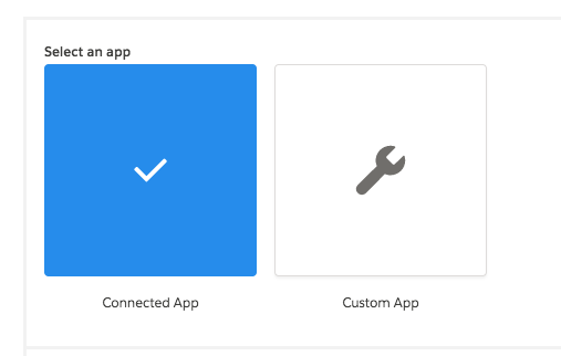
Screenshots
Coverable Visual Picker
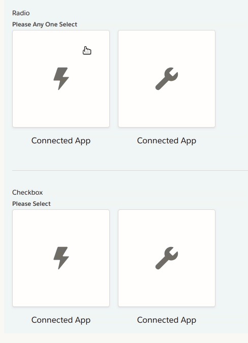
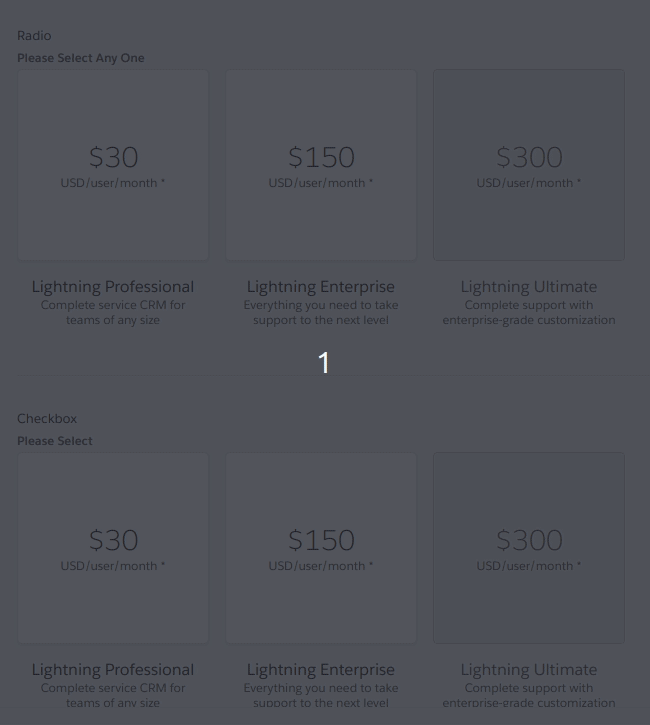
Non-Coverable Visual Picker
CONTRIBUTOR checklist (do not remove)
Please complete for every pull request
npm run lint:fixhas been run and linting passes.components/component-docs.jsonCI tests pass (npm test).REVIEWER checklist (do not remove)
components/component-docs.jsontests.Required only if there are markup / UX changes
last-slds-markup-reviewinpackage.jsonand push.last-accessibility-review, topackage.jsonand push.npm run local-updatewithin locally cloned site repo to confirm the site will function correctly at the next release.