Skip to content

Conversation

@tanhengyeow
Copy link
Contributor

@tanhengyeow tanhengyeow commented Mar 5, 2019

Fixes #1691

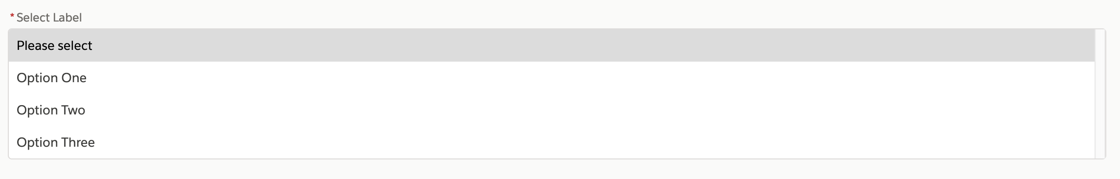
Hi @interactivellama ! Feedback for the initial draft would be appreciated :)

Select:

const propTypes = {
	/**
	 * Shows red borders in the input element is there is an error
	 */
	hasError: PropTypes.bool,
	/**
	 * Shows the content of the Select component.
	 */
	children: PropTypes.node.isRequired,
};

SelectContainer:

const propTypes = {
	/**
	 * The `aria-describedby` attribute is used to indicate the IDs of the elements that describe the object. It is used to establish a relationship between widgets or groups and text that described them. This is very similar to aria-labelledby: a label describes the essence of an object, while a description provides more information that the user might need.
	 */
	'aria-describedby': PropTypes.string,
	/**
	 * Every select input must have a unique ID in order to support keyboard navigation and ARIA support.
	 */
	id: PropTypes.string,
	/**
	 * Highlights the select input as a required field (does not perform any validation).
	 */
	required: PropTypes.bool,
	/**
	 * Disables the select input and prevents editing the contents.
	 */
	disabled: PropTypes.bool,
	/**
	 * Displays options in a multiple selection narrow format.
	 */
	isMultipleSelection: PropTypes.boolean,
	/**
	 * Select options.
	 */
	options: PropTypes.arrayOf(PropTypes.string),
};

Error:

const propTypes = {
	/**
	 * Message to display when the input is in an error state. When this is present, also visually highlights the component as in error.
	 */
	errorText: PropTypes.oneOfType([PropTypes.node, PropTypes.string]) /**
	 * Every label must have a unique ID in order to support keyboard navigation and ARIA support.
	 */,
	id: PropTypes.string.isRequired,
};

Some screenshots for reference below.

Base:
image

Required:
image

Error:
image

Disabled:
image

Multiple Selection Narrow:
image

I'll add support for Multiple Selection once #1712 is fixed.

Additional description


CONTRIBUTOR checklist (do not remove)

Please complete for every pull request

  • First-time contributors should sign the Contributor License Agreement. It's a fancy way of saying that you are giving away your contribution to this project. If you haven't before, wait a few minutes and a bot will comment on this pull request with instructions.
  • npm run lint:fix has been run and linting passes.
  • Mocha, Jest (Storyshots), and components/component-docs.json CI tests pass (npm test).
  • Tests have been added for new props to prevent regressions in the future. See readme.
  • Review the appropriate Storybook stories. Open http://localhost:9001/.
  • The Accessibility panel of each Storybook story has 0 violations (aXe). Open http://localhost:9001/.
  • Review tests are passing in the browser. Open http://localhost:8001/.
  • Review markup conforms to SLDS by looking at DOM snapshot strings.

REVIEWER checklist (do not remove)

  • TravisCI tests pass. This includes linting, Mocha, Jest, Storyshots, and components/component-docs.json tests.
  • Tests have been added for new props to prevent regressions in the future. See readme.
  • Review the appropriate Storybook stories. Open http://localhost:9001/.
  • The Accessibility panel of each Storybook story has 0 violations (aXe). Open http://localhost:9001/.
  • Review tests are passing in the browser. Open http://localhost:8001/.
  • Review markup conforms to SLDS by looking at DOM snapshot strings.
Required only if there are markup / UX changes
  • Add year-first date and commit SHA to last-slds-markup-review in package.json and push.
  • Request a review of the deployed Heroku app by the Salesforce UX Accessibility Team.
  • Add year-first review date, and commit SHA, last-accessibility-review, to package.json and push.
  • While the contributor's branch is checked out, run npm run local-update within locally cloned site repo to confirm the site will function correctly at the next release.

@interactivellama
Copy link
Contributor

Initial thoughts:
label should be prop, so we can require it (or assistiveText.label if it's not visible). Please review Input component https://react.lightningdesignsystem.com/components/inputs/ and consider merging these into one component called Select.

@stale
Copy link

stale bot commented May 9, 2019

This issue has been automatically marked as stale, because it has not had recent activity. It will be closed if no further activity occurs. Maintainers are responsible for tech debt and project health. This is most likely a new components or component feature request. Please submit a pull request for or request feedback on this feature. Thank you.

Copy link
Contributor

@interactivellama interactivellama left a comment

Choose a reason for hiding this comment

The reason will be displayed to describe this comment to others. Learn more.

I left some comments on the code. DOM snapshot tests still need to be added.

import React from 'react';
import IconSettings from '~/components/icon-settings';
import Select from '~/components/select';
import SelectContainer from '../private/container';
Copy link
Contributor

Choose a reason for hiding this comment

The reason will be displayed to describe this comment to others. Learn more.

No components in private folder should be used by consumers or in examples

import IconSettings from '~/components/icon-settings';
import Select from '~/components/select';
import SelectContainer from '../private/container';
import Label from '../private/label';
Copy link
Contributor

Choose a reason for hiding this comment

The reason will be displayed to describe this comment to others. Learn more.

Label should be a prop of Select component.

render() {
return (
<IconSettings iconPath="/assets/icons">
<Select>
Copy link
Contributor

Choose a reason for hiding this comment

The reason will be displayed to describe this comment to others. Learn more.

The outputted markup is good, but this should all be one component called Select, since I don't foresee any rearrangement of these such as the label after the select element, etc.

@interactivellama
Copy link
Contributor

Based on LinkedIn message with @tanhengyeow I'm going to close this pull request. Feel free to pick it back up when you have time to complete it. Thanks!

…to pr/tanhengyeow/1791

# Conflicts:
#	components/index.js
Sign up for free to join this conversation on GitHub. Already have an account? Sign in to comment

Projects

None yet

Development

Successfully merging this pull request may close these issues.

Add Select component

2 participants