Publisher: Adds basic component #1913
Conversation
Publisher component was missing in DSR. This commit roughly
implements the component. More props are yet to be added and tests
are to be added too.
|
@interactivellama @futuremint This is now ready for review. |
 interactivellama
left a comment
interactivellama
left a comment
interactivellama
left a comment
There was a problem hiding this comment.
This is just props proposal feedback right now.
| /** | ||
| * This label appears above the text area | ||
| */ | ||
| label: PropTypes.string, |
There was a problem hiding this comment.
According to the SLDS site, there is no visible label. Therefore this should be assistiveText.label
There was a problem hiding this comment.
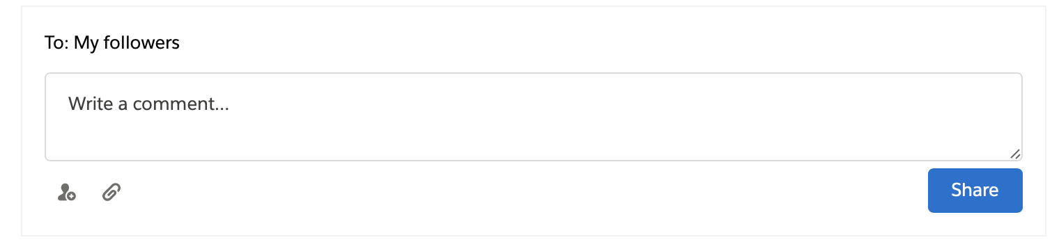
I added label prop as there is a visible label for textarea in this example To: My followers. I can update the name to a better one if this is confusing.
| /** | ||
| * This label appears above the text area | ||
| */ | ||
| label: PropTypes.string, |
There was a problem hiding this comment.
There should be a labels.comment for the comment text button, so that it can be changed. Also any "English text" in this component for instance add user title should be here. the Share button, etc.
| * Unique ID for the component to enable ARIA functioning and keyboard interactions | ||
| */ | ||
| id: PropTypes.string, | ||
| /** |
There was a problem hiding this comment.
I would recommend an avatar prop for use by the comment variant. This would allow reuse and customization of the Avatar component to the consuming developers needs including clicking the Avatar
There was a problem hiding this comment.
I will add an avatar prop and update the PR soon.
| /** | ||
| * Function callback on click of submit button | ||
| */ | ||
| onSubmit: PropTypes.func.isRequired, |
There was a problem hiding this comment.
Is this double function for share and comment?
There was a problem hiding this comment.
Yes, it's for both of those.
|
This issue has been automatically marked as stale, because it has not had recent activity. It will be closed if no further activity occurs. Maintainers are responsible for tech debt and project health. This is most likely a new components or component feature request. Please submit a pull request for or request feedback on this feature. Thank you. |
2 participants
Publisher component was missing in DSR. This PR is focussed at the implementation of the component in DSR.
Fixes #1910
Additional description
CONTRIBUTOR checklist (do not remove)
Please complete for every pull request
npm run lint:fixhas been run and linting passes.components/component-docs.jsonCI tests pass (npm test).REVIEWER checklist (do not remove)
components/component-docs.jsontests.Required only if there are markup / UX changes
last-slds-markup-reviewinpackage.jsonand push.last-accessibility-review, topackage.jsonand push.npm run local-updatewithin locally cloned site repo to confirm the site will function correctly at the next release.