Fix Material non-primary themes #3621
Conversation
Codecov Report✅ All modified and coverable lines are covered by tests. Additional details and impacted files@@ Coverage Diff @@
## master #3621 +/- ##
=======================================
Coverage 83.29% 83.29%
=======================================
Files 611 611
Lines 37646 37646
Branches 6182 6158 -24
=======================================
Hits 31358 31358
- Misses 5332 5345 +13
+ Partials 956 943 -13 ☔ View full report in Codecov by Sentry. |
 RaymondLuong3
left a comment
RaymondLuong3
left a comment
RaymondLuong3
left a comment
There was a problem hiding this comment.
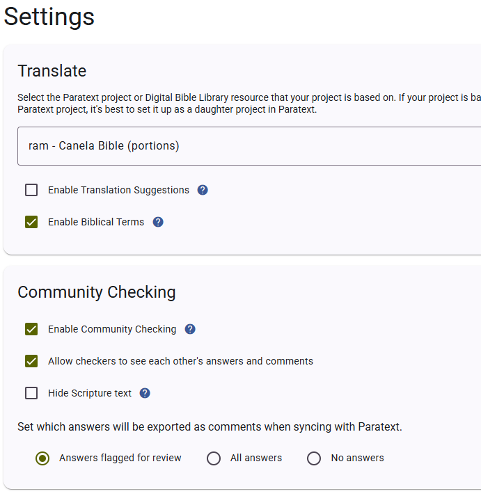
Something is not right. On the settings page the checkboxes and radio buttons use the accent colour as the default.
@RaymondLuong3 reviewed 2 files and all commit messages, and made 1 comment.
Reviewable status:complete! all files reviewed, all discussions resolved (waiting on @Nateowami).
|
@RaymondLuong3 That's what they always used to do. It's a recent thing that they aren't green. |
RaymondLuong3
left a comment
RaymondLuong3
left a comment
There was a problem hiding this comment.
Hah, I don't remember these ever being the accent colour. Hey, now you would be able to use the "warn" colour on the settings page for the delete this project button.
@RaymondLuong3 made 1 comment.
Reviewable status:
|
@RaymondLuong3 You're marked as the assignee on this PR but haven't approved or requested changes. Is that intentional? |
RaymondLuong3
left a comment
RaymondLuong3
left a comment
There was a problem hiding this comment.
I was waiting for a response from my previous comment. It is related to this PR. I will request that change and you can decide whether you would like to make it or not.
@RaymondLuong3 made 1 comment.
Reviewable status:
 Nateowami
force-pushed
the
fix/material-themes
branch
from
Nateowami
force-pushed
the
fix/material-themes
branch
from
25a2bfc to
01ee455
Compare
 Nateowami
left a comment
Nateowami
left a comment
Nateowami
left a comment
There was a problem hiding this comment.
Done.
For what it's worth, I interpreted:
Hey, now you would be able to use the "warn" colour on the settings page for the delete this project button.
as "here's a potential idea", not a request for changes. Just letting you know how I (mis)understood it.
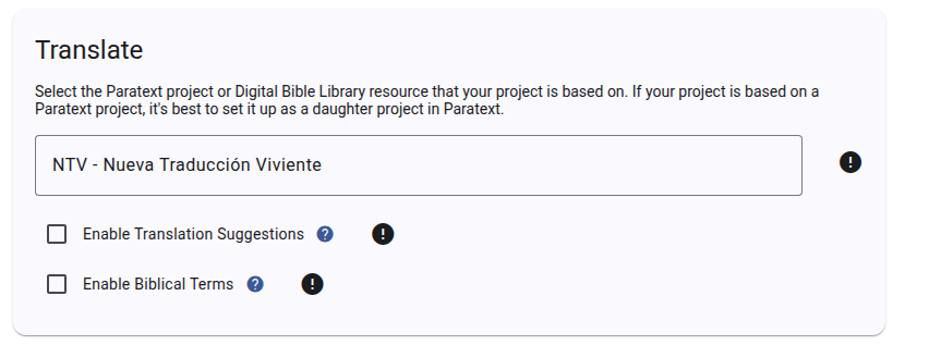
Here's what it currently looks like when the write-status component shows an error:
@Nateowami made 4 comments.
Reviewable status: 2 of 4 files reviewed, all discussions resolved (waiting on @RaymondLuong3).
src/SIL.XForge.Scripture/ClientApp/src/app/settings/settings.component.scss line 76 at r2 (raw file):
}

mat-icon {
As far as I could tell, the only icon being styled by this was the icon I added to the delete button.
src/SIL.XForge.Scripture/ClientApp/src/app/settings/settings.component.scss line 140 at r2 (raw file):
  background-color: var(--mat-sys-error);
  color: var(--mat-sys-on-error);
}
So nice to be able to get rid of all this extraneous theming...
src/SIL.XForge.Scripture/ClientApp/src/app/settings/settings.component.html line 368 at r2 (raw file):
            [disabled]="deleteButtonDisabled"
          >
            <mat-icon>delete</mat-icon>
I've always felt it was a bit odd there wasn't any icon on this button.
RaymondLuong3
left a comment
RaymondLuong3
left a comment
There was a problem hiding this comment.
Yes, I can see the misunderstanding. Thanks for your work on this. I'm happy to get this merged and continue updating components to use the new theming as we go.
@RaymondLuong3 reviewed 2 files and all commit messages, and made 2 comments.
Reviewable status:
src/SIL.XForge.Scripture/ClientApp/src/app/settings/settings.component.html line 368 at r2 (raw file):
Previously, Nateowami wrote…
I've always felt it was a bit odd there wasn't any icon on this button.
Good thinking
2 participants
Throughout our application we have
color="warn"3 times, andcolor="accent"11 times. Unfortunately these and other places that would normally use the accent colors do not actually use them since the upgrade to the Material 3 theming system. We should probably find a new way to apply accent colors, but in the meantime it seems we should apply it where we intended to apply it.Hopefully storybook will show us whether this is actually a good change to make.
This change is