-
Notifications
You must be signed in to change notification settings - Fork 9
New issue
Have a question about this project? Sign up for a free GitHub account to open an issue and contact its maintainers and the community.
By clicking “Sign up for GitHub”, you agree to our terms of service and privacy statement. We’ll occasionally send you account related emails.
Already on GitHub? Sign in to your account
Brand Design for "Simple" #1
Comments
|
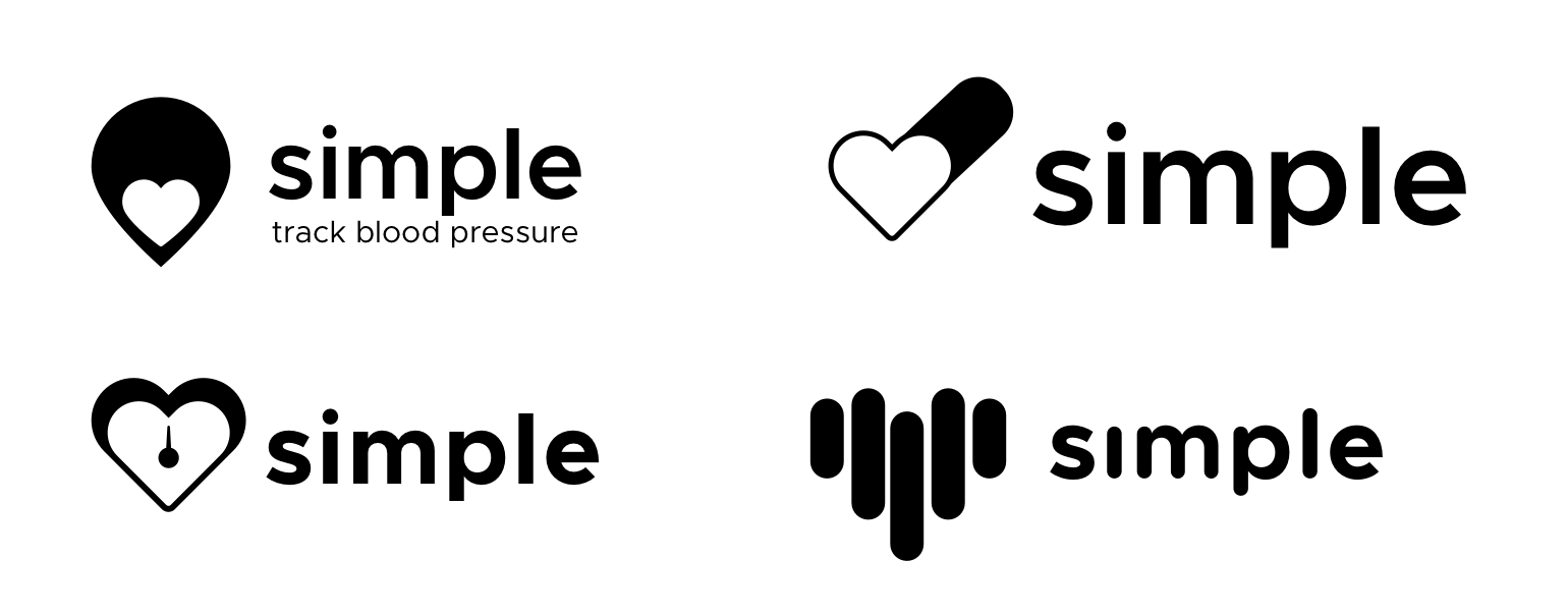
To get the ball rolling here are a few logos that I was riffing on for the app. Download the Sketch file here on Dropbox |
|
Is the app / brand intended to be localized for other languages, or will it always be the English word "Simple"? If translation of the brand name is intended, we may want to stay away from "S" shapes. |
|
Excellent question @infernocloud. The app will be localized into many languages and ideally we would translate the name itself. You are correct that it would be better to avoid "S" shapes. Thank you. |
|
@dannnn submitted an idea that I'm reposting here.
Here's the .ai file -- if interesting, help make it better https://www.dropbox.com/s/jh3ido36ly3oqyx/simple.ai?dl=0 Copyright: CC0 |
|
Darn, just read the localization comments above (and avoiding the 'S' shape) but thought I would share my ideation anyways! ✌️ Sketch file: https://drive.google.com/file/d/13krlCq9akGA8BcEqPH9Vh0O8TmFGl7r3/view?usp=sharing Copyright: CC0 |
|
Thanks for your idea @kellyjepsen! I love that you can drop the "i" and keep the heart in the app icon — I never would have thought of that. Really clever work. Interesting that you're using a serif too... it adds a bit of gravitas that could be good for the brand overall. Thanks again for putting your idea in the mix. 🙌 |
|
Thanks for putting this together @dburka this is fun! I spent some time this weekend playing around, like @kellyjepsen above, I may have gone to far with the "S" shape in the color version, but there might still be something to the b/w version. Sketch file in Dropbox I tried a bit to combine two hearts, and have a lil nod to the "S" as well. I also saw you "gradient" comment and thought maybe the digital version could have a bit of gradient? While the mark still worked in solid form. Excited to hear everyone's feedback 🎉 |
|
There are so many differently awesome approaches in here, I love it! 😍Really love that final shape created by the two hearts, @tdrach. Also plays into the #/# blood pressure format nicely. Also really like the totally different approach you have at the end there, @webalys, with the "friendly" heart. 👍 Question for @dburka: Are you and the team looking to embrace the "heart" or shy away from it? Does the heart translate well across languages? (I'm hesitantly thinking maybe it does, and that maybe it's a good symbol to explore?) |
|
I riffed off the ideas of @menachemkrinsky and @tdrach. Using the heart shape and shaping it slightly to make the shape of a cuffed arm. Sketch file available on dropbox Copyright: CC0 |
|
Some comments on the ideas above: @menachemkrinsky Whoa. I love how simple these are. The top left and bottom left both have a great paper-like quality that could translate well across the whole app. I think the paper concept is one worth pursuing by a bunch of us — in many places this software is replace largely paper-based systems. I'm less sure if the dual-color thing will be too jarring... I often gravitate towards brands that own one color hard (e.g. Ally bank = eggplant) but obviously it could work. @tdrach Ooooo, I like these! I never would have found the "S" in the middle of two interconnected hearts. I'm always so impressed when designers find these hidden connections. I find the second, angled version a little more obviously "hearts"... especially in the monotone version the vertical stack takes a second to register as "hearts". The second lockup also would more easily translate into places like a website or app icon. This is super clever work. As @infernocloud pointed out above, we may want to avoid "S" for internationalization reasons, but your concept leans more heavily on the hearts than on the "S". Great contribution. @webalys I love that you're throwing ideas in here. The dotted-heart one is clever. I'd also played with some graphs. It's kind of interesting: we want to show control rates going up, but blood pressure going down, which makes graphs a little funky. That first concept with the + is hot. So... simple. I think there's somethere there worth exploring for sure. I wonder if we could adapt it for languages other than English and use the + as an accompanying icon. It's also interesting to see you using lowercase "s" in the wordmark. We're balancing 'security' and 'friendliness'... I wonder if the lowercase "s" is nice and friendly or a bit juvenile for this context? Love your concepts. |
|
@designernaut Oooo. It's so hard to do an asymmetrically-shaped heart that I hadn't even really tried it. You nailed it. I love how we've seen thousands of hearts and yet this is still iconic with the oblong shape. It's also really helpful to see the logo in a context in an app icon. This has heaps of potential. PS: I love that you're riffing on the word of @menachemkrinsky and @tdrach. |
|
@kellyjepsen To be honest, I'm not sure how well the "heart" translates across cultures. Would love if someone (you?) did some research on it and reported back here. I personally think it could be great for this app, though there are challenges with being iconic with such a common symbol. I would love to see people explore other symbols too. |
|
I wonder if a biologically accurate heart shape might be more culturally agnostic. Much harder to convey in a visually simple way than the symbolic heart, of course. |
|
Hey all, based on the comments above I am not sure if the heart idea or the S will work, however, idea 1 uses two hearts to create an S in the negative space. Also for both concepts, I have used 2 hearts one on top and bottom as a reference to the blood pressure over/under measurement. Copyright: CC0 |
|
Wow, am I an idiot or are there no threaded comments on GitHub? I really like some of the approaches here! Love what @webalys did to combine the heart with a nice little smile. Those symbols should translate well internationally. It's a very disarming mark. Also like how @designernaut riffed off @menachemkrinsky's idea of a heart doubling as an arm. Of those treatments, I like the type outside the mark better. The serif face works well here, and I definitely feel like this brand lends itself to lowercase lettering, but would like to see what that mark looks like with some softer, friendlier type options. |
|
Loved the friendly logo concept by @webalys, added features of a blood pressure cuff kit to the heart |
|
On the issue of the heart translating across cultures, we did a bit of work on that when we changed the Star to the Heart on Twitter and ran into no problems. In fact, it was a better understood symbol than the star. That's not to say this context is exactly the same, but just directionally, it's a pretty widely understood symbol. |
|
@mikeindustries for the typeface, bariol has a nice soft touch to it http://atipofoundry.com/fonts/bariol |
|
@mikeindustries Check also the Bryant typeface: https://processtypefoundry.com/fonts/bryant-2/ |
|
Thought about trying one with negative space. I think some of the others are my favorites over this concept, but thought it might inspire some ideas! Here's my super rough ai file if anyone is interested: Copyright: CC0 |
|
@patrickhill replying to your idea here #1 (comment) There is another brand named "Simple" - the banking app Simple.com. I'm sure we'll want to stay away from designs that resemble its logo entirely just to avoid copyright issues and confusion. I think this design resembles Simple.com's mark too much. |
|
@infernocloud Good catch. I didn't even know about that app. I could totally see that being confusing from a consumer perspective. |
|
@dburka A very good point about thermometers and the need for visual differentiation. I think I was swayed by the fact that the average age of a nurse in the UK is one year older than me, the healthcare workforce worldwide is ageing, and I remember sphygmomanometers with mercury. I also assumed (wrongly or rightly - I didn't research this bit!) that mechanical ones might be used in areas with scant access to electricity. I have taken another swipe! Copyright: CC0 |
|
I feel like once @patrickhill got here it was pretty much /endthread for me. Love it, love it! In my first contribution, I was trying an abstract approach and intentionally avoiding the blood drop/heart concept. Now, after reading the feedback, the reference seems strong enough across most cultures to make a great base for an iconic symbol. And certainly a direction the team would like to take. So here's my quick take on it this evening. I created a 'cute' blood droplet mark then combined and rotated it to form a simple heart. Here are a few applications; The Sketch file is on dropbox https://www.dropbox.com/s/tqafr521alqec0m/Simple.sketch?dl=0 Hope it helps keep the creative juices flowing. |
|
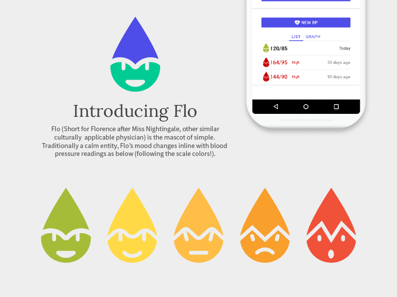
Firstly @patrickhill & @philhammel those logos are absolutely awesome guys! Now this is my contribution, not sure if it works or people are going to like it but I tried to stay simple and work from there. It should be easy to make 3D and provide plenty of animations options whilst still being simple enough to work in mobile apps and with localisation. So the mascot is something of my own devise and I just got a bit carried away with adding a character (now I understand this might not work with the professional sort of nature of SIMPLE but who doesn't love a character right?) I though 'Flo' was appropriate and could have the eyes, mouth and eyebrow changing with animation for higher blood readings. Maybe its stupid. I don't know. Anyway thanks. |
|
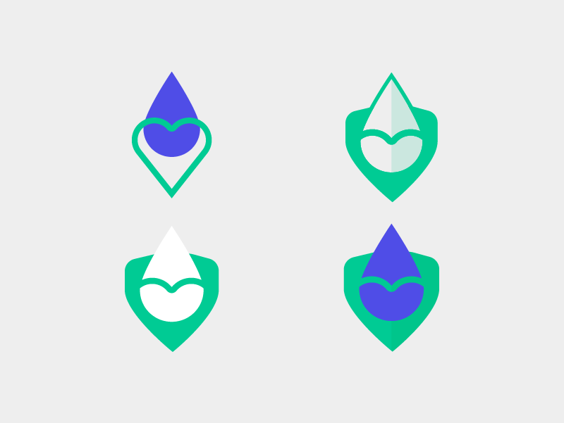
@jamtrash Love the revisions to the bulb concept. The bulb shapes fits well into the blood drop and the animation holds up really well. Nice! @FriendlyDuck Ooo, that's cool. I like the double-drop/heart motif. That's lovely and simple. It's funny... it seems so obvious once you did it but I didn't even consider those shapes in there. Really easy to imagine those animated too... rotate the drops separately around the point. I really like it. PS: What typeface is that? @sambaines Oh hey, that's cool. I really like the humanization of the drop. Again, I never would have thought to try that. I always liked logos like Twitter or Penguin or Snap that have heaps of likeable personality. And, the concepts at the bottom of the drop over a shield are promising too. Thanks so much for all of your work. |
|
@csosebee really like the integration of the smile line inside the drop! Doubles as a smile and a highlight for the liquid. |
|
@csosebee Those are amazing. I absolutely love the collaborative approach and the way you've adapted ideas is awesome. The measurement marks are great and so is the smile inside the droplet... it took an already cool idea and made it even better. Rad. Everyone, I'm getting on a long flight to India and will be in rural Punjab for a week. I'll try to keep up with contributions but thank you for your patience if I'm a bit slow. Keep up the great work. |
|
Fantastic work people! Just to add some context, I've been working with @dburka to put together the android app for Simple and was super excited about the idea of a community-driven brand design. Looking at all the contributions so far, I feel it was a fantastic decision to run this as an open source design project. @csosebee - So many amazing ideas in there, great work! My favourite one is the droplet with a smile. It resonates well with the brand 'Simple', looks very friendly and is immediately recognisable as a blood droplet. I also really like the concept with the heart and a check mark; that is exactly what we're trying to do here - continuously check if the patient's heart is working well. @patrickhill - Thanks for coming up with the idea of the blood droplet with a smile, it is very strong. The animation ideas look very interesting as well and could be things we can use as micro-interactions inside the app. Keep 'em coming! @sambaines - Love how you've subtracted the heart stroke from the droplet to create a human-like figure. Also, cool work with the emoticon-like drops, although at this point I am not sure if we can use them to represent good, bad or sad states for a patient's health. @FriendlyDuck - Some really neat ideas in there. The double drop heart looks really nice, especially because how well it fits into a square box. Brand logos which are primarily mobile-centric are best if they are squarish, and this is a great example. There are so many good ideas in there. A lot of my feedback intersects heavily with the discussion that has already taken place. Thank you, everyone, for putting so much time and hard work into this! @dburka and I will share what we learn from our users in Punjab soon. |
|
Felt really inspired by the response here. Here is a small idea that I came across. The brand mark itself depicts a human (feeling his/her heart). Thought it could be reused as a location pointer for clinics/hospitals involved with Simple/Resolve. It also has a subtle feel of the wordmark S in it (not really important), which was a result of dividing the Heart symbol into half. I created it using Figma, so incase anyone requires the file, I can share the link.
|
|
@hckmstrrahul That's really cool. I love again how simple the concept is. Just adding the basic shape of the S to the bottom of the drop creates such a unique shape that's iconic. Also, your examples in context really help. Bravo. PS: maybe see you in Bangalore next week |
|
@dburka Glad you liked it. Thanks! 😃 |
|
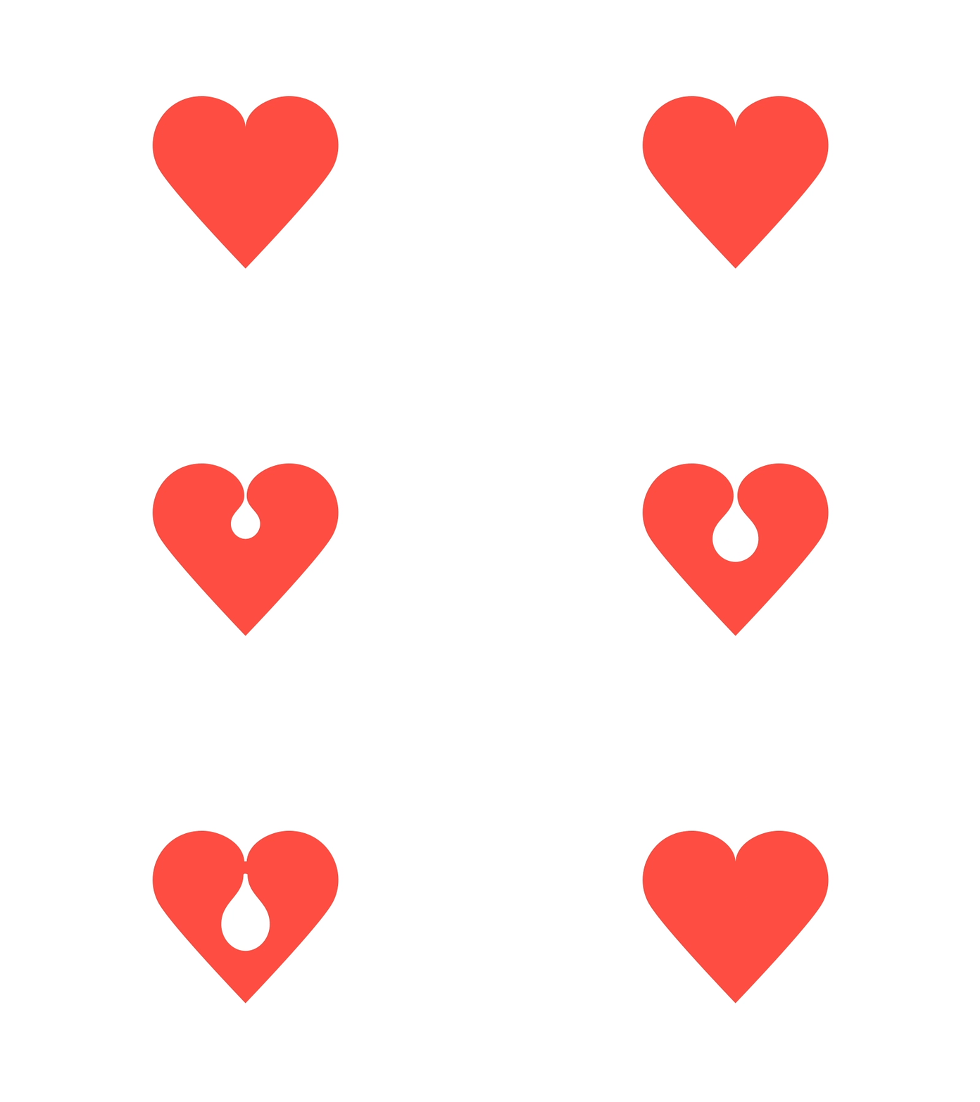
Thought I would add a couple of quick ideas, trying to keep the overall design very simple, might sit down at some stage and think about the type and maybe play with some other ideas. Simple heart shape and a couple of variations. https://drive.google.com/file/d/1tpZH_rA61gDW82D1zg0HEo26GI2OfrCn/view So far quite liking @designernaut |
|
Thanks so much for your patience on feedback. I've been in Bathinda district in Punjab for the past week doing our first user studies of a functional Android app for Simple (previously we've done tests with non-functioning prototypes). Anyhow, I'm back in Delhi with time and good internet. @jarridb Whoa! I love how many ways there are to draw such a basic shape as a heart. All five of those hearts are really interesting. The 3rd is especially cool, in my opinion. It's clearly a heart, but iconic in its own shape. I also love how it's flat but infers a three-dimensional shape so darn clearly. The 4th is clever too, but I worry that out of the context of being directly in the app, its meaning isn't super clear. Thanks for adding these to the mix... so cool! @lbinhammer Hey, fellow Canadian! I lived right by the Church/Wellesley subway stop for 2.5 years. Your submissions are so original! These are great. The checkmark (top right) is really clever — one of our Indian designers and I were just discussing it... it has a lot of potential. I aslo really like the top left one. Geography plays a big role in the app (improving hypertension control in a region... taking a blood pressure at a specific location... etc). I never considered that simple placement of the heart at the bottom of a drop/pin... really smart. The other two are also interesting... even the bottom left could live without the dial/pin and look iconic. Awesome work. Thank you. |
|
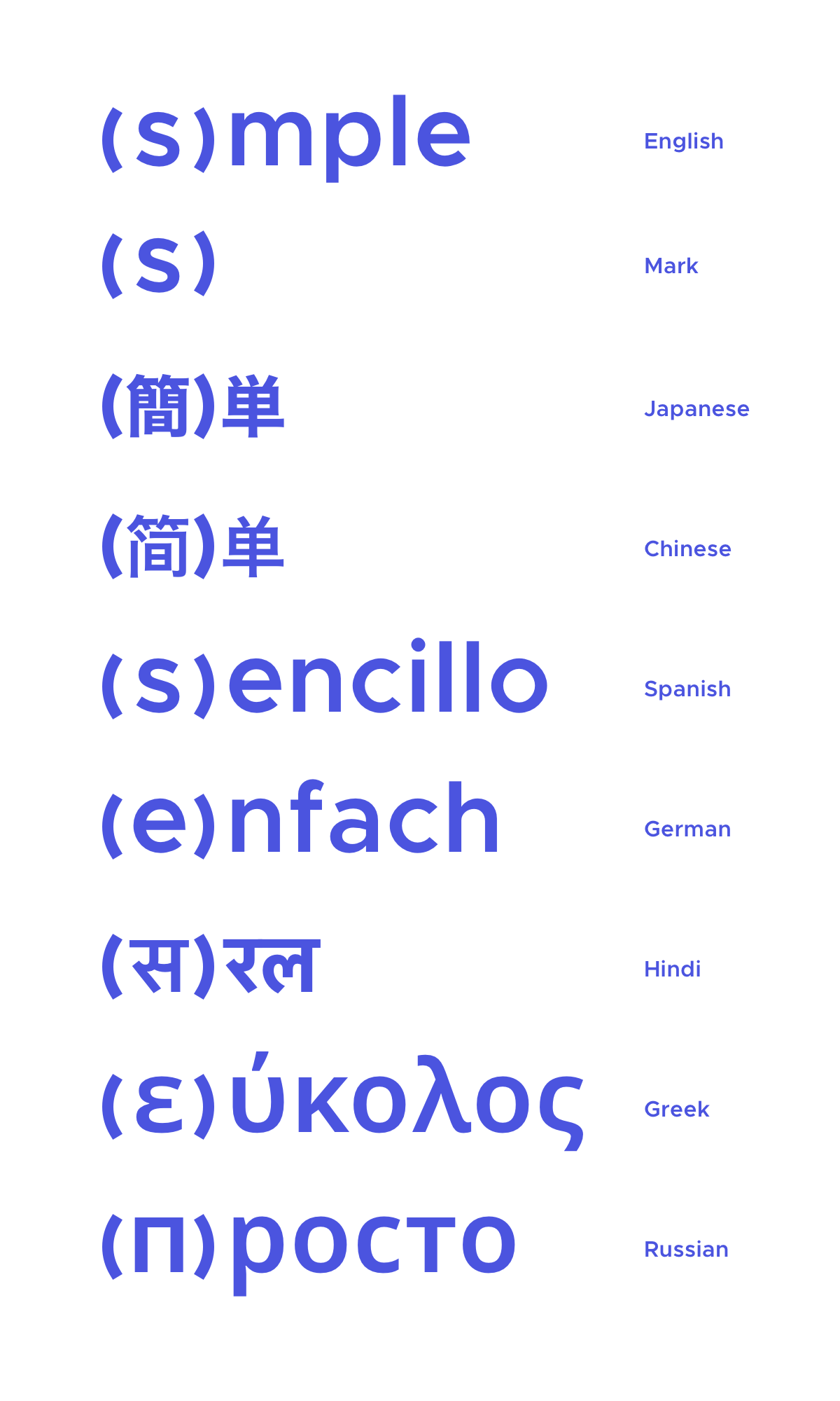
Deliberately not using a heart to kick off some lateral thinking. Going for some really, really, really simple. Almost brutalist. But hopefully not lacking in symbolism – brackets as artery walls that are nice and roomy. Also showing how it can be localized. |
|
@aentan Whoa... these are so ORIGINAL. Simple, stark. I really love that you're pushing ideas out on the edge. We were really narrowing in on a few symbols and this is exactly the kind of exploratory design exercise that's so valuable. I'm chewing on these and thinking how it would reflect in things like app icons, a prize, etc. Awesome contribution, thanks. |
|
Besides the shape, we should also be trying colors that aren’t blue/cyan/green, which IMO are overused in healthcare. We should try to be unique. I’m digging Kenya Hara’s signage design for Umeda Hospital, which uses warm tones to make the environmental really comforting. https://www.ndc.co.jp/hara/en/works/2014/08/umedahospital.html |
|
I also explored a folded treatment. I made an paper model to confirm that it could be folded from one sheet of cut material. This would lend itself to awards that could be produced locally by folding sheet metal. As was mentioned earlier I think staying away from "s" shapes is the best bet since the plan is to localize the name based on location. Copyright: CC0 |
|
Riffing off of @lbinhammer's mockup I tried to take the vertical lines and integrate a check mark to help make it more visually interesting. @aentan suggested using a more warm/inviting palette which I think works well in this treatment Copyright: CC0 |
|
Also the figma edit link to both of my designs is available here: Copyright: CC0 |
|
@rickymetz Sorry for the slow response. These ideas are great! The first set with the folded paper are really cleverly designed. I worry that they're a bit complex , especially with the narrow cut on the bottom left, but the concept is pretty rad. That second set is super cool. I see the checkmark once you pointed it out, but it slaos could represent a patient's systolic and diastolic blood pressure readings over time... which is the key point of the app. These are great, thanks for sharing and for sharing your Figma file! |
|
It's been just over a month and many amazing ideas have been submitted. We love the exploration and ideation in Step 1. Thank you so much to every single person who poured time and energy and skill into this process. We're so grateful. We have posted a brief for Step 2: Narrowing in a separate issue. If you're able to help with the next step, we'd again be humbled by your support. We are going to close this issue as we move to Step 2. Thank you, thank you, thank you! |
















NOTE: See Step 2 of the brand project here.
We are asking designers to consider participating in an open-source effort to create a brand for Simple. Please see this post on Medium for the background of this not-for-profit project. Thank you so much to everyone who participates.
The creative brief for Simple
Great brands often begin with one clearly articulated statement. What makes the "Simple" project different from any other project like it? For us, this all starts with the idea of radical simplicity:
Most other software that healthcare workers use is complicated and hard to learn. Our aim is to be a breath of fresh air — an app that's simple, which nurses and doctors actually like to use.
Brand personality
Think of the brand like your favorite nurse: smart, insightful, careful with your privacy, and treats you as a human being. The brand isn't goofy, corporate, aloof, or complicated.
The audience for the brand
This software will be deployed all over the world, starting in India, so take cultural considerations into account.
Common touch points
The brand will sometimes be used in low quality one-color physical prints (e.g. a training manual), so keep your design simple and unfussy. Really thin lines or gradients might be hard to reproduce.
Foundations of community
We wrote these foundational statements based on discussions with designers who work in open-source. Don't agree with the statements? Think something is missing? Let's discuss in the comments on Medium!
How to participate
We asked several designers to take the lead on critique. When you submit your ideas, you will likely receive feedback from:
Keep in mind, this is a collaboration not a contest. The only prize is that in a few years, together we will have improved the cardiovascular health of millions of people.
The world is improved by the combined efforts of many people in big and small ways. We are excited to see what we can create together.
Thank you.
Thoughts on open-source design
This open-source branding project is a bit of an experiment. There are a few concerns that I would like to address:
Doesn't good design cost money?
Asking people to do work for free makes me nervous. Although we are a well-funded not-for-profit and could hire a design agency to create this brand, we are taking a collaborative open-source approach to involve a broad community from all over the world.
Isn't this spec work?
I'm sensitive to designers' concerns about spec work and I'm genuinely concerned that I'm asking designers to volunteer their professional skills. Spec work usually promises something down the road if you do unpaid work now. This is not spec work - it's volunteer work with no promise of exposure or compensation down the road.
In addition to contributing in a small way to a project that will save lives around the globe, I hope that our critique group will benefit designers who contribute their ideas.
Design by committee results in mediocre design, right?
Design can easily be watered down by making decisions as a group. But, design also benefits from a diversity of ideas. The diamond shaped design process has a lot of value - generate lots and lots of ideas and then narrow in on the best ones.
At the beginning, the brief needs a strong viewpoint. At the end, the decision-making process needs a strong viewpoint. Those parts should not be done by committee. Our team wrote the brief with input from friends. And at the end, I will art direct with input from the community as well as from the designers who I have asked to help moderate the critique.
I'm mostly hopeful that this process will generate many great ideas and fruitful discussions about which ideas best serve the brief.
This isn't a new idea.
Correct. Many designers have done open-source work. Projects have done open-source brand solicitations previously - check out the relatively recent projects by WebAassembly and NodeJS. I am not the most knowledgeable person in the world about open-source and design, but I did speak to some of the experts. I hope we can adjust, learn, and try to create a great process for projects like this.
About Resolve to Save Lives
Resolve to Save Lives is a five-year, $225 million initiative funded by Bloomberg Philanthropies, the Chan Zuckerberg Initiative, and the Bill & Melinda Gates Foundation. It is led by Dr. Tom Frieden, former director of the US Centers for Disease Control and Prevention, and housed at Vital Strategies, which works in 60 countries with the vision of a world in which every person is protected by a strong public health system. To find out more visit: https://www.resolvetosavelives.org
About Vital Strategies
Vital Strategies is a global health organization that seeks to accelerate progress on the world's most pressing health problems. The Vital Strategies team combines evidence-based strategies with innovation to help develop and implement sound public health policies, manage programs efficiently, strengthen data systems, conduct research, and design strategic communication campaigns for policy and behavior change. To find out more, visit www.vitalstrategies.org
The text was updated successfully, but these errors were encountered: