The Design Extensions Integration enhances design and layout control via Uniform UI extensions, allowing you to manage the appearance of your components seamlessly.
Before setting up the project, ensure you have the following installed:
- Node.js:
>= 20 - npm:
>= 10 - Vercel KV Storage: Required for storing key-value data
To set up the project locally, follow these steps:
git clone https://github.com/your-repo/design-extensions.git
cd design-extensionsnpm installCreate a .env file in the root directory and set up the necessary environment variables based on .env.example:
KV_URL=<your_kv_url>
KV_REST_API_URL=<your_rest_api_url>
KV_REST_API_TOKEN=<your_rest_api_token>
KV_REST_API_READ_ONLY_TOKEN=<your_read_only_token>
These credentials are required to interact with Vercel KV Storage.
npm run devAccess the application at http://localhost:4030.
npm run build
npm start
The production server will be available at http://localhost:4030.
npm run dev- Starts the development server.npm run build- Builds the integration for production.npm run start- Runs the production server.npm run lint- Lints the project for code quality.npm run lint:fix- Auto-fixes lint issues.npm run format- Formats the code using Prettier.
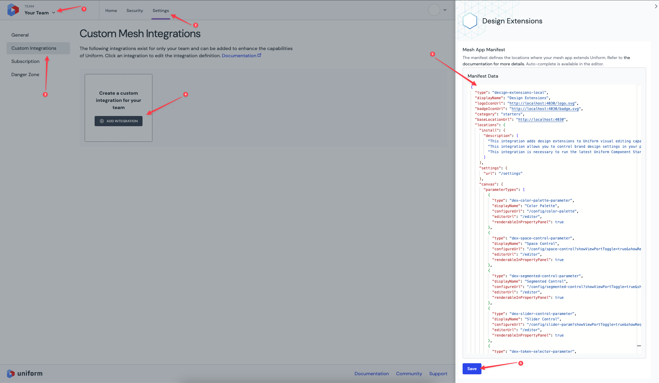
To install and use the Design Extensions Integration within Uniform, follow these steps:
-
Navigate to Uniform.app and open your Team.
-
Go to the Settings tab and select Custom Integrations.
-
Click Add Integration and provide the required manifest.
-
Once added, the Custom Integration will be available for all projects under the selected team.
- Run the integration locally or deploy it to a hosting provider.
- If deploying, update the integration manifest to replace
http://localhost:4030with the deployed domain.
-
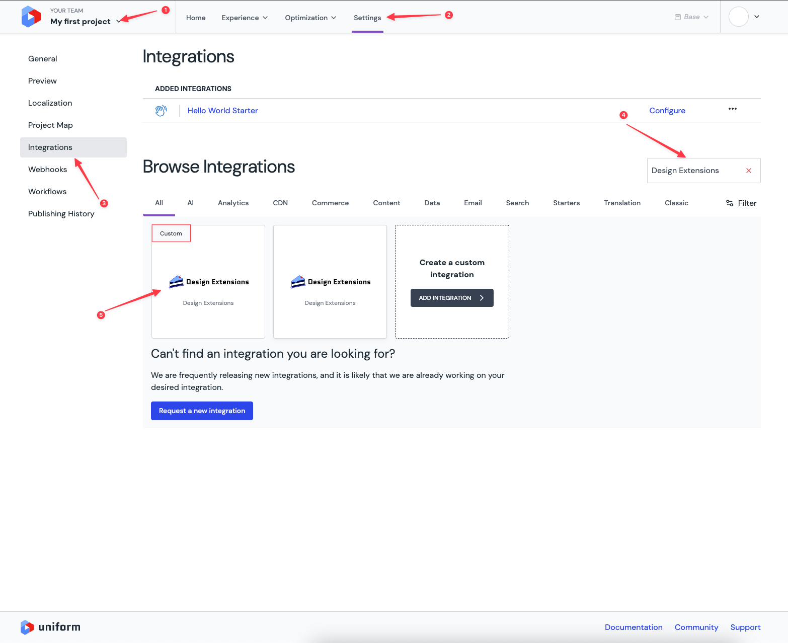
Open the Canvas project settings tab and navigate to Integrations.
-
Select the newly added Custom Integration.
-
In the Integration Settings, configure:
- Color
- Size/Dimension
- Font
- Border
You can also import Design Tokens from Figma for seamless configuration.
-
You will now have access to custom parameters from the Design Extensions Integration.


For a quick start with a pre-configured application, use the Component Starter Kit, which is already set up for Design Extensions Integration:
-
GitHub repository: Component Starter Kit
-
Install via CLI:
npx @uniformdev/cli@latest new
Follow the interactive steps to set up the starter kit.
Enhance your development workflow with these essential packages:
- @uniformdev/design-extensions-tools
- Utilities for importing/exporting design tokens.
- @uniformdev/csk-components
- Ready-to-use components compatible with custom design parameters.
- Use the
extractcommand to inspect the implementation of all Canvas components.
- Uniform Component Catalog
- Explore components, get usage instructions, and experiment with examples.
- Uniform Documentation
- Find comprehensive guidance on integrating and customizing your application.
This integration is built using:
- Next.js (Framework)
- React (UI Library)
- Tailwind CSS (Styling)
- Vercel KV Storage (Data Storage)
- ESLint & Prettier (Code Quality & Formatting)
The Design Extensions Integration enhances design flexibility and control within Uniform, providing an optimized and streamlined development experience.