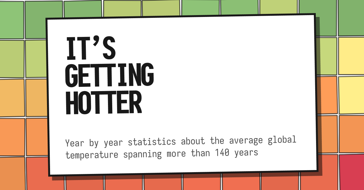
Ever wondered what the average global temperature was in, say, 1883? Or how hot it got in July 2001? Well, you've come to the right place! It's getting hotter visualizes over 140 years of global temperatures, with each year represented as a vibrant square in an awesome grid.
- The Grid: Each square in our grid represents a year, colored according to its average temperature. Cooler years? Think greens and yellows. Hotter years? Reds and oranges, baby!
- Year by year: Click on any year, and BAM! You can explore it month by month. Each month has its own average temperature, so you can see just how frosty (or toasty) it got.
From the ever trustworthy NASA. Here's the link to the page dedicated to these kinds of datasets, and here's the raw data I used to create this site.
