-
Notifications
You must be signed in to change notification settings - Fork 5k
New issue
Have a question about this project? Sign up for a free GitHub account to open an issue and contact its maintainers and the community.
By clicking “Sign up for GitHub”, you agree to our terms of service and privacy statement. We’ll occasionally send you account related emails.
Already on GitHub? Sign in to your account
已完成《exploring-the-product》的翻译 #83
Changes from all commits
File filter
Filter by extension
Conversations
Jump to
Diff view
Diff view
There are no files selected for viewing
| Original file line number | Diff line number | Diff line change |
|---|---|---|
|
|
@@ -5,103 +5,101 @@ | |
| * 校对者: | ||
| * 状态 : 待定 | ||
|
|
||
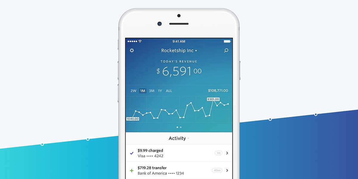
| Because of the service it provides, Stripe didn’t start as a mobile-first company, like many other startups these days. The core business is the payments API, allowing companies to get setup to accept payments within minutes. The web dashboard makes it easy for everyone on a team to track and manage subscriptions, payments, customers, and transfers. However, it was designed for larger screens and as such, is barely usable on mobile. After shipping the latest version of Checkout, we decided to focus on developing [a mobile app](https://stripe.com/dashboard/iphone), starting with the iPhone. | ||
| 考虑到它提供的服务类型,Stripe没有像很多现在的新公司那样从移动端开始做起。Stripe的核心业务是它的支付API,这些API可以让使用它们的公司在几分钟内就完成支付设置。网页端的页面可以让一个团队里的每一个人都轻松地跟踪和管理订阅信息、支付信息、交易信息以及他们的顾客。但是这个页面是给大屏幕设计的,也正因此,它在移动端上几乎可以说是不可用的。不过,在将Checkout的最新版本发布之后,我们决定从iPhone下手,集中精力开发[一个移动端的app](https://stripe.com/dashboard/iphone)。 | ||
|
|
||
|  | ||
|
|
||
| 这篇文章是关于创造这个移动端app的过程的,或者从更大的方面来讲,是关于[本杰明](https://twitter.com/bdc)和[我](https://twitter.com/michaelvillar)是如何设计产品的。这不一定是一种做产品的新方法,但我想和感兴趣的人一起分享。 | ||
|
|
||
| This article is about the creation process of the app, and more generally, about how [Benjamin](https://twitter.com/bdc) and [I](https://twitter.com/michaelvillar) design products. It’s not necessarily a new way of doing things but I wanted to share it for the curious. | ||
| _设计任何一款产品都可能会让你感到无从下手,但是当你把它削减到只照顾到最关键的用户体验时,它就变得可实现了。_ | ||
|
|
||
| _Designing any product can feel overwhelming but by diluting it down to the essential user experience, you can make it approachable and doable._ | ||
|
|
||
| 我们在把产品概念化的阶段花了大量时间。尽管这是第一步,但产品设计从来都不会真的完成,你要始终仔细地回过头来思考你对产品的设计。 | ||
|
|
||
| We spend a lot of time in the conceptualization phase. Even though it’s the first step, product design never truly ends and should be carefully revisited at all times. | ||
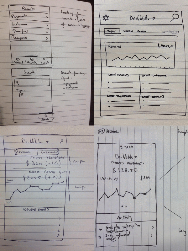
| 我们的第一次会议是用白板的形式展开的,在那次会议上我们挑出了我们认为的所有属于核心体验的特性,并以此作为会议的开端。对于iPhone上的这个Dashboard,我们把它视作一个和网页端搭配使用的app,并且只专注于两种最主要的使用情景,而不是使它成为一个具有网页端全部特性的版本: | ||
|
|
||
| Our first meeting starts with white boarding, where we start by identifying all of the features that are part of the core experience, as we define it. For the Dashboard for iPhone app, we envisioned it as a companion app and focused on two main use cases, rather than having it be a full-featured version of the web dashboard: | ||
|
|
||
| 1. An app you open first thing in the morning to quickly review yesterday’s numbers | ||
| 2. A way to be able to quickly look up customers, payments, and transfer information | ||
| 1. 一个你在早晨会最先打开并且快速回顾昨天的各种数字的app | ||
|
There was a problem hiding this comment. Choose a reason for hiding this commentThe reason will be displayed to describe this comment to others. Learn more. 昨天的数字看起来怪怪的, 补充成 (统计)数字 会不会好点 There was a problem hiding this comment. Choose a reason for hiding this commentThe reason will be displayed to describe this comment to others. Learn more. 但是统计数字的话就无法突出时间了,它这里既然写了在早上打开就应该强调是昨天的数字吧。 There was a problem hiding this comment. Choose a reason for hiding this commentThe reason will be displayed to describe this comment to others. Learn more. 但是当你把它削减到只照顾到最关键的用户体验时->但是当你把需求削减到只照顾到最关键的用户体验时 |
||
| 2. 一个快速查找客户、支付信息以及交易信息的工具 | ||
|
|
||
|
|
||
|  | ||
|
|
||
|
|
||
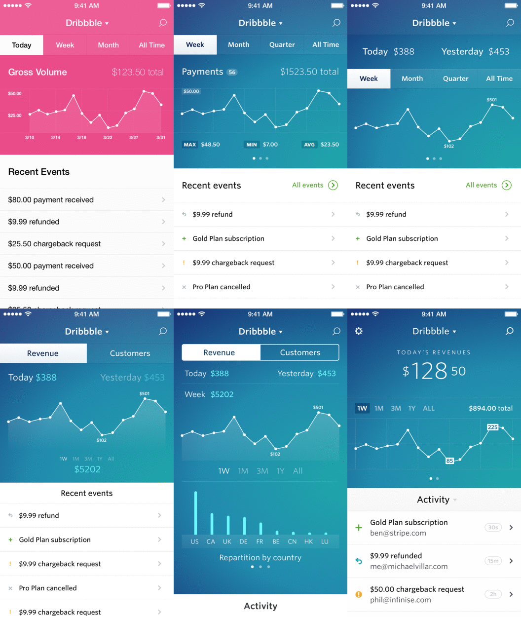
| After defining the features, we work on the wireframes. We have the added difficulty of working with a 9 hour timezone difference. In order to work around this, we draw things on paper, take pictures, and record an explanation of the wireframes. We send them to each other and wait for the response. Here is an example (in French): [http://bit.ly/1GSByqd](http://bit.ly/1GSByqd) | ||
| 在确定了我们需要的特性之后,我们就开始着手设计整个app的框架了。但是由于我们两个人之间有9小时的时差,我们的工作又有了额外的困难。为了解决这个问题,我们就在纸上画下我们想要展示的东西并拍成照片,然后录一段对于框架的说明,发给对方然后等待回复。这里有一个例子(用法语写的): [http://bit.ly/1GSByqd](http://bit.ly/1GSByqd) | ||
|
|
||
| Our wireframes are really rough. There’s no visual refinement; it’s really about the flow and overall user experience. They help us define our expectations and remind us of what we want on every screen. | ||
| 我们的框架非常粗糙。它没有任何视觉上的优化设计,它仅仅是对流程以及一个总的用户体验的说明。但它们能够帮助我们确定对这个app的预期,并且提醒我们想在每一屏上展示什么。 | ||
|
There was a problem hiding this comment. Choose a reason for hiding this commentThe reason will be displayed to describe this comment to others. Learn more. 它仅仅是对流程以及一个总的用户体验的说明 -> 它仅仅是对流程以及一个大体上用户体验的说明 |
||
|
|
||
|
|
||
|  | ||
|
|
||
|
|
||
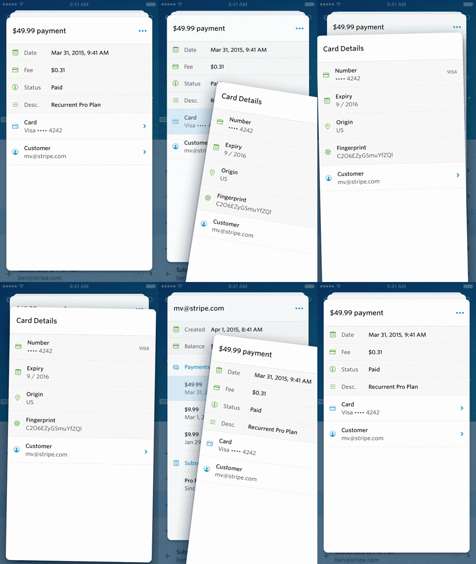
| When our wireframes are done, we start working on the visual design. At the beginning of this stage, we work closely together to find the right direction that best fits our vision. The homepage, for example, took a lot of different iterations. We knew that we wanted recent activity front and center but deciding what _didn’t_ need to be there was tough. It’s easy to think the more data the better, but we had to decide which were the most important and deserved the limelight versus their interesting-but-not-necessary cousins. | ||
| 在我们的框架确定好之后,我们就开始进行UI的设计了。这个阶段刚开始时,我们一起紧张地工作,来确定最符合我们预想的UI。举个例子来说,主页的UI就经过了许多次迭代。我们很清楚我们想要让近期活动显示在最前面和最中央,但是决定什么 _不_ 需要显示在那里很困难。展示尽可能多的数据可能是个简便易行的方法,但是我们要决定哪些信息是最重要而应该被重点显示的,以便和其他虽然有趣但是不那么重要的信息区别开来。 | ||
|
|
||
| When we both agree on the visual design direction, Benjamin starts finalizing everything. Of course, there is plenty of feedback along the way but mainly, Benjamin runs the show here. | ||
| 在我们两个都对我们的UI设计感到满意之后,本杰明便开始敲定所有的设计元素。当然,整个过程我也给出了不少反馈,但主要是本杰明做出了整个UI。 | ||
|
|
||
|
|
||
| Interactions are thought about during the whole visual design process but we only begin to prototype them when we have a clear idea of the visual design. In the prototyping phase, we can confirm whether our initial interaction ideas were right or not. | ||
| 在整个UI设计过程中我们都在考虑交互,但直到我们对整个UI设计有一个清晰的认识时我们才开始作出交互设计的原型。在设计原型的阶段,我们可以确认自己最初的交互设计是否是正确的。 | ||
|
|
||
| For the Dashboard app, the main one was the cards paradigm. We decided to implement a web prototype of it, which was ridiculously buggy, but it convinced us that the idea was one worth pursuing. | ||
| 对于这个Dashboard app来说,最主要的部分是那些卡牌的样式。我们想在web端做一个这样的原型,但是做出来的东西有很多bug,不过这最起码告诉我们这主意值得一试。 | ||
|
There was a problem hiding this comment. Choose a reason for hiding this commentThe reason will be displayed to describe this comment to others. Learn more. 卡牌->卡片 |
||
|
|
||
|
|
||
|  | ||
|
|
||
|
|
||
| Getting this UI to feel intuitive and snappy is complex. | ||
| 让这个UI显得直观又简洁是一个十分复杂的过程。 | ||
|
|
||
| * You want new cards to be opened in a way to show that users how they can be manipulated: slide open from the side with a slight spring because that’s how they can be moved and dismissed | ||
| * You want an extra shadow when you drag a card to emphasize that you’re controlling that specific card | ||
| * You want to move the other cards behind it forward when you’re dragging a card away in order to show their progress | ||
| * You want to match the velocity of the card being thrown away to the velocity of the deck moving forward so that it’s clear the actions are connected | ||
| * You want cards farther back to be darker like they would be in real life | ||
| * 我们想让一张卡片的打开方式能告诉用户他们能够对这张卡片进行些什么样的操作:我们让它在从侧面滑出时有一个小小的跳跃效果,因为这就是移动和挪走它们的方式 | ||
| * 我们想在拖拽一张卡片时在它对应的那一行上有一个阴影效果来表明你操作的是哪一张卡片 | ||
| * 我们想在移走一张卡片的同时将其他在它后面的卡片挪到前面来,来表明这是一个完整的过程 | ||
| * 我们想让卡片被移走的速度和余下的卡片堆往前移动的速度保持一致,这样就可以很清晰地表明这两个操作是互相关联的 | ||
| * 我们想让越靠后的卡片看起来越暗,就像它们在现实中的那样 | ||
|
|
||
|
|
||
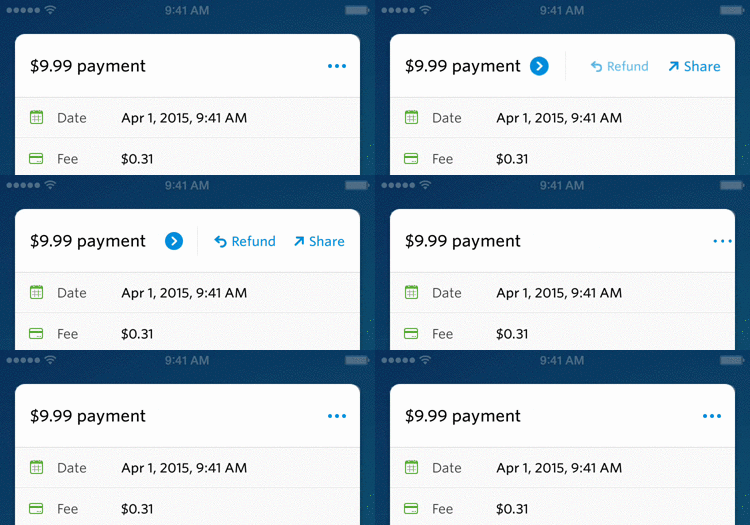
| For the action menu, we wanted a contextual menu without opening a large and intrusive native popup menu. We came up with this fun animation that works well for us since we didn’t have more than two actions per card. You also don’t even need to close the menu if you are not interested. | ||
| 对操作菜单来说,我们想让这个菜单里按钮的名字和当前卡片的内容有关,而我们又不想打开一个大的、可能会烦到用户的那种传统的弹出菜单。于是我们想到了这种有趣的动画,到目前为止这种方式都没有什么问题,因为对每张卡片来说我们只需要不超过两个操作。如果你对这个菜单的内容不感兴趣,你甚至都不用去关掉它。 | ||
|
|
||
|
|
||
|  | ||
|
|
||
| Toggling the actions menu (we did a HTML/CSS prototype) | ||
|
|
||
| 打开/关闭这个操作菜单(我们做了一个HTML/CSS的原型) | ||
|
|
||
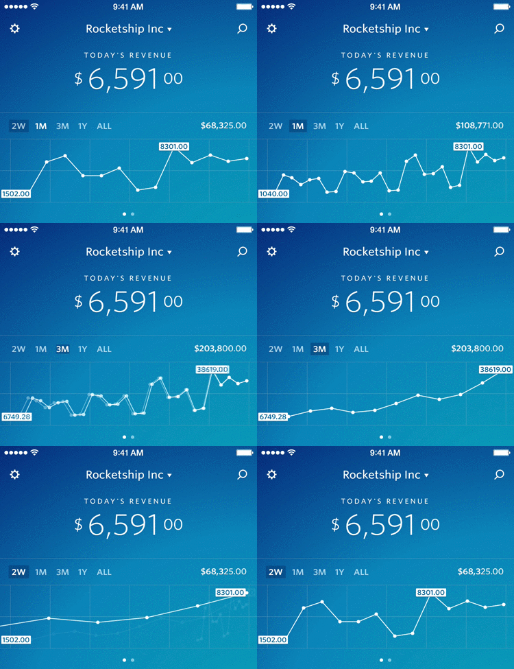
| You can switch the time period displayed in the revenue/customer graph. The way we’ve made this animation helps users understand where the previous time period fits in the new one. If you look closely, you’ll see that as the units change from days to weeks, we fade the graphs out while scaling. | ||
| 你可以在展示收益/客户的这张图中切换展示时使用的时间周期。我们设计的这种动画可以帮助用户搞懂之前的时间周期是如何变到新的来的。如果你仔细点看,你会发现在每一个小格代表的时间长度从天变到星期时,我们在缩小整张图的时候还做了一个渐隐的效果。 | ||
|
|
||
|
|
||
|  | ||
|
|
||
| Changing time periods in the graph view | ||
| 在图表中改变显示的时间周期 | ||
|
|
||
|
|
||
| When an app is internet dependent, you can either show a landing screen or an empty app with lots of spinners. We end up choosing the former combined with an animation because during that loading period the app isn’t responsive anyway. Here are a few of the startup animations prototypes we came up with: | ||
| 当一个app需要网络连接才能工作时,你可以展示一个着陆页,或是一个有一堆菊花图的空白app。最后我们选择了前者,并且加上了一点动画效果,因为在app加载数据的时候它其实并不会有什么响应。图中是一些我们设计的启动动画的原型: | ||
|
There was a problem hiding this comment. Choose a reason for hiding this commentThe reason will be displayed to describe this comment to others. Learn more. 着陆页 -> 登录界面 |
||
|
|
||
|
|
||
|  | ||
|
|
||
| For the startup animation, we did a few prototypes in HTML/CSS and After Effects. | ||
| 对于启动动画,我们用HTML/CSS和After Effects(AE)做了一些原型 | ||
|
|
||
| At app launch, we wait for the data to be loaded to display the first screen and show the UI all at once with no extra spinner or UI blinking. If the network is too slow, we’ll show the UI with spinners anyway after a few seconds though. | ||
| app启动后,我们等待数据被加载来显示第一屏,并且立刻展示UI,没有多余的菊花图,也没有闪烁着的UI。如果网速太慢,我们还是会在几秒钟后显示菊花图。 | ||
|
|
||
|
|
||
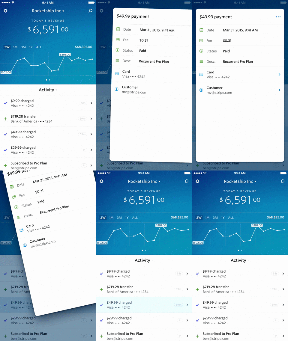
| We also added a tap animation (inspired by [Material Design](https://www.google.com/design/spec/material-design/introduction.html)) when you tap on a row anywhere in the app. We added a 100 ms delay before opening the card for two reasons: 1) the data needs to load and showing an empty card is unhelpful and 2) the user has the time to see where they tapped. | ||
| 当你在app中点击任何一行的时候,我们还加了一个点击动画(受[Material Design](https://www.google.com/design/spec/material-design/introduction.html)的启发)。出于两个考虑,我们在打开一张卡片之前加了100毫秒的延迟:1)数据需要时间来加载,而显示一张空白的卡片没有任何意义,而且 2)用户这样就有时间看清他们点击了哪里。 | ||
|
|
||
|  | ||
|
|
||
|
|
||
| My strategy behind implementing an app is pretty simple: I always start by implementing the user interface. The UI is the most important part of the app and should be a main focus for iOS app developers. Starting with the user interface without binding any data or working with the API will help you make sure the UI is as smooth as possible. It also makes it easier to understand why performance degrades when implementing new features and allows us to fix these problems faster. | ||
| 我在设计一款app的策略其实很简单:我总是从设计UI开始。UI是app最重要的部分,而且对iOS开发者来说,UI应该是他们最关注的地方。从UI开始,不绑定任何数据,不使用任何API,这可以确保你的UI尽可能流畅。这也可以让我们明白为什么在实现新特性时体验变差了,同时也让我们可以更快地解决这些问题。 | ||
|
|
||
| This is one of my favorite features of the app. We use push notifications for a few different things at the moment (more to come): | ||
| 这是我最喜欢的这个app的特性之一。目前我们对如下的一些事情发推送通知(更多内容将在后续版本推出): | ||
|
|
||
| * Daily summary: a quick look at your sales and new customers from yesterday when you wake up in the morning. | ||
| * New payments and new customers: for small businesses, it’s really exciting to see your business growing. | ||
| * Failed transfers: we want to make sure our users notice their transfers failing and explain how to fix them. | ||
| * Account changes: we let the users know that their password or bank account has changed as soon as it changes. This allows them to react and contact support if the changes were unauthorized. | ||
| * 每日总结:在你早晨醒来时让你能够快速地浏览你昨天的销售额和新的客户。 | ||
| * 新的支付信息和新的客户:对小型企业来说,看到自己的生意有了进展是一件很令人激动的事情。 | ||
| * 失败的交易:我们想确保我们的用户能及时发现他们的交易失败了,并且能够根据提供的信息想出该怎么解决这些问题。 | ||
| * 账户变更:如果用户的密码或者银行账户有变动,我们就立刻让用户知道。这可以让他们在这些变更是在未被授权的情况下发生的时候迅速做出反应,或是寻求帮助。 | ||
|
|
||
| For non-urgent notifications, we make sure to send them during business hours, depending on the user’s timezone. Nobody wants to be woken up in the middle of the night! | ||
| 对于一些不是那么重要的通知,我们确保只在工作时间把它们推送给用户,至于具体的时间段要取决于用户所在的时区。没人想在半夜被吵醒吧! | ||
|
|
||
| Today, the iOS team ([Ben](https://twitter.com/benzguo) and [Jack](https://twitter.com/jflinter)) is working on a bunch of new features and improvements that are taking the product that Benjamin and I started to the next level. | ||
| 现在,iOS团队([本](https://twitter.com/benzguo)和[杰克](https://twitter.com/jflinter))在开发很多新特性,并对现有的特性进行优化,这些改进将把本杰明和我初创的这个产品带入下一阶段。 | ||
|
|
||
| I’ve thought a lot about why Benjamin and I are able to kick off new products together so well. Having a team with complementary skills is key to this. We start by working together on product design, then he focuses on visual design while I focus on the code. It’s a great combination — between the two of us we’re able to create entire apps together. Everything moves lightning fast, and you spend less time in meetings and clarifying the vision if members are on the same page. Of course, it also helps if you worked with the same person for the last 5 years. | ||
| 我想过很多,为什么本杰明和我能够如此完美地共同做出新的产品。我觉得,有一个成员互补的团队是关键。我们开始时一同进行产品设计,然后他负责UI设计,我负责代码实现。这是一个绝妙的组合——我们两个人就可以创造一个完整的app。随着时间的推移,只要一个团队的成员都能跟得上团队的进度,那么这个团队就会花越来越少的时间在开会、在解释他们的想法上。当然了,如果你和同一个人在过去的5年里一直共事,这也是很有帮助的。 | ||
|
|
||
| Thanks to [Kat](http://twitter.com/kitchenettekat) for rewriting my English to make it human-readable. | ||
| 感谢[卡蒂](http://twitter.com/kitchenettekat)帮我改写了一遍,让这篇文章更具有可读性。 | ||
|
|
||
| [You can follow me on Twitter :)](https://twitter.com/michaelvillar) | ||
| [你可以在推特上关注我哦 :)](https://twitter.com/michaelvillar) | ||
There was a problem hiding this comment.
Choose a reason for hiding this comment
The reason will be displayed to describe this comment to others. Learn more.
startup -> 初创公司
dashboard -> 我觉得这个词出现挺频繁的, 可以不译或者叫后台管理页面
There was a problem hiding this comment.
Choose a reason for hiding this comment
The reason will be displayed to describe this comment to others. Learn more.
嗯,这两个都可以改一下。
There was a problem hiding this comment.
Choose a reason for hiding this comment
The reason will be displayed to describe this comment to others. Learn more.
它在移动端上几乎可以说是不可用的->它在移动端上几乎是不可用的
在将Checkout的最新版本发布之后->在发布最新版本的"账单"页面后