Orthography used for Plex Sans TC #346
Comments
|
+1 against using the Taiwanese orthography. IBM Plex Sans would be much better off not using it. |
|
+2 against using the ROC orthography (Ugly orthography) In the TC version of the Source Han project, the Chinese characters look like trash and the result is a disaster (they appear on many books, AD and screens). |

|
+3 against using the ROC orthography. |
|
+1 left is better |
|
left is better |
|
I chose left |
|
+1. I support using the traditional form. |
|
+1 left is better, I support using the traditional form. |
|
+1 for the left form |
1 similar comment
|
+1 for the left form |
|
These are the forms that have stabilized over centuries. They are formal, classical, and prestigious. However, they're no longer common on computers, because operating system vendors decided it was "better" to follow national standards, then demanded font vendors to change the forms to match them. Those national standards however were never mandatory outside of primary education use. I think it would be a great choice for IBM Plex TC if Plex could reinvigorate our true traditional forms for screen display. |

|
+1 I choose left, |
|
I need to bring in Sandoll to be part of tis dialogue! |
|
+1 to left. It has the added benefit that it will be closer to Japanese joyo kanji (can largely be re-used for Japanese) |
|
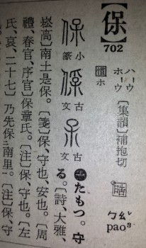
+1 Traditional glyphs are better. However, @ichitenfont's "Inherited Glyph" standard (esp. the table of recommended glyphs) is not 100% traditional. When there is a conflict between etymology and tradition, @ichitenfont's glyph standard sometimes chooses the etymological one as the "recommended glyph" and lists the traditional one as variant. Examples include U+4FDD 保, U+6975 極, and U+5E38 常.
The glyphs in @hfhchan's photograph above are also more traditional than etymological (c.f. 當 in line 6 from right, 掌 in line 9 from right). [2020/11/21 update: for "traditional" read "de-facto"] |

|
Full disclosure: I volunteer as a technical consultant on encoding affairs to itichenfont, and I have given a lot of feedback on itichenfont's Inherited Glyph standard, so I think I'm in a position to explain from itichenfont's decision making. For Inherited Glyphs standard, there was a preference to choose glyphs which are more correct on an etymological basis. In case of conflict, the other common traditional forms were placed into the variant list. The chosen forms which are more etymologically correct forms are glyphs also used in traditional woodblock or lead-type print, even though they might not match the exact form used in the Kangxi dictionary. A quick check in the MOE Variant Dictionary will show you that these forms are also well attested in authoritative dictionaries preceding the Kangxi Dictionary: This is from 《字彙》: This is from 《正字通》: This is from 《經典文字辨證書》: This is from 《正字通》: These forms were also found in newspapers using lead type, mostly newspapers from the early to mid 20th century Hong Kong, but I don't have the excerpts on my hand right now. It's not technically accurate to call those glyphs in the recommended list that differ from the Kangxi form as "not traditional", but some of them are not particularly common, yes. That being said, there are minor issues in Kangxi Dictionary: the forms for 在、你 are not common, the forms for 牙、瓦 in the index are not common, and the 戶-series and the 辛-series are not internally consistent either. Kangxi is definitely authoritative, and is mostly well-known as a de-facto standard of traditional orthography, but there are also issues using it verbatim. I'm perfectly fine if IBM Plex uses the form found in the Kangxi dictionaries for the above quoted characters. Especially they're listed in the variant list because the team at itichenfont determined those common forms as also acceptable from an etymological point of view. Based on Sandoll's experience on making fonts, I think Sandoll is definitely capable of making the right call for which traditional form to use. |


|
Totally agree with what @hfhchan said above. The glyphs “常”, “亟”, and “保” shown on the “Standardization documents of Inherited Glyphs” are also common in traditional printing. @dine2014 said they're not traditional, but I don’t think this is correct. Another additional point is that in the “Standardization documents of Inherited Glyph”, both “ If the designer prefers, they can select the green glyphs “ |


|
@mjabbink can we can a comment from Sandoll? I support the green glyphs in the above post. |
|
The etymological form of 保 is used as the head character in the 1943 edition of Dai Kan-Wa Jiten: Though the Kangxi form (⿰亻⿱口木) is used in the postwar editions of Dai Kan-Wa Jiten, as well as fonts like 新細明體, 方正新秀麗繁體, cwTeX 明體, Korean hanja standard, etc. |
|
Well Sandoll had a reply over at #334, I am going to post it here as well in case anyone doesn't see it:
It has been implied that the style would follow that of number two as described here. Number two is "印刷風格、新舊字形混合" which means a mix of handwritten/new orthography (新字形) and traditional orthography (舊字形). Something like this (although the final shape will be determined by the designers):
The image shows the fonts from top to bottom: Lantinghei TC, Adobe Fan Heiti Std, Adobe Ming Std and justfont's open huninn (jf open 粉圓). I added GenYoGothic TW (源樣黑體 TW, a Source Han Sans derivative) for reference as an almost traditional orthographic font and colour coded what glyphs I personally favour (green, which means traditional orthography), what I don't (red, which means Japanese shinjitai forms) and what I wouldn't mind, or what I am okay with (yellow). Basically it is very likely some glyphs that I marked yellow will be part of the final glyph design, but as said before, it is still ultimately up to the designers to decide. So in a way this is good news. EDIT: I added a few more glyphs, same font order, same colour coding scheme. HINT: Since the JP version conforms to the Adobe Japan 1-3 StdN specification, the designers can save some time by picking some hidden glyphs from the JP version, for example, 翠 (U+7FE0), which if the JIS1978 forms are used, is in Kyujitai form suitable for TC, and CJK Compatibility Ideographs like 海 (The appropriate glyph is at U+FA45, which can be easily used for U+6D77 in the TC version). |


|
For the top example, here is a diagram that can (hopefully) give more details: Even if the designers opt to not choose the preferred TC glyphs as default glyphs, options should be given through OpenType (such as |

(For Traditional Chinese users passing by this issue, please refer to #346 (comment) reply. If you like the form on the left over the right, please upvote this issue.)
(路過嘅繁體中文使用者,請參見 #346 (comment) 回覆入面嘅圖片。如果您認為左邊寫法比右邊寫法順眼耐看,請讚好此帖)
I'd like to know if Plex Sans TC will or will not adhere to which orthography.
First there is the traditional orthography, which is not standardized by any government which uses Traditional Chinese as its official language, but works as the de-facto standard in Traditional Chinese speaking areas, and remnants can still be found in predominantly Simplified Chinese areas. This orthography became popular in the Ming dynasty, and is also known as the "Kangxi form" because it was used in the Kangxi Dictionary, which is one of the authoritative dictionaries in use since the 18th century.
All traffic signs in Hong Kong and most existing traffic signs in Taiwan are in the traditional orthography. This is also the main orthography in use in published books before computer typesetting became available. This orthography is also used officially for characters outside the 常用漢字 (jōyō kanji) in Japan, and in all official standards by South Korea.
Then there are the official orthographies of modern governments, the first official orthography being published is by the Taiwanese government 國字標準字體 (Standard Typeface for National Characters), and the second is the 香港電腦漢字宋體〔印刷體〕字形參考指引 (Reference Glyphs for Chinese Computer Systems in Hong Kong).
Most commercially successful fonts published by vendors are typically an amalgam of the traditional orthography or their own modern interpretation. JT Foundry has summarized four forms (traditional, amalgam, modern, official) in use by Traditional Chinese font foundries here. Computer fonts produced by Monotype for Traditional Chinese areas are in the 'modern' form. Computer fonts produced by Dynacomware, Arphic, and other smaller foundries are generally in the 'amalgam' form. Nearly all metal type is in the traditional form. A number of forks of Source Han Sans are in the traditional form.
I'd like to know if Plex Sans TC intends to adhere to any particular orthography. The official Taiwanese orthography is not well accepted for HK users. The official TW and HK orthographies have also met widespread criticism by commercial type and font vendors and designers in Taiwan and HK alike.
In recent years, default fonts for operating systems have been released following the Taiwanese orthography, i.e. Microsoft Jhenghei (Windows), PingFang (Apple) and Source Han Sans (Android). Also due to the sheer size of CJK fonts, only these fonts remain. This has caused the traditional orthography to virtually disappear from computer systems.
Fonts which follow the orthography also look like clones of each other. It would be a loss if IBM also followed suit and adhered to the official orthography of Taiwan.
The text was updated successfully, but these errors were encountered: