Add UI to create/edit custom gradients #16662
Comments
 karmatosed
added
Needs Design
karmatosed
added
Needs Design
|
Here's a first stab at one way this could look, mainly trying to use existing patterns... New gradient options, along with a Gradient Type (linear, radial, conic) selector, and angle select: Gradient picker, using the existing color picker to set color stops along the gradient: I imagine gradients could be set at the theme level—maybe with something like |


|
I realized it would be useful to have an alpha slider alongside the RGB slider. Also, I realized keyboard users wouldn't have an obvious way of adding color stops—this is not the most elegant, but I added buttons for adding and removing color stops. Would love to see what ideas other folks have for these tools!
|

|
Here's an alternative exploration for the color stops—this version might provide more flexibility, especially if users are inserting multiple stops:
|

|
For the Gradient Angle input, it might be nice to use something like UI Anglepicker:
|

|
A little inspiration to add into this mix from @melchoyce is https://www.gradientmagic.com/. |
|
Those are awesome! A lot of those are built by layering one gradient on top of another. That would make the gradient builder UI more complicated, but it would be a cool feature to have. Here's a revision based on adding that ability. First off, we could break the preset gradients into different tabs:
With a Custom tab, we could move the gradient builder out of the color picker and into its own dedicated space:
(Note that with multiple gradient layers, we'd need to move the Type and Angle options into each layer, so we could have different angled gradients for different layers.) Here's a mockup with two gradients layered on top of each other, with controls to reorder the layers:
|


|
Hey guys, Sorry for the delay on my take on this. @susurruses fantastic mockups! My personal approach was simpler and as most in line with GB's design pattern as possible. So with zero state, user would select whether the overlay going to be a color or gradient. And once gradient selected, gradient checkboard bar and options would appear, along with the presets: Hovering on the gradient bar anywhere but the color stops would display a plus button to add a new stop. And once a new stop is added, ability to add it's position would be appended to the panel body as a Number/RangeControl component.
Now I personally like to keep the panelbody heights as minimum as possible to avoid overwhelming look of all the options coming one after another, so I'm also attaching an inline Number component alignment version of the inputs instead of range controls:
And once a color stop is clicked, the color picker would appear. The component I found really useful was React Color: (or default ColorPicker component can also be used).
Let me know what you think |


|
Thanks for these awesome explorations. @susurruses I like you are using existing patterns, that's a really strong starting point. I also really like the gradient type. It reminds me of the way Sketch and other applications do this. For the angle I think exploring a dragging on circle position like many applications have could be really interesting, there's something about visually seeing for angles. I do think we need to consider how minimal this could be, there's a lot we could add but what is what someone would want? For me that is:
@onuro it's great to see where you ran with the ideas here. I like gradient showing on selecting that. I also like the simplification but I think bringing in transparency from @susurruses showing in the color circles could be a nice next step. I do wonder if I'd as a user understanding 'colour 1/ colour 2' and then positions. Is there even more simplification could be done there? I like idea of gradients types as in @susurruses' example, maybe we have a future of packs for this as people extend in themes and even plugins. Again, huge thanks to you both and looking forward to where this can go from here and then looking at having a gradient interface we can use for example on the button block. |
|
These mockups are great 🙌 Before we get too far, we should find out if the color picker library we're using comes with gradient support. That could potentially reduce the amount of custom design work needed. |
|
Following up on this, I asked @ryelle about the library our color picker is based on, and she confirmed that it doesn't natively come with gradient tools. We will need to make something custom :) |
|
I think the gradient component you guys are thinking about adding is the crucial part of this all. Because the more it gets complicated, the more it is overwhelming for the user. I also agree that if this is going to be a user driven component, then yeah we need a special gradient component to run. I'd say minimal attributes with maximum output! |
|
Agreed! For simplifying, how about dropping support for layered gradients (ala the GradientMagic examples)? We could also differentiate just between Preset and Custom gradients. I like the idea @karmatosed mentioned about themes and plugins being able to register gradient sets. Here's a modification of what I'd posted before, dropping the layering feature, and simplifying where possible. (@onuro I snagged your gradient bar styling for this!)
|

|
Here's how Stackable handles it:
Trying to find other examples for reference. |


|
A little revisit to my version of it:
I think gradient color bar in context adding color stops would help a more centralized UX for the new colors to be added, while removing a stop can be grouped within a range control. (still exploring ways to further simplifying, since this control is very prone to overwhelming a user) I also think limiting the max number of stops would be a good idea to avoid going too crazy with gradients (say maybe max 5).
Also attaching the sketch file in case you want to hack it: Btw this is how I handle the gradients and presets currently with Kioken Blocks:
|


|
I just found this discussion because of the #design meeting. I have been thinking of putting a gradient maker into my theme for the last few weeks. It would be best if this could be used in the Customizer, on the Header Image area or on the Background area of the Customizer, without the theme having to write a new control. In other words, make it usable by themes without having to call |
|
Also, I just wanted to say that the design with the check marks on top of the selected item is not very friendly. You can't tell what is actually selected because the check mark is in the way. |
|
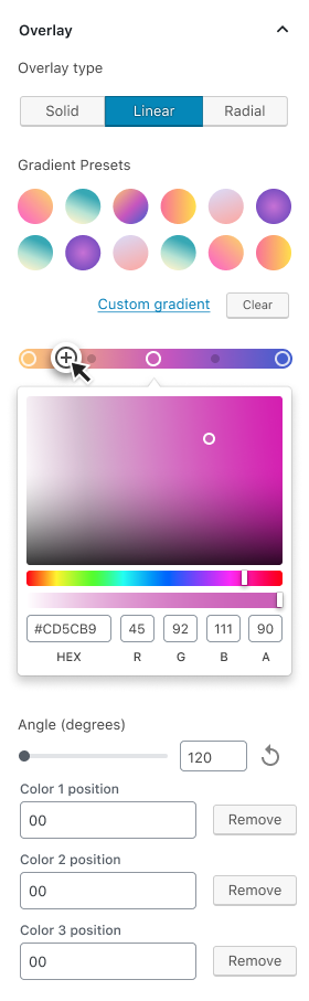
@onuro I like your latest design. I feel before we go any further, we should include a11y by adding the appropriate label to the issue. I'll go ahead and do that. This is already present in the latest designs, but I think it's important to note that most users will probably only need either a solid color or gradient, not both at once. Any kind of layering of multiple colors/gradients is too complex. Solid, Linear, and Radial can be considered a type of overlay. The type of overlay could be selected with a button group. I'd use text just to be more accessible.
Once the user has selected one of the gradient options, I think it's important to present some preset options, but hide the custom gradient controls until the user presses some sort of button. Similar to what exists now for the solid colors:
Some notes:
Not perfect, but here is what I mean
|


|
I think these mockups are beautiful, but there's a lot of custom stuff there and it feels like it might all be a bit too much. Is there an argument for making something simpler? My concern is that the controls being designed would take a long to make (since there's a lot of custom work), and be harder for non-technical users to understand. Plus making them accessible would be a lot of work. Personally I would suggest starting with something like the mockup below. This could be made a lot quicker with existing controls (that are presumably already tested and accessibly). Admittedly it's a lot less flexible but it would still be a big step up from just a colour control.
|

|
@BinaryMoon I'm not sure if you saw this, but we already have a color picker and I think it's accessible:
|
|
@drw158 Yes - I've used that quite a few times. My concern was less about the colour-picker than it was the new custom things and the large amount of extra controls. My preference is to make things as simple as they can be. Your mockup was the simplest but I felt it could be simpler still and so suggested an alternative. |
karmatosed
added
Needs Design Feedback
|
It's amazing to watch this UI evolve. Thank you for the work! I really like the combined effort between @drw158 and @onuro in this comment. My only concern however, is the color stops at the bottom. While I think it's important to have the label "Color position 1," I also don't know which color stop is "1" (ie. the one on left, the one on the right? the first one I added?). So including color circles as in @susurruses's mockups would be very helpful. I also imagine that if "Color position 1" changes based on location within the gradient bar, it would need to update automatically if I moved it to the other side. |
|
While looking into selecting gradient types, I looked into the mozilla documentation. Listed on this include. There are also repeating versions of all of these. We could support of all these types of gradients. However, the different types of gradient will likely have different design requires than the simple linear gradient that is currently supported. Some of these types of gradients get extremely complex and I am sure sure how they could be supported. Some types that I flagged.
So if we consider the solid color is also an option we have to support.
When gradients are selected, a checkbox for repeating could be displayed. The direction gradient should be a range bar. The select menu isn't my fav for design here, but it does allow for more options to be added later, as conic gradient might not be in this first version. |
|
I don't think Conic should be an option because it wouldn't be used. I could see some people using Radial though. |
The theme I wrote provides conic gradients (I provide a polyfill). So it could be used. But it probably doesn't need to be in there if there is no polyfill. It just points to a need for it to be variable or at least extensible. |
|
What about repeating gradients? |
Do you mean break points in gradients? I think for v1 we really should focus on the simplest version. One thing to keep in mind is what can we do as base then build up? |
 youknowriad
changed the title
youknowriad
changed the title
|
Since buttons and covers do support Gradients, I updated the title of the issue to reflect the current work being done here. |
|
Apparently, the group block still doesn't support gradient backgrounds. |
|
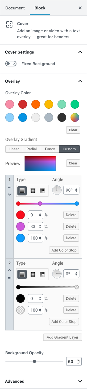
This issue seems to be resolved now, let's have separate issues for block support. |
Gradients support was added to the button and cover blocks. We're still missing a UI to edit custom gradients.
The text was updated successfully, but these errors were encountered: