-
Notifications
You must be signed in to change notification settings - Fork 4.3k
New issue
Have a question about this project? Sign up for a free GitHub account to open an issue and contact its maintainers and the community.
By clicking “Sign up for GitHub”, you agree to our terms of service and privacy statement. We’ll occasionally send you account related emails.
Already on GitHub? Sign in to your account
Add Block: Section #4900
Comments
|
I really like this idea! I also like fact it has a background setting to it. |
|
Nice! What if the block allowed the three following 'advanced' settings:
|
|
Love this idea. If background and text colors can be altered, it might make sense to add link colors as well. |
|
Excellent Idea. This will literally add much value to Gutenberg Editor. |
|
Much better than just the Columns block, which has a lot of issues. Cool! |
|
If this block has "columns", we should just update the "columns" block. But it's still possible to use a columns block inside a section block and keep the section block columnless. |
|
As long as you can't put column blocks inside column blocks 😉 |
|
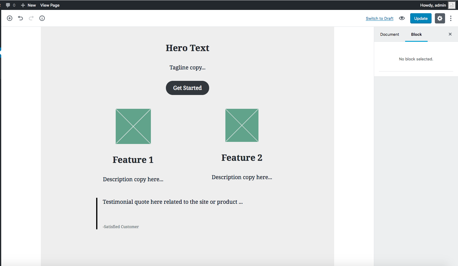
A lot of site pages are broken up into sections that has mixed content with multiple rows of columns and often columns nested inside larger ones. This is a quick example: A section block that just acts like a bare wrapper I think would be the most flexible. (as would being able to nest column blocks!) We've kicked off a new site project this week. Normally it would be built with with Advanced Custom Fields flexible content layouts but I'm going to see how far we can get using Gutenberg alone. |
|
Yeah, I think multi-column sections like @jvisick's above example aren't uncommon. A container with background/text options that nests blocks would be the most flexible approach. Since we now have a functioning column block, we could even consider taking out the column option from this. |
|
It would be great if there is an inner-container (div) in this block which then contains all the child blocks. This container could then be styled with max-width and margin-left/right: auto to center the child blocks and have a full-width background. |
|
Having a fullwidth section with the content contained to a narrower layout is a common design pattern. I'm wondering if it would be best controlled by the nested blocks rather than baked into the parent section block? |
|
I think a section block would be very useful for... well, sections on a page, and I agree that columns should be a separate block (like the one that exists now) that can be nested in a section block. I think this is something that, along with the Columns block, should be included in the version of Gutenberg that is merged into WordPress 5.0. If you look at existing page builder plugins, sections are used a lot, as are columns (obviously), so including them in the initial core release is essential in my opinion. (I also think it is important that the columns block gets features like variable-width columns and responsive columns, both for the sake of the core experience as well as making it easier for existing page builders to re-base themselves off of Gutenberg, but that is a separate issue.) |
|
Section blocks would be awesome, but please make it semantic mark-up only! Keeping things in semantic HTML structure would create the most agnostic code base. |
|
@talldan Sorry I missed your comment, but I am 100% okay with you taking this on 🙌 I'm sure you'll rock it! |
|
It would also be great to be able to use the focal point of the text & media block #10925. Of course this only makes sense if you have an image background. A great thing, which, by the way, a lot of page builders also have. Or at least something like that: |
|
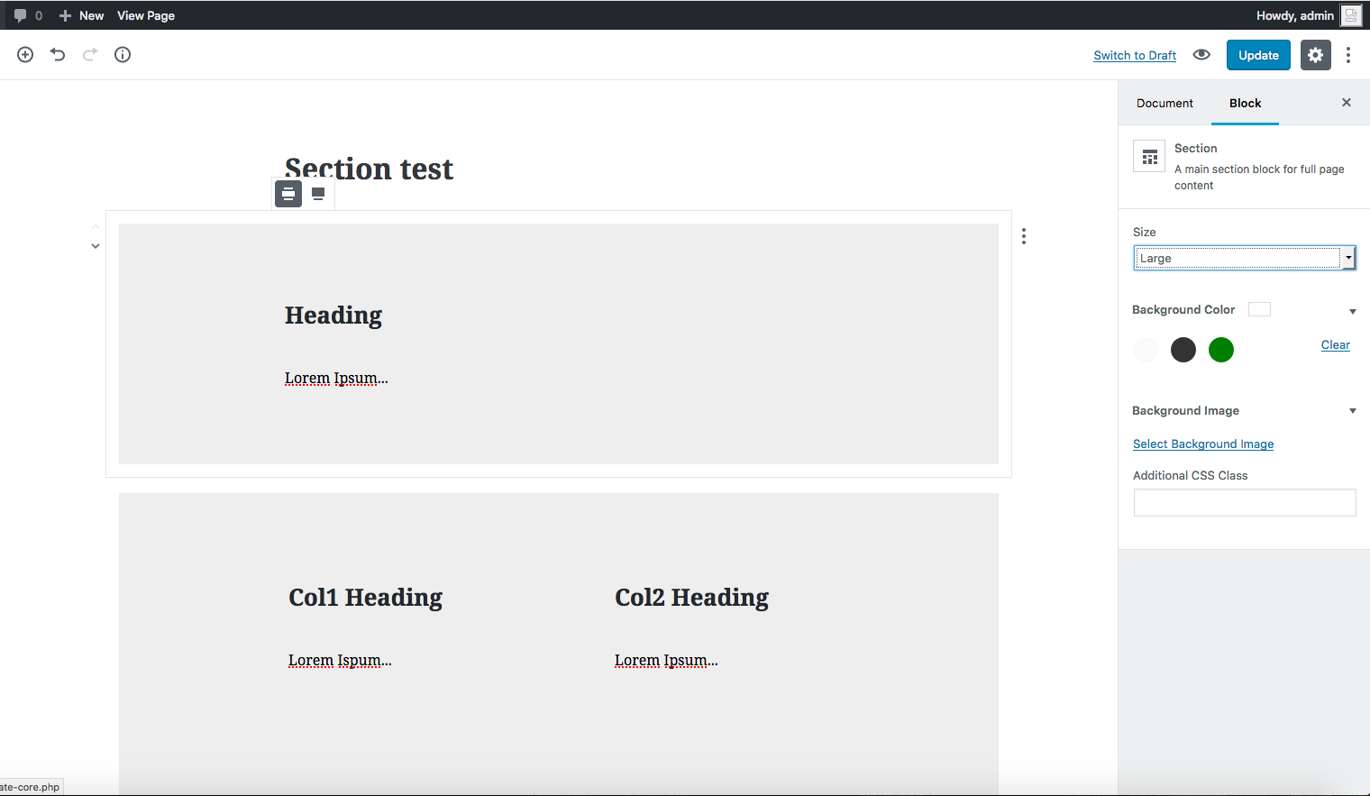
Agreed a focal point picker would be great here. It works really well in the cover block! With that in mind, I've updated my earlier mockups for a section block. It acts purely as a container element with an adjustable background color and image. Preview: |
|
Some additional notes:
|
|
I agree, the background image can be added using css if needed for the time being 👍 |
One of the reasons to consider the section block the right place for block level colors is that otherwise we have to answer why the list, heading, and other basic text blocks don't have those color options. And since those are split at the block level, you'd never be able to have a background image that spanned all of those continuously, whereas a section block fixes that. The way to deprecate these colors could potentially be to just remove the UI for it, but let existing blocks remain styled as the are. |
|
Nice! Would be useful to have small/medium/large classes for vertical padding. |
This dips into theme / framework-level, and I'm not sure if core has a place for anything like https://cdn.vaadin.com/vaadin-lumo-styles/1.4.1/demo/sizing-and-spacing.html |
Couldn't agree more. Get a v1 out and then v2 can add the more complex functionality.
Agreed - this Block should be as simple and unopinionated as possible. I think we should merge this PR if possible. |
|
I took a whack at something like this... released as a plugin: |
|
Please, no more plugins that will leave people depending on it. Just release the damned block already. |
|
@webdados I second this. Not to diminish anyone's work, but we really need this to be built-in at some level. Especially in a world where there's this issue. Should an adequate solution be found for #13391, then the existence of countless container block implementations would probably be fine. |
|
Until the new block builder cracks having a standard foundation for layout elements (containers, sections, rows columns) that third party plugins can extend, then it is at nothing and perpetuates the mess of switching on and off third party blocks, themes, builders (those trying to address the layout issue) and ending up losing content and page layout. |
|
When can we expect this feature? |
|
Should already be in the latest version: |
|
@ksere: I missed that probably because the changelog for v5.5.0 of the plugin is empty. |
|
Really digging the implementation on this so far. I understand it was just released in 5.5, but I'm wondering when we might expect additions for background images (and their positioning), background colour opacity, etc. Is this something we should expect before late 2019, or are we talking more long-term than that? |
|
@nathansnelgrove Thanks for the feedback. There are definitely some improvements coming to the group block, here are two already in progress:
I haven't seen the issues you mentioned about background images and opacity being tracked anywhere, it might be worth creating a separate issue for that if you have time as this issue is now closed. |
|
Background images/colors/opacity are from the original proposal — I'll make a new issue for them. |
|
I've just installed WordPress 5.2.4, and I can't find any "Section" or "Group" block. What's going on here? |
|
@patrikhuber: This will be included in WordPress 5.3 which is currently planned to be released on November 12. |
|
@noisysocks I see, thanks a lot! |


Now that we have official support for nesting as of #3745, let's consider adding a Section block that can act as a generic block container.
This block would have the following settings:
The text was updated successfully, but these errors were encountered: