Focal Point Picker #10925
Focal Point Picker #10925
Conversation
 mtias
added
[Type] Enhancement
mtias
added
[Type] Enhancement
|
Thanks @jeffersonrabb for the proposal and implementation! I think this will be a neat addition. Having it as a reusable component would also help others build blocks with equal capabilities (and a consistent experience). |
|
This is great! |
|
@jasmussen, @jeffersonrabb is going to rebase and I was wondering if you might be able to help out with a design feedback review? |
…al Point Picker for non-parallaxed image backgrounds.
…ess focal point picker UI if image dimensions aren't available, 2) suppress background-position styling unless focal point is valid.
…e.scss instead of the components index.s.
 jeffersonrabb
force-pushed
the
try/focal-point-picker
branch
from
jeffersonrabb
force-pushed
the
try/focal-point-picker
branch
from
c1ecc3b to
ded1017
Compare
|
Rebased and ready for review! |
| } ); | ||
|
|
||
| /* Example function to render the CSS styles based on Focal Point Picker value */ | ||
| const renderImageContainerWithFocalPoint = ( url, focalPoint ) => { |
There was a problem hiding this comment.
How would this function be used? It’s not clear from this document.
There was a problem hiding this comment.
This is meant to illustrate how the percentage values from the component can be translated into a "real-world" CSS background-position definition. The relevant line in Cover block is:
It would probably make sense for me to use the actual example instead of the hypothetical, but I'd prefer to hold off on updating the README until the PR is ready to merge, in case there are changes still to come. Would this be a reasonable approach?
| y: 0.5 | ||
| }, | ||
| } )( ( { focalPoint, setState } ) => { | ||
| const url = '/path/to/image'; |
There was a problem hiding this comment.
This example is going to be used in auto-generated docs so it should ideally provide a valid url that can be rendered.
There was a problem hiding this comment.
Are there examples of valid url parameters in any other Gutenberg components? I just did a quick scan looking for one and came up blank, but maybe you can point me to a relevant one?
There was a problem hiding this comment.
See how ResponsiveWrapper is documented:
https://github.com/WordPress/gutenberg/blob/master/packages/components/src/responsive-wrapper/README.md
This is how it renders in Calypso DevDocs:
https://wpcalypso.wordpress.com/devdocs/gutenberg-components/responsive-wrapper
| import { withInstanceId, compose } from '@wordpress/compose'; | ||
| import BaseControl from '../base-control/'; | ||
| import withFocusOutside from '../higher-order/with-focus-outside'; | ||
| import classnames from 'classnames'; |
There was a problem hiding this comment.
Only classnames is an external dependency here.
Packages with the WordPress namespace should be in their own group.
Everything else is internal dependencies.
There was a problem hiding this comment.
Resolved in 97fcd04
|
I didn’t do very in-depth review of this PR, just initial pass. At first glance, it looks good. Thanks for working on it 👍 |
| }, | ||
| dimensions: { | ||
| type: 'object', | ||
| }, |
There was a problem hiding this comment.
Why do we need to store the dimensions? Can't we just use percentage in the focal point instead?
There was a problem hiding this comment.
The focal point picker needs image dimensions for two reasons:
- To define the drag area for the target. The user should only be able to drag the target over the area of the image, and unless the image's aspect ratio precisely matches the focal point picker's area there will be blank space on the left/right or top/bottom. Awareness of the dimensions allows a precise definition of the drag area. This is done here:
gutenberg/packages/components/src/focal-point-picker/index.js
Lines 39 to 64 in 97fcd04
- To convert the location of the target to a percentage-based focal point we need to know the dimensions of the original image. This calculation occurs here:
gutenberg/packages/components/src/focal-point-picker/index.js
Lines 65 to 90 in 97fcd04
However, I don't love requiring dimensions as a parameter for the component. First of all, it's restrictive - ideally the component just takes the image path and handles the rest. And second, it also creates a deprecation problem for Cover blocks created prior to the Focal Point Picker in which the dimensions are not retained. Ideally, I'd prefer that the Focal Point Picker component determine the dimensions programmatically from the image itself. I'm going to experiment with a few approaches to this and will update the PR shortly.
There was a problem hiding this comment.
In 5567d16 I've introduced a different approach to getting the image dimensions. The parameters are gone. Instead, the component creates an invisible <img /> (opacity: 0) and derives the dimensions from that. This way the block using the component need not supply dimensions and the component will work with legacy blocks. Does this seem like a viable approach?
Update: as of b67aaa4 I've removed the background image completely in favor of the IMG element, so it is no longer invisible as I indicated above.
|
Really nice work. GIF:
Can you make the focal point picker look like this?
That is,
There's white padding above and below the focal point picker — is this intended? Can it be removed? |


|
Can you add input fields below the picker that matches the percentages typed in? This would be an accessible option:
|

…s, for accessibility reasons. Slight corrections to the postion calculations.
Done in 7131d07. I added my own styles for placing the two TextControls side-by-side. If there is a Gutenberg component or other structure that makes this easier to do, let me know and I will replace. Also note that these text fields are not editable. Making them editable would introduce a bit more complexity - is this needed? |
Yep, that's it. Adding |
…onvention. Moved render() function to be the last one.
Added Seems to work well. |
Can confirm — I'm no longer seeing those artifacts. I think we're all set from a design perspective now. 👍 |
|
🎉 |
|
I've just noticed this component renders two input fields that are completely unlabelled. The visible text is just plain text. There's no associated Similar cases happened several times in the past months and I'm sorry to have to point it out again: this is a very basic accessibility requirement. There's been some discussion in the past about a way to try to avoid this kind of oversights but nothing concrete happened. Please, let's try to find together a way to improve the process. 🙂 |
| </div> | ||
| </div> | ||
| <div className="components-focal-point-picker_position-display-container"> | ||
| <BaseControl label={ __( 'Horizontal Pos.' ) }> |
There was a problem hiding this comment.
Per @afercia 's comment, I think this needed to have been assigned an id for a label to be produced associated with the rendered input (which does have an id).
It seems at some point BaseControl was updated to be accommodating to receiving a label and not an id, at which point it renders a span. I don't know that this should be supported, as it leaves open the possibility for errors like this.
There was a problem hiding this comment.
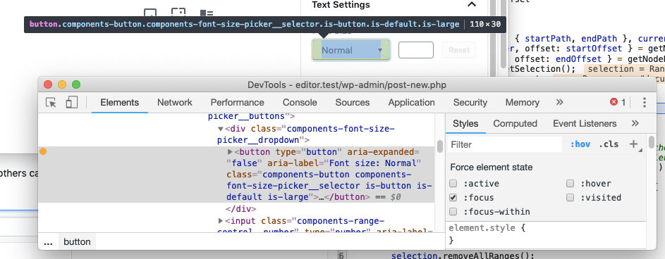
Thanks @aduth I think that change was made for the new font size picker:
where the visible text can't be a label element. At that point though, the input child must have an aria-label attribute: and yes, this leaves open the possibility that developers forget or don't know they need to label the input.
There was a problem hiding this comment.
where the visible text can't be a label element
(Related: #9802 (comment) )
Forgive my understanding, but it's not clear to me why in that example "Font Size" would not be a label element associated with the dropdown input?
There was a problem hiding this comment.
Not all elements can have an associated element. Form elements and a few others can. What is the dropdown input in this case? The div?
There was a problem hiding this comment.
Not all elements can have an associated element. Form elements and a few others can. What is the dropdown input in this case? The div?
There's a button which could receive the initial focus for the dropdown.
There was a problem hiding this comment.
Yes, technically a button is a labelable element, here's a list: https://www.w3.org/TR/html52/sec-forms.html#labelable-element
However, it's not just about click > focus. The primary goal of labels is giving names to controls. In this case, it wouldn't make sense. A <label> element would override the button text. It wouldn't override the button aria-label though, which is, for example: aria-label: "Font size: Normal". It would be a very uncommon usage. Seems to me your proposal in #9802 (comment) is preferable.
There was a problem hiding this comment.
FYI these specific BaseControl were corrected by @jorgefilipecosta in #14152
|
Why wasn't the addition of this new component reflected in the changelog? |
It should have been, but the changelog workflows are not universally adopted / enforced. This should become less an issue after #13594. |
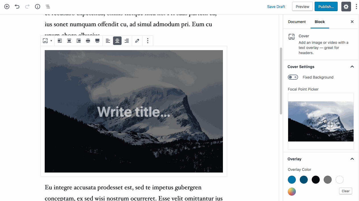
Description
This PR creates a Focal Point Picker component and implements it in the
Coverblock. Here is the rationale for this functionality: when dealing with large background images like the ones used inCover, it's common to see undesirable crops, especially on smaller viewports. If the primary subject of an image happens to be dead center then it will display perfectly everywhere, but if it is off-center by even a little, key visual information can be cropped out.The Focal Point Picker component allows the user to visually select the ideal center point, which is then returned as a pair of percentage-like coordinates (e.g.
{ x: 0.1, y: 0.9 }) which can easily be converted intobackground-positionattributes and applied to the element with the background image.Video and Parallax
The Focal Point Picker only works if an image is being used, and if
Fixed Backgroundis disabled. For now, the same approach won't be applied to videos, and Parallaxed images don't really require a focal point since their crop changes as the user scrolls.Legacy Content
As part of this branch,
Coverblock saves the dimensions of images when selected, which is needed by the component. For instances ofCoverblock that pre-date this branch there will be no dimensions data, and therefore the focal point picker is suppressed. Because of this approach there was no need to add a Gutenberg deprecation definition.How has this been tested?
try/focal-point-pickerCoverblock to post.focal point of the image. Depending on the dimensions, you will probably see the image move around a little in the editor.
Screenshots
Here are two screen captures demonstrating the use of the focal point picker:
https://cloudup.com/cIIvWAafA20
https://cloudup.com/cnL3p-eZvSq
Types of changes
The Focal Point Picker is a new feature, which shouldn't affect anything, however the implementation in
Covercould possibly break the block and should be tested thoroughly. Another important testing flow is to create aCoverblock while onmaster, then branch switch totry/focal-point-picker. The block should remain exact as it was, with no focal point picker visible.Checklist: