-
Notifications
You must be signed in to change notification settings - Fork 4.3k
New issue
Have a question about this project? Sign up for a free GitHub account to open an issue and contact its maintainers and the community.
By clicking “Sign up for GitHub”, you agree to our terms of service and privacy statement. We’ll occasionally send you account related emails.
Already on GitHub? Sign in to your account
Fix issues with image initial size #11846
Conversation
|
Not sure what I'm doing wrong but I can't resize the images this way. |
|
Hmm, indeed. It works if I remove both the min and maxwidths entirely, but then you can size the image above the width of the container. Investigating. |
7b8b44c to
3501d96
Compare
|
So, in 3501d96 I committed a horrible hack just to get it working. To be clear, we can't ship that. Not only is it terrible, it's likely to break in a billion ways. However, hopefully it can suggest what we need to get to a proper solution. I'm not actually sure why the 100% property didn't work — that would've been way cleaner. Any help appreciated. |
|
Unless we can find a good way to make the max-width match that of the theme, honestly I feel like we should remove the max-width and minwidth constraints entirely: Yeah, that's not ideal. But at this point it's better given how broken TwentyNineteen and any other theme that provides an editor style is. The classic editor also doesn't have a max width. |
|
I'm in favor of getting rid of max width in theory, if we have plans in the future of using Gutenberg in a theme's context for site building etc., then max width is going to bite us there. (to be honest, I'm not sure Gutenberg should be defining widths at all if the current theme can provide them, but that's a different issue 😁 ) Couple of things:
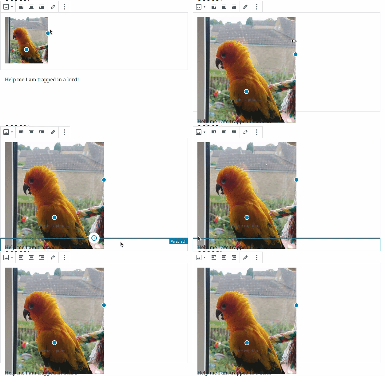
Image used: https://i.imgur.com/AWJ2njK.jpg
Insert a landscape aspect image, resize it to the width of the editor, then resize your window to switch to the narrow screen styles. Image used: https://i.imgur.com/vu0EZ38.gif |
|
Thanks for taking a look at this! I'm excited to get it fixed. Your hack does work for the most part, but I'm seeing it fall apart at smaller screen sizes: I wonder if the fix for this might end up being related to #5650 and #6177. Seems like this could tie into the theme's content width in some way. |
|
Yeah might be worth flagging in @azaozz who has spent a ton of time thinking about how we handle images and such in Gutenberg :) |
|
To be clear, the PR as implemented now has more or less fallen apart and can't really be merged as is, so it's more of a starting point for discussing the actual fix. Which, as much as I'd like for it not to be necessary, might require use of the $content_width variable. |
Tried that too and didn't see any downsides. Still thinking that ideally that should always be set by the theme. Themes with fixed width for the main column may have unexpected results.
Yeah, I was really hoping we can avoid using that. Been looking at ways to replace it, but we need a simple, straightforward method for three-way communication between the theme, the editor, and the front-end. In the (experimental) #11377 looked at introducing another "global" setting In any case, themes should be setting their own |
Well, the downside is that the resizablebox component we're using for this doesn't appear to work there. The initial size is right, but otherwise the thing isn't resizable at all. |
|
So the ideal solution is to figure out why ResizableBox isn't able to handle the 100% value. Because a theme might have a 50% wide main column, so the content-width variable is a little useless in that situation regardless. Barring that, leveraging the column width will at least go a ways to fixing this. I did notice the reports Nikki noted, that especially in the initial sizing up of portrait images, the sizing is a little funky. But this seems to settle after a bit. Figuring that funk out might be a different fix. |
I don't know if it's capable for handling that or not but even if it's capable, it won't work because the width of the container of the block will follow the image size, which means 100% will decrease as soon as you resize the image to a lower size and you won't be able to increase the size of the image. (for floats at least) |
This PR aims to fix an issue where if an editor style provides a wider main column width than the default, images are still constrained by the default editor width (580px).

For example, the editor main column width in TwentyNineteen is wider than that of the vanilla editor style. So any image you insert there is constrained, but only in the editor.

This PR simply removes our max-width variable and defaults it to 100%. I can't tell if there are any downsides or risks to this, please give me your thoughts on it.
This commit uses a horrendous hack to calculate the width that the image should have as its max-width. It needs to be refactored, better, don't merge.

However it works.
3501d96 to
6d81175
Compare
With the current implementation of ResizableBox, an image needs an explicit pixel value for the max-width.
In absence of being able to set the content-width, this max-width is currently dictated by the vanilla editor style.
The following variable adds a buffer to this vanilla style, so 3rd party themes have some wiggleroom.
This does, in most cases, allow you to scale the image beyond the width of the main column, though not infinitely.
It would be good to revisit this once a content-width variable becomes available.
6d81175 to
dfdd839
Compare
|
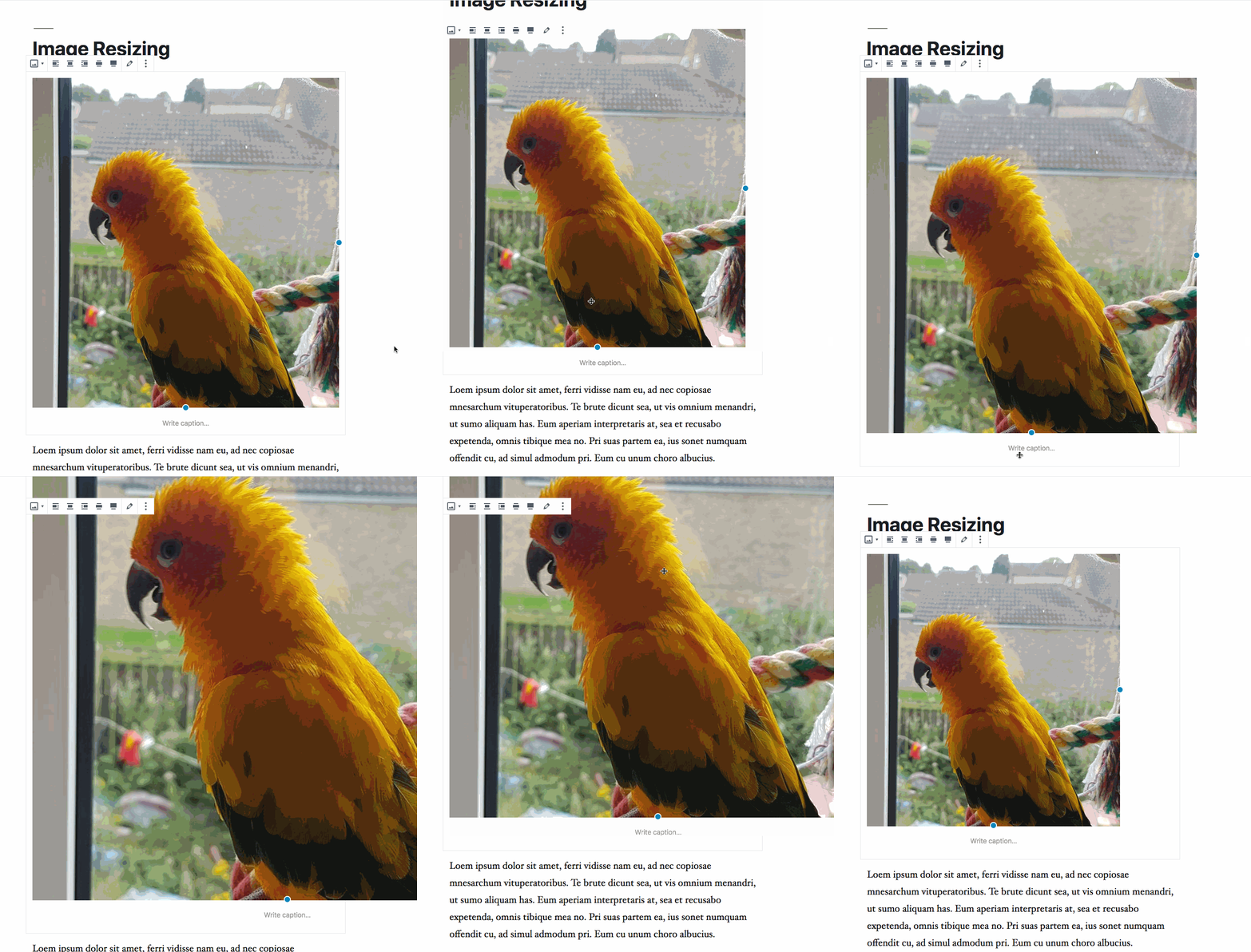
Okay, rebased and pushed a change that I think we might be able to ship. The change is to use the vanilla editor width (580px), but with a 2.5x buffer. This means:
I've added a comment explaining this, and a todo so we can revisit in the future. But for now, this seems like a better experience than in master, and worth shipping. Some GIFs: Portrait: Note that we can actually "fix" it so that the gray boundaries scale with the image: However that requires setting the image block to However I would recommend us not doing that, as it has side effects that on one hand might not be worth it, and on the other hand are definitely too risky to merge this late in the process: In any case, I feel like the implementation added in dfdd839 is a good balanced fix for now, and I think we should merge it for 4.4. Your thoughts and reviews are appreciated. |
There was a problem hiding this comment.
Choose a reason for hiding this comment
The reason will be displayed to describe this comment to others. Learn more.
I feel this is one of those issues where there's no ideal solution. I think the current proposal is a good enhancement so I'm approving.
|
Uh, sorry I'm late to comment here, so much things to do, so little time... :) Tried looking at why ResizableBox can't handle "100%" size images. Seems structural CSS related, but needs a lot of changes to fix. Came up to pretty much the same conclusion: it needs a fixed width but we can make that width pretty large to not limit the theme. Another thing I'd like to test is setting the container's max-width to the image file's actual width. That seems to work pretty well (fixes ResizableBox) and prevents upscaling (currently you can upscale freely). (BTW, WOW! GH? What is that page jumping!? Large images and not having width/height??) :) |
|
Lots of improvements still to look into, here, sure.
So just to stop myself from having a heart attack, are you referring to this github page loading? Or are you referring to this branch loading on your local dev system? |
|
Uh, sorry about that, it's this Github page. There are several large images that load slow(er), and the page keeps jumping and pushing the comment form under the fold... Quite annoying. |


This PR aims to fix an issue where if an editor style provides a wider main column width than the default, images are still constrained by the default editor width (580px).
For example, the editor main column width in TwentyNineteen is wider than that of the vanilla editor style. So any image you insert there is constrained, but only in the editor.
This PR simply removes our max-width variable and defaults it to 100%. I can't tell if there are any downsides or risks to this, please give me your thoughts on it.
Before:
After:
closes #9302