[dashboard] Update theme preference selector #4021
Conversation
 jankeromnes
force-pushed
the
jx/new-theme-selector
branch
3 times, most recently
from
jankeromnes
force-pushed
the
jx/new-theme-selector
branch
3 times, most recently
from
c08e587 to
b1807d9
Compare
jankeromnes
force-pushed
the
jx/new-theme-selector
branch
from
b1807d9 to
ccff686
Compare
|
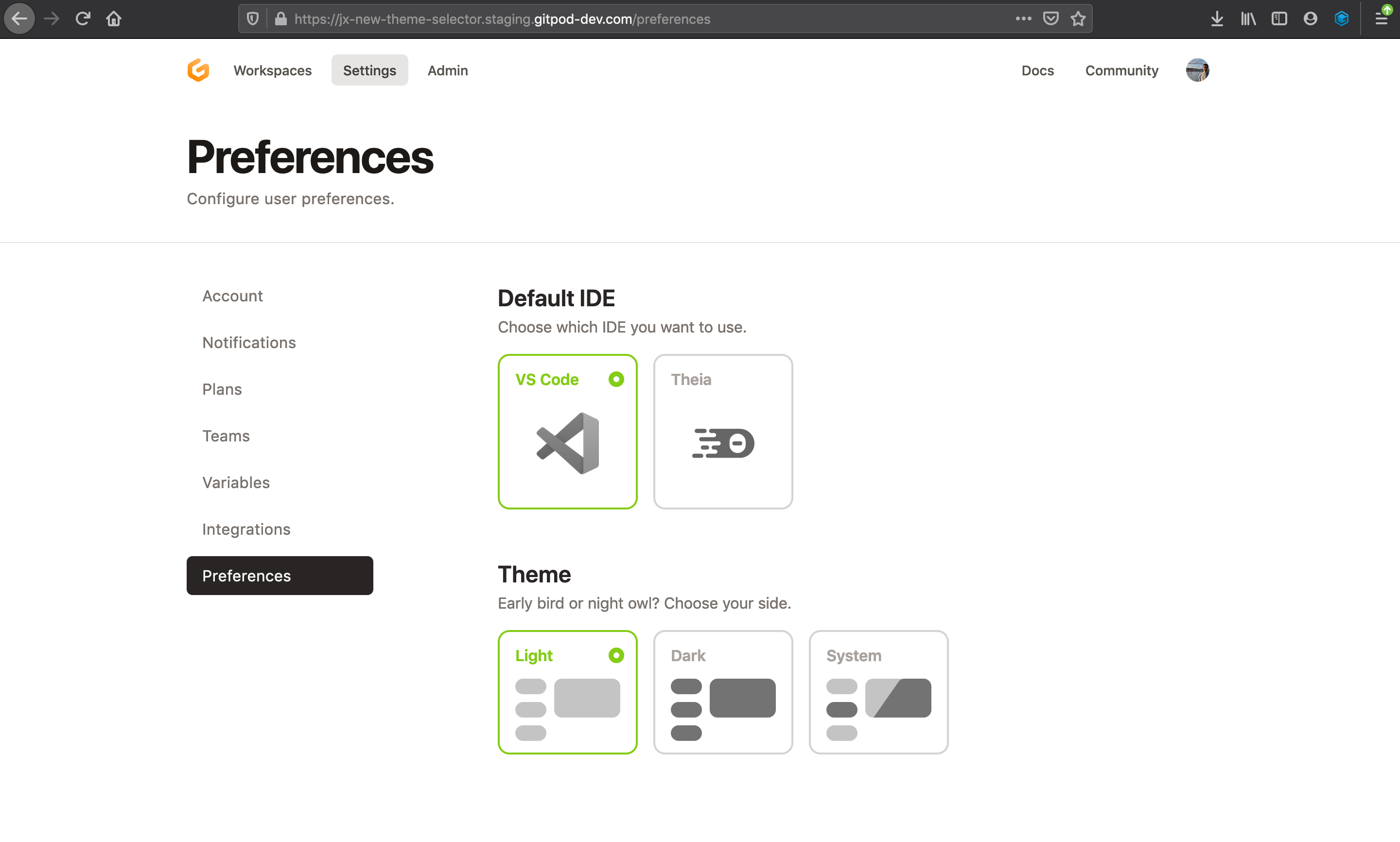
Great design! 💯 Currently looks like this:
|

|
Thought: Maybe the IDE cards and Theme cards could be squares?
Or IDE cards could have the same height / aspect ratio as Theme cards?
|


There was a problem hiding this comment.
This looks so good. Thanks for picking this up @jankeromnes! 🌟 🌟 🌟
Regarding the pending tasks:
Default to light theme to be less surprising to the user
No strong feelings for this one. We could keep defaulting to system theme, as the current setup. The two primary reasons for that suggestion are a) to avoid surprising the user, especially given that we can't sync back and forth with the editor (see #3982 (comment)) and b) to make the dark and system setting opt-in in #3956 instead of a fallback.
Consider introducing a secondary option to sync
We could keep this out of this iteration or wait to reach some consensus in #3982. I'd vote for getting this in as soon as possible.
Maybe the IDE cards and Theme cards could be squares?
Also thought about this while designing the theme preference selector. Two reasons why I kept these as they are. First, a) to differentiate these options and make them distinct options from the editor preference[1] and second b) to evolve the card component by trying a new design[2].
[1] For example, we should separate tab index between editor and theme cards. Currently, you can cycle between every option when using the right or left arrows. You should able to jump between Editor and Theme options (cards) only using Tab.
[2] Our component system will naturally evolve and new designs will pop-up on the way as the system matures. Aligning the rest of the components by making them square here is also fine. Your call! 📞

| <label><input type="radio" name="theme" value="system" checked={theme === 'system'} onChange={() => actuallySetTheme('system')}></input> System</label> | ||
| <label><input type="radio" name="theme" value="dark" checked={theme === 'dark'} onChange={() => actuallySetTheme('dark')}></input> Dark</label> | ||
| <label><input type="radio" name="theme" value="light" checked={theme === 'light'} onChange={() => actuallySetTheme('light')}></input> Light</label> | ||
| <SelectableCard className="w-36 h-32" title="Light" selected={theme === 'light'} onClick={() => actuallySetTheme('light')}> |
There was a problem hiding this comment.
praise: Go re-usable components! 🎉
There was a problem hiding this comment.
More coming 🔜! 😇
| <img className="w-16 dark:filter-invert" src={theia}/> | ||
| </div> | ||
| </SelectableCard> | ||
| </div> | ||
| <h3 className="mt-12">Theme</h3> | ||
| <p className="text-base text-gray-500">Light or dark?</p> | ||
| <p className="text-base text-gray-500">Early bird or night owl? Choose your side.</p> |
There was a problem hiding this comment.
thought: Suggested text can be taken lightly here. If anyone has a better alternative, feel free to update! In any case, looks great for this iteration. 🦉
There was a problem hiding this comment.
Your text is perfect! 🌟🎯
| <svg className="h-16" xmlns="http://www.w3.org/2000/svg" fill="none" viewBox="0 0 108 64"><rect width="68" height="40" x="40" fill="#C4C4C4" rx="8"/><rect width="32" height="16" fill="#C4C4C4" rx="8"/><rect width="32" height="16" y="24" fill="#C4C4C4" rx="8"/><rect width="32" height="16" y="48" fill="#C4C4C4" rx="8"/></svg> | ||
| </div> | ||
| </SelectableCard> | ||
| <SelectableCard className="w-36 h-32" title="Dark" selected={theme === 'dark'} onClick={() => actuallySetTheme('dark')}> |
There was a problem hiding this comment.
question: Curious why we named this actuallySetTheme? Isn't setTheme a sufficient alternative? Do we use setTheme elsewhere? 🤷
There was a problem hiding this comment.
Haha 😂 nice catch! If you look above in the code, there is a theme React state (a string), with already a setTheme(value) function.
But if we just call setTheme(value) from the selector component, we'll just switch the React state / selected card, but not the actual web app theme itself.
That's where actuallySetTheme(value) comes in: it calls setTheme(value), but then it also toggles the dark class on the body, and it also updates local storage so that the value is remembered across reloads.
If you see better names for these functions, please share. 😇
There was a problem hiding this comment.
Thanks for explaining @jankeromnes! Sounds good! Let's keep this as is. DOES. THE. JOB. 💯
|
Many thanks for the quick review! 🙏
That's a good point. In this light, I think the default theme should be the same for the dashboard and the IDE (i.e. "System" default in both, or "Light" default in both, but maybe we don't need to sync beyond the default value). Added my thoughts to the issue.
Agreed, thanks! 🚀 |
Fixes #3984