-
Notifications
You must be signed in to change notification settings - Fork 819
New issue
Have a question about this project? Sign up for a free GitHub account to open an issue and contact its maintainers and the community.
By clicking “Sign up for GitHub”, you agree to our terms of service and privacy statement. We’ll occasionally send you account related emails.
Already on GitHub? Sign in to your account
Equals and other horizontal characters uneven rendering on Windows 10 / VS Code #377
Comments
|
Thanks for the feedback. Font rendering is a notoriously challenging area because it will differ quite significantly depending on the OS you use, the resolution of the screen, and the rendering approach used by a given application. Not to mention that different coding applications have different modifications that they do to glyphs, which changes rendering. Phew! In TTF fonts, we add what is called "hinting", which is code built into the font that tells the rasterizer how to render the font. However, it is challenging to fully control glyph rendering since it depends entirely on how the glyph falls on the pixel grid (plus everything I mentioned above). The approach used for this font was to try and 'lock' one part of a given glyph to the pixel grid (thus achieving high contrast / differentiation between white and black). And then other elements in the glyph are determined from there. But as I said earlier, things will vary depending on the rasterization mode, etc. In the case of the In thinking about it, I do think I could try to make the In the case of jetbrains—I can't speak to the way that they have hinted the font, nor if the I guess the sum up is, I'll take a look, but may leave it as is :) |
|
Don't compromise contrast |
This is a significant update to Cascadia Code including a large number
of bug fixes as well as updating the font to offer support for Fira
Code v5 ligature support.

This update supersedes PR #373.

Closes #262 - ⏎ added
Closes #264 - additional codepoints for control characters added
Closes #281 - `!:` and `!.` added
Closes #290 - `/\` and `\/` added
Closes #301 - `??=` added
Closes #324 - ℞ added
Closes #327 - `<:>` and other variants implemented via the `calt`
  refactoring
Closes #359 - house added
Closes #371 - Added x-height instruction into ttfautohint to control the
  height of the lowercase.
Closes #375 - Completely redesigned quote marks for better recognition
Closes #377 - updated hinting to achieve more consistent results
Closes #381 - increased height of thetamod
Closes #382 - reduced the width of the hooklefts
Closes #383 - updated heights on esh, glottalstop, glottalstopreversed
Closes #384 - tweaked hinting a little bit. Maybe it'll help :)
Closes #386 - added remaining soft-dotting
Closes #392 - changed designs of angled quotes (they are now round)
Closes #394 - changed former `~=` symbol to a simpler component-based
  version. Should be less confusing now for Lua / Matlab users.
Closes #395 - makes the underline thicker based on font weight
Closes #400 - increased size of degree

Closes #219
The full control pictures block has been added (u+2400 to u+2426). For
purposes of rendering, the two letter abbreviations have been used
instead of the standard three letter abbreviations:

Additionally, ss20 includes the oft-unused graphical representations of
these codepoints (for fun!):

Closes #276 (infinite arrows)
Full support for Fira Code's current ligature set (with a few
exceptions). Now featuring infinite arrows!!!

This involved a full refactoring of the `calt` feature—for those
interested, it now uses forward-looking substitutions instead of
backward-looking substitutions and progressive substitution to reduce
code. This also required some redesigning of the greater / lesser
related ligatures. Please note, I have also removed all the obsolete
ligatures now covered by the arrows code.

Closes #329
There was a mismatch in the font's postscript naming conventions that
was corrected. Should now render all weights in Word. **Note** there is
apparently an additional bug in Mac Word's implementation of variable
fonts which should be available in an update mid-Feb.

* Not listed – Reworked the hints for the mod and superscript glyphs so
  that they're bottom-up rather than top-down. This allows for better
  bottom alignments.

Aside from the above changes, this version also includes many other
small updates including spacing, outline quality improvements, and
fixing hinting.
Environment
Any other software?
Steps to reproduce
just type
or
Expected behavior
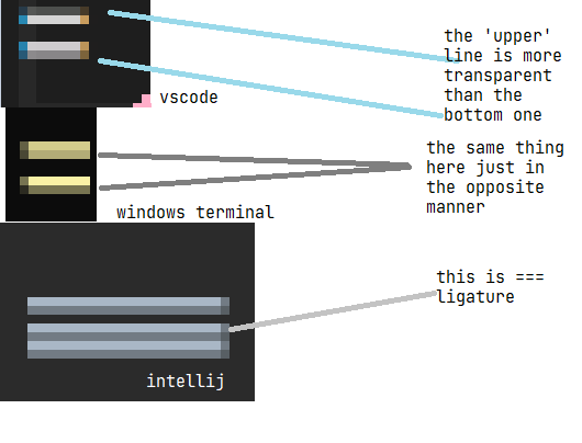
I expected both lines to be the same width/height depends how you look at it also happens with other characters/ligatures; I can provide more examples if needed
The example below might look funny because its so enhanced but it is really noticeable when looking at text with normal zoom levels
Actual behavior
3440x1440 34' screen


2560x1440 27' screen
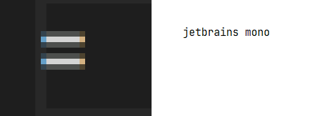
and in comparison to Jetbrains Mono
The text was updated successfully, but these errors were encountered: